Willkommen bei den Top‑Schriften – hier treffen Beliebtheit und Qualität aufeinander. Das sind die in diesem Jahr am häufigsten heruntergeladenen und genutzten Fonts. Wenn Sie sichere Optionen für Logo, Web oder Social suchen, starten Sie hier.
Jeder Top‑Font überzeugt durch Balance, Lesbarkeit und Vielseitigkeit. Sie finden moderne Sans‑Serifs, elegante Scripts, Vintage‑Serifs und minimalistische Displays.
-
( Fonts by www.houseoflime.com )
A bold, framed font inspired by traditional Asian calligraphy with a modern twist.
 Herunterladen 111 Downloads@WebFont
 -
( maciej.chodakowski.com )
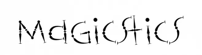
A whimsical, hand-drawn font with dots and lines creating a magical appearance.
![Magicstics Frei Schriftart Herunterladen]() Herunterladen 111 Downloads@WebFont
Herunterladen 111 Downloads@WebFont -
( Fonts by Southype )
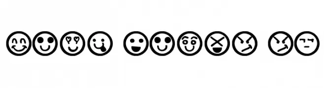
A decorative font made of expressive hand-drawn emoticon faces in circles.
![Hand Faces St Frei Schriftart Herunterladen]() Herunterladen 111 Downloads@WebFont
Herunterladen 111 Downloads@WebFont -
( Fonts by Iconian Fonts )
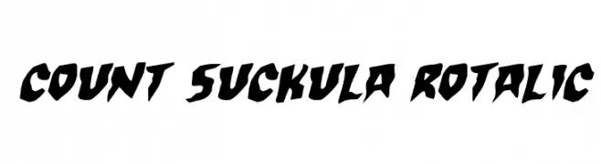
A bold, angular, and slightly italicized font with a dynamic and edgy style.
![Count Suckula Rotalic Frei Schriftart Herunterladen]() Herunterladen 111 Downloads@WebFont
Herunterladen 111 Downloads@WebFont -
( Fonts by Daniel Zadorozny - www.iconian.com - Free for personal use )
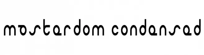
A modern, geometric, and bold condensed font with a futuristic style.
![Masterdom Condensed Frei Schriftart Herunterladen]() Herunterladen 111 Downloads@WebFont
Herunterladen 111 Downloads@WebFont -
-
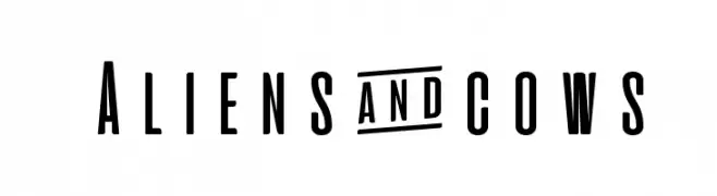
( Fonts by Zetafonts - Personal-use only. For commercial use please contact owner. )
A bold, condensed font with a modern and sleek design.
![Aliens & cows Frei Schriftart Herunterladen]() Herunterladen 111 Downloads@WebFont
Herunterladen 111 Downloads@WebFont -
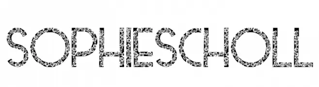
( Fonts by GorillaBlu - Personal-use only. For commercial use please contact owner. )
A decorative font with floral patterns on bold uppercase letters.
![Sophie Scholl Frei Schriftart Herunterladen]() Herunterladen 111 Downloads@WebFont
Herunterladen 111 Downloads@WebFont -
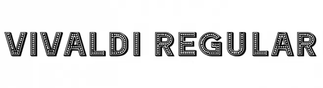
( Fonts by Vladimir Nikolic )
A bold, decorative font with a dotted, marquee light style.
![Vivaldi Regular Frei Schriftart Herunterladen]() Herunterladen 111 Downloads@WebFont
Herunterladen 111 Downloads@WebFont -
( wraith wolf - boxed in - shadowdesign.tumblr.com/ )
A geometric, modern font with a boxy, technical appearance.
![boxmd Regular Frei Schriftart Herunterladen]() Herunterladen 111 Downloads@WebFont
Herunterladen 111 Downloads@WebFont -
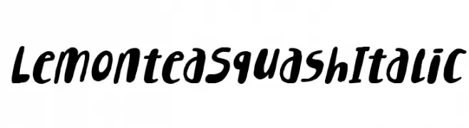
( Fonts by 7NTypes )
A bold, italicized font with playful, rounded strokes and a dynamic style.
![Lemontea Squash Italic Frei Schriftart Herunterladen]() Herunterladen 111 Downloads@WebFont
Herunterladen 111 Downloads@WebFont

Welche Schriften sind gerade am populärsten?
Poppins, Roboto, Montserrat, Open Sans und Lato sind wegen ihrer klaren Formen und breiten Einsetzbarkeit sehr gefragt – von Markenauftritt über Landingpages bis hin zu Postern.
Welche Fonts eignen sich für Logos?
Geometrische Sans‑Serifs (z. B. Poppins, Familien im Gotham‑Stil) sind ein häufiger Griff für sauberes, skalierbares Branding. Für eine persönlichere Note bleiben Scripts und Handschrift‑Stile beliebt. Kombinieren Sie einen prägnanten Headline‑Font mit einer neutralen Brotschrift für Wiedererkennung und Harmonie.
Wie oft wird die Top‑Liste aktualisiert?
Regelmäßig – basierend auf realen Downloads und Interaktionen. Schauen Sie öfter vorbei, um aufstrebende Favoriten früh zu entdecken.
💡 Tipp: Seite bookmarken – Trends wechseln schnell, und heutige Top‑Schriften inspirieren morgen vielleicht das Rebranding.