Willkommen bei den Top‑Schriften – hier treffen Beliebtheit und Qualität aufeinander. Das sind die in diesem Jahr am häufigsten heruntergeladenen und genutzten Fonts. Wenn Sie sichere Optionen für Logo, Web oder Social suchen, starten Sie hier.
Jeder Top‑Font überzeugt durch Balance, Lesbarkeit und Vielseitigkeit. Sie finden moderne Sans‑Serifs, elegante Scripts, Vintage‑Serifs und minimalistische Displays.
-
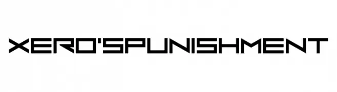
( Chequered Ink - chequered.ink/ )
A futuristic, geometric font with sharp angles and a bold, modern style.
 Herunterladen 108 Downloads@WebFont
 -
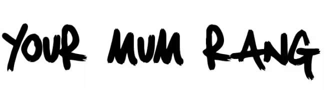
( CHU - schudio.co.uk )
A bold, graffiti-inspired font with dynamic, expressive strokes.
![Your Mum Rang Frei Schriftart Herunterladen]() Herunterladen 108 Downloads@WebFont
Herunterladen 108 Downloads@WebFont -
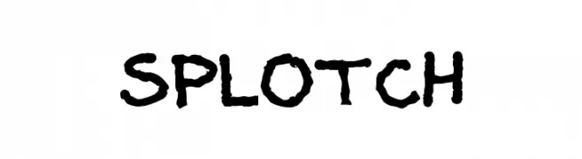
( Fonts by Dan P. Lyons - Personal-use only. For commercial use please contact owner. )
A bold, hand-drawn font with a playful, splotchy texture.
![Splotch Frei Schriftart Herunterladen]() Herunterladen 108 Downloads@WebFont
Herunterladen 108 Downloads@WebFont -
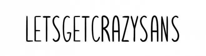
( Fonts by Pedro Teixeira Foundry - Pedro Alexandre Teixeira - Personal-use only. For commercial use please contact owner. )
A playful, narrow font with a hand-drawn, whimsical style.
![Letsgetcrazysans Frei Schriftart Herunterladen]() Herunterladen 108 Downloads@WebFont
Herunterladen 108 Downloads@WebFont -
( Fonts by Peter Wiegel - www.peter-wiegel.de - Personal-use only. For commercial use please contact owner. )
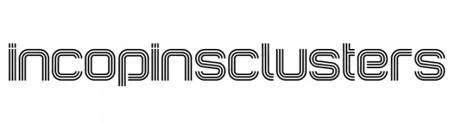
A decorative, multi-line font with a retro-futuristic aesthetic.
![IncopinsClusters Frei Schriftart Herunterladen]() Herunterladen 108 Downloads@WebFont
Herunterladen 108 Downloads@WebFont -
-
( Fonts by Darrell Flood )
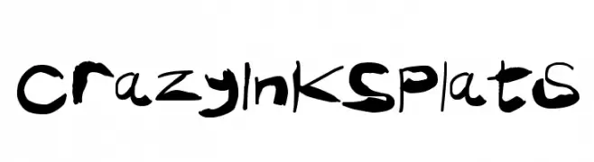
A bold, ink-splattered font with a chaotic and artistic style.
![Crazy Ink Splats Frei Schriftart Herunterladen]() Herunterladen 108 Downloads@WebFont
Herunterladen 108 Downloads@WebFont -
( Fonts by Manfred Klein. Free for private and charity use. Free for commercial with donation to organizations )
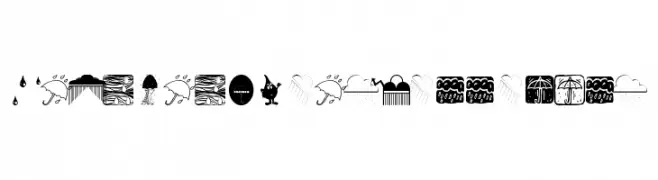
A decorative font featuring weather-themed illustrations.
![RainmansWeatherreport Frei Schriftart Herunterladen]() Herunterladen 108 Downloads@WebFont
Herunterladen 108 Downloads@WebFont -
( Fonts by Jeff Levine. FREEWARE )
A retro font with letters inside floppy disk shapes, perfect for vintage tech themes.
![Diskettes JL Frei Schriftart Herunterladen]() Herunterladen 108 Downloads@WebFont
Herunterladen 108 Downloads@WebFont -
( Fonts by Storytype Studio )
Elegant and decorative script font.
![Moriyathena Frei Schriftart Herunterladen]() Herunterladen 108 Downloads@WebFont
Herunterladen 108 Downloads@WebFont -
( - soulcase.deviantart.com )
A geometric and abstract font with sharp angles and bold shapes.
![Trifont Frei Schriftart Herunterladen]() Herunterladen 108 Downloads@WebFont
Herunterladen 108 Downloads@WebFont


Welche Schriften sind gerade am populärsten?
Poppins, Roboto, Montserrat, Open Sans und Lato sind wegen ihrer klaren Formen und breiten Einsetzbarkeit sehr gefragt – von Markenauftritt über Landingpages bis hin zu Postern.
Welche Fonts eignen sich für Logos?
Geometrische Sans‑Serifs (z. B. Poppins, Familien im Gotham‑Stil) sind ein häufiger Griff für sauberes, skalierbares Branding. Für eine persönlichere Note bleiben Scripts und Handschrift‑Stile beliebt. Kombinieren Sie einen prägnanten Headline‑Font mit einer neutralen Brotschrift für Wiedererkennung und Harmonie.
Wie oft wird die Top‑Liste aktualisiert?
Regelmäßig – basierend auf realen Downloads und Interaktionen. Schauen Sie öfter vorbei, um aufstrebende Favoriten früh zu entdecken.
💡 Tipp: Seite bookmarken – Trends wechseln schnell, und heutige Top‑Schriften inspirieren morgen vielleicht das Rebranding.