Willkommen bei den Top‑Schriften – hier treffen Beliebtheit und Qualität aufeinander. Das sind die in diesem Jahr am häufigsten heruntergeladenen und genutzten Fonts. Wenn Sie sichere Optionen für Logo, Web oder Social suchen, starten Sie hier.
Jeder Top‑Font überzeugt durch Balance, Lesbarkeit und Vielseitigkeit. Sie finden moderne Sans‑Serifs, elegante Scripts, Vintage‑Serifs und minimalistische Displays.
-
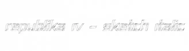
( Fonts by Apostrophic Lab )
A sketch-style, 3D italic font with a dynamic and artistic appearance.
 Herunterladen 108 Downloads@WebFont
 -
( Fonts by Woodcutter )
A bold, textured font with a distressed, hand-drawn style.
![Crazy Saigon Frei Schriftart Herunterladen]() Herunterladen 108 Downloads@WebFont
Herunterladen 108 Downloads@WebFont -
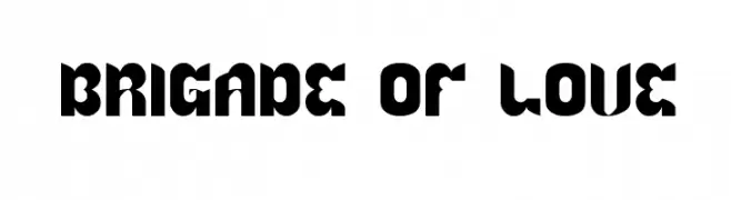
![BRIGADE OF LOVE Frei Schriftart Herunterladen]() Herunterladen 108 Downloads@WebFont
Herunterladen 108 Downloads@WebFont -
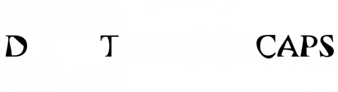
( Fonts by www.foamtrain.com )
A bold, angular serif font with a modern twist.
![Dry Toast CAPS Frei Schriftart Herunterladen]() Herunterladen 108 Downloads@WebFont
Herunterladen 108 Downloads@WebFont -
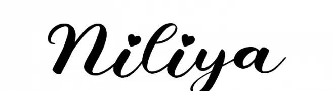
( Fonts by AEN Creative Studio - Personal-use only. For commercial use please contact owner. )
A flowing, cursive script with elegant, sweeping strokes and artistic flair.
![Niliya Frei Schriftart Herunterladen]() Herunterladen 108 Downloads@WebFont
Herunterladen 108 Downloads@WebFont -
-
![Font Color Qatar Frei Schriftart Herunterladen]() Herunterladen 108 Downloads@WebFont
Herunterladen 108 Downloads@WebFont -
( Fonts by Sasa Kojic - Personal-use only. For commercial use please contact owner. )
A modern, geometric sans-serif font with uniform strokes and high legibility.
![I shot the Serif Frei Schriftart Herunterladen]() Herunterladen 108 Downloads@WebFont
Herunterladen 108 Downloads@WebFont -
![Calculator LCDs Regular Frei Schriftart Herunterladen]() Herunterladen 108 Downloads@WebFont
Herunterladen 108 Downloads@WebFont -
( Fonts by Bloknote.nl - Personal-use only. For commercial use please contact owner. )
A distressed, grunge-style font with a textured, urban appearance.
![Ticket Scraps Urban Frei Schriftart Herunterladen]() Herunterladen 108 Downloads@WebFont
Herunterladen 108 Downloads@WebFont -
( Fonts by twinletter - Rozikan - Personal-use only. For commercial use please contact owner. )
A bold, cursive font with smooth, flowing lines and a playful, energetic style.
![Biund Frei Schriftart Herunterladen]() Herunterladen 108 Downloads@WebFont
Herunterladen 108 Downloads@WebFont


Welche Schriften sind gerade am populärsten?
Poppins, Roboto, Montserrat, Open Sans und Lato sind wegen ihrer klaren Formen und breiten Einsetzbarkeit sehr gefragt – von Markenauftritt über Landingpages bis hin zu Postern.
Welche Fonts eignen sich für Logos?
Geometrische Sans‑Serifs (z. B. Poppins, Familien im Gotham‑Stil) sind ein häufiger Griff für sauberes, skalierbares Branding. Für eine persönlichere Note bleiben Scripts und Handschrift‑Stile beliebt. Kombinieren Sie einen prägnanten Headline‑Font mit einer neutralen Brotschrift für Wiedererkennung und Harmonie.
Wie oft wird die Top‑Liste aktualisiert?
Regelmäßig – basierend auf realen Downloads und Interaktionen. Schauen Sie öfter vorbei, um aufstrebende Favoriten früh zu entdecken.
💡 Tipp: Seite bookmarken – Trends wechseln schnell, und heutige Top‑Schriften inspirieren morgen vielleicht das Rebranding.