Willkommen bei den Top‑Schriften – hier treffen Beliebtheit und Qualität aufeinander. Das sind die in diesem Jahr am häufigsten heruntergeladenen und genutzten Fonts. Wenn Sie sichere Optionen für Logo, Web oder Social suchen, starten Sie hier.
Jeder Top‑Font überzeugt durch Balance, Lesbarkeit und Vielseitigkeit. Sie finden moderne Sans‑Serifs, elegante Scripts, Vintage‑Serifs und minimalistische Displays.
-
( Fonts by www.junkohanhero.com - Personal-use only. For commercial use please contact owner. )
A bold, playful font with a layered outline effect and whimsical style.
 Herunterladen 103 Downloads@WebFont
 -
( Fonts by Jeff Bensch )
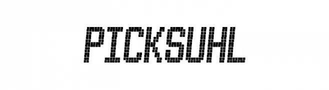
A pixelated, retro-style font with a digital, geometric look.
![PICKSUHL Frei Schriftart Herunterladen]() Herunterladen 103 Downloads@WebFont
Herunterladen 103 Downloads@WebFont -
( Fonts by Iconian Fonts )
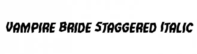
A bold, staggered, and italic font with sharp angles and dynamic style.
![Vampire Bride Staggered Italic Frei Schriftart Herunterladen]() Herunterladen 103 Downloads@WebFont
Herunterladen 103 Downloads@WebFont -
( Fonts by Claudia )
A lively, handwritten font with fluid, continuous strokes and elegant slant.
![Biellsa Frei Schriftart Herunterladen]() Herunterladen 103 Downloads@WebFont
Herunterladen 103 Downloads@WebFont -
![Neodymium Frei Schriftart Herunterladen]() Herunterladen 103 Downloads@WebFont
Herunterladen 103 Downloads@WebFont -
-
( Fonts by Castcraft Software - opti.netii.net - check the website before use )
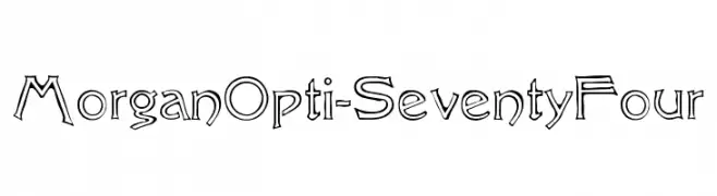
A whimsical, hand-drawn font with playful and dynamic characters.
![MorganOpti-SeventyFour Frei Schriftart Herunterladen]() Herunterladen 103 Downloads@WebFont
Herunterladen 103 Downloads@WebFont -
( Fonts by Przemyslaw Hoffer )
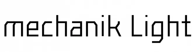
A geometric, angular font with a modern, mechanical style.
![mechanik Light Frei Schriftart Herunterladen]() Herunterladen 103 Downloads@WebFont
Herunterladen 103 Downloads@WebFont -
( Fonts by Mans Greback - Personal-use only. For commercial use please contact owner. )
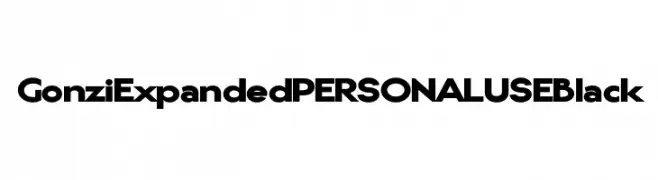
A bold, expanded font with geometric letterforms and a modern aesthetic.
![Gonzi Expanded PERSONAL USE Black Frei Schriftart Herunterladen]() Herunterladen 103 Downloads@WebFont
Herunterladen 103 Downloads@WebFont -
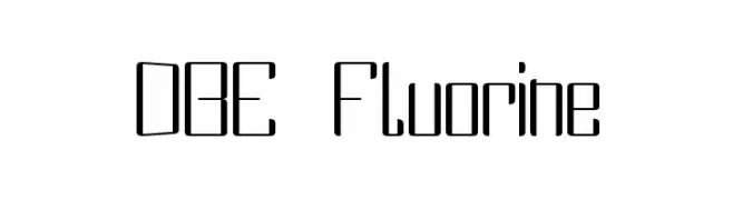
![DBE Fluorine Frei Schriftart Herunterladen]() Herunterladen 103 Downloads@WebFont
Herunterladen 103 Downloads@WebFont -
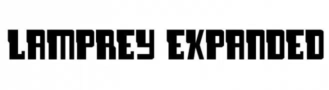
( Fonts by Daniel Zadorozny - www.iconian.com - Free for personal use )
A bold, geometric font with an expanded width and angular design.
![Lamprey Expanded Frei Schriftart Herunterladen]() Herunterladen 103 Downloads@WebFont
Herunterladen 103 Downloads@WebFont

Welche Schriften sind gerade am populärsten?
Poppins, Roboto, Montserrat, Open Sans und Lato sind wegen ihrer klaren Formen und breiten Einsetzbarkeit sehr gefragt – von Markenauftritt über Landingpages bis hin zu Postern.
Welche Fonts eignen sich für Logos?
Geometrische Sans‑Serifs (z. B. Poppins, Familien im Gotham‑Stil) sind ein häufiger Griff für sauberes, skalierbares Branding. Für eine persönlichere Note bleiben Scripts und Handschrift‑Stile beliebt. Kombinieren Sie einen prägnanten Headline‑Font mit einer neutralen Brotschrift für Wiedererkennung und Harmonie.
Wie oft wird die Top‑Liste aktualisiert?
Regelmäßig – basierend auf realen Downloads und Interaktionen. Schauen Sie öfter vorbei, um aufstrebende Favoriten früh zu entdecken.
💡 Tipp: Seite bookmarken – Trends wechseln schnell, und heutige Top‑Schriften inspirieren morgen vielleicht das Rebranding.