Willkommen bei den Top‑Schriften – hier treffen Beliebtheit und Qualität aufeinander. Das sind die in diesem Jahr am häufigsten heruntergeladenen und genutzten Fonts. Wenn Sie sichere Optionen für Logo, Web oder Social suchen, starten Sie hier.
Jeder Top‑Font überzeugt durch Balance, Lesbarkeit und Vielseitigkeit. Sie finden moderne Sans‑Serifs, elegante Scripts, Vintage‑Serifs und minimalistische Displays.
-
( Hardik )
A bold, retro 3D font with thick outlines and shadow effects.
 Herunterladen 103 Downloads@WebFont
 -
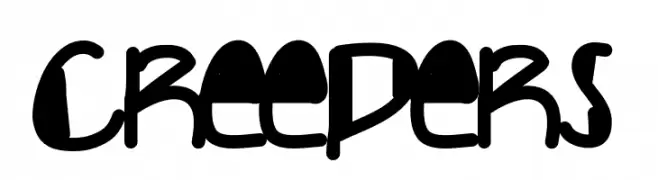
( Fonts by Des Gomez )
A bold, playful handwritten font with a quirky, energetic style.
![Creepers Frei Schriftart Herunterladen]() Herunterladen 103 Downloads@WebFont
Herunterladen 103 Downloads@WebFont -
Schriftart von danny91194. For commercial use please contact the owner.
( tricky )
A modern, blocky font with rounded corners and consistent thickness.
![The Slinging Beginnings Frei Schriftart Herunterladen]() Herunterladen 103 Downloads@WebFont
Herunterladen 103 Downloads@WebFont -
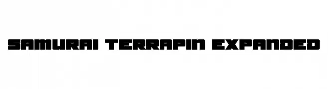
![Samurai Terrapin Expanded Frei Schriftart Herunterladen]() Herunterladen 103 Downloads@WebFont
Herunterladen 103 Downloads@WebFont -
( Fonts by Endri Sulistyawan - Personal-use only. For commercial use please contact owner. )
A playful and elegant handwritten script font with medium contrast.
![Valentisa - Personal Use Frei Schriftart Herunterladen]() Herunterladen 103 Downloads@WebFont
Herunterladen 103 Downloads@WebFont -
-
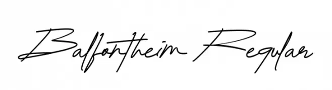
( Fonts by RiseGraph )
A fluid and elegant handwritten script with dynamic strokes.
![Balfontheim Regular Frei Schriftart Herunterladen]() Herunterladen 103 Downloads@WebFont
Herunterladen 103 Downloads@WebFont -
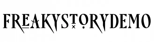
( Fonts by Saridezra - Personal-use only. For commercial use please contact owner. )
A bold, artistic font with sharp angles and unique embellishments.
![FreakyStoryDEMO Frei Schriftart Herunterladen]() Herunterladen 103 Downloads@WebFont
Herunterladen 103 Downloads@WebFont -
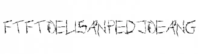
![FTFToelisanPedjoeang Frei Schriftart Herunterladen]() Herunterladen 103 Downloads@WebFont
Herunterladen 103 Downloads@WebFont -
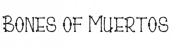
( Fonts by Madatype Studio )
A playful, bone-themed font with a quirky, skeletal design.
![Bones of Muertos Frei Schriftart Herunterladen]() Herunterladen 103 Downloads@WebFont
Herunterladen 103 Downloads@WebFont -
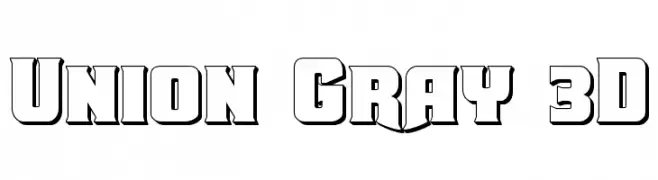
( Fonts by Daniel Zadorozny - www.iconian.com - Free for personal use )
A bold, 3D geometric font with a strong, modern presence.
![Union Gray 3D Frei Schriftart Herunterladen]() Herunterladen 103 Downloads@WebFont
Herunterladen 103 Downloads@WebFont


Welche Schriften sind gerade am populärsten?
Poppins, Roboto, Montserrat, Open Sans und Lato sind wegen ihrer klaren Formen und breiten Einsetzbarkeit sehr gefragt – von Markenauftritt über Landingpages bis hin zu Postern.
Welche Fonts eignen sich für Logos?
Geometrische Sans‑Serifs (z. B. Poppins, Familien im Gotham‑Stil) sind ein häufiger Griff für sauberes, skalierbares Branding. Für eine persönlichere Note bleiben Scripts und Handschrift‑Stile beliebt. Kombinieren Sie einen prägnanten Headline‑Font mit einer neutralen Brotschrift für Wiedererkennung und Harmonie.
Wie oft wird die Top‑Liste aktualisiert?
Regelmäßig – basierend auf realen Downloads und Interaktionen. Schauen Sie öfter vorbei, um aufstrebende Favoriten früh zu entdecken.
💡 Tipp: Seite bookmarken – Trends wechseln schnell, und heutige Top‑Schriften inspirieren morgen vielleicht das Rebranding.