Willkommen bei den Top‑Schriften – hier treffen Beliebtheit und Qualität aufeinander. Das sind die in diesem Jahr am häufigsten heruntergeladenen und genutzten Fonts. Wenn Sie sichere Optionen für Logo, Web oder Social suchen, starten Sie hier.
Jeder Top‑Font überzeugt durch Balance, Lesbarkeit und Vielseitigkeit. Sie finden moderne Sans‑Serifs, elegante Scripts, Vintage‑Serifs und minimalistische Displays.
-
( Fonts by BBA Key - Personal-use only. For commercial use please contact owner. )
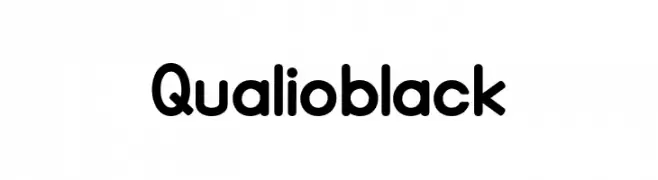
A bold, rounded sans-serif font with a modern and friendly appearance.
 Herunterladen 102 Downloads@WebFont
 -
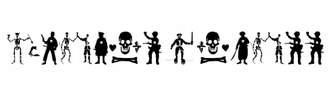
![PiratesThree Frei Schriftart Herunterladen]() Herunterladen 102 Downloads@WebFont
Herunterladen 102 Downloads@WebFont -
Schriftart von typotopia. For commercial use please contact the owner.
( Fonts bt Typotopia - Typotopia.co - Personal Use Only, for Commercial Use, please contact us )
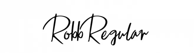
A lively handwritten font with dynamic strokes and a casual, energetic style.
![Robb Regular Frei Schriftart Herunterladen]() Herunterladen 102 Downloads@WebFont
Herunterladen 102 Downloads@WebFont -
( Fonts by Xerographer Fonts )
A textured, hand-drawn font with a distressed and artistic style.
![SimpleLucky Frei Schriftart Herunterladen]() Herunterladen 102 Downloads@WebFont
Herunterladen 102 Downloads@WebFont -
( Fonts by MJType )
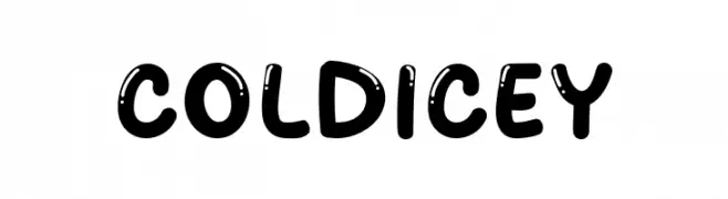
A bold, playful font with rounded, hand-drawn characters and a shadow effect.
![COLD ICEY Frei Schriftart Herunterladen]() Herunterladen 102 Downloads@WebFont
Herunterladen 102 Downloads@WebFont -
-
![ryp_sflake4 Frei Schriftart Herunterladen]() Herunterladen 102 Downloads@WebFont
Herunterladen 102 Downloads@WebFont -
( Fonts by Luu Thy Nguyen )
A modern, artistic handwritten font with playful loops and sharp angles.
![Hong Kim Regular Frei Schriftart Herunterladen]() Herunterladen 102 Downloads@WebFont
Herunterladen 102 Downloads@WebFont -
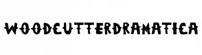
( Fonts by www.woodcutter.es - woodcutter Manero - Personal-use only. For commercial use please contact owner. )
A bold, playful font with a hand-drawn, whimsical style.
![Woodcutter Dramatica Frei Schriftart Herunterladen]() Herunterladen 102 Downloads@WebFont
Herunterladen 102 Downloads@WebFont -
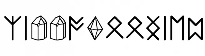
![Zillaroonies Frei Schriftart Herunterladen]() Herunterladen 102 Downloads@WebFont
Herunterladen 102 Downloads@WebFont -
( Fonts by Daniel Zadorozny - www.iconian.com )
A bold, futuristic italic font with a 3D effect, perfect for modern designs.
![Gunship 3D Italic Frei Schriftart Herunterladen]() Herunterladen 102 Downloads@WebFont
Herunterladen 102 Downloads@WebFont


Welche Schriften sind gerade am populärsten?
Poppins, Roboto, Montserrat, Open Sans und Lato sind wegen ihrer klaren Formen und breiten Einsetzbarkeit sehr gefragt – von Markenauftritt über Landingpages bis hin zu Postern.
Welche Fonts eignen sich für Logos?
Geometrische Sans‑Serifs (z. B. Poppins, Familien im Gotham‑Stil) sind ein häufiger Griff für sauberes, skalierbares Branding. Für eine persönlichere Note bleiben Scripts und Handschrift‑Stile beliebt. Kombinieren Sie einen prägnanten Headline‑Font mit einer neutralen Brotschrift für Wiedererkennung und Harmonie.
Wie oft wird die Top‑Liste aktualisiert?
Regelmäßig – basierend auf realen Downloads und Interaktionen. Schauen Sie öfter vorbei, um aufstrebende Favoriten früh zu entdecken.
💡 Tipp: Seite bookmarken – Trends wechseln schnell, und heutige Top‑Schriften inspirieren morgen vielleicht das Rebranding.