Willkommen bei den Top‑Schriften – hier treffen Beliebtheit und Qualität aufeinander. Das sind die in diesem Jahr am häufigsten heruntergeladenen und genutzten Fonts. Wenn Sie sichere Optionen für Logo, Web oder Social suchen, starten Sie hier.
Jeder Top‑Font überzeugt durch Balance, Lesbarkeit und Vielseitigkeit. Sie finden moderne Sans‑Serifs, elegante Scripts, Vintage‑Serifs und minimalistische Displays.
-
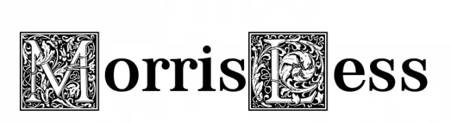
( Fonts by Levi Szekeres )
A decorative serif font with ornate uppercase letters and classic lowercase design.
 Herunterladen 103 Downloads@WebFont
 -
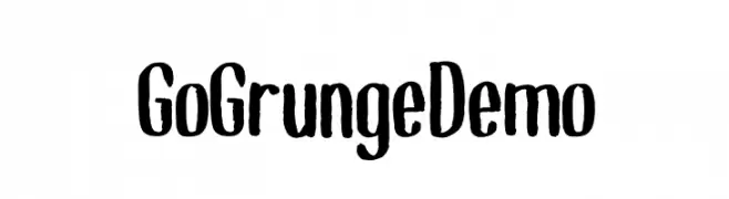
( Fonts by Almaz Studio - Anang Widyasworo - Personal-use only. For commercial use please contact owner. )
A bold, hand-drawn font with a grunge aesthetic and irregular edges.
![GoGrunge_Demo Frei Schriftart Herunterladen]() Herunterladen 103 Downloads@WebFont
Herunterladen 103 Downloads@WebFont -
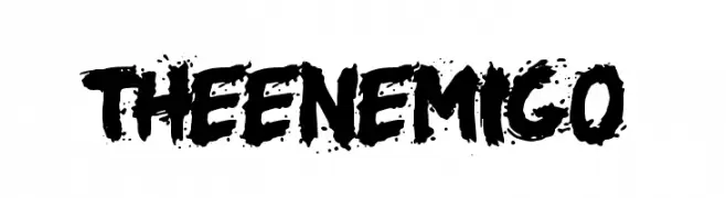
( Woodcutter - woodcutter Manero - www.woodcutter.es )
A bold, grungy font with a distressed, ink-splattered appearance.
![the enemigo Frei Schriftart Herunterladen]() Herunterladen 103 Downloads@WebFont
Herunterladen 103 Downloads@WebFont -
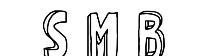
( imagex - www.imagex-fonts.com )
A playful, hand-drawn 3D font with bold outlines and a whimsical style.
![Strange Magic Blank Frei Schriftart Herunterladen]() Herunterladen 103 Downloads@WebFont
Herunterladen 103 Downloads@WebFont -
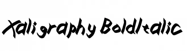
( Fonts by Zdenek Gromnica - www.futuremillennium.com )
A bold, italicized font with sharp, angular lines and a dynamic style.
![Xaligraphy BoldItalic Frei Schriftart Herunterladen]() Herunterladen 103 Downloads@WebFont
Herunterladen 103 Downloads@WebFont -
-
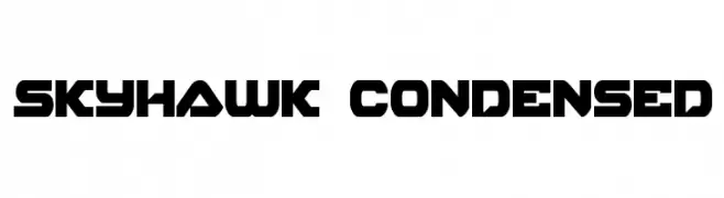
( Fonts by Daniel Zadorozny - www.iconian.com )
A bold, geometric, and condensed font with a futuristic style.
![Skyhawk Condensed Frei Schriftart Herunterladen]() Herunterladen 103 Downloads@WebFont
Herunterladen 103 Downloads@WebFont -
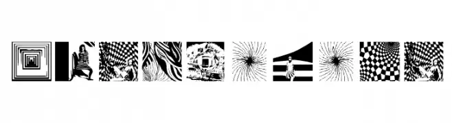
( Fonts by Manfred Klein. Free for private and charity use. Free for commercial with donation to organizations )
Abstract, optical illusion-based decorative font.
![OpticalArt Frei Schriftart Herunterladen]() Herunterladen 103 Downloads@WebFont
Herunterladen 103 Downloads@WebFont -
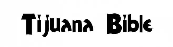
( Roulette Studios - www.roulettestudios.com )
A bold, dynamic font with angular and playful characters.
![Tijuana Bible Frei Schriftart Herunterladen]() Herunterladen 103 Downloads@WebFont
Herunterladen 103 Downloads@WebFont -
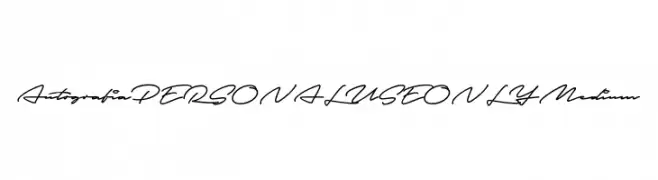
( Fonts by Mans Greback - Personal-use only. For commercial use please contact owner. )
A modern, cursive script font with a flowing, handwritten style.
![Autografia PERSONAL USE ONLY Medium Frei Schriftart Herunterladen]() Herunterladen 103 Downloads@WebFont
Herunterladen 103 Downloads@WebFont -
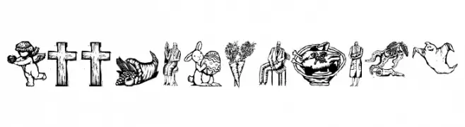
( Fonts by Manfred Klein. Free for private and charity use. Free for commercial with donation to organizations )
Ornate woodcut-style pictorial dingbat font.
![WoodcutsFive Frei Schriftart Herunterladen]() Herunterladen 103 Downloads@WebFont
Herunterladen 103 Downloads@WebFont
Welche Schriften sind gerade am populärsten?
Poppins, Roboto, Montserrat, Open Sans und Lato sind wegen ihrer klaren Formen und breiten Einsetzbarkeit sehr gefragt – von Markenauftritt über Landingpages bis hin zu Postern.
Welche Fonts eignen sich für Logos?
Geometrische Sans‑Serifs (z. B. Poppins, Familien im Gotham‑Stil) sind ein häufiger Griff für sauberes, skalierbares Branding. Für eine persönlichere Note bleiben Scripts und Handschrift‑Stile beliebt. Kombinieren Sie einen prägnanten Headline‑Font mit einer neutralen Brotschrift für Wiedererkennung und Harmonie.
Wie oft wird die Top‑Liste aktualisiert?
Regelmäßig – basierend auf realen Downloads und Interaktionen. Schauen Sie öfter vorbei, um aufstrebende Favoriten früh zu entdecken.
💡 Tipp: Seite bookmarken – Trends wechseln schnell, und heutige Top‑Schriften inspirieren morgen vielleicht das Rebranding.