Willkommen bei den Top‑Schriften – hier treffen Beliebtheit und Qualität aufeinander. Das sind die in diesem Jahr am häufigsten heruntergeladenen und genutzten Fonts. Wenn Sie sichere Optionen für Logo, Web oder Social suchen, starten Sie hier.
Jeder Top‑Font überzeugt durch Balance, Lesbarkeit und Vielseitigkeit. Sie finden moderne Sans‑Serifs, elegante Scripts, Vintage‑Serifs und minimalistische Displays.
-
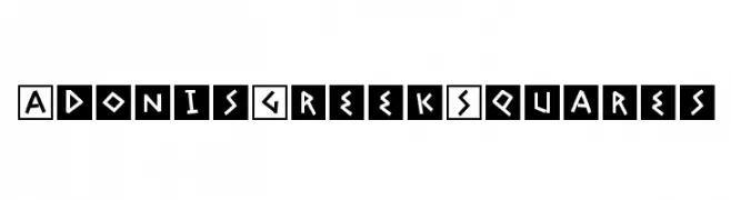
( Fonts by Manfred Klein. Free for private and charity use. Free for commercial with donation to organizations )
A bold, geometric font with Greek-inspired, angular characters enclosed in squares.
 Herunterladen 458 Downloads@WebFont
 -
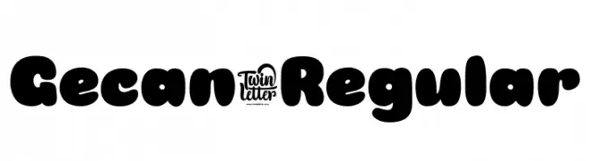
( Fonts by twinletter )
A bold, rounded font with a playful and friendly style.
![Gecan-Regular Frei Schriftart Herunterladen]() Herunterladen 458 Downloads@WebFont
Herunterladen 458 Downloads@WebFont -
![Josephin Frei Schriftart Herunterladen]() Herunterladen 458 Downloads@WebFont
Herunterladen 458 Downloads@WebFont -
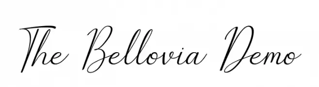
( Fonts by Fajar Abdul Fattah - https://fontbundles.net/sibelumpagi-studio - Personal-use only. For commercial use please contact owner. )
An elegant, high-contrast script font with flowing, cursive characters.
![The Bellovia Demo Frei Schriftart Herunterladen]() Herunterladen 458 Downloads@WebFont
Herunterladen 458 Downloads@WebFont -
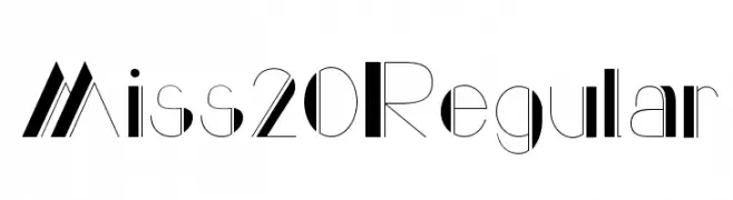
![Miss 20 Regular Frei Schriftart Herunterladen]() Herunterladen 458 Downloads@WebFont
Herunterladen 458 Downloads@WebFont -
-
( Fonts by Daniel Zadorozny - www.iconian.com - Free for personal use )
A bold, hand-drawn, and condensed font with a dynamic and energetic style.
![Yellowjacket Condensed Frei Schriftart Herunterladen]() Herunterladen 458 Downloads@WebFont
Herunterladen 458 Downloads@WebFont -
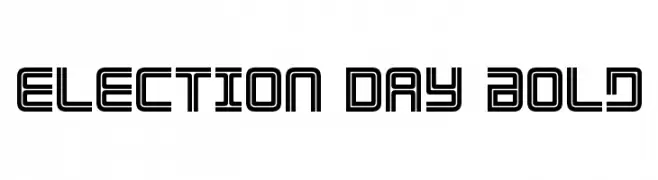
( Fonts by Daniel Zadorozny - www.iconian.com )
A bold, geometric font with a futuristic double-line design.
![Election Day Bold Frei Schriftart Herunterladen]() Herunterladen 458 Downloads@WebFont
Herunterladen 458 Downloads@WebFont -
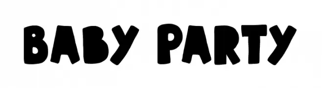
( Fonts by imagex )
A bold, playful font with rounded, hand-drawn characters.
![Baby Party Frei Schriftart Herunterladen]() Herunterladen 458 Downloads@WebFont
Herunterladen 458 Downloads@WebFont -
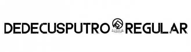
( Fonts by Chris Vile )
A bold, distressed font with a vintage, textured appearance.
![DedecusPutro-Regular Frei Schriftart Herunterladen]() Herunterladen 458 Downloads@WebFont
Herunterladen 458 Downloads@WebFont -
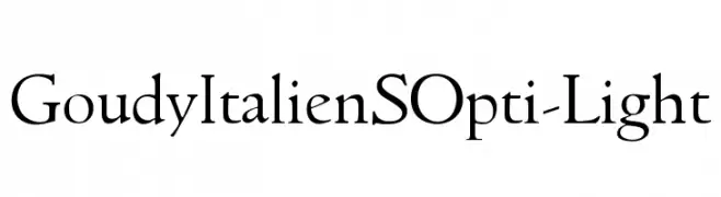
( Fonts by Castcraft Software - opti.netii.net - check the website before use )
A classic serif font with elegant curves and balanced contrast.
![GoudyItalienSOpti-Light Frei Schriftart Herunterladen]() Herunterladen 458 Downloads@WebFont
Herunterladen 458 Downloads@WebFont -
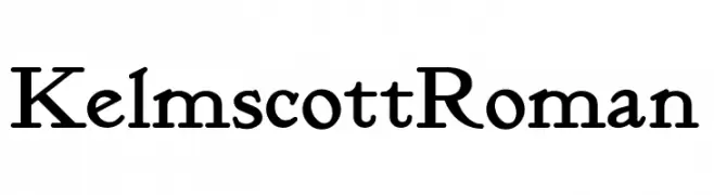
( Fonts by Nick's Fonts )
A classic serif font with a traditional and elegant design.
![KelmscottRoman Frei Schriftart Herunterladen]() Herunterladen 458 Downloads
Herunterladen 458 Downloads -
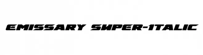
( Fonts by Daniel Zadorozny - www.iconian.com - Free for personal use )
A bold, italicized font with a dynamic and futuristic style.
![Emissary Super-Italic Frei Schriftart Herunterladen]() Herunterladen 458 Downloads@WebFont
Herunterladen 458 Downloads@WebFont -
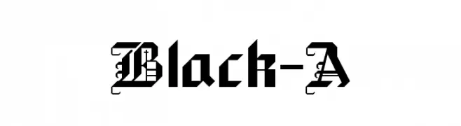
![Black-A Frei Schriftart Herunterladen]() Herunterladen 458 Downloads@WebFont
Herunterladen 458 Downloads@WebFont -
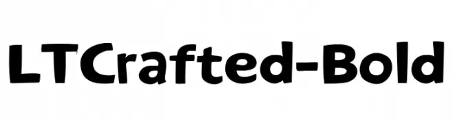
( Fonts by LyonsType )
A bold, rounded font with a playful and handcrafted appearance.
![LTCrafted-Bold Frei Schriftart Herunterladen]() Herunterladen 458 Downloads@WebFont
Herunterladen 458 Downloads@WebFont -
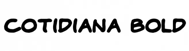
( Donationware - )
A bold, playful font with rounded edges and a hand-drawn feel.
![Cotidiana Bold Frei Schriftart Herunterladen]() Herunterladen 458 Downloads@WebFont
Herunterladen 458 Downloads@WebFont -
![Venetia Monitor Frei Schriftart Herunterladen]() Herunterladen 458 Downloads@WebFont
Herunterladen 458 Downloads@WebFont -
![Unsteady Oversteer Frei Schriftart Herunterladen]() Herunterladen 458 Downloads@WebFont
Herunterladen 458 Downloads@WebFont -
( SDFonts. http://www.angelfire.com/scifi2/sdfonts/index.html )
A bold, geometric font with a modern and impactful style.
![Glue Klinging Klan Frei Schriftart Herunterladen]() Herunterladen 458 Downloads@WebFont
Herunterladen 458 Downloads@WebFont -
( Fonts by Scratchones )
A decorative, whimsical font with elegant swirls and a playful handwritten style.
![Lightrays Frei Schriftart Herunterladen]() Herunterladen 458 Downloads@WebFont
Herunterladen 458 Downloads@WebFont -
( Fonts by Kreative Korporation - www.kreativekorp.com )
A pixelated, blocky font with a retro digital aesthetic.
![Shaston 320 Frei Schriftart Herunterladen]() Herunterladen 458 Downloads@WebFont
Herunterladen 458 Downloads@WebFont -
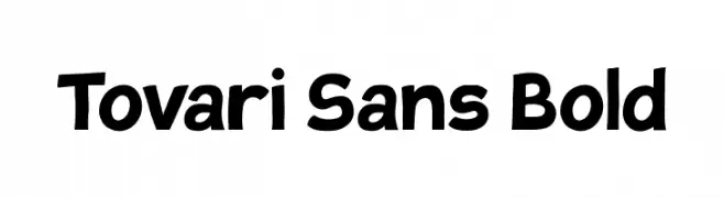
( Fonts by Verneri Kontto )
A bold, playful font with rounded edges and a friendly appearance.
![Tovari Sans Bold Frei Schriftart Herunterladen]() Herunterladen 458 Downloads@WebFont
Herunterladen 458 Downloads@WebFont -
![Double Espresso Frei Schriftart Herunterladen]() Herunterladen 458 Downloads@WebFont
Herunterladen 458 Downloads@WebFont -
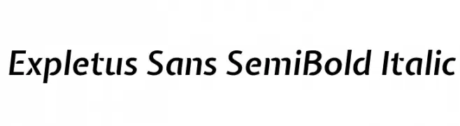
( Copyright (c) 2011, Jasper de Waard (jasper@designtown.nl) )
A modern, semi-bold italic sans-serif font with a sleek and dynamic style.
![Expletus Sans SemiBold Italic Frei Schriftart Herunterladen]() Herunterladen 458 Downloads@WebFont
Herunterladen 458 Downloads@WebFont -
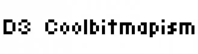
( Fonts by www.DigitalDreamDesign.net )
A pixelated, retro-style font with a digital, tech-inspired aesthetic.
![D3 Coolbitmapism Frei Schriftart Herunterladen]() Herunterladen 458 Downloads@WebFont
Herunterladen 458 Downloads@WebFont -
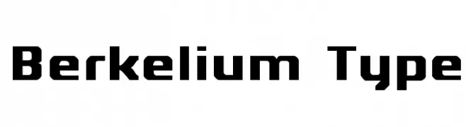
( Fonts by Kreative Korporation - www.kreativekorp.com )
A bold, geometric font with angular, blocky letterforms and a modern aesthetic.
![Berkelium Type Frei Schriftart Herunterladen]() Herunterladen 458 Downloads@WebFont
Herunterladen 458 Downloads@WebFont -
![Notation JL Frei Schriftart Herunterladen]() Herunterladen 458 Downloads@WebFont
Herunterladen 458 Downloads@WebFont -
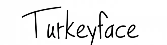
( Fonts by Lee Batchelor http://leeviathan.com/portfolio/fonts/ )
A playful, handwritten font with a casual and whimsical style.
![Turkeyface Frei Schriftart Herunterladen]() Herunterladen 458 Downloads@WebFont
Herunterladen 458 Downloads@WebFont -
( Marc Clancy - www.marcclancy.com/ )
A modern, clean sans-serif font with excellent legibility.
![Powdah Frei Schriftart Herunterladen]() Herunterladen 458 Downloads@WebFont
Herunterladen 458 Downloads@WebFont -
( گالری فانت فارسی پژوهش آريانا - only compatible with Farsi and Arabic )
An elegant Arabic-style font with flowing, traditional calligraphic elements.
![Arabic Style II Frei Schriftart Herunterladen]() Herunterladen 458 Downloads@WebFont
Herunterladen 458 Downloads@WebFont -
![Booday Frei Schriftart Herunterladen]() Herunterladen 458 Downloads@WebFont
Herunterladen 458 Downloads@WebFont -
![Christian Participants Frei Schriftart Herunterladen]() Herunterladen 458 Downloads@WebFont
Herunterladen 458 Downloads@WebFont -
![ALAMBRADO INFERNAL Frei Schriftart Herunterladen]() Herunterladen 458 Downloads@WebFont
Herunterladen 458 Downloads@WebFont -
( Fonts by Kreative Korporation - www.kreativekorp.com )
A pixelated, retro-style font with a blocky, geometric design.
![Monterey Frei Schriftart Herunterladen]() Herunterladen 458 Downloads@WebFont
Herunterladen 458 Downloads@WebFont -
![Black ink Frei Schriftart Herunterladen]() Herunterladen 458 Downloads@WebFont
Herunterladen 458 Downloads@WebFont -
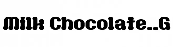
( Fonts by Goma Shin - Shintarou Nakayama www.geocities.jp/gomarice_font/ )
A bold, playful font with rounded edges and a bubbly appearance.
![Milk Chocolate__G Frei Schriftart Herunterladen]() Herunterladen 458 Downloads@WebFont
Herunterladen 458 Downloads@WebFont


Welche Schriften sind gerade am populärsten?
Poppins, Roboto, Montserrat, Open Sans und Lato sind wegen ihrer klaren Formen und breiten Einsetzbarkeit sehr gefragt – von Markenauftritt über Landingpages bis hin zu Postern.
Welche Fonts eignen sich für Logos?
Geometrische Sans‑Serifs (z. B. Poppins, Familien im Gotham‑Stil) sind ein häufiger Griff für sauberes, skalierbares Branding. Für eine persönlichere Note bleiben Scripts und Handschrift‑Stile beliebt. Kombinieren Sie einen prägnanten Headline‑Font mit einer neutralen Brotschrift für Wiedererkennung und Harmonie.
Wie oft wird die Top‑Liste aktualisiert?
Regelmäßig – basierend auf realen Downloads und Interaktionen. Schauen Sie öfter vorbei, um aufstrebende Favoriten früh zu entdecken.
💡 Tipp: Seite bookmarken – Trends wechseln schnell, und heutige Top‑Schriften inspirieren morgen vielleicht das Rebranding.