Willkommen bei den Top‑Schriften – hier treffen Beliebtheit und Qualität aufeinander. Das sind die in diesem Jahr am häufigsten heruntergeladenen und genutzten Fonts. Wenn Sie sichere Optionen für Logo, Web oder Social suchen, starten Sie hier.
Jeder Top‑Font überzeugt durch Balance, Lesbarkeit und Vielseitigkeit. Sie finden moderne Sans‑Serifs, elegante Scripts, Vintage‑Serifs und minimalistische Displays.
-
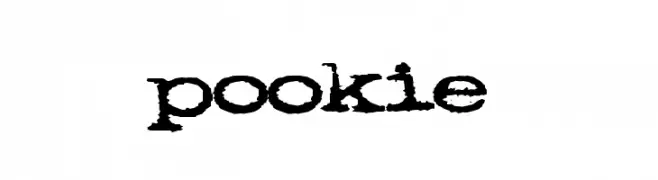
( Fonts by Emerald City Fontwerks )
A bold, distressed typewriter-style font with a vintage, grunge aesthetic.
 Herunterladen 417 Downloads@WebFont
 -
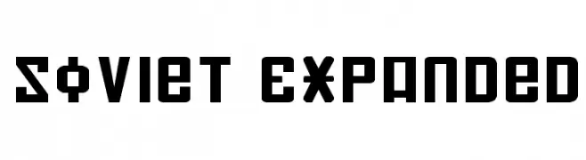
( Fonts by Daniel Zadorozny - www.iconian.com )
A bold, geometric font with an industrial, Soviet-era aesthetic.
![Soviet Expanded Frei Schriftart Herunterladen]() Herunterladen 417 Downloads@WebFont
Herunterladen 417 Downloads@WebFont -
![Shepherdy Frei Schriftart Herunterladen]() Herunterladen 417 Downloads@WebFont
Herunterladen 417 Downloads@WebFont -
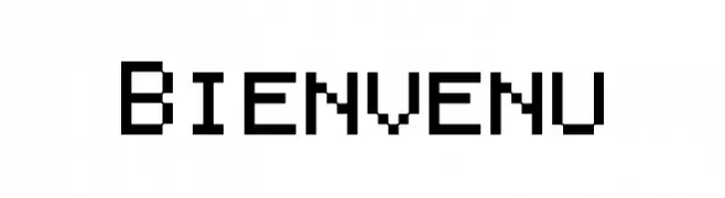
( Fonts by a Neale Davidson - www.pixelsagas.com. Personal-use only. For commercial use please contact owner. )
A pixelated, monospaced font with a retro digital aesthetic.
![Bienvenu Frei Schriftart Herunterladen]() Herunterladen 417 Downloads@WebFont
Herunterladen 417 Downloads@WebFont -
( Fonts by Linafis Studio - Ahmad Fashihullisan - Personal-use only. For commercial use please contact owner. )
A bold, cracked texture font with a rugged, urban style.
![CRACK WALL Regular Frei Schriftart Herunterladen]() Herunterladen 417 Downloads@WebFont
Herunterladen 417 Downloads@WebFont -
-
![dUBBEL Frei Schriftart Herunterladen]() Herunterladen 417 Downloads@WebFont
Herunterladen 417 Downloads@WebFont -
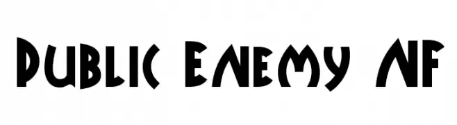
( Fonts by Nick Curtis - www.nicksfonts.com )
A bold, geometric font with Art Deco influences, ideal for impactful designs.
![Public Enemy NF Frei Schriftart Herunterladen]() Herunterladen 417 Downloads@WebFont
Herunterladen 417 Downloads@WebFont -
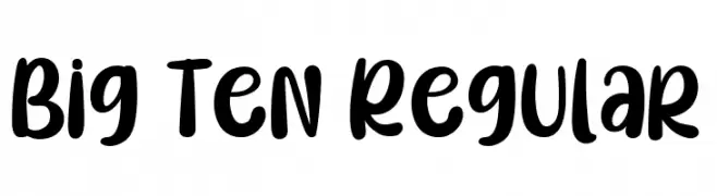
( Fonts by Type on Studio )
A bold, playful font with rounded, thick strokes and a slightly condensed style.
![Big Ten Regular Frei Schriftart Herunterladen]() Herunterladen 417 Downloads@WebFont
Herunterladen 417 Downloads@WebFont -
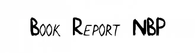
![Book Report NBP Frei Schriftart Herunterladen]() Herunterladen 417 Downloads@WebFont
Herunterladen 417 Downloads@WebFont -
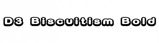
( Fonts by www.DigitalDreamDesign.net )
A bold, rounded font with a playful, retro style and thick outlines.
![D3 Biscuitism Bold Frei Schriftart Herunterladen]() Herunterladen 417 Downloads@WebFont
Herunterladen 417 Downloads@WebFont -
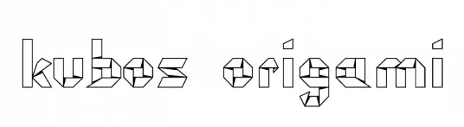
![kubos origami Frei Schriftart Herunterladen]() Herunterladen 417 Downloads@WebFont
Herunterladen 417 Downloads@WebFont -
( Fonts by Nick Curtis - www.nicksfonts.com )
A tall, narrow font with elegant inline detailing and a modern style.
![Lagniappe-Inline Frei Schriftart Herunterladen]() Herunterladen 417 Downloads@WebFont
Herunterladen 417 Downloads@WebFont -
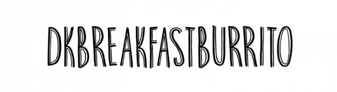
![DKBreakfastBurrito Frei Schriftart Herunterladen]() Herunterladen 417 Downloads@WebFont
Herunterladen 417 Downloads@WebFont -
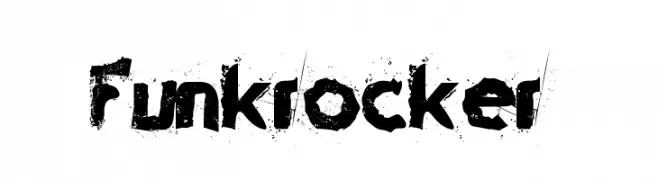
( Fonts by Sharkshock Productions----www.sharkshock.com. Personal-use only. For commercial use please contact owner. )
A bold, grunge-style font with a distressed, textured appearance.
![Funkrocker Frei Schriftart Herunterladen]() Herunterladen 417 Downloads@WebFont
Herunterladen 417 Downloads@WebFont -
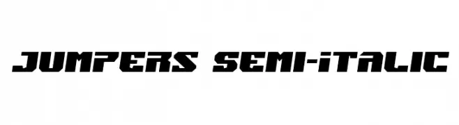
( Fonts by Iconian Fonts )
A bold, angular, semi-italic font with a dynamic and modern style.
![Jumpers Semi-Italic Frei Schriftart Herunterladen]() Herunterladen 417 Downloads@WebFont
Herunterladen 417 Downloads@WebFont -
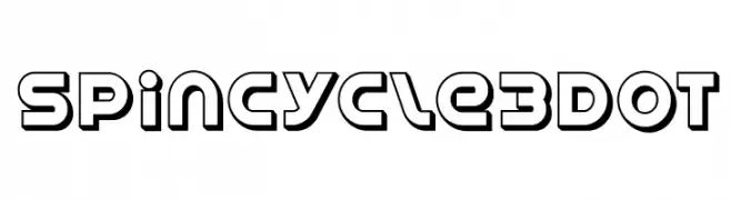
( Free for Personal Use. To use commercially please visit the www.bvfonts.com )
A bold, modern font with a three-dimensional outline style and geometric shapes.
![SpinCycle3DOT Frei Schriftart Herunterladen]() Herunterladen 417 Downloads@WebFont
Herunterladen 417 Downloads@WebFont -
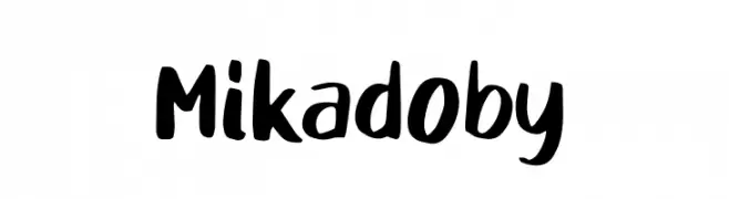
( Fonts by D&K Project )
A bold, playful handwritten font with thick strokes and dynamic shapes.
![Mikadoby Frei Schriftart Herunterladen]() Herunterladen 417 Downloads@WebFont
Herunterladen 417 Downloads@WebFont -
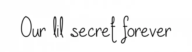
( Fonts by Vanessa Bays - bythebutterfly.com )
A playful, hand-drawn font with tall, narrow letterforms and decorative lowercase letters.
![Our lil secret forever Frei Schriftart Herunterladen]() Herunterladen 417 Downloads@WebFont
Herunterladen 417 Downloads@WebFont -
![Schneller Frei Schriftart Herunterladen]() Herunterladen 417 Downloads@WebFont
Herunterladen 417 Downloads@WebFont -
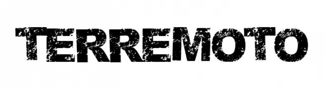
( Fonts by Woodcutter Manero - www.woodcutter.es - Personal-use only. For commercial use please contact owner. )
A bold, distressed font with a gritty, textured appearance.
![Terremoto Frei Schriftart Herunterladen]() Herunterladen 417 Downloads@WebFont
Herunterladen 417 Downloads@WebFont -
( Fonts by ShyFonts )
A bold, italicized font with extended, rounded letterforms and a playful style.
![SF Arch Rival Extended Bold Italic Frei Schriftart Herunterladen]() Herunterladen 417 Downloads@WebFont
Herunterladen 417 Downloads@WebFont -
( Fonts by Situjuh Nazara - 7ntypes.com - Personal-use only. For commercial use please contact owner. )
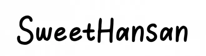
A playful, handwritten font with rounded edges and a casual, friendly appearance.
![SweetHansan Frei Schriftart Herunterladen]() Herunterladen 417 Downloads@WebFont
Herunterladen 417 Downloads@WebFont -
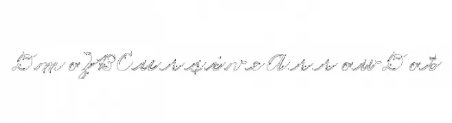
( Demo font. To purchase the full version, you can order it online at www.schoolhousefonts.com )
A dotted cursive font with arrows for instructional handwriting practice.
![DmoZBCursiveArrowDot Frei Schriftart Herunterladen]() Herunterladen 417 Downloads@WebFont
Herunterladen 417 Downloads@WebFont -
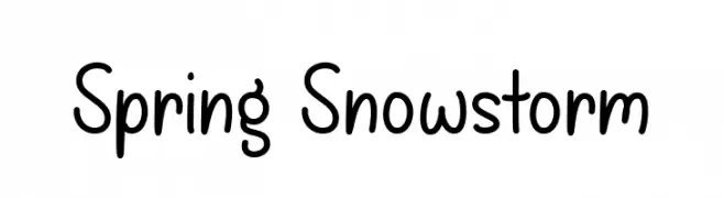
( Fonts by Misti Hammers - mistifonts.com - Personal-use only. For commercial use please contact owner. )
A playful, handwritten font with smooth, rounded edges and a casual style.
![Spring Snowstorm Frei Schriftart Herunterladen]() Herunterladen 417 Downloads@WebFont
Herunterladen 417 Downloads@WebFont -
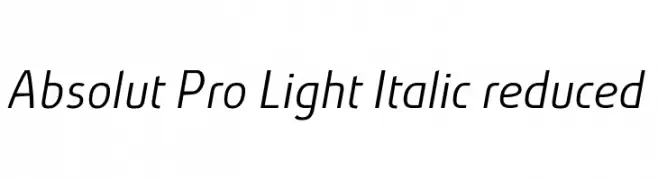
( Fonts by Ingo Zimmermann - www.ingofonts.com )
A sleek, modern, light italic font with medium contrast and a streamlined appearance.
![Absolut Pro Light Italic reduced Frei Schriftart Herunterladen]() Herunterladen 417 Downloads@WebFont
Herunterladen 417 Downloads@WebFont -
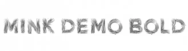
( Fonts by Büro Sequenz )
An artistic font with swirling, intricate line patterns creating a dynamic look.
![Mink Demo Bold Frei Schriftart Herunterladen]() Herunterladen 417 Downloads@WebFont
Herunterladen 417 Downloads@WebFont -
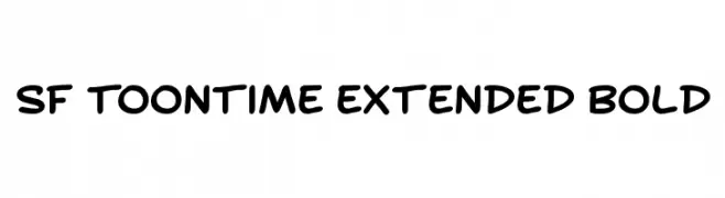
( Fonts by ShyFonts )
A bold, playful font with rounded, cartoon-like characters.
![SF Toontime Extended Bold Frei Schriftart Herunterladen]() Herunterladen 417 Downloads@WebFont
Herunterladen 417 Downloads@WebFont -
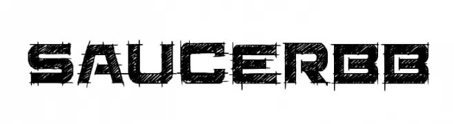
( Fonts by www.blambot.com )
A bold, distressed font with a textured, scratch-like appearance.
![SaucerBB Frei Schriftart Herunterladen]() Herunterladen 417 Downloads@WebFont
Herunterladen 417 Downloads@WebFont -
( Fonts by Apostrophic Lab )
A bold, distressed font with a rugged, grunge aesthetic.
![Grunja Frei Schriftart Herunterladen]() Herunterladen 417 Downloads@WebFont
Herunterladen 417 Downloads@WebFont -
( Fonts by Ditya Ananto )
A playful, bold, and hand-drawn font with rounded, irregular shapes.
![Montana Frei Schriftart Herunterladen]() Herunterladen 417 Downloads@WebFont
Herunterladen 417 Downloads@WebFont -
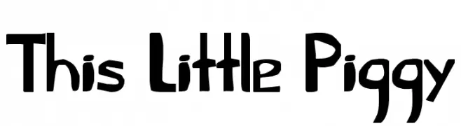
( Fonts by David Kerkhoff - www.hanodedphotography.com )
A playful, hand-drawn font with bold, irregular strokes and a whimsical style.
![This Little Piggy Frei Schriftart Herunterladen]() Herunterladen 417 Downloads@WebFont
Herunterladen 417 Downloads@WebFont -
( Fonts by www.tepidmonkey.net )
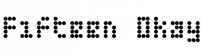
A modern, dotted font with a pixelated, digital aesthetic.
![Fifteen Okay Frei Schriftart Herunterladen]() Herunterladen 417 Downloads@WebFont
Herunterladen 417 Downloads@WebFont -
( Fonts by Kotak Kuning Studio - kotakkuning.com - Personal-use only. For commercial use please contact owner. )
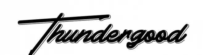
A bold, dynamic script font with a modern and playful style.
![Thundergood Frei Schriftart Herunterladen]() Herunterladen 417 Downloads@WebFont
Herunterladen 417 Downloads@WebFont -
Schriftart von joorgemoron. For commercial use please contact the owner.
( Free for personal use only )
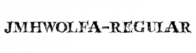
A bold, distressed font with a rugged, textured appearance.
![JMHWolfa-Regular Frei Schriftart Herunterladen]() Herunterladen 417 Downloads@WebFont
Herunterladen 417 Downloads@WebFont -
![Dead CircuitRegular Frei Schriftart Herunterladen]() Herunterladen 417 Downloads@WebFont
Herunterladen 417 Downloads@WebFont


Welche Schriften sind gerade am populärsten?
Poppins, Roboto, Montserrat, Open Sans und Lato sind wegen ihrer klaren Formen und breiten Einsetzbarkeit sehr gefragt – von Markenauftritt über Landingpages bis hin zu Postern.
Welche Fonts eignen sich für Logos?
Geometrische Sans‑Serifs (z. B. Poppins, Familien im Gotham‑Stil) sind ein häufiger Griff für sauberes, skalierbares Branding. Für eine persönlichere Note bleiben Scripts und Handschrift‑Stile beliebt. Kombinieren Sie einen prägnanten Headline‑Font mit einer neutralen Brotschrift für Wiedererkennung und Harmonie.
Wie oft wird die Top‑Liste aktualisiert?
Regelmäßig – basierend auf realen Downloads und Interaktionen. Schauen Sie öfter vorbei, um aufstrebende Favoriten früh zu entdecken.
💡 Tipp: Seite bookmarken – Trends wechseln schnell, und heutige Top‑Schriften inspirieren morgen vielleicht das Rebranding.