Willkommen bei den Top‑Schriften – hier treffen Beliebtheit und Qualität aufeinander. Das sind die in diesem Jahr am häufigsten heruntergeladenen und genutzten Fonts. Wenn Sie sichere Optionen für Logo, Web oder Social suchen, starten Sie hier.
Jeder Top‑Font überzeugt durch Balance, Lesbarkeit und Vielseitigkeit. Sie finden moderne Sans‑Serifs, elegante Scripts, Vintage‑Serifs und minimalistische Displays.
-
( Astageni Studio - Nur Solikh - nursolikh.blogspot.com )
A bold, geometric font with a strong, industrial style.
 Herunterladen 391 Downloads@WebFont
 -
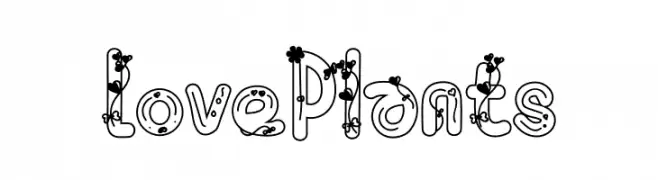
( Fonts by Eddy Goodboy )
A playful, plant-themed decorative font with bold outlines and floral embellishments.
![Love Plants Frei Schriftart Herunterladen]() Herunterladen 391 Downloads@WebFont
Herunterladen 391 Downloads@WebFont -
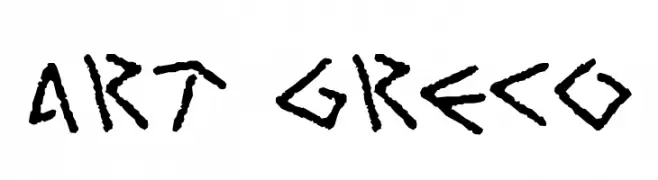
( Fonts by Cumberland Fontworks - http://www222.pair.com/sjohn/fonts.htm - S. John Ross )
A bold, hand-drawn font with a rough, textured, and angular style.
![Art Greco Frei Schriftart Herunterladen]() Herunterladen 391 Downloads@WebFont
Herunterladen 391 Downloads@WebFont -
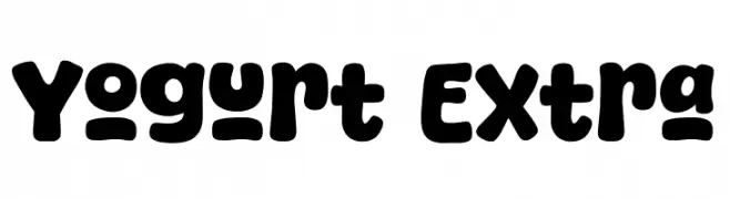
( Fonts by Khurasan )
A playful, bold font with thick, rounded characters and a bubbly appearance.
![Yogurt Extra Frei Schriftart Herunterladen]() Herunterladen 391 Downloads@WebFont
Herunterladen 391 Downloads@WebFont -
( Fonts by Gabriel Santee )
A bold, decorative font with iconic imagery integrated into each character.
![Ubuy Iconic Regular Frei Schriftart Herunterladen]() Herunterladen 391 Downloads@WebFont
Herunterladen 391 Downloads@WebFont -
( Fonts by Brithos Type )
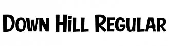
A bold, dynamic font with playful, slightly slanted characters.
![Down Hill Regular Frei Schriftart Herunterladen]() Herunterladen 391 Downloads@WebFont
Herunterladen 391 Downloads@WebFont -
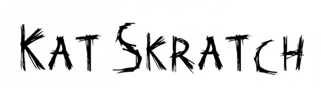
![Kat Skratch Frei Schriftart Herunterladen]() Herunterladen 391 Downloads@WebFont
Herunterladen 391 Downloads@WebFont -
( Fonts by Lucas LE BIHAN - Personal-use only. For commercial use please contact owner. )
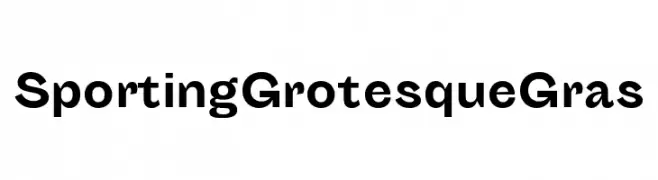
A bold, geometric typeface with a modern and professional appearance.
![Sporting Grotesque Gras Frei Schriftart Herunterladen]() Herunterladen 391 Downloads@WebFont
Herunterladen 391 Downloads@WebFont -
![Jenelson Frei Schriftart Herunterladen]() Herunterladen 391 Downloads@WebFont
Herunterladen 391 Downloads@WebFont -
( Free for a personal use. For a commercial use please visit www.kevinandamanda.com )
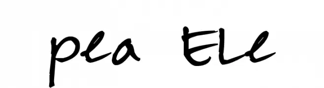
A casual, playful handwritten font with fluid strokes and a dynamic style.
![Pea Ele Frei Schriftart Herunterladen]() Herunterladen 391 Downloads@WebFont
Herunterladen 391 Downloads@WebFont -
( Fonts by wep - Wahyu Eka Prasetya - Personal-use only. For commercial use please contact owner. )
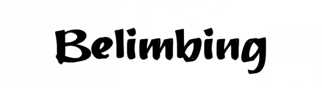
A bold, brush-style font with dynamic curves and a hand-drawn appearance.
![Belimbing Frei Schriftart Herunterladen]() Herunterladen 391 Downloads@WebFont
Herunterladen 391 Downloads@WebFont -
Schriftart von fontone. For commercial use please contact the owner.
![Gavin Frei Schriftart Herunterladen]() Herunterladen 391 Downloads@WebFont
Herunterladen 391 Downloads@WebFont -
( Fonts by Fie Clarke - bonezdesignz.com - check the website before use the fonts! Personal-use only. )
A bold, brush-stroke style font with a dynamic and artistic appearance.
![Inky Frei Schriftart Herunterladen]() Herunterladen 391 Downloads@WebFont
Herunterladen 391 Downloads@WebFont -
( Fonts by Kurdz - vividbluezz.weebly.com )
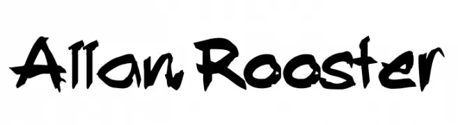
A bold, graffiti-inspired font with dynamic, hand-drawn characters.
![Allan Rooster Frei Schriftart Herunterladen]() Herunterladen 391 Downloads@WebFont
Herunterladen 391 Downloads@WebFont -
( Fonts by Zhalgas Kassymkulov - Personal-use only. For commercial use please contact owner. )
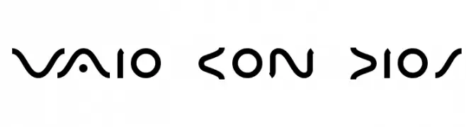
A futuristic, geometric font with sharp angles and smooth curves.
![VAIO CON DIOS Frei Schriftart Herunterladen]() Herunterladen 391 Downloads@WebFont
Herunterladen 391 Downloads@WebFont -
( Fonts by www.chequered.ink - Chequered Ink - Personal-use only. For commercial use please contact owner. )
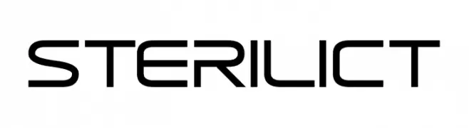
A futuristic, geometric font with clean lines and rounded edges.
![Sterilict Frei Schriftart Herunterladen]() Herunterladen 391 Downloads@WebFont
Herunterladen 391 Downloads@WebFont -
( Fonts by prescottdesignshop.com - Personal-use only. For commercial use please contact owner. )
A modern, ultra-thin sans-serif font with a minimalist design.
![PassionSansPDaa-Hairline Frei Schriftart Herunterladen]() Herunterladen 391 Downloads@WebFont
Herunterladen 391 Downloads@WebFont -
( Fonts by Gunawan )
A playful, bold font with thick strokes and rounded edges, perfect for creative designs.
![Big Babol Frei Schriftart Herunterladen]() Herunterladen 391 Downloads@WebFont
Herunterladen 391 Downloads@WebFont -
( Fonts by www.empire-of-the-claw.com )
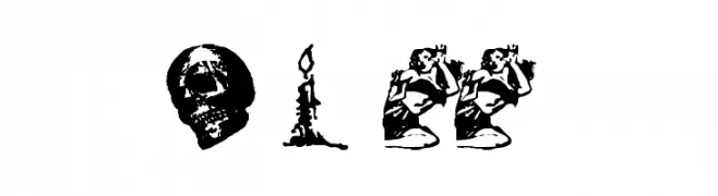
A collection of horror-themed dingbats with eerie and spooky designs.
![Horror Dingbats Eerie Edition Frei Schriftart Herunterladen]() Herunterladen 391 Downloads@WebFont
Herunterladen 391 Downloads@WebFont -
( Fonts by Peter Wiegel - www.peter-wiegel.de - Personal-use only. For commercial use please contact owner. )
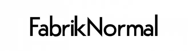
A modern, geometric sans-serif font with clean lines and uniform strokes.
![FabrikNormal Frei Schriftart Herunterladen]() Herunterladen 391 Downloads@WebFont
Herunterladen 391 Downloads@WebFont -
( Fonts by Don Marciano - Personal-use only. For commercial use please contact owner. )
A bold, playful handwritten font with rounded edges and a whimsical touch.
![Amore Frei Schriftart Herunterladen]() Herunterladen 391 Downloads@WebFont
Herunterladen 391 Downloads@WebFont -
( Fonts by Mytype Studio - Mhd Husaini - Personal-use only. For commercial use please contact owner. )
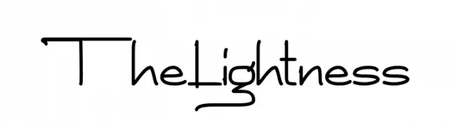
A playful, casual handwritten font with rounded, irregular letterforms.
![The Lightness Frei Schriftart Herunterladen]() Herunterladen 391 Downloads@WebFont
Herunterladen 391 Downloads@WebFont -
( Fonts by Graham Meade - GemFonts )
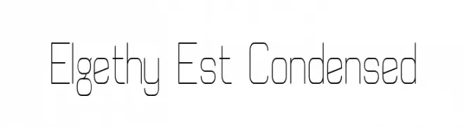
A modern, geometric, and condensed font with thin lines and a minimalist style.
![Elgethy Est Condensed Frei Schriftart Herunterladen]() Herunterladen 391 Downloads@WebFont
Herunterladen 391 Downloads@WebFont -
( Fonts by Apostrophic Lab )
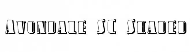
A bold, decorative font with a unique shaded effect for a three-dimensional look.
![Avondale SC Shaded Frei Schriftart Herunterladen]() Herunterladen 391 Downloads@WebFont
Herunterladen 391 Downloads@WebFont -
( Fonts by bogstav - Personal-use only. For commercial use please contact owner. )
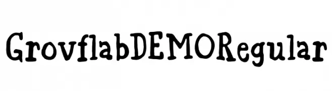
A playful, hand-drawn font with bold, irregular strokes and a whimsical style.
![Grovflab DEMO Regular Frei Schriftart Herunterladen]() Herunterladen 391 Downloads@WebFont
Herunterladen 391 Downloads@WebFont -
( Fonts by Tokopress )
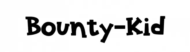
A playful, bold, and cartoonish font with thick, uneven strokes and a hand-drawn feel.
![Bounty-Kid Frei Schriftart Herunterladen]() Herunterladen 391 Downloads@WebFont
Herunterladen 391 Downloads@WebFont -
![Lichtner Italic Frei Schriftart Herunterladen]() Herunterladen 391 Downloads@WebFont
Herunterladen 391 Downloads@WebFont -
![Ruffle Script DEMO Regular Frei Schriftart Herunterladen]() Herunterladen 391 Downloads@WebFont
Herunterladen 391 Downloads@WebFont -
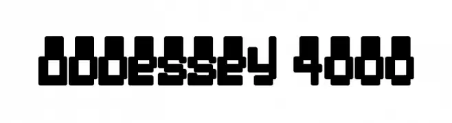
![Oddessey 4000 Frei Schriftart Herunterladen]() Herunterladen 391 Downloads@WebFont
Herunterladen 391 Downloads@WebFont -
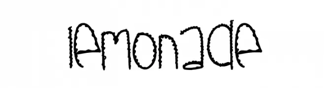
( Fonts by Des Gomez )
A playful, hand-drawn font with decorative, stitched-like details.
![Lemonade Frei Schriftart Herunterladen]() Herunterladen 391 Downloads@WebFont
Herunterladen 391 Downloads@WebFont -
( Iconian Fonts - Daniel Zadorozny - www.iconian.com )
A sleek, modern, condensed italic font with uniform stroke thickness and geometric design.
![Classic Cobra Condensed Italic Frei Schriftart Herunterladen]() Herunterladen 391 Downloads@WebFont
Herunterladen 391 Downloads@WebFont -
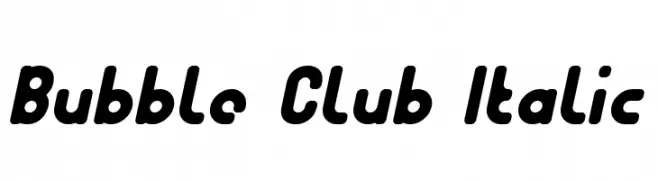
![Bubble Club Italic Frei Schriftart Herunterladen]() Herunterladen 391 Downloads@WebFont
Herunterladen 391 Downloads@WebFont -
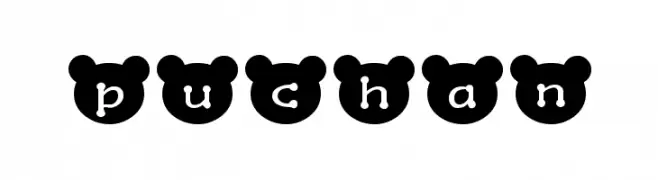
![puchan Frei Schriftart Herunterladen]() Herunterladen 391 Downloads@WebFont
Herunterladen 391 Downloads@WebFont -
( Fonts by GUD )
An elegant script font with flowing, interconnected letters and ornate flourishes.
![FacesittingProject Frei Schriftart Herunterladen]() Herunterladen 391 Downloads@WebFont
Herunterladen 391 Downloads@WebFont -
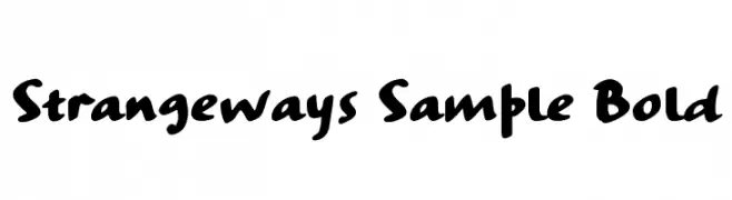
( Fonts by Ana )
A bold, playful handwritten font with a casual and friendly style.
![Strangeways Sample Bold Frei Schriftart Herunterladen]() Herunterladen 391 Downloads@WebFont
Herunterladen 391 Downloads@WebFont


Welche Schriften sind gerade am populärsten?
Poppins, Roboto, Montserrat, Open Sans und Lato sind wegen ihrer klaren Formen und breiten Einsetzbarkeit sehr gefragt – von Markenauftritt über Landingpages bis hin zu Postern.
Welche Fonts eignen sich für Logos?
Geometrische Sans‑Serifs (z. B. Poppins, Familien im Gotham‑Stil) sind ein häufiger Griff für sauberes, skalierbares Branding. Für eine persönlichere Note bleiben Scripts und Handschrift‑Stile beliebt. Kombinieren Sie einen prägnanten Headline‑Font mit einer neutralen Brotschrift für Wiedererkennung und Harmonie.
Wie oft wird die Top‑Liste aktualisiert?
Regelmäßig – basierend auf realen Downloads und Interaktionen. Schauen Sie öfter vorbei, um aufstrebende Favoriten früh zu entdecken.
💡 Tipp: Seite bookmarken – Trends wechseln schnell, und heutige Top‑Schriften inspirieren morgen vielleicht das Rebranding.