Willkommen bei den Top‑Schriften – hier treffen Beliebtheit und Qualität aufeinander. Das sind die in diesem Jahr am häufigsten heruntergeladenen und genutzten Fonts. Wenn Sie sichere Optionen für Logo, Web oder Social suchen, starten Sie hier.
Jeder Top‑Font überzeugt durch Balance, Lesbarkeit und Vielseitigkeit. Sie finden moderne Sans‑Serifs, elegante Scripts, Vintage‑Serifs und minimalistische Displays.
-
( deFharo - Fernando Haro - defharo.com )
A clean and elegant serif font with thin, uniform strokes and subtle curves.
 Herunterladen 318 Downloads@WebFont
 -
( Copyright 2017 The Barlow Project Authors (https://github.com/jpt/barlow) )
A modern, medium-weight italic sans-serif font with a clean and dynamic style.
![Barlow Medium Italic Frei Schriftart Herunterladen]() Herunterladen 318 Downloads@WebFont
Herunterladen 318 Downloads@WebFont -
( Fonts by p2pnut - Personal-use only. For commercial use please contact owner. )
A classic Gothic-style font with ornate, angular characters and decorative serifs.
![RM Albion Regular Frei Schriftart Herunterladen]() Herunterladen 318 Downloads@WebFont
Herunterladen 318 Downloads@WebFont -
( Fonts by Dieter Steffmann )
A bold serif font with a distinctive shadow effect, perfect for impactful designs.
![Ventura Shadow Bold Frei Schriftart Herunterladen]() Herunterladen 318 Downloads@WebFont
Herunterladen 318 Downloads@WebFont -
( Fonts by Daniel Zadorozny - www.iconian.com - Free for personal use )
A bold, vintage-style font with wide, blocky characters.
![Union Gray Expanded Frei Schriftart Herunterladen]() Herunterladen 318 Downloads@WebFont
Herunterladen 318 Downloads@WebFont -
( Fonts by Vanessa Bays - bythebutterfly.com )
A tall, narrow font with sleek, elongated characters and tight spacing.
![TooTight Frei Schriftart Herunterladen]() Herunterladen 318 Downloads@WebFont
Herunterladen 318 Downloads@WebFont -
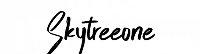
( madeDeduk )
A bold and expressive handwritten font with dynamic strokes and tight spacing.
![Skytreeone Frei Schriftart Herunterladen]() Herunterladen 318 Downloads@WebFont
Herunterladen 318 Downloads@WebFont -
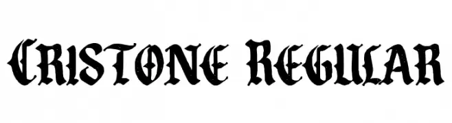
( Fonts by Bangkit Tri Setiadi - Personal-use only. For commercial use please contact owner. )
A bold, blackletter-style font with intricate detailing and strong vertical strokes.
![Cristone Regular Frei Schriftart Herunterladen]() Herunterladen 318 Downloads@WebFont
Herunterladen 318 Downloads@WebFont -
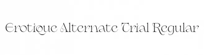
( Fonts by Zetafonts - Personal-use only. For commercial use please contact owner. )
A modern, elegant font with decorative swashes and refined strokes.
![Erotique Alternate Trial Regular Frei Schriftart Herunterladen]() Herunterladen 318 Downloads@WebFont
Herunterladen 318 Downloads@WebFont -
( Intellecta Design - Paulo W - new.myfonts.com/foundry/Intellecta_Design/?refby=paulow )
A bold, flowing script font with a dynamic and energetic style.
![Arresto Frei Schriftart Herunterladen]() Herunterladen 318 Downloads@WebFont
Herunterladen 318 Downloads@WebFont -
( Vladimir Nikolic - www.coroflot.com/vladimirnikolic )
A bold, 3D decorative font with a striped pattern and strong visual impact.
![Casino 3D Lines Regular Frei Schriftart Herunterladen]() Herunterladen 318 Downloads@WebFont
Herunterladen 318 Downloads@WebFont -
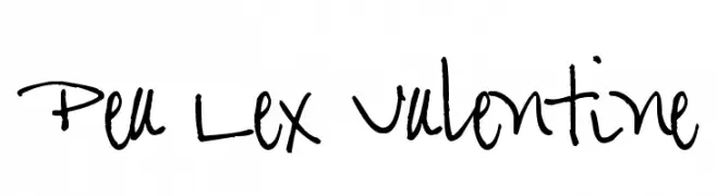
( Free for a personal use. For a commercial use please visit www.kevinandamanda.com )
A lively, handwritten font with flowing, cursive letterforms and a personal touch.
![Pea Lex Valentine Frei Schriftart Herunterladen]() Herunterladen 318 Downloads@WebFont
Herunterladen 318 Downloads@WebFont -
![Sweetie Love Frei Schriftart Herunterladen]() Herunterladen 318 Downloads@WebFont
Herunterladen 318 Downloads@WebFont -
( dccanim.deviantart.com )
A bold, distressed font with a vintage, rugged appearance.
![DCC-Manifest Frei Schriftart Herunterladen]() Herunterladen 318 Downloads@WebFont
Herunterladen 318 Downloads@WebFont -
( Fonts by lyanatha )
A playful, rounded font with a hand-drawn, friendly appearance.
![KidsPlanetRegular Frei Schriftart Herunterladen]() Herunterladen 318 Downloads@WebFont
Herunterladen 318 Downloads@WebFont -
( Fonts by Vít Čondák )
A geometric, octagonal font with a modern and technical style.
![Octagonal Light Frei Schriftart Herunterladen]() Herunterladen 318 Downloads@WebFont
Herunterladen 318 Downloads@WebFont -
( Fonts by exe.vis.ne.jp )
A sleek, elongated font with a modern and minimalist design.
![Nue Medium Frei Schriftart Herunterladen]() Herunterladen 318 Downloads@WebFont
Herunterladen 318 Downloads@WebFont -
![Verminoriko Aki Frei Schriftart Herunterladen]() Herunterladen 318 Downloads@WebFont
Herunterladen 318 Downloads@WebFont -
( Free for a personal use. For a commercial use please visit www.kevinandamanda.com )
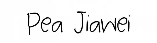
A playful, casual handwritten font with irregular strokes and a personal touch.
![Pea Jiawei Frei Schriftart Herunterladen]() Herunterladen 318 Downloads@WebFont
Herunterladen 318 Downloads@WebFont -
( Fonts by www.fontalicious.com )
A playful, hand-drawn font with bold, irregular strokes and quirky letterforms.
![Zodiastic Frei Schriftart Herunterladen]() Herunterladen 318 Downloads@WebFont
Herunterladen 318 Downloads@WebFont -
( Fonts by Daniel Zadorozny - www.iconian.com )
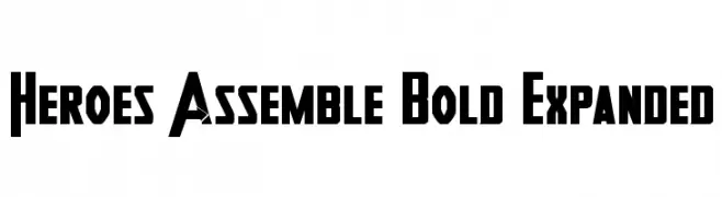
A bold, expanded font with geometric shapes and sharp angles, perfect for impactful headlines.
![Heroes Assemble Bold Expanded Frei Schriftart Herunterladen]() Herunterladen 318 Downloads@WebFont
Herunterladen 318 Downloads@WebFont -
( Fonts by www.chequered.ink - Chequered Ink - Personal-use only. For commercial use please contact owner. )
A bold, geometric font with strong, sharp angles and a modern style.
![Ineptic Frei Schriftart Herunterladen]() Herunterladen 318 Downloads@WebFont
Herunterladen 318 Downloads@WebFont -
( Fonts by Typhoon Type - Suthi Srisopha - www.typhoontype.net - Personal-use only. For commercial use please contact owner. )
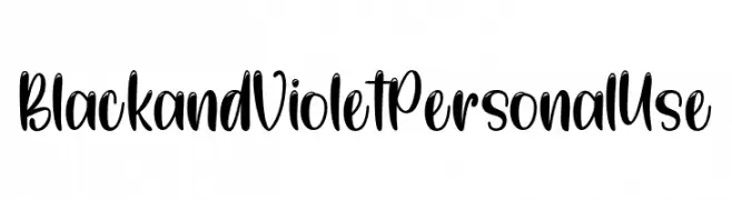
A bold, flowing script font with playful curves and dynamic strokes.
![BlackandVioletPersonalUse Frei Schriftart Herunterladen]() Herunterladen 318 Downloads@WebFont
Herunterladen 318 Downloads@WebFont -
![Orchidee Light Frei Schriftart Herunterladen]() Herunterladen 318 Downloads@WebFont
Herunterladen 318 Downloads@WebFont -
![KG Love is LOVE is love Frei Schriftart Herunterladen]() Herunterladen 318 Downloads@WebFont
Herunterladen 318 Downloads@WebFont -
( Fonts by Tursun Sultan - Personal-use only. For commercial use please contact owner. )
A bold serif font with high contrast and a classic yet modern style.
![UKIJ Tuz Kitab Bold Frei Schriftart Herunterladen]() Herunterladen 318 Downloads@WebFont
Herunterladen 318 Downloads@WebFont -
( Fonts by Denise Bentulan - douxiegirl.com. Personal-use only. For commercial use please contact owner. )
A playful, hand-drawn font with bold outlines and a cartoonish style.
![DENNE | schooLgirL Frei Schriftart Herunterladen]() Herunterladen 318 Downloads@WebFont
Herunterladen 318 Downloads@WebFont -
( Fonts by Daniel Zadorozny - www.iconian.com )
![Time Warriors Frei Schriftart Herunterladen]() Herunterladen 318 Downloads@WebFont
Herunterladen 318 Downloads@WebFont -
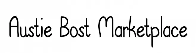
( austiebost.net )
A playful, handwritten-style font with rounded edges and a whimsical appearance.
![Austie Bost Marketplace Frei Schriftart Herunterladen]() Herunterladen 318 Downloads@WebFont
Herunterladen 318 Downloads@WebFont -
![Dameron Condensed Italic Frei Schriftart Herunterladen]() Herunterladen 318 Downloads@WebFont
Herunterladen 318 Downloads@WebFont -
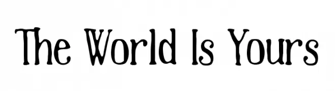
( Fonts by Mans Greback - www.mawns.com )
A playful, hand-drawn font with a whimsical and informal style.
![The World Is Yours Frei Schriftart Herunterladen]() Herunterladen 318 Downloads@WebFont
Herunterladen 318 Downloads@WebFont -
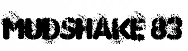
( Fonts by Gyom Seguin - last-soundtrack.daportfolio.com )
A bold, distressed font with an ink-splattered, gritty appearance.
![MUDSHAKE 83 Frei Schriftart Herunterladen]() Herunterladen 318 Downloads@WebFont
Herunterladen 318 Downloads@WebFont -
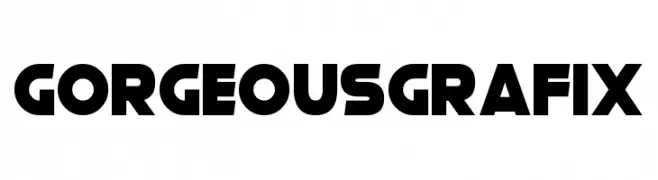
( Fonts by Darrell Flood - Personal-use only. For commercial use please contact owner. )
A bold, geometric font with a modern and impactful style.
![Gorgeous Grafix Frei Schriftart Herunterladen]() Herunterladen 318 Downloads@WebFont
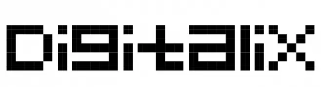
Herunterladen 318 Downloads@WebFont -
![Digitalix Frei Schriftart Herunterladen]() Herunterladen 318 Downloads@WebFont
Herunterladen 318 Downloads@WebFont -
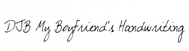
( Fonts by Darcy Baldwin - darcybaldwin.com. Free for personal use only )
A casual, handwritten-style font with a playful and personal touch.
![DJB My Boyfriend's Handwriting Frei Schriftart Herunterladen]() Herunterladen 318 Downloads@WebFont
Herunterladen 318 Downloads@WebFont


Welche Schriften sind gerade am populärsten?
Poppins, Roboto, Montserrat, Open Sans und Lato sind wegen ihrer klaren Formen und breiten Einsetzbarkeit sehr gefragt – von Markenauftritt über Landingpages bis hin zu Postern.
Welche Fonts eignen sich für Logos?
Geometrische Sans‑Serifs (z. B. Poppins, Familien im Gotham‑Stil) sind ein häufiger Griff für sauberes, skalierbares Branding. Für eine persönlichere Note bleiben Scripts und Handschrift‑Stile beliebt. Kombinieren Sie einen prägnanten Headline‑Font mit einer neutralen Brotschrift für Wiedererkennung und Harmonie.
Wie oft wird die Top‑Liste aktualisiert?
Regelmäßig – basierend auf realen Downloads und Interaktionen. Schauen Sie öfter vorbei, um aufstrebende Favoriten früh zu entdecken.
💡 Tipp: Seite bookmarken – Trends wechseln schnell, und heutige Top‑Schriften inspirieren morgen vielleicht das Rebranding.