Willkommen bei den Top‑Schriften – hier treffen Beliebtheit und Qualität aufeinander. Das sind die in diesem Jahr am häufigsten heruntergeladenen und genutzten Fonts. Wenn Sie sichere Optionen für Logo, Web oder Social suchen, starten Sie hier.
Jeder Top‑Font überzeugt durch Balance, Lesbarkeit und Vielseitigkeit. Sie finden moderne Sans‑Serifs, elegante Scripts, Vintage‑Serifs und minimalistische Displays.
-
 Herunterladen 311 Downloads@WebFont
 -
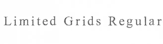
![Limited Grids Regular Frei Schriftart Herunterladen]() Herunterladen 311 Downloads@WebFont
Herunterladen 311 Downloads@WebFont -
( Fonts by New Typography - Vernon Adams. Personal-use only. For commercial use please contact owner. )
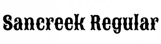
A bold, decorative font with a vintage Western style.
![Sancreek Regular Frei Schriftart Herunterladen]() Herunterladen 311 Downloads@WebFont
Herunterladen 311 Downloads@WebFont -
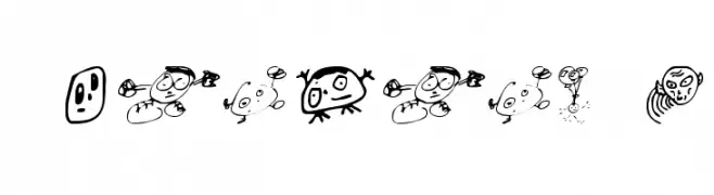
![Swatbats 1 Frei Schriftart Herunterladen]() Herunterladen 311 Downloads@WebFont
Herunterladen 311 Downloads@WebFont -
( Iconian Fonts - Daniel Zadorozny - www.iconian.com )
A bold, condensed font with a modern, angular design.
![Promethean Bold Condensed Frei Schriftart Herunterladen]() Herunterladen 311 Downloads@WebFont
Herunterladen 311 Downloads@WebFont -
-
( Fonts by Khurasan )
A bold, energetic font with thick strokes and a dynamic slant.
![Virus Killer Frei Schriftart Herunterladen]() Herunterladen 311 Downloads@WebFont
Herunterladen 311 Downloads@WebFont -
( Fonts by Khurasan )
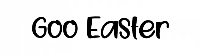
A playful, bold, and hand-drawn style font with rounded characters.
![Goo Easter Frei Schriftart Herunterladen]() Herunterladen 310 Downloads@WebFont
Herunterladen 310 Downloads@WebFont -
( Fonts by MuraKnockout Media + Design - muraknockout.com. Personal-use only. For commercial use please contact owner. )
A modern, geometric sans-serif font with clean lines and uniform width.
![Marcelita Sans Frei Schriftart Herunterladen]() Herunterladen 310 Downloads@WebFont
Herunterladen 310 Downloads@WebFont -
( Fonts by Mans Greback - www.mawns.com )
A bold, calligraphic font with expressive and fluid strokes.
![Blods Frei Schriftart Herunterladen]() Herunterladen 310 Downloads@WebFont
Herunterladen 310 Downloads@WebFont -
( www.woodcutter.es )
A modern, bilingual font combining sans-serif Roman and Japanese characters.
![Apple Japanese Keyboard Frei Schriftart Herunterladen]() Herunterladen 310 Downloads@WebFont
Herunterladen 310 Downloads@WebFont -
( Fonts by wepfont - Wahyu Eka Prasetya - Personal-use only. For commercial use please contact owner. )
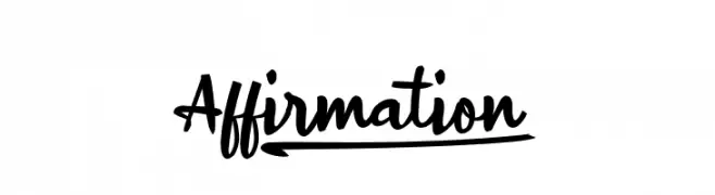
A lively handwritten font with fluid, dynamic strokes and a playful demeanor.
![Affirmation_ Frei Schriftart Herunterladen]() Herunterladen 310 Downloads@WebFont
Herunterladen 310 Downloads@WebFont -
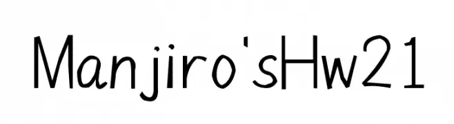
![Manjiro'sHw21 Frei Schriftart Herunterladen]() Herunterladen 310 Downloads@WebFont
Herunterladen 310 Downloads@WebFont -
( Fonts by www.peter-wiegel.de. Personal-use only. For commercial use please contact owner. )
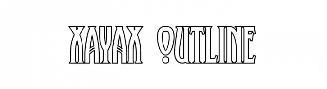
A bold, outlined font with art deco influences, featuring tall, narrow characters.
![XAyax Outline Frei Schriftart Herunterladen]() Herunterladen 310 Downloads@WebFont
Herunterladen 310 Downloads@WebFont -
![Kirie-Fu Frei Schriftart Herunterladen]() Herunterladen 310 Downloads@WebFont
Herunterladen 310 Downloads@WebFont -
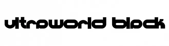
![Ultraworld black Frei Schriftart Herunterladen]() Herunterladen 310 Downloads@WebFont
Herunterladen 310 Downloads@WebFont -
![BigSwingingSlabS-Italic Frei Schriftart Herunterladen]() Herunterladen 310 Downloads@WebFont
Herunterladen 310 Downloads@WebFont -
( Fonts by a Neale Davidson - www.pixelsagas.com. Personal-use only. For commercial use please contact owner. )
A bold, italic font with a dynamic and modern style.
![Ravenwood Italic Frei Schriftart Herunterladen]() Herunterladen 310 Downloads@WebFont
Herunterladen 310 Downloads@WebFont -
( Fonts by Sharkshock )
A modern calligraphic font with elegant, flowing letterforms and sharp serifs.
![RingofKerry Frei Schriftart Herunterladen]() Herunterladen 310 Downloads@WebFont
Herunterladen 310 Downloads@WebFont -
![Vintage Straps Regular Frei Schriftart Herunterladen]() Herunterladen 310 Downloads@WebFont
Herunterladen 310 Downloads@WebFont -
( Fonts by James Klahn - Personal-use only. For commercial use please contact owner. )
A futuristic, geometric font with clean lines and angular shapes.
![Exosphere Regular Frei Schriftart Herunterladen]() Herunterladen 310 Downloads@WebFont
Herunterladen 310 Downloads@WebFont -
( Fonts by Dmitry Astakhov - www.behance.net/adonis-abe1e - Personal-use only. For commercial use please contact owner. )
Bold, geometric, and condensed font with a modern style.
![Astakhov First Two Stripes Frei Schriftart Herunterladen]() Herunterladen 310 Downloads@WebFont
Herunterladen 310 Downloads@WebFont -
( Fonts by Mans Greback - www.mawns.com )
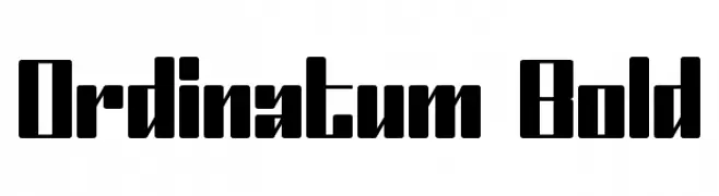
A bold, geometric font with thick strokes and sharp angles, ideal for impactful designs.
![Ordinatum Bold Frei Schriftart Herunterladen]() Herunterladen 310 Downloads@WebFont
Herunterladen 310 Downloads@WebFont -
( Fonts by dot colon - Personal-use only. For commercial use please contact owner. )
A bold, italic, modern font with clean lines and dynamic slanted letterforms.
![Route 159 Bold Italic Frei Schriftart Herunterladen]() Herunterladen 310 Downloads@WebFont
Herunterladen 310 Downloads@WebFont -
( Iconian Fonts - Daniel Zadorozny - www.iconian.com )
A bold, condensed, and italicized font with a dynamic and modern style.
![Uglier Things Condensed Italic Frei Schriftart Herunterladen]() Herunterladen 310 Downloads@WebFont
Herunterladen 310 Downloads@WebFont -
( Fonts by Mike Hind - Stick Fonts )
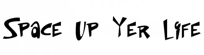
A bold, playful font with a comic and graffiti-inspired style.
![Space Up Yer Life Frei Schriftart Herunterladen]() Herunterladen 310 Downloads@WebFont
Herunterladen 310 Downloads@WebFont -
( Fonts by Original fonts by Christian Thalmann (Catharsis Fonts), Modifications by Cristiano Sobral - Personal-use only. For commercial use please contact owner. )
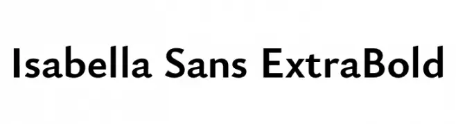
A bold, modern sans-serif font with clean lines and strong presence.
![Isabella Sans ExtraBold Frei Schriftart Herunterladen]() Herunterladen 310 Downloads@WebFont
Herunterladen 310 Downloads@WebFont -
( Fonts by Din Studio - Donis Miftahudin - Personal-use only. For commercial use please contact owner. )
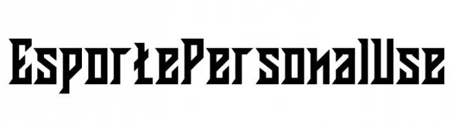
A bold, angular font with a modern, energetic style.
![Esporte Personal Use Frei Schriftart Herunterladen]() Herunterladen 310 Downloads@WebFont
Herunterladen 310 Downloads@WebFont -
( Fonts by David Espinosa - http://issuu.com/davidespinosa5/ )
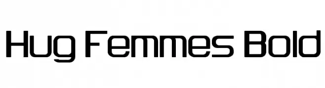
A bold, modern font with geometric shapes and rounded corners.
![Hug Femmes Bold Frei Schriftart Herunterladen]() Herunterladen 310 Downloads@WebFont
Herunterladen 310 Downloads@WebFont -
( Fonts by Kong Font - https://fontkong.com/ - Personal-use only. For commercial use please contact owner. )
A bold, dramatic font with sharp angles and smooth curves, perfect for impactful designs.
![Wilson hawk Frei Schriftart Herunterladen]() Herunterladen 310 Downloads@WebFont
Herunterladen 310 Downloads@WebFont -
( Fonts by Richard Woods )
A bold, playful handwritten font with a casual and friendly style.
![WoodsScript Frei Schriftart Herunterladen]() Herunterladen 310 Downloads@WebFont
Herunterladen 310 Downloads@WebFont -
( Fonts by a Max Infeld - XEROGRAPHER FONTS - xerographer.blogspot.com . Personal-use only. For commercial use please contact owner. )
A bold, playful font with exaggerated, cartoonish characters.
![AwesomePlay Frei Schriftart Herunterladen]() Herunterladen 310 Downloads@WebFont
Herunterladen 310 Downloads@WebFont -
( Fonts by Manuel Viergutz - Typo Graphic Design - www.typographicdesign.de )
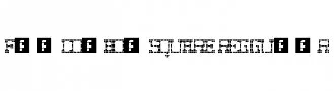
A bold, pixelated font with a retro digital aesthetic.
![Fat Cowboy SQUARE Regular Frei Schriftart Herunterladen]() Herunterladen 310 Downloads@WebFont
Herunterladen 310 Downloads@WebFont -
( Fonts by Jeff Levine. FREEWARE )
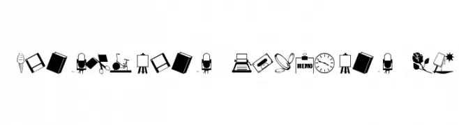
A decorative dingbat font featuring assorted icons and pictograms.
![ArtsyParts Dingbats JL Frei Schriftart Herunterladen]() Herunterladen 310 Downloads@WebFont
Herunterladen 310 Downloads@WebFont -
( evuez.net )
A playful, handwritten font with whimsical and elegant characteristics.
![Princesse Muffin Frei Schriftart Herunterladen]() Herunterladen 310 Downloads@WebFont
Herunterladen 310 Downloads@WebFont -
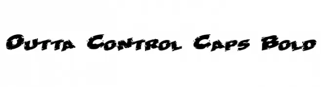
![Outta Control Caps Bold Frei Schriftart Herunterladen]() Herunterladen 310 Downloads@WebFont
Herunterladen 310 Downloads@WebFont


Welche Schriften sind gerade am populärsten?
Poppins, Roboto, Montserrat, Open Sans und Lato sind wegen ihrer klaren Formen und breiten Einsetzbarkeit sehr gefragt – von Markenauftritt über Landingpages bis hin zu Postern.
Welche Fonts eignen sich für Logos?
Geometrische Sans‑Serifs (z. B. Poppins, Familien im Gotham‑Stil) sind ein häufiger Griff für sauberes, skalierbares Branding. Für eine persönlichere Note bleiben Scripts und Handschrift‑Stile beliebt. Kombinieren Sie einen prägnanten Headline‑Font mit einer neutralen Brotschrift für Wiedererkennung und Harmonie.
Wie oft wird die Top‑Liste aktualisiert?
Regelmäßig – basierend auf realen Downloads und Interaktionen. Schauen Sie öfter vorbei, um aufstrebende Favoriten früh zu entdecken.
💡 Tipp: Seite bookmarken – Trends wechseln schnell, und heutige Top‑Schriften inspirieren morgen vielleicht das Rebranding.