Willkommen bei den Top‑Schriften – hier treffen Beliebtheit und Qualität aufeinander. Das sind die in diesem Jahr am häufigsten heruntergeladenen und genutzten Fonts. Wenn Sie sichere Optionen für Logo, Web oder Social suchen, starten Sie hier.
Jeder Top‑Font überzeugt durch Balance, Lesbarkeit und Vielseitigkeit. Sie finden moderne Sans‑Serifs, elegante Scripts, Vintage‑Serifs und minimalistische Displays.
-
( Fonts by Bud White. Personal-use only. For commercial use please contact owner. )
A modern, geometric font with a linear and rhythmic design.
 Herunterladen 309 Downloads@WebFont
 -
![Daville Condensed Rev Slanted Frei Schriftart Herunterladen]() Herunterladen 309 Downloads@WebFont
Herunterladen 309 Downloads@WebFont -
![101! Closer Inspection Frei Schriftart Herunterladen]() Herunterladen 309 Downloads@WebFont
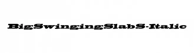
Herunterladen 309 Downloads@WebFont -
![BigSwingingSlabS-Italic Frei Schriftart Herunterladen]() Herunterladen 309 Downloads@WebFont
Herunterladen 309 Downloads@WebFont -
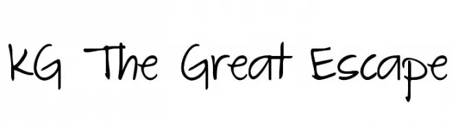
( Fonts by www.kimberlygeswein.com - Kimberly Geswein )
A playful, informal handwritten font with smooth, flowing lines and a cohesive appearance.
![KG The Great Escape Frei Schriftart Herunterladen]() Herunterladen 309 Downloads@WebFont
Herunterladen 309 Downloads@WebFont -
-
![Millennium Frei Schriftart Herunterladen]() Herunterladen 309 Downloads@WebFont
Herunterladen 309 Downloads@WebFont -
( Sigit Nur Wicaksono - creativemarket.com/ogit )
A modern, geometric sans-serif font with clean lines and balanced spacing.
![revilo san Frei Schriftart Herunterladen]() Herunterladen 309 Downloads@WebFont
Herunterladen 309 Downloads@WebFont -
![Schwarzenegger Condensed Italic Frei Schriftart Herunterladen]() Herunterladen 309 Downloads@WebFont
Herunterladen 309 Downloads@WebFont -
( Fonts by Kong Font - https://fontkong.com/ - Personal-use only. For commercial use please contact owner. )
A dynamic and expressive handwritten font with fluid strokes.
![The Rambler Frei Schriftart Herunterladen]() Herunterladen 309 Downloads@WebFont
Herunterladen 309 Downloads@WebFont -
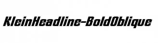
( Fonts by Manfred Klein. Free for private and charity use. Free for commercial with donation to organizations )
A bold, oblique font with a modern and dynamic style.
![KleinHeadline-BoldOblique Frei Schriftart Herunterladen]() Herunterladen 309 Downloads@WebFont
Herunterladen 309 Downloads@WebFont -
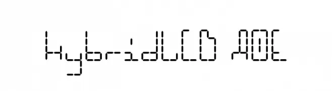
( Fonts by Astigmatic One Eye Typographic Institute - Brian J. Bonislawsky - astigmatic.com )
A digital-inspired font with segmented, geometric characters.
![HybridLCD AOE Frei Schriftart Herunterladen]() Herunterladen 309 Downloads@WebFont
Herunterladen 309 Downloads@WebFont -
( free for non-commercial use. buy commercial license at pixelpropaganda.com )
A playful, pixelated font with characters in square boxes, reminiscent of retro video game graphics.
![Scumskullz Box Frei Schriftart Herunterladen]() Herunterladen 309 Downloads@WebFont
Herunterladen 309 Downloads@WebFont -
( Fonts by Rodrigo German - RASDESIGN )
A bold, rounded font with a retro-modern style, perfect for headlines and logos.
![PLOP Frei Schriftart Herunterladen]() Herunterladen 309 Downloads@WebFont
Herunterladen 309 Downloads@WebFont -
![GalaxyfaceReg Frei Schriftart Herunterladen]() Herunterladen 309 Downloads@WebFont
Herunterladen 309 Downloads@WebFont -
![Sabor Digital Frei Schriftart Herunterladen]() Herunterladen 309 Downloads@WebFont
Herunterladen 309 Downloads@WebFont -
( Fonts by NowType - Claudio Rocha - Personal-use only. For commercial use please contact owner. )
A bold, geometric font with sharp edges and a modern style.
![Ciclope Black Black Frei Schriftart Herunterladen]() Herunterladen 309 Downloads@WebFont
Herunterladen 309 Downloads@WebFont -
![Skylab 600 Frei Schriftart Herunterladen]() Herunterladen 309 Downloads@WebFont
Herunterladen 309 Downloads@WebFont -
![JASON'S bowling Regular Frei Schriftart Herunterladen]() Herunterladen 309 Downloads@WebFont
Herunterladen 309 Downloads@WebFont -
( Fonts by Kong Font - Personal-use only. For commercial use please contact owner. )
A flowing, cursive script font with elegant, connected strokes.
![Christmas Glooves Frei Schriftart Herunterladen]() Herunterladen 309 Downloads@WebFont
Herunterladen 309 Downloads@WebFont -
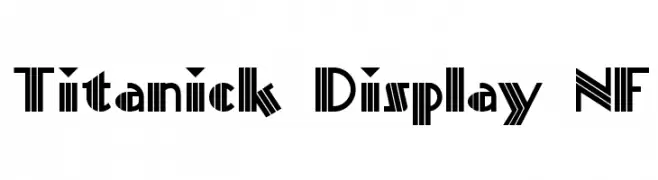
( Fonts by Nick Curtis - www.nicksfonts.com )
A bold, geometric font with Art Deco influences and high contrast.
![Titanick Display NF Frei Schriftart Herunterladen]() Herunterladen 309 Downloads@WebFont
Herunterladen 309 Downloads@WebFont -
( Fonts by www.selawetype.com - Personal-use only. FOR DONATION https://www.paypal.me/selawe . For commercial use please contact owner. )
A bold, dynamic script font with a brush-like, hand-drawn appearance.
![CRACKROCK Frei Schriftart Herunterladen]() Herunterladen 309 Downloads@WebFont
Herunterladen 309 Downloads@WebFont -
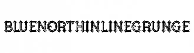
( Fonts by Peter Olexa - www.dealjumbo.com - Personal-use only. For commercial use please contact owner. )
A bold, grunge-style font with an inline effect and distressed texture.
![Blue North Inline Grunge Frei Schriftart Herunterladen]() Herunterladen 309 Downloads@WebFont
Herunterladen 309 Downloads@WebFont -
( Fonts by Arkandis Digital Foundry )
A bold, modern sans-serif font with clean lines and strong presence.
![IkariusADFStd-Bold Frei Schriftart Herunterladen]() Herunterladen 309 Downloads@WebFont
Herunterladen 309 Downloads@WebFont -
( Fonts by Fontfabric - Svetoslav Simov - Personal-use only. For commercial use please contact owner. )
A modern, geometric sans-serif font with a clean and balanced design.
![Code Next-Trial Light Frei Schriftart Herunterladen]() Herunterladen 309 Downloads@WebFont
Herunterladen 309 Downloads@WebFont -
( Fonts by Dieter Steffmann )
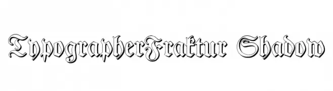
A decorative blackletter font with shadow effects, offering a classic and dimensional look.
![TypographerFraktur Shadow Frei Schriftart Herunterladen]() Herunterladen 309 Downloads@WebFont
Herunterladen 309 Downloads@WebFont -
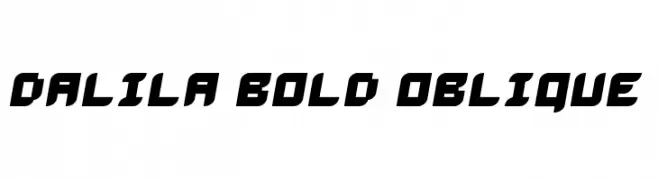
![Dalila Bold Oblique Frei Schriftart Herunterladen]() Herunterladen 309 Downloads@WebFont
Herunterladen 309 Downloads@WebFont -
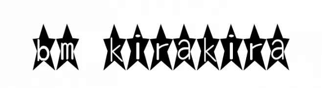
![bm kirakira Frei Schriftart Herunterladen]() Herunterladen 309 Downloads@WebFont
Herunterladen 309 Downloads@WebFont -
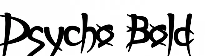
![Psycho Bold Frei Schriftart Herunterladen]() Herunterladen 309 Downloads@WebFont
Herunterladen 309 Downloads@WebFont -
( Fonts by site.xavier.edu/polt/typewriters/ - Richard Polt )
A bold, hand-drawn font with an organic, playful style.
![Sholes & Glidden Frei Schriftart Herunterladen]() Herunterladen 309 Downloads@WebFont
Herunterladen 309 Downloads@WebFont -
( Fonts by Apostrophic Lab )
A modern, reverse italic, compressed font with consistent stroke weight.
![Street - Compressed Reverse Italic Frei Schriftart Herunterladen]() Herunterladen 309 Downloads@WebFont
Herunterladen 309 Downloads@WebFont -
( Fonts by Fenotype - Emil Bertell - Personal-use only. For commercial use please contact owner. )
A modern, light sans-serif font with excellent readability and clean lines.
![Resolve Sans Light Frei Schriftart Herunterladen]() Herunterladen 309 Downloads@WebFont
Herunterladen 309 Downloads@WebFont -
![BDPlankton Frei Schriftart Herunterladen]() Herunterladen 309 Downloads@WebFont
Herunterladen 309 Downloads@WebFont -
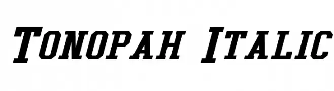
![Tonopah Italic Frei Schriftart Herunterladen]() Herunterladen 309 Downloads@WebFont
Herunterladen 309 Downloads@WebFont -
![Xorx_windy Cyr Frei Schriftart Herunterladen]() Herunterladen 309 Downloads@WebFont
Herunterladen 309 Downloads@WebFont -
( Fonts by Studio Typo )
A geometric, pixelated font with a retro digital aesthetic.
![Big Pixel Light Demo Frei Schriftart Herunterladen]() Herunterladen 309 Downloads@WebFont
Herunterladen 309 Downloads@WebFont


Welche Schriften sind gerade am populärsten?
Poppins, Roboto, Montserrat, Open Sans und Lato sind wegen ihrer klaren Formen und breiten Einsetzbarkeit sehr gefragt – von Markenauftritt über Landingpages bis hin zu Postern.
Welche Fonts eignen sich für Logos?
Geometrische Sans‑Serifs (z. B. Poppins, Familien im Gotham‑Stil) sind ein häufiger Griff für sauberes, skalierbares Branding. Für eine persönlichere Note bleiben Scripts und Handschrift‑Stile beliebt. Kombinieren Sie einen prägnanten Headline‑Font mit einer neutralen Brotschrift für Wiedererkennung und Harmonie.
Wie oft wird die Top‑Liste aktualisiert?
Regelmäßig – basierend auf realen Downloads und Interaktionen. Schauen Sie öfter vorbei, um aufstrebende Favoriten früh zu entdecken.
💡 Tipp: Seite bookmarken – Trends wechseln schnell, und heutige Top‑Schriften inspirieren morgen vielleicht das Rebranding.