Willkommen bei den Top‑Schriften – hier treffen Beliebtheit und Qualität aufeinander. Das sind die in diesem Jahr am häufigsten heruntergeladenen und genutzten Fonts. Wenn Sie sichere Optionen für Logo, Web oder Social suchen, starten Sie hier.
Jeder Top‑Font überzeugt durch Balance, Lesbarkeit und Vielseitigkeit. Sie finden moderne Sans‑Serifs, elegante Scripts, Vintage‑Serifs und minimalistische Displays.
-
( Fonts by MalikDesign - Personal-use only. For commercial use please contact owner. )
A bold, angular font with a strong geometric style.
 Herunterladen 304 Downloads@WebFont
 -
( Fonts by letterey )
A playful, handwritten font with smooth, flowing lines and a casual style.
![Liddy Frei Schriftart Herunterladen]() Herunterladen 304 Downloads@WebFont
Herunterladen 304 Downloads@WebFont -
( Fonts by Wojciech Kalinowski "wmk69" (wmk69@o2.pl) - Personal-use only. For commercial use please contact owner. )
A clean, modern sans-serif font with geometric precision and excellent readability.
![Simply Sans Book Frei Schriftart Herunterladen]() Herunterladen 304 Downloads@WebFont
Herunterladen 304 Downloads@WebFont -
( Fonts by zulkhairilettering - Zulkhairi M Saleh - Personal-use only. For commercial use please contact owner. )
A modern, elegant script font with flowing cursive characters.
![malori Frei Schriftart Herunterladen]() Herunterladen 304 Downloads@WebFont
Herunterladen 304 Downloads@WebFont -
![Empty Trash Frei Schriftart Herunterladen]() Herunterladen 304 Downloads@WebFont
Herunterladen 304 Downloads@WebFont -
-
( Fonts by www.stereo-type.net )
A classic serif font with modern elements and medium contrast.
![Perestroika Frei Schriftart Herunterladen]() Herunterladen 304 Downloads@WebFont
Herunterladen 304 Downloads@WebFont -
![Klaudia Oblique Frei Schriftart Herunterladen]() Herunterladen 304 Downloads@WebFont
Herunterladen 304 Downloads@WebFont -
( Michael Alexander - www.sanrokstudio.com )
A clean, geometric font with a modern and minimalist design.
![DINASTI-Regular Frei Schriftart Herunterladen]() Herunterladen 304 Downloads@WebFont
Herunterladen 304 Downloads@WebFont -
( Fonts by Pennyzine - www.thedevilinjasonramirez.com - Free for personal use )
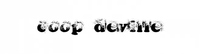
A bold, distressed font with a grunge aesthetic.
![coop deville Frei Schriftart Herunterladen]() Herunterladen 304 Downloads@WebFont
Herunterladen 304 Downloads@WebFont -
( Fonts by Vladimir Nikolic - www.creativefabrica.com/designer/vladimirnikolic/ - Personal-use only. For commercial use please contact owner. )
A bold, geometric font with a modern and robust style.
![Kotatsu Book Regular Frei Schriftart Herunterladen]() Herunterladen 304 Downloads@WebFont
Herunterladen 304 Downloads@WebFont -
![Tricrown Frei Schriftart Herunterladen]() Herunterladen 304 Downloads@WebFont
Herunterladen 304 Downloads@WebFont -
( Fonts by a cenz qobbal - www.facebook.com/cenzqobbalfonts. Personal-use only. For commercial use please contact owner. )
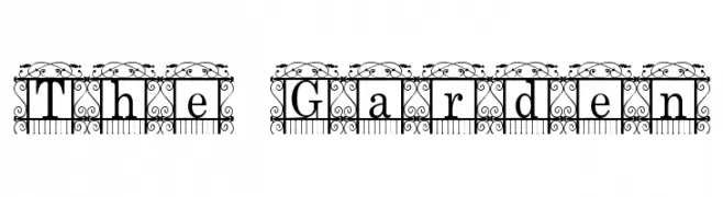
An ornate, decorative font with intricate garden-themed borders.
![The Garden Frei Schriftart Herunterladen]() Herunterladen 304 Downloads@WebFont
Herunterladen 304 Downloads@WebFont -
( Fonts by Daniel Zadorozny - www.iconian.com - Free for personal use )
Bold, geometric font with sharp angles and a blocky design.
![Nyet Frei Schriftart Herunterladen]() Herunterladen 304 Downloads@WebFont
Herunterladen 304 Downloads@WebFont -
( Fonts by Darcy Baldwin - darcybaldwin.com. Free for personal use only )
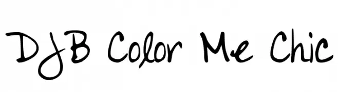
A playful, casual handwritten font with fluid strokes and a natural flow.
![DJB Color Me Chic Frei Schriftart Herunterladen]() Herunterladen 304 Downloads@WebFont
Herunterladen 304 Downloads@WebFont -
![Incest Frei Schriftart Herunterladen]() Herunterladen 304 Downloads@WebFont
Herunterladen 304 Downloads@WebFont -
![Blob Spongey Lowercase Frei Schriftart Herunterladen]() Herunterladen 304 Downloads@WebFont
Herunterladen 304 Downloads@WebFont -
![QueenXylophia-Regular Frei Schriftart Herunterladen]() Herunterladen 304 Downloads@WebFont
Herunterladen 304 Downloads@WebFont -
( dcoxy - Greg Medina - www.dcoxy.com/ )
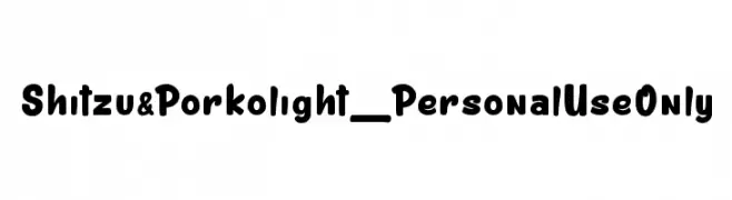
A playful, bold font with rounded, thick strokes and a friendly appearance.
![Shitzu&Porko light_PersonalUseOnly Frei Schriftart Herunterladen]() Herunterladen 304 Downloads@WebFont
Herunterladen 304 Downloads@WebFont -
( Fonts by Manfred Klein. Free for private and charity use. Free for commercial with donation to organizations )
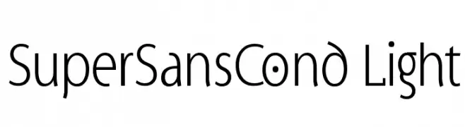
A modern, light sans-serif font with geometric shapes and low contrast.
![SuperSansCond Light Frei Schriftart Herunterladen]() Herunterladen 304 Downloads@WebFont
Herunterladen 304 Downloads@WebFont -
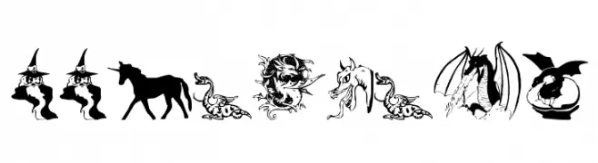
![WWFantasy Frei Schriftart Herunterladen]() Herunterladen 304 Downloads@WebFont
Herunterladen 304 Downloads@WebFont -
( Fonts by Muhammad Sirojuddin - lettersiro.com - Personal-use only. For commercial use please contact owner. )
An elegant, cursive font with a natural handwriting style.
![Ausberg Frei Schriftart Herunterladen]() Herunterladen 304 Downloads@WebFont
Herunterladen 304 Downloads@WebFont -
( Fonts by Wino S Kadir - weknow - www.revolge.com/shop/weknow/ - Personal-use only. For commercial use please contact owner. )
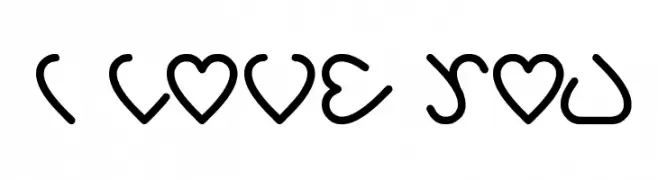
A playful font with heart-shaped characters, perfect for romantic themes.
![i love you Frei Schriftart Herunterladen]() Herunterladen 304 Downloads@WebFont
Herunterladen 304 Downloads@WebFont -
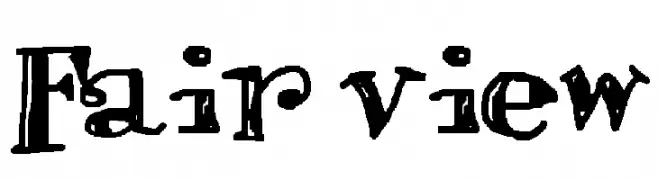
![Fair view Frei Schriftart Herunterladen]() Herunterladen 304 Downloads@WebFont
Herunterladen 304 Downloads@WebFont -
( Fonts by www.alphabetype.it )
An elegant, cursive font with intricate loops and swirls.
![Metis Frei Schriftart Herunterladen]() Herunterladen 304 Downloads@WebFont
Herunterladen 304 Downloads@WebFont -
( Fonts by Wahyu Studio )
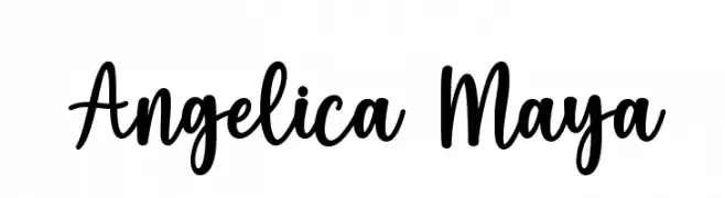
A playful, handwritten script font with dynamic, flowing characters.
![Angelica Maya Frei Schriftart Herunterladen]() Herunterladen 304 Downloads@WebFont
Herunterladen 304 Downloads@WebFont -
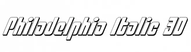
![Philadelphia Italic 3D Frei Schriftart Herunterladen]() Herunterladen 304 Downloads@WebFont
Herunterladen 304 Downloads@WebFont -
( Copyright (c) 2010, Danh Hong (khmertype.blogspot.com) )
A clean, modern font with balanced spacing and clear characters.
![Suwannaphum Frei Schriftart Herunterladen]() Herunterladen 304 Downloads@WebFont
Herunterladen 304 Downloads@WebFont -
( Fonts by www.TomzWeb.com - Thomas E. Harvey - NOT free - Commercial use requires license )
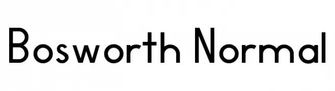
A modern, geometric sans-serif font with clean lines and balanced proportions.
![Bosworth Normal Frei Schriftart Herunterladen]() Herunterladen 304 Downloads@WebFont
Herunterladen 304 Downloads@WebFont -
( Fonts by Garisman Studio - Risman Ginarwan - Personal-use only. For commercial use please contact owner. )
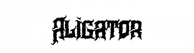
A bold, gothic-inspired font with sharp, intricate detailing.
![Aligator Frei Schriftart Herunterladen]() Herunterladen 304 Downloads@WebFont
Herunterladen 304 Downloads@WebFont -
( Fonts by Press Gang Studios - Andeh Pinkard - www.pressgang-studios.com )
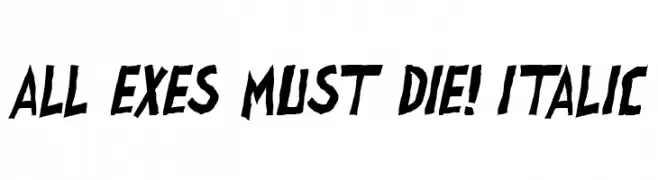
A bold, angular, and italicized font with a dynamic, edgy style.
![all exes must die! Italic Frei Schriftart Herunterladen]() Herunterladen 304 Downloads@WebFont
Herunterladen 304 Downloads@WebFont -
![Eller Frei Schriftart Herunterladen]() Herunterladen 304 Downloads@WebFont
Herunterladen 304 Downloads@WebFont -
( Fonts by Press Gang Studios - Andeh Pinkard - www.pressgang-studios.com )
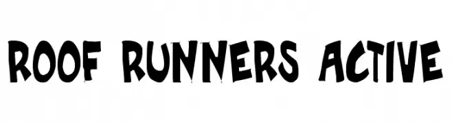
A bold, playful font with a hand-drawn, graffiti-like style.
![Roof runners active Frei Schriftart Herunterladen]() Herunterladen 304 Downloads@WebFont
Herunterladen 304 Downloads@WebFont -
( Fonts by Misti Hammers - mistifonts.com - Personal-use only. For commercial use please contact owner. )
A bold, playful handwritten font with a casual and friendly style.
![My Yellow Car Regular Frei Schriftart Herunterladen]() Herunterladen 304 Downloads@WebFont
Herunterladen 304 Downloads@WebFont -
![Movie Posters Delight Frei Schriftart Herunterladen]() Herunterladen 304 Downloads@WebFont
Herunterladen 304 Downloads@WebFont -
( Fonts by Daniel Zadorozny - www.iconian.com - Free for personal use )
A modern, geometric, and condensed typeface with rounded edges.
![Federal Service Light Condensed Frei Schriftart Herunterladen]() Herunterladen 304 Downloads@WebFont
Herunterladen 304 Downloads@WebFont


Welche Schriften sind gerade am populärsten?
Poppins, Roboto, Montserrat, Open Sans und Lato sind wegen ihrer klaren Formen und breiten Einsetzbarkeit sehr gefragt – von Markenauftritt über Landingpages bis hin zu Postern.
Welche Fonts eignen sich für Logos?
Geometrische Sans‑Serifs (z. B. Poppins, Familien im Gotham‑Stil) sind ein häufiger Griff für sauberes, skalierbares Branding. Für eine persönlichere Note bleiben Scripts und Handschrift‑Stile beliebt. Kombinieren Sie einen prägnanten Headline‑Font mit einer neutralen Brotschrift für Wiedererkennung und Harmonie.
Wie oft wird die Top‑Liste aktualisiert?
Regelmäßig – basierend auf realen Downloads und Interaktionen. Schauen Sie öfter vorbei, um aufstrebende Favoriten früh zu entdecken.
💡 Tipp: Seite bookmarken – Trends wechseln schnell, und heutige Top‑Schriften inspirieren morgen vielleicht das Rebranding.