Willkommen bei den Top‑Schriften – hier treffen Beliebtheit und Qualität aufeinander. Das sind die in diesem Jahr am häufigsten heruntergeladenen und genutzten Fonts. Wenn Sie sichere Optionen für Logo, Web oder Social suchen, starten Sie hier.
Jeder Top‑Font überzeugt durch Balance, Lesbarkeit und Vielseitigkeit. Sie finden moderne Sans‑Serifs, elegante Scripts, Vintage‑Serifs und minimalistische Displays.
-
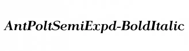
( Fonts by www.houseoflime.com )
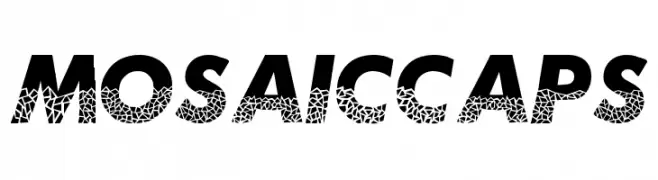
A bold, mosaic-patterned font with an italicized style.
 Herunterladen 304 Downloads@WebFont
 -
![AntPoltSemiExpd-BoldItalic Frei Schriftart Herunterladen]() Herunterladen 304 Downloads@WebFont
Herunterladen 304 Downloads@WebFont -
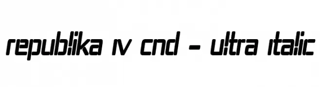
( Fonts by Apostrophic Lab )
A bold, ultra-condensed, and italic font with a modern, futuristic style.
![Republika IV Cnd - Ultra Italic Frei Schriftart Herunterladen]() Herunterladen 304 Downloads@WebFont
Herunterladen 304 Downloads@WebFont -
![KR Tulips Frei Schriftart Herunterladen]() Herunterladen 304 Downloads@WebFont
Herunterladen 304 Downloads@WebFont -
( l8estobsession.blogspot.com )
A playful, hand-drawn font with sketch-like, irregular characters.
![madness Frei Schriftart Herunterladen]() Herunterladen 304 Downloads@WebFont
Herunterladen 304 Downloads@WebFont -
-
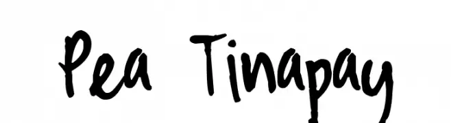
( Free for a personal use. For a commercial use please visit www.kevinandamanda.com )
A playful, hand-drawn font with bold, uneven strokes and a casual style.
![Pea Tinapay Frei Schriftart Herunterladen]() Herunterladen 304 Downloads@WebFont
Herunterladen 304 Downloads@WebFont -
( Richard )
A modern, geometric outlined font with a minimalist aesthetic.
![Antwerp Regular Frei Schriftart Herunterladen]() Herunterladen 304 Downloads@WebFont
Herunterladen 304 Downloads@WebFont -
( Fonts by Tokopress )
A bold, playful font with rounded strokes and a friendly appearance.
![Big Jano Frei Schriftart Herunterladen]() Herunterladen 304 Downloads@WebFont
Herunterladen 304 Downloads@WebFont -
( Zulkhairi M Saleh - fontbundles.net/zulkhairilettering )
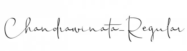
A modern, elegant handwritten font with flowing, cursive letterforms.
![Chandrawinata-Regular Frei Schriftart Herunterladen]() Herunterladen 304 Downloads@WebFont
Herunterladen 304 Downloads@WebFont -
( Fonts by Jovanny Lemonad - typetype.ru - Personal-use only. For commercial use please contact owner. )
A modern, thin, and geometric sans-serif font with clean lines.
![TTCoralsThinDEMO Frei Schriftart Herunterladen]() Herunterladen 304 Downloads@WebFont
Herunterladen 304 Downloads@WebFont -
Schriftart von glyphstyle. For commercial use please contact the owner.
( NOTE: This demo font is for PERSONAL USE ONLY! But any donation are very appreciated. Paypal account for donation : https://www.paypal.me/dimasardhi full version: https://www.glyphstyle.net/sigokae/ contact us at styleglyph@gmail.com And follow my in )
A clean, modern font with strong readability and balanced proportions.
![Sigokae Demo Frei Schriftart Herunterladen]() Herunterladen 304 Downloads@WebFont
Herunterladen 304 Downloads@WebFont -
Schriftart von jlog3000. For commercial use please contact the owner.
( Fonts by John Ocasio. Free for personal use only )
A bold, angular serif font with a modern italic slant.
![J-LOG Razor Edge Serif Normal Italic Frei Schriftart Herunterladen]() Herunterladen 304 Downloads@WebFont
Herunterladen 304 Downloads@WebFont -
( Fonts by a Neale Davidson - www.pixelsagas.com. Personal-use only. For commercial use please contact owner. )
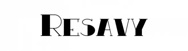
A bold, geometric font with high contrast and unique cutout designs.
![Resavy Frei Schriftart Herunterladen]() Herunterladen 304 Downloads@WebFont
Herunterladen 304 Downloads@WebFont -
![BubbleBaZ Frei Schriftart Herunterladen]() Herunterladen 304 Downloads@WebFont
Herunterladen 304 Downloads@WebFont -
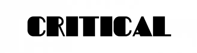
![Critical Frei Schriftart Herunterladen]() Herunterladen 304 Downloads@WebFont
Herunterladen 304 Downloads@WebFont -
( aldedesign - Alde Saputro - creativemarket.com/aldedesign?u=aldedesign )
A graceful calligraphy font with flowing, interconnected strokes and elegant flourishes.
![Charlotte Calligraphy Frei Schriftart Herunterladen]() Herunterladen 304 Downloads@WebFont
Herunterladen 304 Downloads@WebFont -
( Fonts by www.blambot.com )
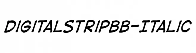
A bold, italic script font with a playful, handwritten style.
![DigitalStripBB-Italic Frei Schriftart Herunterladen]() Herunterladen 304 Downloads@WebFont
Herunterladen 304 Downloads@WebFont -
( Fonts by www.aenigmafonts.com )
A futuristic, hollow, and rounded font with a geometric design.
![Quantum Round Hollow [BRK] Frei Schriftart Herunterladen]() Herunterladen 303 Downloads@WebFont
Herunterladen 303 Downloads@WebFont -
( Fonts by Abraham Plaza - behance.net/abrahamplazadelpino - For fully operational commercial use of any of my fonts please donate 12€ (10£/14$) via PayPal abrahamplapi(at)gmail.com - Personal-use only. )
A bold, modern sans-serif font with geometric shapes and clean lines.
![Lugos Frei Schriftart Herunterladen]() Herunterladen 303 Downloads@WebFont
Herunterladen 303 Downloads@WebFont -
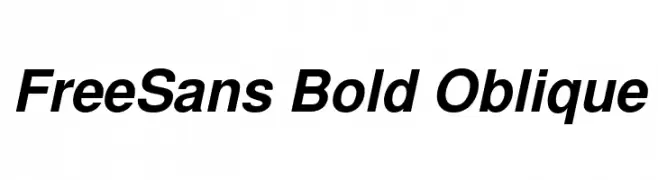
( Fonts by GNU )
A bold, oblique font with a modern and dynamic style.
![FreeSans Bold Oblique Frei Schriftart Herunterladen]() Herunterladen 303 Downloads@WebFont
Herunterladen 303 Downloads@WebFont -
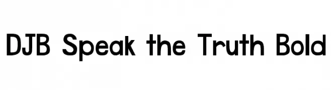
( Fonts by Darcy Baldwin - darcybaldwin.com. Free for personal use only )
A bold, modern sans-serif font with clean lines and high legibility.
![DJB Speak the Truth Bold Frei Schriftart Herunterladen]() Herunterladen 303 Downloads@WebFont
Herunterladen 303 Downloads@WebFont -
![LVDC Common2 Frei Schriftart Herunterladen]() Herunterladen 303 Downloads@WebFont
Herunterladen 303 Downloads@WebFont -
( Copyright (c) 2010, Santiago Orozco (hi@typemade.mx) )
A bold, italic slab serif font with a modern twist.
![Josefin Slab Bold Italic Frei Schriftart Herunterladen]() Herunterladen 303 Downloads@WebFont
Herunterladen 303 Downloads@WebFont -
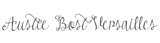
![Austie Bost Versailles Frei Schriftart Herunterladen]() Herunterladen 303 Downloads@WebFont
Herunterladen 303 Downloads@WebFont -
( Fonts by Ariq Sya - marsnev.com )
A playful, rounded font with bold, smooth curves and a friendly appearance.
![Roadshow-IAIC-2013 Frei Schriftart Herunterladen]() Herunterladen 303 Downloads@WebFont
Herunterladen 303 Downloads@WebFont -
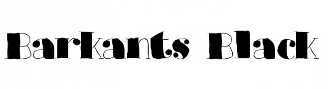
( Fonts by Mans Greback - www.mawns.com )
A bold, artistic font with a hand-drawn, whimsical style.
![Barkants Black Frei Schriftart Herunterladen]() Herunterladen 303 Downloads@WebFont
Herunterladen 303 Downloads@WebFont -
( Fonts by a Max Infeld - XEROGRAPHER FONTS - xerographer.blogspot.com . Personal-use only. For commercial use please contact owner. )
A bold, graffiti-inspired font with a distressed, painted look.
![UrbanPaints Frei Schriftart Herunterladen]() Herunterladen 303 Downloads@WebFont
Herunterladen 303 Downloads@WebFont -
( Fonts by CosmicStunky )
A playful, handwritten font with smooth, rounded edges and a casual style.
![BunnyCookies Frei Schriftart Herunterladen]() Herunterladen 303 Downloads@WebFont
Herunterladen 303 Downloads@WebFont -
( Fonts by Castcraft Software - OPTI Fonts Archive - opti.netii.net - Personal-use only. For commercial use please contact owner. )
A bold, high-contrast font with a dramatic and commanding style.
![RubensRimmed Frei Schriftart Herunterladen]() Herunterladen 303 Downloads@WebFont
Herunterladen 303 Downloads@WebFont -
![Rocketfont Frei Schriftart Herunterladen]() Herunterladen 303 Downloads@WebFont
Herunterladen 303 Downloads@WebFont -
( Fonts by Scratchones )
A dynamic and expressive handwritten font with fluid, cursive strokes.
![Skeleton Frei Schriftart Herunterladen]() Herunterladen 303 Downloads@WebFont
Herunterladen 303 Downloads@WebFont -
( Donationware - www.junkohanhero.com )
A bold, decorative font with a hand-drawn, textured appearance.
![Adieresis, Odieresis & Aring Frei Schriftart Herunterladen]() Herunterladen 303 Downloads@WebFont
Herunterladen 303 Downloads@WebFont -
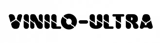
( Fonts by Fernando Carvente )
A bold, decorative font with unique cut-out patterns and rounded edges.
![Vinilo-Ultra Frei Schriftart Herunterladen]() Herunterladen 303 Downloads@WebFont
Herunterladen 303 Downloads@WebFont -
![Raptor Attack Frei Schriftart Herunterladen]() Herunterladen 303 Downloads@WebFont
Herunterladen 303 Downloads@WebFont -
( Fonts by Iconian Fonts )
A bold, distressed font with a vintage carnival or horror theme.
![Carnival Corpse Expanded Frei Schriftart Herunterladen]() Herunterladen 303 Downloads@WebFont
Herunterladen 303 Downloads@WebFont


![Quantum Round Hollow [BRK] Frei Schriftart Herunterladen](https://d144mzi0q5mijx.cloudfront.net/img/Q/U/Quantum-Round-Hollow-BRK.webp)


Welche Schriften sind gerade am populärsten?
Poppins, Roboto, Montserrat, Open Sans und Lato sind wegen ihrer klaren Formen und breiten Einsetzbarkeit sehr gefragt – von Markenauftritt über Landingpages bis hin zu Postern.
Welche Fonts eignen sich für Logos?
Geometrische Sans‑Serifs (z. B. Poppins, Familien im Gotham‑Stil) sind ein häufiger Griff für sauberes, skalierbares Branding. Für eine persönlichere Note bleiben Scripts und Handschrift‑Stile beliebt. Kombinieren Sie einen prägnanten Headline‑Font mit einer neutralen Brotschrift für Wiedererkennung und Harmonie.
Wie oft wird die Top‑Liste aktualisiert?
Regelmäßig – basierend auf realen Downloads und Interaktionen. Schauen Sie öfter vorbei, um aufstrebende Favoriten früh zu entdecken.
💡 Tipp: Seite bookmarken – Trends wechseln schnell, und heutige Top‑Schriften inspirieren morgen vielleicht das Rebranding.