Willkommen bei den Top‑Schriften – hier treffen Beliebtheit und Qualität aufeinander. Das sind die in diesem Jahr am häufigsten heruntergeladenen und genutzten Fonts. Wenn Sie sichere Optionen für Logo, Web oder Social suchen, starten Sie hier.
Jeder Top‑Font überzeugt durch Balance, Lesbarkeit und Vielseitigkeit. Sie finden moderne Sans‑Serifs, elegante Scripts, Vintage‑Serifs und minimalistische Displays.
-
 Herunterladen 250 Downloads@WebFont
 -
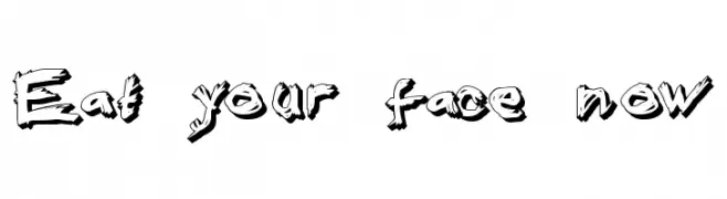
![Eat your face now Frei Schriftart Herunterladen]() Herunterladen 250 Downloads@WebFont
Herunterladen 250 Downloads@WebFont -
( Fonts by Fenny Wiryani - Personal-use only. For commercial use please contact owner. )
A bold, expressive handwritten font with dynamic strokes and artistic flair.
![High Sylvester Frei Schriftart Herunterladen]() Herunterladen 250 Downloads@WebFont
Herunterladen 250 Downloads@WebFont -
( Fonts by Michael Muranaka - muraknockout.com - Personal-use only. For commercial use please contact owner. )
A minimalist, geometric font with a modern and futuristic style.
![MNML FNT Frei Schriftart Herunterladen]() Herunterladen 250 Downloads@WebFont
Herunterladen 250 Downloads@WebFont -
( Fonts by www.fontalicious.com )
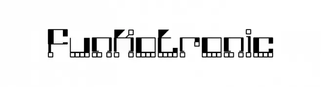
A futuristic, geometric font with a digital, pixelated aesthetic.
![Funkotronic Frei Schriftart Herunterladen]() Herunterladen 250 Downloads@WebFont
Herunterladen 250 Downloads@WebFont -
-
( Fonts by Apostrophic Lab )
A bold, futuristic italic font with a 3D outlined style.
![Plasmatica Open Italic Frei Schriftart Herunterladen]() Herunterladen 250 Downloads@WebFont
Herunterladen 250 Downloads@WebFont -
![NovaScript Frei Schriftart Herunterladen]() Herunterladen 250 Downloads@WebFont
Herunterladen 250 Downloads@WebFont -
( Fonts by Craft Supply Co - Personal-use only. For commercial use please contact owner. )
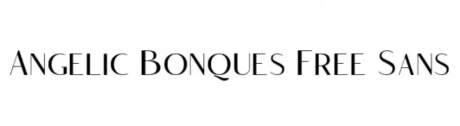
A modern, elegant font with geometric shapes and consistent stroke width.
![Angelic Bonques Free Sans Frei Schriftart Herunterladen]() Herunterladen 250 Downloads@WebFont
Herunterladen 250 Downloads@WebFont -
( Fonts by Kong Font - https://fontkong.com/ - Personal-use only. For commercial use please contact owner. )
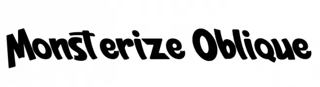
A bold, playful font with slanted, dynamic characters.
![Monsterize Oblique Frei Schriftart Herunterladen]() Herunterladen 250 Downloads@WebFont
Herunterladen 250 Downloads@WebFont -
( Fonts by Iconian Fonts )
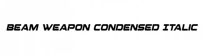
A futuristic, condensed italic font with bold, angular lines.
![Beam Weapon Condensed Italic Frei Schriftart Herunterladen]() Herunterladen 250 Downloads@WebFont
Herunterladen 250 Downloads@WebFont -
( Pisto Casero - Gilberto Moya Perona - www.pistocasero.com )
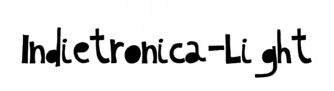
A playful, hand-drawn font with bold, irregular letterforms.
![Indietronica-Light Frei Schriftart Herunterladen]() Herunterladen 250 Downloads@WebFont
Herunterladen 250 Downloads@WebFont -
( Fonts by Goma Shin - Shintarou Nakayama www.geocities.jp/gomarice_font/ )
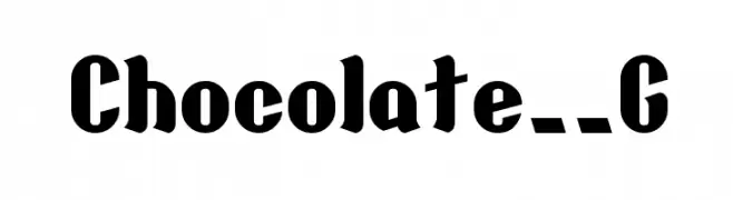
A bold, playful font with vintage-inspired, thick strokes.
![Chocolate__G Frei Schriftart Herunterladen]() Herunterladen 250 Downloads@WebFont
Herunterladen 250 Downloads@WebFont -
( Fonts by Goma Shin - Shintarou Nakayama www.geocities.jp/gomarice_font/ )
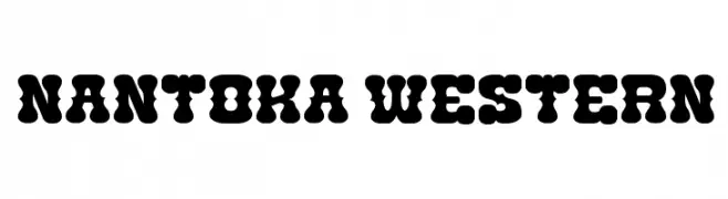
A bold, playful font with thick, rounded strokes and a unique, bubbly appearance.
![Nantoka Western Frei Schriftart Herunterladen]() Herunterladen 250 Downloads@WebFont
Herunterladen 250 Downloads@WebFont -
( Please check www.otlab.ru before you use this font! )
Iconic pictogram font for signage and wayfinding.
![Notice2Std Frei Schriftart Herunterladen]() Herunterladen 250 Downloads@WebFont
Herunterladen 250 Downloads@WebFont -
( Fonts by Wahyu Eka Prasetya - wepfont.com - Personal-use only. For commercial use please contact owner. )
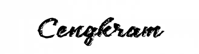
A bold, textured script font with a brush stroke appearance.
![Cengkram Frei Schriftart Herunterladen]() Herunterladen 250 Downloads@WebFont
Herunterladen 250 Downloads@WebFont -
( Fonts by Iconian Fonts )
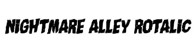
A bold, distressed, and slanted font with a gritty, urban aesthetic.
![Nightmare Alley Rotalic Frei Schriftart Herunterladen]() Herunterladen 250 Downloads@WebFont
Herunterladen 250 Downloads@WebFont -
( Fonts by David Kerkhoff - www.hanodedphotography.com )
A bold, cursive script font with elegant, flowing strokes and ornate details.
![Gerards Gold Frei Schriftart Herunterladen]() Herunterladen 250 Downloads@WebFont
Herunterladen 250 Downloads@WebFont -
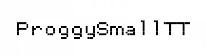
![ProggySmallTT Frei Schriftart Herunterladen]() Herunterladen 250 Downloads@WebFont
Herunterladen 250 Downloads@WebFont -
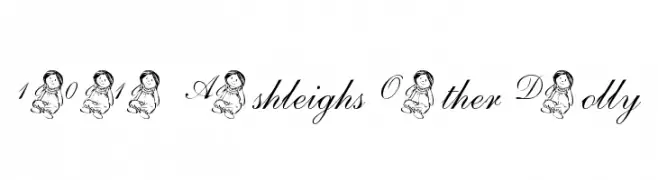
( Nght's Place - www.crosswinds.net/~nghtmvs/font/fonts1.html )
A whimsical script font with decorative doll illustrations on uppercase letters and numerals.
![101! Ashleigh's Other Dolly Frei Schriftart Herunterladen]() Herunterladen 250 Downloads@WebFont
Herunterladen 250 Downloads@WebFont -
( Fonts by Daniel Zadorozny - www.iconian.com )
A bold, futuristic font with geometric and angular design.
![Skyhawk Frei Schriftart Herunterladen]() Herunterladen 250 Downloads@WebFont
Herunterladen 250 Downloads@WebFont -
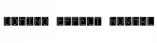
![Domino-Effect-Normal Frei Schriftart Herunterladen]() Herunterladen 250 Downloads
Herunterladen 250 Downloads -
( Fonts by Apostrophic Lab )
A playful, rounded font with consistent stroke thickness and whimsical curves.
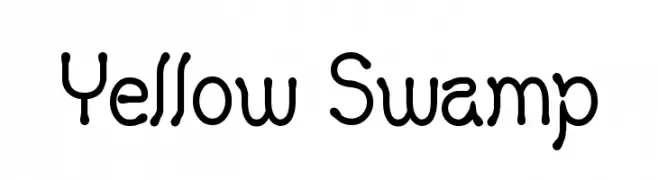
![Yellow Swamp Frei Schriftart Herunterladen]() Herunterladen 250 Downloads@WebFont
Herunterladen 250 Downloads@WebFont -
( Fonts by Daniel Zadorozny - www.iconian.com - Free for personal use )
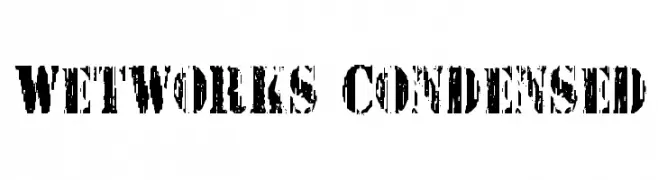
A bold, distressed font with a rugged, urban style and condensed width.
![Wetworks Condensed Frei Schriftart Herunterladen]() Herunterladen 250 Downloads@WebFont
Herunterladen 250 Downloads@WebFont -
( Fonts by designavmad - Malin Danngärde - Personal-use only. For commercial use please contact owner. )
A playful, hand-drawn style with rounded, consistent strokes.
![Limejuice Frei Schriftart Herunterladen]() Herunterladen 250 Downloads@WebFont
Herunterladen 250 Downloads@WebFont -
( Fonts by Vable Studio )
A bold, decorative font with intricate line patterns within each character.
![Matsuri Regular Frei Schriftart Herunterladen]() Herunterladen 250 Downloads@WebFont
Herunterladen 250 Downloads@WebFont -
![KR Christmas Dings 2004 Three Frei Schriftart Herunterladen]() Herunterladen 250 Downloads@WebFont
Herunterladen 250 Downloads@WebFont -
( Free on condition that you make a donation of 5€ favor of an organization dealing with global warming. http://www.sergiolelli.it )
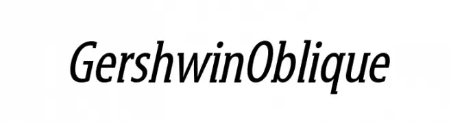
An elegant oblique font with moderate contrast and a cohesive, sophisticated style.
![GershwinOblique Frei Schriftart Herunterladen]() Herunterladen 250 Downloads@WebFont
Herunterladen 250 Downloads@WebFont -
![Wavy Optickal Frei Schriftart Herunterladen]() Herunterladen 250 Downloads@WebFont
Herunterladen 250 Downloads@WebFont -
![Pixel II Regular Frei Schriftart Herunterladen]() Herunterladen 250 Downloads@WebFont
Herunterladen 250 Downloads@WebFont -
( Fonts by falahfont248 )
A bold, playful, and hand-drawn style font with dynamic curves.
![Gaming Frei Schriftart Herunterladen]() Herunterladen 250 Downloads@WebFont
Herunterladen 250 Downloads@WebFont -
( Free on condition that you make a donation of 5€ favor of an organization dealing with global warming. http://www.sergiolelli.it )
A bold, oblique font with a modern and dynamic style.
![KarlKrausSansOblique Frei Schriftart Herunterladen]() Herunterladen 250 Downloads@WebFont
Herunterladen 250 Downloads@WebFont -
![BRANDED Frei Schriftart Herunterladen]() Herunterladen 250 Downloads@WebFont
Herunterladen 250 Downloads@WebFont -
( Font by Jonathan Harris - www.tattoowoo.com )
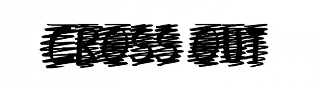
A bold, scribbled font with a hand-drawn, cross-hatched style.
![Cross Out Frei Schriftart Herunterladen]() Herunterladen 250 Downloads@WebFont
Herunterladen 250 Downloads@WebFont -
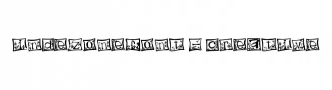
![indezonefont - creative Frei Schriftart Herunterladen]() Herunterladen 250 Downloads@WebFont
Herunterladen 250 Downloads@WebFont -
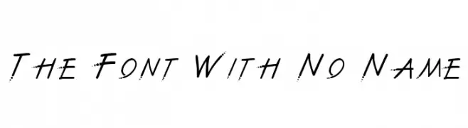
![The Font With No Name Frei Schriftart Herunterladen]() Herunterladen 250 Downloads@WebFont
Herunterladen 250 Downloads@WebFont


Welche Schriften sind gerade am populärsten?
Poppins, Roboto, Montserrat, Open Sans und Lato sind wegen ihrer klaren Formen und breiten Einsetzbarkeit sehr gefragt – von Markenauftritt über Landingpages bis hin zu Postern.
Welche Fonts eignen sich für Logos?
Geometrische Sans‑Serifs (z. B. Poppins, Familien im Gotham‑Stil) sind ein häufiger Griff für sauberes, skalierbares Branding. Für eine persönlichere Note bleiben Scripts und Handschrift‑Stile beliebt. Kombinieren Sie einen prägnanten Headline‑Font mit einer neutralen Brotschrift für Wiedererkennung und Harmonie.
Wie oft wird die Top‑Liste aktualisiert?
Regelmäßig – basierend auf realen Downloads und Interaktionen. Schauen Sie öfter vorbei, um aufstrebende Favoriten früh zu entdecken.
💡 Tipp: Seite bookmarken – Trends wechseln schnell, und heutige Top‑Schriften inspirieren morgen vielleicht das Rebranding.