Willkommen bei den Top‑Schriften – hier treffen Beliebtheit und Qualität aufeinander. Das sind die in diesem Jahr am häufigsten heruntergeladenen und genutzten Fonts. Wenn Sie sichere Optionen für Logo, Web oder Social suchen, starten Sie hier.
Jeder Top‑Font überzeugt durch Balance, Lesbarkeit und Vielseitigkeit. Sie finden moderne Sans‑Serifs, elegante Scripts, Vintage‑Serifs und minimalistische Displays.
-
( www.arthus.nl )
A dual-style font combining geometric uppercase letters with whimsical, flowing numerals and symbols.
 Herunterladen 249 Downloads@WebFont
 -
( Fonts by www.kimberlygeswein.com - Kimberly Geswein )
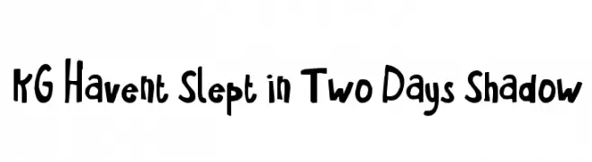
A playful, hand-drawn font with bold, irregular characters and a whimsical style.
![KG Havent Slept in Two Days Shadow Frei Schriftart Herunterladen]() Herunterladen 249 Downloads@WebFont
Herunterladen 249 Downloads@WebFont -
( Fonts by KB3Teach )
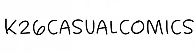
A playful, handwritten-style font with a casual and friendly appearance.
![K26CasualComics Frei Schriftart Herunterladen]() Herunterladen 249 Downloads@WebFont
Herunterladen 249 Downloads@WebFont -
( Copyright (c) 2015, Christian Thalmann and the Cormorant Project Authors (github.com/CatharsisFonts/Cormorant) )
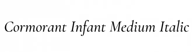
An elegant and sophisticated italic serif font with medium weight and refined details.
![Cormorant Infant Medium Italic Frei Schriftart Herunterladen]() Herunterladen 249 Downloads@WebFont
Herunterladen 249 Downloads@WebFont -
( Fonts by Fikry Alif - Fikryal studio - https://www.creativefabrica.com/designer/mfikryalif/ref/222304/ - Personal-use only. For commercial use please contact owner. )
A playful, flowing script font with elegant, cursive letterforms.
![Hello Snowflake Frei Schriftart Herunterladen]() Herunterladen 249 Downloads@WebFont
Herunterladen 249 Downloads@WebFont -
-
( Fonts by www.kimberlygeswein.com - Kimberly Geswein )
A versatile collection of decorative frames and shapes with unique styles.
![KG Flavor and Frames Five Frei Schriftart Herunterladen]() Herunterladen 249 Downloads@WebFont
Herunterladen 249 Downloads@WebFont -
![Just Vector Regular Frei Schriftart Herunterladen]() Herunterladen 249 Downloads@WebFont
Herunterladen 249 Downloads@WebFont -
![UNDER STAND Frei Schriftart Herunterladen]() Herunterladen 249 Downloads@WebFont
Herunterladen 249 Downloads@WebFont -
( Fonts by a Max Infeld - XEROGRAPHER FONTS - xerographer.blogspot.com . Personal-use only. For commercial use please contact owner. )
A playful, handwritten font with bold strokes and a casual, informal style.
![BasicHand Frei Schriftart Herunterladen]() Herunterladen 249 Downloads@WebFont
Herunterladen 249 Downloads@WebFont -
( Fonts by Iconian Fonts )
A futuristic, geometric font with a sci-fi aesthetic and sharp angles.
![Banshee Pilot Black Frei Schriftart Herunterladen]() Herunterladen 249 Downloads@WebFont
Herunterladen 249 Downloads@WebFont -
![Krishna Bold Frei Schriftart Herunterladen]() Herunterladen 249 Downloads
Herunterladen 249 Downloads -
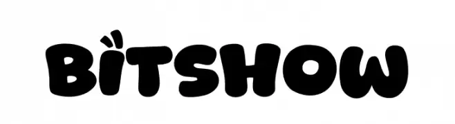
( Fonts by Khurasan )
A bold, playful font with rounded, bubble-like characters ideal for fun and creative designs.
![Bitshow Frei Schriftart Herunterladen]() Herunterladen 249 Downloads@WebFont
Herunterladen 249 Downloads@WebFont -
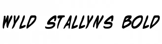
( Fonts by Daniel Zadorozny - www.iconian.com - Free for personal use )
A bold, dynamic, and handwritten-style font with a playful energy.
![Wyld Stallyns Bold Frei Schriftart Herunterladen]() Herunterladen 249 Downloads@WebFont
Herunterladen 249 Downloads@WebFont -
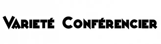
( Fonts by Peter Wiegel - www.peter-wiegel.de - Personal-use only. For commercial use please contact owner. )
A bold, geometric font with strong, impactful characters.
![Varieté Conférencier Frei Schriftart Herunterladen]() Herunterladen 249 Downloads@WebFont
Herunterladen 249 Downloads@WebFont -
( Collection of Korean web fonts - Personal-use only. For commercial use please contact owner. )
A casual, handwritten-style font with smooth curves and consistent stroke width.
![Nanum Pen Script Frei Schriftart Herunterladen]() Herunterladen 249 Downloads@WebFont
Herunterladen 249 Downloads@WebFont -
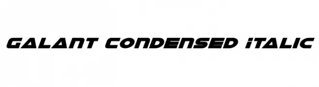
( Iconian Fonts - Daniel Zadorozny - www.iconian.com )
A bold, italic, condensed font with a modern and futuristic style.
![Galant Condensed Italic Frei Schriftart Herunterladen]() Herunterladen 249 Downloads@WebFont
Herunterladen 249 Downloads@WebFont -
![Inquisition Thin Italic Frei Schriftart Herunterladen]() Herunterladen 249 Downloads@WebFont
Herunterladen 249 Downloads@WebFont -
![Simmone's Handwriting: Shards of Glass Frei Schriftart Herunterladen]() Herunterladen 249 Downloads@WebFont
Herunterladen 249 Downloads@WebFont -
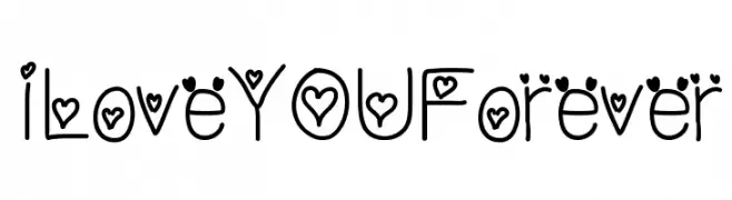
![ILoveYOUForever Frei Schriftart Herunterladen]() Herunterladen 249 Downloads@WebFont
Herunterladen 249 Downloads@WebFont -
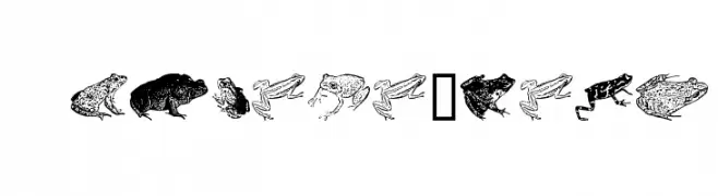
( Fonts by Astigmatic One Eye Typographic Institute - Brian J. Bonislawsky - astigmatic.com )
A decorative font with detailed amphibian illustrations for each character.
![AmphibiPrint Frei Schriftart Herunterladen]() Herunterladen 249 Downloads@WebFont
Herunterladen 249 Downloads@WebFont -
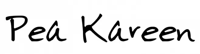
( Free for a personal use. For a commercial use please visit www.kevinandamanda.com )
A playful, casual handwritten font with a natural, informal style.
![Pea Kareen Frei Schriftart Herunterladen]() Herunterladen 249 Downloads@WebFont
Herunterladen 249 Downloads@WebFont -
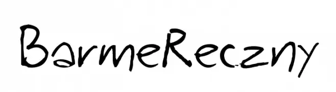
( Fonts by Bartek Nowak - www.nowak.tv/fontoholic/ )
A casual, handwritten font with fluid and organic strokes.
![BarmeReczny Frei Schriftart Herunterladen]() Herunterladen 249 Downloads@WebFont
Herunterladen 249 Downloads@WebFont -
Schriftart von yuliusparyadi. For commercial use please contact the owner.
( Sellomitha )
A decorative, semi-bold cursive font with elegant loops and swirls.
![Sellomitha Demo SemiBold Frei Schriftart Herunterladen]() Herunterladen 249 Downloads@WebFont
Herunterladen 249 Downloads@WebFont -
( Fonts by Letterena Studios )
A playful, casual handwritten font with smooth, flowing strokes.
![Caroline Display Frei Schriftart Herunterladen]() Herunterladen 249 Downloads@WebFont
Herunterladen 249 Downloads@WebFont -
( Fonts by Televo - Personal-use only. For commercial use please contact owner. )
A bold, italicized font with a modern and dynamic style.
![KHMenu BoldItalic Frei Schriftart Herunterladen]() Herunterladen 249 Downloads@WebFont
Herunterladen 249 Downloads@WebFont -
( Fonts by Excellent Ritma Florendia )
A playful and bold font with exaggerated curves and a lively personality.
![Chocolate Grande Frei Schriftart Herunterladen]() Herunterladen 249 Downloads@WebFont
Herunterladen 249 Downloads@WebFont -
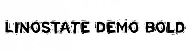
( Fonts by Büro Sequenz )
A bold, distressed font with a grunge aesthetic.
![Linostate Demo Bold Frei Schriftart Herunterladen]() Herunterladen 249 Downloads@WebFont
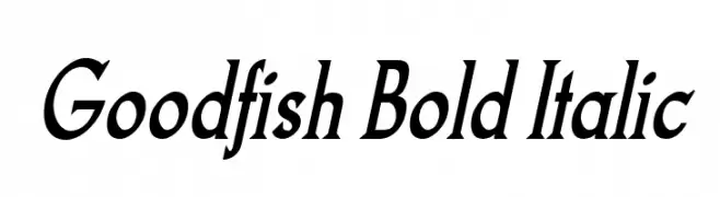
Herunterladen 249 Downloads@WebFont -
![Goodfish Bold Italic Frei Schriftart Herunterladen]() Herunterladen 249 Downloads@WebFont
Herunterladen 249 Downloads@WebFont -
![Blau 7pt Frei Schriftart Herunterladen]() Herunterladen 249 Downloads@WebFont
Herunterladen 249 Downloads@WebFont -
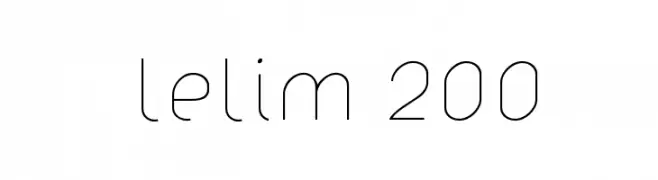
( Fonts by www.artill.de - Lukas Bischoff )
A minimalist, geometric font with uniform stroke widths and a modern aesthetic.
![lelim 200 Frei Schriftart Herunterladen]() Herunterladen 249 Downloads@WebFont
Herunterladen 249 Downloads@WebFont -
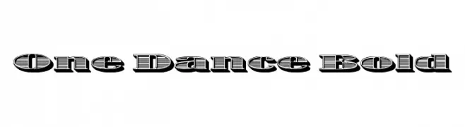
( Fonts by Koczman Balint - magiquefonts.gportal.hu )
A bold, decorative font with a 3D shadow effect and striped pattern.
![One Dance Bold Frei Schriftart Herunterladen]() Herunterladen 249 Downloads@WebFont
Herunterladen 249 Downloads@WebFont -
( Fonts by Letterena Studios )
A dynamic and elegant script font with fluid, cursive letterforms.
![Kashmir Revenge Frei Schriftart Herunterladen]() Herunterladen 249 Downloads@WebFont
Herunterladen 249 Downloads@WebFont -
( Fonts by Daniel Zadorozny - www.iconian.com - Free for personal use )
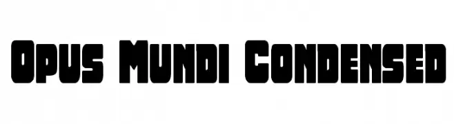
A bold, condensed font with rounded edges for a strong, modern look.
![Opus Mundi Condensed Frei Schriftart Herunterladen]() Herunterladen 249 Downloads@WebFont
Herunterladen 249 Downloads@WebFont -
( Fonts by Origin Type )
Playful handwritten font with rounded edges.
![The Series Frei Schriftart Herunterladen]() Herunterladen 249 Downloads@WebFont
Herunterladen 249 Downloads@WebFont -
( imagex - www.imagex-fonts.com )
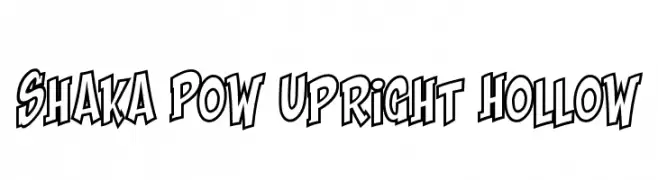
A bold, playful font with a hollow interior and dynamic style.
![Shaka Pow Upright Hollow Frei Schriftart Herunterladen]() Herunterladen 249 Downloads@WebFont
Herunterladen 249 Downloads@WebFont


Welche Schriften sind gerade am populärsten?
Poppins, Roboto, Montserrat, Open Sans und Lato sind wegen ihrer klaren Formen und breiten Einsetzbarkeit sehr gefragt – von Markenauftritt über Landingpages bis hin zu Postern.
Welche Fonts eignen sich für Logos?
Geometrische Sans‑Serifs (z. B. Poppins, Familien im Gotham‑Stil) sind ein häufiger Griff für sauberes, skalierbares Branding. Für eine persönlichere Note bleiben Scripts und Handschrift‑Stile beliebt. Kombinieren Sie einen prägnanten Headline‑Font mit einer neutralen Brotschrift für Wiedererkennung und Harmonie.
Wie oft wird die Top‑Liste aktualisiert?
Regelmäßig – basierend auf realen Downloads und Interaktionen. Schauen Sie öfter vorbei, um aufstrebende Favoriten früh zu entdecken.
💡 Tipp: Seite bookmarken – Trends wechseln schnell, und heutige Top‑Schriften inspirieren morgen vielleicht das Rebranding.