Willkommen bei den Top‑Schriften – hier treffen Beliebtheit und Qualität aufeinander. Das sind die in diesem Jahr am häufigsten heruntergeladenen und genutzten Fonts. Wenn Sie sichere Optionen für Logo, Web oder Social suchen, starten Sie hier.
Jeder Top‑Font überzeugt durch Balance, Lesbarkeit und Vielseitigkeit. Sie finden moderne Sans‑Serifs, elegante Scripts, Vintage‑Serifs und minimalistische Displays.
-
 Herunterladen 1195 Downloads@WebFont
 -
( Fonts by Quiccs )
A futuristic, bold font with sharp angles and a digital aesthetic.
![QuikiDigitalNinja Frei Schriftart Herunterladen]() Herunterladen 1195 Downloads@WebFont
Herunterladen 1195 Downloads@WebFont -
( Copyright (c) 2011, Jasper de Waard (jasper@designtown.nl) )
A modern, medium-weight sans-serif font with a clean and versatile style.
![Expletus Sans Medium Frei Schriftart Herunterladen]() Herunterladen 1195 Downloads@WebFont
Herunterladen 1195 Downloads@WebFont -
( Fonts by Dieter Steffmann )
An ornate, decorative font with intricate floral embellishments.
![Napoli Initialen Frei Schriftart Herunterladen]() Herunterladen 1195 Downloads@WebFont
Herunterladen 1195 Downloads@WebFont -
( Fonts by Divide By Zero! - fonts.tom7.com )
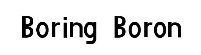
A bold, modern sans-serif font with geometric influences and excellent readability.
![Boring Boron Frei Schriftart Herunterladen]() Herunterladen 1195 Downloads@WebFont
Herunterladen 1195 Downloads@WebFont -
-
( Fonts by AEnigma - www.aenigmafonts.com )
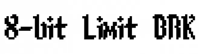
A retro, pixelated font inspired by classic 8-bit video games.
![8-bit Limit BRK Frei Schriftart Herunterladen]() Herunterladen 1195 Downloads@WebFont
Herunterladen 1195 Downloads@WebFont -
![GarbageG Frei Schriftart Herunterladen]() Herunterladen 1195 Downloads@WebFont
Herunterladen 1195 Downloads@WebFont -
( Copyright 2008 The Sunflower Project Authors )
A modern, light sans-serif font with clean lines and balanced spacing.
![Sunflower Light Frei Schriftart Herunterladen]() Herunterladen 1194 Downloads@WebFont
Herunterladen 1194 Downloads@WebFont -
( Copyright (c) 2010-2012, Alejandro Inler (alejandroinler@gmail.com), with Reserved Font Name 'Elsie' )
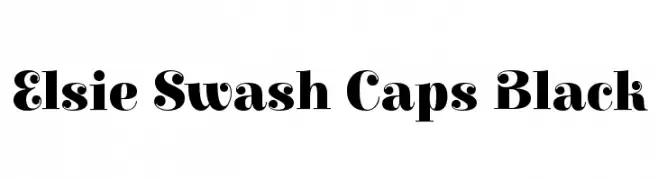
A bold, decorative serif font with elegant swash elements.
![Elsie Swash Caps Black Frei Schriftart Herunterladen]() Herunterladen 1194 Downloads@WebFont
Herunterladen 1194 Downloads@WebFont -
( Fonts by Geronimo Fonts - Personal-use only. For commercial use please contact owner. )
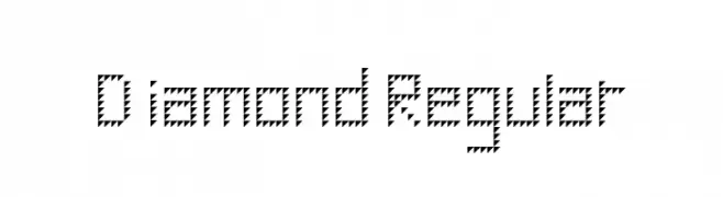
A geometric, zigzag-patterned font with a bold and artistic style.
![Diamond Regular Frei Schriftart Herunterladen]() Herunterladen 1194 Downloads@WebFont
Herunterladen 1194 Downloads@WebFont


Welche Schriften sind gerade am populärsten?
Poppins, Roboto, Montserrat, Open Sans und Lato sind wegen ihrer klaren Formen und breiten Einsetzbarkeit sehr gefragt – von Markenauftritt über Landingpages bis hin zu Postern.
Welche Fonts eignen sich für Logos?
Geometrische Sans‑Serifs (z. B. Poppins, Familien im Gotham‑Stil) sind ein häufiger Griff für sauberes, skalierbares Branding. Für eine persönlichere Note bleiben Scripts und Handschrift‑Stile beliebt. Kombinieren Sie einen prägnanten Headline‑Font mit einer neutralen Brotschrift für Wiedererkennung und Harmonie.
Wie oft wird die Top‑Liste aktualisiert?
Regelmäßig – basierend auf realen Downloads und Interaktionen. Schauen Sie öfter vorbei, um aufstrebende Favoriten früh zu entdecken.
💡 Tipp: Seite bookmarken – Trends wechseln schnell, und heutige Top‑Schriften inspirieren morgen vielleicht das Rebranding.