Willkommen bei den Top‑Schriften – hier treffen Beliebtheit und Qualität aufeinander. Das sind die in diesem Jahr am häufigsten heruntergeladenen und genutzten Fonts. Wenn Sie sichere Optionen für Logo, Web oder Social suchen, starten Sie hier.
Jeder Top‑Font überzeugt durch Balance, Lesbarkeit und Vielseitigkeit. Sie finden moderne Sans‑Serifs, elegante Scripts, Vintage‑Serifs und minimalistische Displays.
-
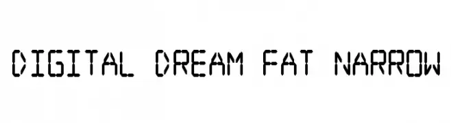
( Fonts by Jacob Fisher - www.pizzadude.dk )
A digital, geometric font with a blocky, futuristic style.
 Herunterladen 822 Downloads@WebFont
 -
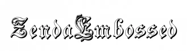
( Fonts by Paul Lloyd )
An ornate, embossed blackletter font with intricate details and a historical feel.
![ZendaEmbossed Frei Schriftart Herunterladen]() Herunterladen 822 Downloads@WebFont
Herunterladen 822 Downloads@WebFont -
( Fonts by Dieter Steffmann )
A classic serif font with sharp serifs and moderate stroke contrast.
![Weiss Lapidar Frei Schriftart Herunterladen]() Herunterladen 822 Downloads@WebFont
Herunterladen 822 Downloads@WebFont -
![LumineSign Bold Frei Schriftart Herunterladen]() Herunterladen 822 Downloads@WebFont
Herunterladen 822 Downloads@WebFont -
![My Pager Frei Schriftart Herunterladen]() Herunterladen 822 Downloads@WebFont
Herunterladen 822 Downloads@WebFont -
-
( Fonts by ReyreyBlue )
A playful, rounded font with bold, slightly irregular characters.
![Tropical Land Frei Schriftart Herunterladen]() Herunterladen 821 Downloads@WebFont
Herunterladen 821 Downloads@WebFont -
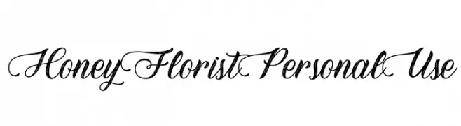
( Fonts by Typhoon Type - Suthi Srisopha - www.typhoontype.net - Personal-use only. For commercial use please contact owner. )
An elegant script font with flowing, cursive style and decorative swashes.
![HoneyFloristPersonalUse Frei Schriftart Herunterladen]() Herunterladen 821 Downloads@WebFont
Herunterladen 821 Downloads@WebFont -
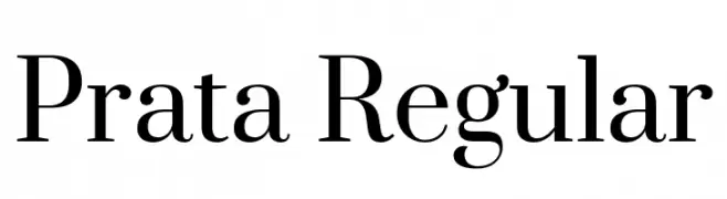
( Fonts by Ivan Petrov - Personal-use only. For commercial use please contact owner. )
A refined serif typeface with high contrast and sharp serifs.
![Prata Regular Frei Schriftart Herunterladen]() Herunterladen 821 Downloads@WebFont
Herunterladen 821 Downloads@WebFont -
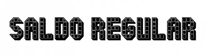
( Fonts by Vladimir Nikolic )
A bold, geometric font with a grid-like, three-dimensional design.
![Saldo Regular Frei Schriftart Herunterladen]() Herunterladen 821 Downloads@WebFont
Herunterladen 821 Downloads@WebFont -
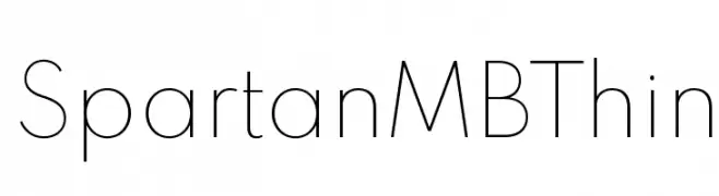
( Fonts by Matt Bailey - Personal-use only. For commercial use please contact owner. )
A thin, minimalist font with clean lines and balanced spacing.
![Spartan MB Thin Frei Schriftart Herunterladen]() Herunterladen 821 Downloads@WebFont
Herunterladen 821 Downloads@WebFont


Welche Schriften sind gerade am populärsten?
Poppins, Roboto, Montserrat, Open Sans und Lato sind wegen ihrer klaren Formen und breiten Einsetzbarkeit sehr gefragt – von Markenauftritt über Landingpages bis hin zu Postern.
Welche Fonts eignen sich für Logos?
Geometrische Sans‑Serifs (z. B. Poppins, Familien im Gotham‑Stil) sind ein häufiger Griff für sauberes, skalierbares Branding. Für eine persönlichere Note bleiben Scripts und Handschrift‑Stile beliebt. Kombinieren Sie einen prägnanten Headline‑Font mit einer neutralen Brotschrift für Wiedererkennung und Harmonie.
Wie oft wird die Top‑Liste aktualisiert?
Regelmäßig – basierend auf realen Downloads und Interaktionen. Schauen Sie öfter vorbei, um aufstrebende Favoriten früh zu entdecken.
💡 Tipp: Seite bookmarken – Trends wechseln schnell, und heutige Top‑Schriften inspirieren morgen vielleicht das Rebranding.