Willkommen bei den Top‑Schriften – hier treffen Beliebtheit und Qualität aufeinander. Das sind die in diesem Jahr am häufigsten heruntergeladenen und genutzten Fonts. Wenn Sie sichere Optionen für Logo, Web oder Social suchen, starten Sie hier.
Jeder Top‑Font überzeugt durch Balance, Lesbarkeit und Vielseitigkeit. Sie finden moderne Sans‑Serifs, elegante Scripts, Vintage‑Serifs und minimalistische Displays.
-
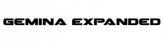
( Fonts by Daniel Zadorozny - www.iconian.com - Free for personal use )
A bold, modern font with a geometric and expansive design.
 Herunterladen 820 Downloads@WebFont
 -
( Fonts by Taylor Baybutt - ikon3.com - Free for personal use only )
A hand-crafted, calligraphic font with bold, irregular strokes.
![The Missus Hand Strong Frei Schriftart Herunterladen]() Herunterladen 820 Downloads@WebFont
Herunterladen 820 Downloads@WebFont -
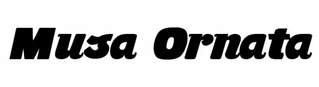
( Fonts by Fernando Carvente - serifdechocolate.wordpress.com )
A bold, dynamic font with thick strokes and a slight slant.
![Musa Ornata Frei Schriftart Herunterladen]() Herunterladen 820 Downloads@WebFont
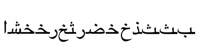
Herunterladen 820 Downloads@WebFont -
![ArabicRiyadhSSK Frei Schriftart Herunterladen]() Herunterladen 820 Downloads@WebFont
Herunterladen 820 Downloads@WebFont -
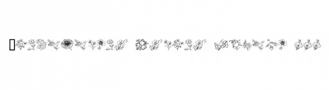
( Fonts by www.houseoflime.com )
Hand-drawn floral illustration font with detailed botanical motifs.
![Traditional Floral Design III Frei Schriftart Herunterladen]() Herunterladen 820 Downloads@WebFont
Herunterladen 820 Downloads@WebFont -
-
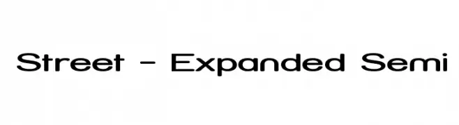
( Fonts by Apostrophic Lab )
A modern, expanded font with smooth, rounded characters and consistent stroke thickness.
![Street - Expanded Semi Frei Schriftart Herunterladen]() Herunterladen 820 Downloads@WebFont
Herunterladen 820 Downloads@WebFont -
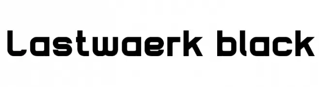
![Lastwaerk black Frei Schriftart Herunterladen]() Herunterladen 820 Downloads@WebFont
Herunterladen 820 Downloads@WebFont -
( Free for personal use - Fonts by Markus Schroppel. For commercial license please donate to http://www.die-gute-schrift.de/donation.html )
A bold, hand-drawn font with textured strokes and a playful, artistic style.
![LLCooper Frei Schriftart Herunterladen]() Herunterladen 820 Downloads@WebFont
Herunterladen 820 Downloads@WebFont -
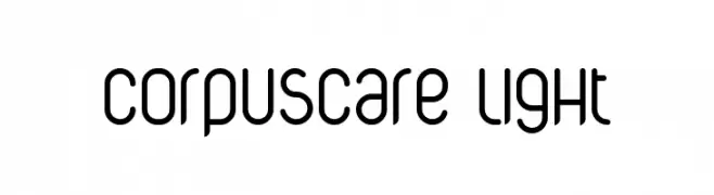
![CorpusCare Light Frei Schriftart Herunterladen]() Herunterladen 820 Downloads@WebFont
Herunterladen 820 Downloads@WebFont -
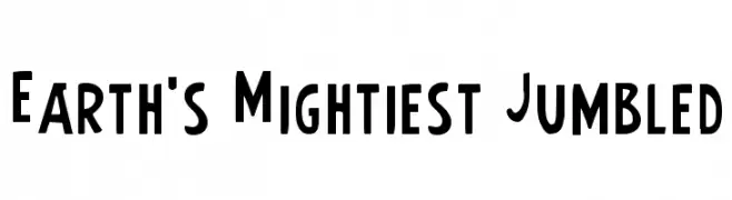
( Fonts by Daniel Zadorozny - www.iconian.com - Free for personal use )
A bold, playful font with a slightly condensed and dynamic style.
![Earth's Mightiest Jumbled Frei Schriftart Herunterladen]() Herunterladen 820 Downloads
Herunterladen 820 Downloads


Welche Schriften sind gerade am populärsten?
Poppins, Roboto, Montserrat, Open Sans und Lato sind wegen ihrer klaren Formen und breiten Einsetzbarkeit sehr gefragt – von Markenauftritt über Landingpages bis hin zu Postern.
Welche Fonts eignen sich für Logos?
Geometrische Sans‑Serifs (z. B. Poppins, Familien im Gotham‑Stil) sind ein häufiger Griff für sauberes, skalierbares Branding. Für eine persönlichere Note bleiben Scripts und Handschrift‑Stile beliebt. Kombinieren Sie einen prägnanten Headline‑Font mit einer neutralen Brotschrift für Wiedererkennung und Harmonie.
Wie oft wird die Top‑Liste aktualisiert?
Regelmäßig – basierend auf realen Downloads und Interaktionen. Schauen Sie öfter vorbei, um aufstrebende Favoriten früh zu entdecken.
💡 Tipp: Seite bookmarken – Trends wechseln schnell, und heutige Top‑Schriften inspirieren morgen vielleicht das Rebranding.