Willkommen bei den Top‑Schriften – hier treffen Beliebtheit und Qualität aufeinander. Das sind die in diesem Jahr am häufigsten heruntergeladenen und genutzten Fonts. Wenn Sie sichere Optionen für Logo, Web oder Social suchen, starten Sie hier.
Jeder Top‑Font überzeugt durch Balance, Lesbarkeit und Vielseitigkeit. Sie finden moderne Sans‑Serifs, elegante Scripts, Vintage‑Serifs und minimalistische Displays.
-
 Herunterladen 2551 Downloads@WebFont
 -
( Fonts by www.kuzumi.net - Dust@fonts )
A bold, geometric font with a modern and futuristic style.
![Electrofied Bold Frei Schriftart Herunterladen]() Herunterladen 2551 Downloads@WebFont
Herunterladen 2551 Downloads@WebFont -
( Fonts by Pinisiart )
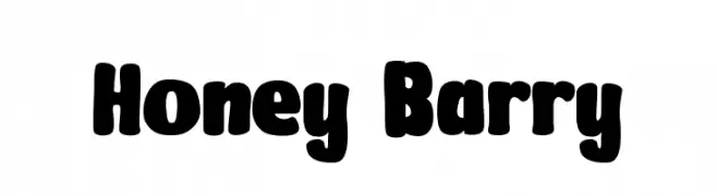
A bold, playful font with rounded edges and a bubbly appearance.
![Honey Barry Frei Schriftart Herunterladen]() Herunterladen 2550 Downloads@WebFont
Herunterladen 2550 Downloads@WebFont -
( Fonts by Sebastian Kosch - Personal-use only. For commercial use please contact owner. )
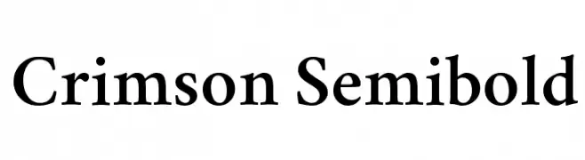
A classic serif font with semi-bold weight, offering elegance and readability.
![Crimson Semibold Frei Schriftart Herunterladen]() Herunterladen 2550 Downloads@WebFont
Herunterladen 2550 Downloads@WebFont -
![LCDDot Regular Frei Schriftart Herunterladen]() Herunterladen 2550 Downloads@WebFont
Herunterladen 2550 Downloads@WebFont -
( Fonts by Daniel Zadorozny - www.iconian.com )
A bold, geometric font with a futuristic and impactful design.
![Moltors Frei Schriftart Herunterladen]() Herunterladen 2550 Downloads@WebFont
Herunterladen 2550 Downloads@WebFont -
( Fonts by Khurasan )
A bold, rounded font with a playful and whimsical style.
![Lonely Coffee Frei Schriftart Herunterladen]() Herunterladen 2549 Downloads@WebFont
Herunterladen 2549 Downloads@WebFont -
( Fonts by a Neale Davidson - www.pixelsagas.com. Personal-use only. For commercial use please contact owner. )
A bold, slab serif font with a vintage, decorative style.
![Rio Oro Bold Frei Schriftart Herunterladen]() Herunterladen 2549 Downloads@WebFont
Herunterladen 2549 Downloads@WebFont -
( Fonts by Burim Loshaj )
A bold, geometric font with a pixelated, digital appearance.
![Cinderblock Frei Schriftart Herunterladen]() Herunterladen 2549 Downloads@WebFont
Herunterladen 2549 Downloads@WebFont -
( Fonts by Glyphobet Font Foundry - Matt Chisholm - http://glyphobet.net/typography/ )
A bold, angular font with a modern twist on Gothic style, featuring high contrast and sharp edges.
![Shark Frei Schriftart Herunterladen]() Herunterladen 2549 Downloads@WebFont
Herunterladen 2549 Downloads@WebFont -
![Blecklet Frei Schriftart Herunterladen]() Herunterladen 2549 Downloads
Herunterladen 2549 Downloads -
( Dominique Idiart - dominiqueidiart.myportfolio.com )
A playful, irregular handwritten font with quirky angles and uneven strokes.
![Naive Frei Schriftart Herunterladen]() Herunterladen 2548 Downloads@WebFont
Herunterladen 2548 Downloads@WebFont -
![it font Frei Schriftart Herunterladen]() Herunterladen 2548 Downloads@WebFont
Herunterladen 2548 Downloads@WebFont -
( Fonts by Basni.std - Bery Arisandi - Personal-use only. For commercial use please contact owner. )
A flowing, cursive script font with elegant, handwritten characteristics.
![Signature Frei Schriftart Herunterladen]() Herunterladen 2547 Downloads@WebFont
Herunterladen 2547 Downloads@WebFont -
( Fonts by Yadhie Setiawan - typelinestudio.com - Personal-use only. For commercial use please contact owner. )
An elegant script font with flowing, cursive letters and intricate flourishes.
![Switzerland Frei Schriftart Herunterladen]() Herunterladen 2547 Downloads@WebFont
Herunterladen 2547 Downloads@WebFont -
( Roger White - web.archive.org/web/20120416090521/www.rogersfonts.org.uk/ )
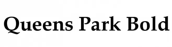
A bold, classic serif font with strong strokes and pronounced serifs.
![Queens Park Bold Frei Schriftart Herunterladen]() Herunterladen 2547 Downloads@WebFont
Herunterladen 2547 Downloads@WebFont -
( Copyright 2011, Tsong-Min Wu, Tsong-Huey Wu, Edward G.J. Lee and Seventeen. )
A classic serif font with elegant, well-defined characters and consistent stroke widths.
![cwTeXMing Frei Schriftart Herunterladen]() Herunterladen 2547 Downloads@WebFont
Herunterladen 2547 Downloads@WebFont -
( Fonts by GNU )
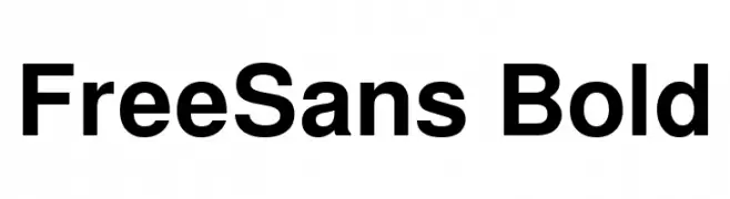
A bold, modern sans-serif font with clean lines and uniform width.
![FreeSans Bold Frei Schriftart Herunterladen]() Herunterladen 2546 Downloads@WebFont
Herunterladen 2546 Downloads@WebFont -
( Fonts by Blue Vinyl - Jess Latham - www.bvfonts.com )
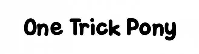
A playful, bold font with rounded edges and a bubbly appearance.
![One Trick Pony Frei Schriftart Herunterladen]() Herunterladen 2546 Downloads@WebFont
Herunterladen 2546 Downloads@WebFont -
( Fonts by www.fonthead.com )
A bold, geometric font with sharp angles and a modern design.
![RedFive Frei Schriftart Herunterladen]() Herunterladen 2545 Downloads@WebFont
Herunterladen 2545 Downloads@WebFont -
( Fonts by a www.fontfabric.com. Personal-use only. For commercial use please contact owner. )
A modern, ultra-thin typeface with clean lines and geometric precision.
![ZonaPro-Thin Frei Schriftart Herunterladen]() Herunterladen 2544 Downloads@WebFont
Herunterladen 2544 Downloads@WebFont -
( Fonts by softerviews.org )
A clean, modern sans-serif font with uniform stroke weight and rounded edges.
![Verajja Frei Schriftart Herunterladen]() Herunterladen 2544 Downloads@WebFont
Herunterladen 2544 Downloads@WebFont -
( Fonts by Daniel Gauthier )
A bold, angular font with a rugged, vintage western style.
![Eastwood Frei Schriftart Herunterladen]() Herunterladen 2544 Downloads@WebFont
Herunterladen 2544 Downloads@WebFont -
( Fonts by Paul Lloyd )
A bold, intricate blackletter font with ornate and dramatic letterforms.
![Proclamate Heavy Heavy Frei Schriftart Herunterladen]() Herunterladen 2544 Downloads@WebFont
Herunterladen 2544 Downloads@WebFont -
![Theo Van Doesburg Frei Schriftart Herunterladen]() Herunterladen 2544 Downloads@WebFont
Herunterladen 2544 Downloads@WebFont -
( Fonts by Casady & Greene )
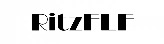
A bold, high-contrast font with geometric flair and modern elegance.
![RitzFLF Frei Schriftart Herunterladen]() Herunterladen 2543 Downloads@WebFont
Herunterladen 2543 Downloads@WebFont -
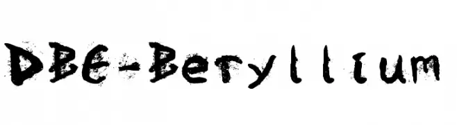
Schriftart von davalignllc. For commercial use please contact the owner.
![DBE-Beryllium Frei Schriftart Herunterladen]() Herunterladen 2543 Downloads@WebFont
Herunterladen 2543 Downloads@WebFont -
( Fonts by www.lifewithouttaffy.com )
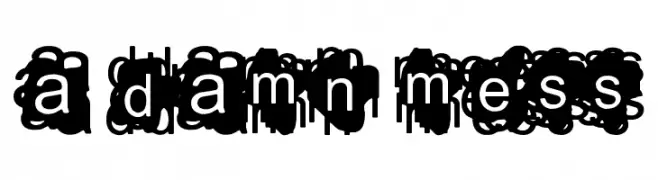
A chaotic, overlapping font with heavily obscured characters.
![A Damn Mess Frei Schriftart Herunterladen]() Herunterladen 2543 Downloads@WebFont
Herunterladen 2543 Downloads@WebFont -
( www.tomtor.com )
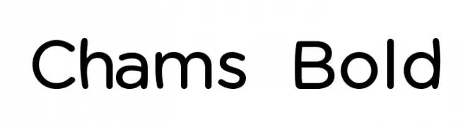
A modern, rounded font with a friendly and approachable style.
![Chams Bold Frei Schriftart Herunterladen]() Herunterladen 2542 Downloads@WebFont
Herunterladen 2542 Downloads@WebFont -
( Fonts by Sacred Nipple - Brode Vosloo )
A bold, modern font with geometric and sleek design elements.
![Fuel Frei Schriftart Herunterladen]() Herunterladen 2541 Downloads@WebFont
Herunterladen 2541 Downloads@WebFont -
( Fonts by Alan Carr )
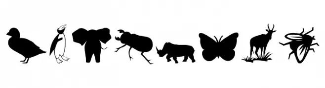
Animal silhouette icons form each character in a bold, decorative style.
![Animals 2 Frei Schriftart Herunterladen]() Herunterladen 2541 Downloads@WebFont
Herunterladen 2541 Downloads@WebFont -
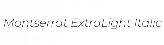
( Copyright 2011 The Montserrat Project Authors (https://github.com/JulietaUla/Montserrat) )
A sleek, modern, and italicized font with thin strokes and high legibility.
![Montserrat ExtraLight Italic Frei Schriftart Herunterladen]() Herunterladen 2540 Downloads@WebFont
Herunterladen 2540 Downloads@WebFont -
( Fonts by Thomas Mettendorf )
A bold, distressed font with a vintage, industrial feel.
![Derivat No1 Frei Schriftart Herunterladen]() Herunterladen 2540 Downloads@WebFont
Herunterladen 2540 Downloads@WebFont -
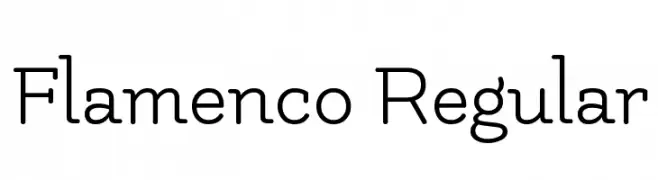
( Copyright (c) 2011 by LatinoType Limitada (luciano@latinotype.com) )
A clean, modern font with a playful touch and consistent stroke width.
![Flamenco Regular Frei Schriftart Herunterladen]() Herunterladen 2540 Downloads@WebFont
Herunterladen 2540 Downloads@WebFont -
( Fonts by Nick Curtis - www.nicksfonts.com )
A sleek, modern font with geometric influences and clean lines.
![Perisphere Frei Schriftart Herunterladen]() Herunterladen 2540 Downloads
Herunterladen 2540 Downloads


Welche Schriften sind gerade am populärsten?
Poppins, Roboto, Montserrat, Open Sans und Lato sind wegen ihrer klaren Formen und breiten Einsetzbarkeit sehr gefragt – von Markenauftritt über Landingpages bis hin zu Postern.
Welche Fonts eignen sich für Logos?
Geometrische Sans‑Serifs (z. B. Poppins, Familien im Gotham‑Stil) sind ein häufiger Griff für sauberes, skalierbares Branding. Für eine persönlichere Note bleiben Scripts und Handschrift‑Stile beliebt. Kombinieren Sie einen prägnanten Headline‑Font mit einer neutralen Brotschrift für Wiedererkennung und Harmonie.
Wie oft wird die Top‑Liste aktualisiert?
Regelmäßig – basierend auf realen Downloads und Interaktionen. Schauen Sie öfter vorbei, um aufstrebende Favoriten früh zu entdecken.
💡 Tipp: Seite bookmarken – Trends wechseln schnell, und heutige Top‑Schriften inspirieren morgen vielleicht das Rebranding.