Willkommen bei den Top‑Schriften – hier treffen Beliebtheit und Qualität aufeinander. Das sind die in diesem Jahr am häufigsten heruntergeladenen und genutzten Fonts. Wenn Sie sichere Optionen für Logo, Web oder Social suchen, starten Sie hier.
Jeder Top‑Font überzeugt durch Balance, Lesbarkeit und Vielseitigkeit. Sie finden moderne Sans‑Serifs, elegante Scripts, Vintage‑Serifs und minimalistische Displays.
-
( Nasir Udin - creativemarket.com/vectro?u=vectro )
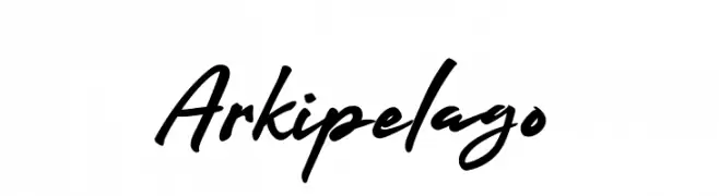
A bold, fluid handwritten font with dynamic strokes and a lively slant.
 Herunterladen 2598 Downloads@WebFont
 -
![MORVA Frei Schriftart Herunterladen]() Herunterladen 2598 Downloads@WebFont
Herunterladen 2598 Downloads@WebFont -
( Google Web Fonts )
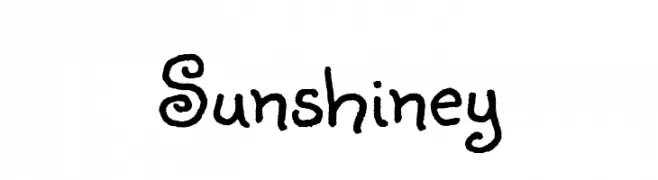
A playful, hand-drawn font with curly, whimsical letterforms.
![Sunshiney Frei Schriftart Herunterladen]() Herunterladen 2598 Downloads@WebFont
Herunterladen 2598 Downloads@WebFont -
( Fonts by Christopher Hansen )
A grungy, distressed font with an uneven, chaotic style.
![Got heroin? Frei Schriftart Herunterladen]() Herunterladen 2598 Downloads@WebFont
Herunterladen 2598 Downloads@WebFont -
( Fonts by Astigmatic One Eye Typographic Institute - Brian J. Bonislawsky - astigmatic.com )
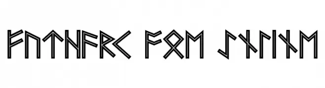
A bold, angular font inspired by ancient runic alphabets with an inline design.
![Futhark AOE Inline Frei Schriftart Herunterladen]() Herunterladen 2598 Downloads@WebFont
Herunterladen 2598 Downloads@WebFont -
( Fonts by Billy Argel Fonts - www.billyargel.com - Personal-use only. For commercial use please contact owner. )
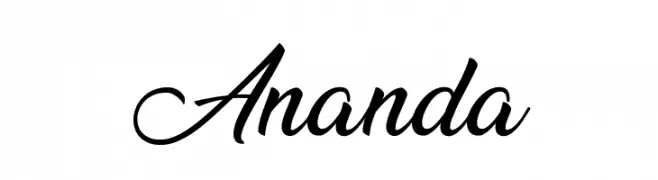
A graceful and elegant script font with flowing cursive strokes.
![Ananda Frei Schriftart Herunterladen]() Herunterladen 2597 Downloads@WebFont
Herunterladen 2597 Downloads@WebFont -
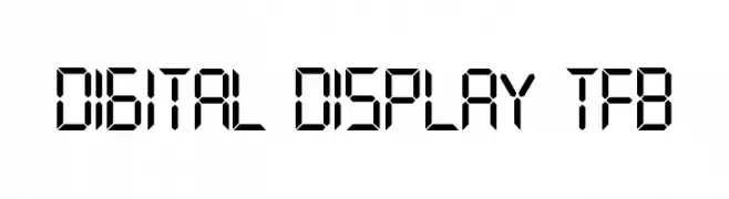
( truefonts.blogspot.com )
A digital display font with segmented, geometric characters.
![digital display tfb Frei Schriftart Herunterladen]() Herunterladen 2597 Downloads@WebFont
Herunterladen 2597 Downloads@WebFont -
( Font by Sven Stuber - www.superlooper.de )
A bold, modern font with rounded edges and a friendly appearance.
![Nordica Bold Frei Schriftart Herunterladen]() Herunterladen 2596 Downloads@WebFont
Herunterladen 2596 Downloads@WebFont -
Schriftart von LOMBAXRATCHET. For commercial use please contact the owner.
![Lane D Frei Schriftart Herunterladen]() Herunterladen 2596 Downloads@WebFont
Herunterladen 2596 Downloads@WebFont -
( austiebost.net )
A playful, bold font with rounded strokes and smooth curves.
![Austie Bost Chunky Description Frei Schriftart Herunterladen]() Herunterladen 2595 Downloads@WebFont
Herunterladen 2595 Downloads@WebFont -
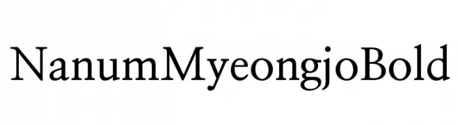
( Copyright (c) 2010, NHN Corporation (http://www.nhncorp.com) )
A classic serif font with elegant strokes and balanced proportions.
![NanumMyeongjoBold Frei Schriftart Herunterladen]() Herunterladen 2595 Downloads@WebFont
Herunterladen 2595 Downloads@WebFont -
![ModeNine Frei Schriftart Herunterladen]() Herunterladen 2595 Downloads@WebFont
Herunterladen 2595 Downloads@WebFont -
( Fonts by Graham Meade - GemFonts )
A modern, condensed sans-serif font with semi-bold weight and clean lines.
![Walkway Condensed SemiBold Frei Schriftart Herunterladen]() Herunterladen 2595 Downloads@WebFont
Herunterladen 2595 Downloads@WebFont -
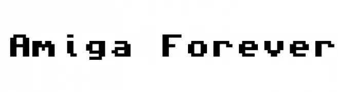
( Fonts by www.freakyfonts.de )
A pixelated, retro-style font inspired by early computer graphics.
![Amiga Forever Frei Schriftart Herunterladen]() Herunterladen 2595 Downloads@WebFont
Herunterladen 2595 Downloads@WebFont -
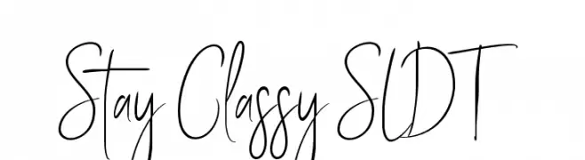
( Solidtype - bit.ly/2OxZn2V )
A stylish, handwritten font with elongated, flowing letterforms.
![Stay Classy SLDT Frei Schriftart Herunterladen]() Herunterladen 2594 Downloads@WebFont
Herunterladen 2594 Downloads@WebFont -
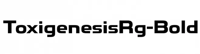
( Typodermic Fonts - Ray Larabie - www.typodermicfonts.com/ )
A bold, modern font with geometric shapes and clean lines.
![ToxigenesisRg-Bold Frei Schriftart Herunterladen]() Herunterladen 2593 Downloads@WebFont
Herunterladen 2593 Downloads@WebFont -
( Fonts by Luke Owens - Personal-use only. For commercial use please contact owner. )
A modern, high-contrast font with a sleek and elegant design.
![Oregon LDO Light Frei Schriftart Herunterladen]() Herunterladen 2593 Downloads@WebFont
Herunterladen 2593 Downloads@WebFont -
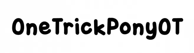
( Free for Personal Use. To use commercially please visit the www.bvfonts.com )
A playful, rounded font with bold, smooth curves and a friendly appearance.
![OneTrickPonyOT Frei Schriftart Herunterladen]() Herunterladen 2593 Downloads@WebFont
Herunterladen 2593 Downloads@WebFont -
![Armegoe Frei Schriftart Herunterladen]() Herunterladen 2592 Downloads@WebFont
Herunterladen 2592 Downloads@WebFont -
( Copyright (c) 2012 by Sorkin Type Co (www.sorkintype.com) )
A robust slab serif font with modern elements and strong, bold strokes.
![ArbutusSlab Frei Schriftart Herunterladen]() Herunterladen 2592 Downloads@WebFont
Herunterladen 2592 Downloads@WebFont -
![Kelt Bold Frei Schriftart Herunterladen]() Herunterladen 2592 Downloads@WebFont
Herunterladen 2592 Downloads@WebFont -
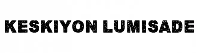
( www.junkohanhero.com )
A bold, textured font with a speckled, weathered appearance.
![Keskiyon Lumisade Frei Schriftart Herunterladen]() Herunterladen 2591 Downloads@WebFont
Herunterladen 2591 Downloads@WebFont -
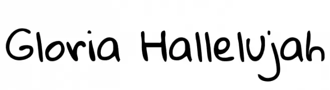
( Copyright (c) 2010, Kimberly Geswein (kimberlygeswein.com) )
A playful, handwritten font with a casual and friendly style.
![Gloria Hallelujah Frei Schriftart Herunterladen]() Herunterladen 2591 Downloads@WebFont
Herunterladen 2591 Downloads@WebFont -
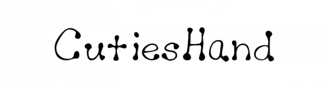
![CutiesHand Frei Schriftart Herunterladen]() Herunterladen 2591 Downloads
Herunterladen 2591 Downloads -
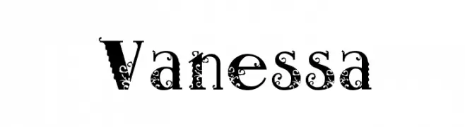
![Vanessa Frei Schriftart Herunterladen]() Herunterladen 2590 Downloads@WebFont
Herunterladen 2590 Downloads@WebFont -
( Fonts by Punchcut )
A bold, modern sans-serif font with excellent legibility and balance.
![Amble Bold Frei Schriftart Herunterladen]() Herunterladen 2589 Downloads@WebFont
Herunterladen 2589 Downloads@WebFont -
( Fonts by GreyWolf Webworks - www.greywolfwebworks.com - Personal-use only. For commercial use please contact owner. )
A playful, handwritten font with irregular strokes and a casual vibe.
![Expletive Deleted Frei Schriftart Herunterladen]() Herunterladen 2588 Downloads@WebFont
Herunterladen 2588 Downloads@WebFont -
( Noto is a trademark of Google Inc. Noto fonts are open source. All Noto fonts are published under the SIL Open Font License, Version 1.1 )
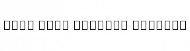
A clean, modern font supporting the Myanmar script with balanced proportions.
![Noto Sans Myanmar Regular Frei Schriftart Herunterladen]() Herunterladen 2588 Downloads@WebFont
Herunterladen 2588 Downloads@WebFont -
( Fonts by Alex Slobzheninov - Personal-use only. For commercial use please contact owner. )
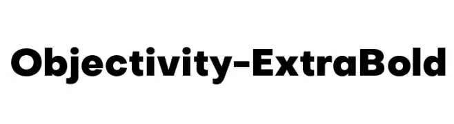
A bold, modern typeface with thick strokes and clean lines.
![Objectivity-ExtraBold Frei Schriftart Herunterladen]() Herunterladen 2588 Downloads@WebFont
Herunterladen 2588 Downloads@WebFont -
( Fonts by a Neale Davidson - www.pixelsagas.com. Personal-use only. For commercial use please contact owner. )
A bold, geometric font with angular, industrial letterforms.
![Optimus Frei Schriftart Herunterladen]() Herunterladen 2588 Downloads@WebFont
Herunterladen 2588 Downloads@WebFont -
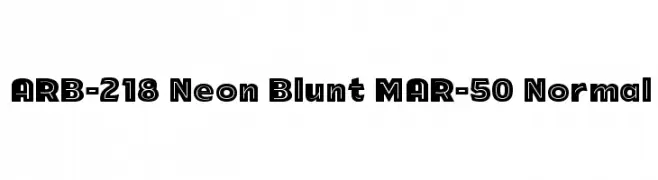
![ARB-218 Neon Blunt MAR-50 Normal Frei Schriftart Herunterladen]() Herunterladen 2588 Downloads@WebFont
Herunterladen 2588 Downloads@WebFont -
![AurulentSans-Regular Frei Schriftart Herunterladen]() Herunterladen 2588 Downloads@WebFont
Herunterladen 2588 Downloads@WebFont -
( Fonts by Gassstype )
A bold, dynamic font with slanted characters and a modern style.
![Ramai Frei Schriftart Herunterladen]() Herunterladen 2587 Downloads@WebFont
Herunterladen 2587 Downloads@WebFont -
( Fonts by Castcraft Software - OPTI Fonts Archive - opti.netii.net - Personal-use only. For commercial use please contact owner. )
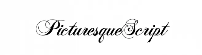
An elegant script font with intricate swashes and high contrast, perfect for luxurious and formal designs.
![PicturesqueScript Frei Schriftart Herunterladen]() Herunterladen 2587 Downloads@WebFont
Herunterladen 2587 Downloads@WebFont -
( Fonts by Galdino Otten - galdinootten.com )
A distressed, eroded font with a rugged, vintage appearance.
![New Press Eroded Frei Schriftart Herunterladen]() Herunterladen 2587 Downloads@WebFont
Herunterladen 2587 Downloads@WebFont


Welche Schriften sind gerade am populärsten?
Poppins, Roboto, Montserrat, Open Sans und Lato sind wegen ihrer klaren Formen und breiten Einsetzbarkeit sehr gefragt – von Markenauftritt über Landingpages bis hin zu Postern.
Welche Fonts eignen sich für Logos?
Geometrische Sans‑Serifs (z. B. Poppins, Familien im Gotham‑Stil) sind ein häufiger Griff für sauberes, skalierbares Branding. Für eine persönlichere Note bleiben Scripts und Handschrift‑Stile beliebt. Kombinieren Sie einen prägnanten Headline‑Font mit einer neutralen Brotschrift für Wiedererkennung und Harmonie.
Wie oft wird die Top‑Liste aktualisiert?
Regelmäßig – basierend auf realen Downloads und Interaktionen. Schauen Sie öfter vorbei, um aufstrebende Favoriten früh zu entdecken.
💡 Tipp: Seite bookmarken – Trends wechseln schnell, und heutige Top‑Schriften inspirieren morgen vielleicht das Rebranding.