Willkommen bei den Top‑Schriften – hier treffen Beliebtheit und Qualität aufeinander. Das sind die in diesem Jahr am häufigsten heruntergeladenen und genutzten Fonts. Wenn Sie sichere Optionen für Logo, Web oder Social suchen, starten Sie hier.
Jeder Top‑Font überzeugt durch Balance, Lesbarkeit und Vielseitigkeit. Sie finden moderne Sans‑Serifs, elegante Scripts, Vintage‑Serifs und minimalistische Displays.
-
 Herunterladen 2250 Downloads@WebFont
 -
![Floralies Frei Schriftart Herunterladen]() Herunterladen 2250 Downloads@WebFont
Herunterladen 2250 Downloads@WebFont -
![Aster1 Frei Schriftart Herunterladen]() Herunterladen 2250 Downloads@WebFont
Herunterladen 2250 Downloads@WebFont -
![Coke4U Frei Schriftart Herunterladen]() Herunterladen 2249 Downloads@WebFont
Herunterladen 2249 Downloads@WebFont -
( Fonts by Agathe M.Joyce - www.foundmyfont.com - Personal-use only. For commercial use please contact owner. )
An elegant, flowing script font with a classic italic style.
![Champion Shipmate-Italic Frei Schriftart Herunterladen]() Herunterladen 2249 Downloads@WebFont
Herunterladen 2249 Downloads@WebFont -
-
( Fonts by Daniel Zadorozny - www.iconian.com - Free for personal use )
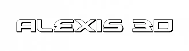
A bold, 3D futuristic font with geometric shapes and sharp angles.
![Alexis 3D Frei Schriftart Herunterladen]() Herunterladen 2249 Downloads@WebFont
Herunterladen 2249 Downloads@WebFont -
( Fonts by a Neale Davidson - www.pixelsagas.com. Personal-use only. For commercial use please contact owner. )
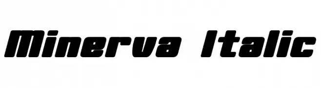
A bold, italicized font with a modern and dynamic style.
![Minerva Italic Frei Schriftart Herunterladen]() Herunterladen 2248 Downloads@WebFont
Herunterladen 2248 Downloads@WebFont -
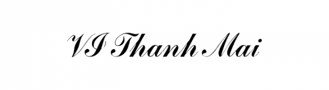
![VI Thanh Mai Frei Schriftart Herunterladen]() Herunterladen 2248 Downloads@WebFont
Herunterladen 2248 Downloads@WebFont -
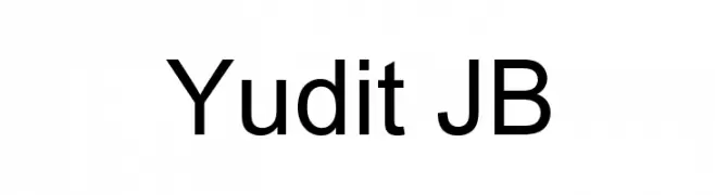
![Yudit JB Frei Schriftart Herunterladen]() Herunterladen 2248 Downloads@WebFont
Herunterladen 2248 Downloads@WebFont -
![UVN Co Dien Bold Frei Schriftart Herunterladen]() Herunterladen 2247 Downloads@WebFont
Herunterladen 2247 Downloads@WebFont -
( Chandan Acharja - www.charuchandan.com )
A clean, modern sans-serif font with consistent stroke width and excellent readability.
![Charu Chandan Unicode Frei Schriftart Herunterladen]() Herunterladen 2247 Downloads@WebFont
Herunterladen 2247 Downloads@WebFont -
( Copyright 2016 The M+ Project Authors. )
A modern, geometric sans-serif font with a clean and minimalistic design.
![Mplus 1p Frei Schriftart Herunterladen]() Herunterladen 2247 Downloads@WebFont
Herunterladen 2247 Downloads@WebFont -
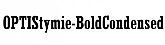
( Fonts by Castcraft Software - OPTI Fonts Archive - opti.netii.net - Personal-use only. For commercial use please contact owner. )
A bold, condensed serif font with strong strokes and high contrast.
![OPTIStymie-BoldCondensed Frei Schriftart Herunterladen]() Herunterladen 2247 Downloads@WebFont
Herunterladen 2247 Downloads@WebFont -
![WGTreeline Frei Schriftart Herunterladen]() Herunterladen 2247 Downloads@WebFont
Herunterladen 2247 Downloads@WebFont -
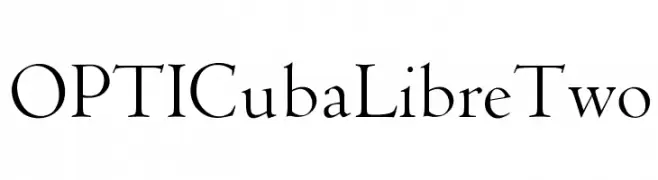
( Fonts by Castcraft Software - opti.netii.net - check the website before use )
A classic serif font with elegant, thin strokes and a timeless appeal.
![OPTICubaLibreTwo Frei Schriftart Herunterladen]() Herunterladen 2247 Downloads@WebFont
Herunterladen 2247 Downloads@WebFont -
![NFL Colts Throwback Frei Schriftart Herunterladen]() Herunterladen 2247 Downloads@WebFont
Herunterladen 2247 Downloads@WebFont -
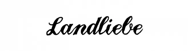
![Landliebe Frei Schriftart Herunterladen]() Herunterladen 2247 Downloads@WebFont
Herunterladen 2247 Downloads@WebFont -
( Fonts by HPLHS Prop Fonts - Andrew H. Leman http://www.cthulhulives.org/toybox/propdocs/propfonts.html )
A classic serif font with elegant, bold uppercase and consistent lowercase characters.
![Oldstyle Small Caps HPLHS Frei Schriftart Herunterladen]() Herunterladen 2247 Downloads@WebFont
Herunterladen 2247 Downloads@WebFont -
![Galatia SIL Frei Schriftart Herunterladen]() Herunterladen 2246 Downloads@WebFont
Herunterladen 2246 Downloads@WebFont -
![Shlop Frei Schriftart Herunterladen]() Herunterladen 2246 Downloads@WebFont
Herunterladen 2246 Downloads@WebFont -
( Fonts by http://perso.calixo.net/~uzim/ )
A playful, casual handwritten font with irregular strokes and a whimsical appearance.
![Origin Frei Schriftart Herunterladen]() Herunterladen 2246 Downloads@WebFont
Herunterladen 2246 Downloads@WebFont -
( Copyright (c) 2015, Pablo Impallari, Rodrigo Fuenzalida (Modified by Dan O. Williams and USWDS) (https://github.com/uswds/public-sans) )
A bold, modern sans-serif font with excellent readability and uniform strokes.
![Public Sans Bold Frei Schriftart Herunterladen]() Herunterladen 2245 Downloads@WebFont
Herunterladen 2245 Downloads@WebFont -
( Fonts by Sang Seo - LALATO FONTS. Personal-use only. For commercial use please contact owner. )
A playful, rounded handwritten font with a whimsical and friendly style.
![bingbong Frei Schriftart Herunterladen]() Herunterladen 2245 Downloads@WebFont
Herunterladen 2245 Downloads@WebFont -
( Fonts by junkohanhero )
A bold, distressed font with a vintage, hand-printed look.
![Eight Days A Week Frei Schriftart Herunterladen]() Herunterladen 2245 Downloads@WebFont
Herunterladen 2245 Downloads@WebFont -
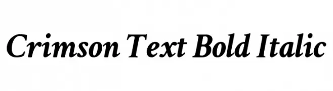
( Copyright (c) 2010, Sebastian Kosch (sebastian@aldusleaf.org) )
A bold, italic serif font with a classic and elegant style.
![Crimson Text Bold Italic Frei Schriftart Herunterladen]() Herunterladen 2245 Downloads@WebFont
Herunterladen 2245 Downloads@WebFont -
![Italian Cursive, 16th Century Frei Schriftart Herunterladen]() Herunterladen 2245 Downloads
Herunterladen 2245 Downloads -
![Blocktastic Frei Schriftart Herunterladen]() Herunterladen 2244 Downloads@WebFont
Herunterladen 2244 Downloads@WebFont -
![London Font Frei Schriftart Herunterladen]() Herunterladen 2244 Downloads@WebFont
Herunterladen 2244 Downloads@WebFont -
![Adhawin-Tamil Regular Frei Schriftart Herunterladen]() Herunterladen 2244 Downloads@WebFont
Herunterladen 2244 Downloads@WebFont -
( Fonts by www.typodermicfonts.com - Ray Larabie )
A bold, condensed font with high contrast and a modern style.
![Droid-Regular Frei Schriftart Herunterladen]() Herunterladen 2244 Downloads@WebFont
Herunterladen 2244 Downloads@WebFont -
( گالری فانت فارسی پژوهش آريانا - only compatible with Farsi and Arabic )
A bold, angular font with a futuristic and geometric style.
![Quark Frei Schriftart Herunterladen]() Herunterladen 2244 Downloads@WebFont
Herunterladen 2244 Downloads@WebFont -
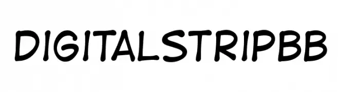
( Fonts by www.blambot.com )
A playful, handwritten font with rounded, consistent strokes and a casual vibe.
![DigitalStripBB Frei Schriftart Herunterladen]() Herunterladen 2243 Downloads@WebFont
Herunterladen 2243 Downloads@WebFont -
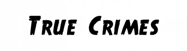
( Fonts by www.waltervelezart.com )
A bold, brush-style font with dynamic, slanted strokes.
![True Crimes Frei Schriftart Herunterladen]() Herunterladen 2243 Downloads@WebFont
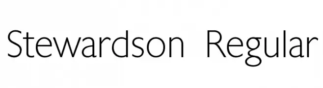
Herunterladen 2243 Downloads@WebFont -
![Stewardson Regular Frei Schriftart Herunterladen]() Herunterladen 2243 Downloads@WebFont
Herunterladen 2243 Downloads@WebFont -
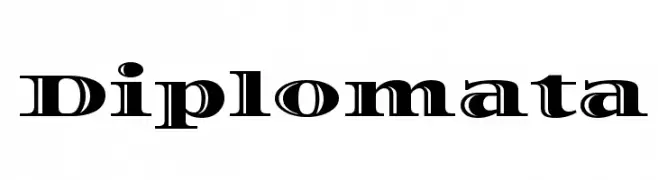
( Copyright (c) 2011, Eduardo Tunni (http://www.tipo.net.ar) )
A classic serif font with elegant curves and sharp serifs, perfect for formal and modern uses.
![Diplomata Frei Schriftart Herunterladen]() Herunterladen 2242 Downloads@WebFont
Herunterladen 2242 Downloads@WebFont


Welche Schriften sind gerade am populärsten?
Poppins, Roboto, Montserrat, Open Sans und Lato sind wegen ihrer klaren Formen und breiten Einsetzbarkeit sehr gefragt – von Markenauftritt über Landingpages bis hin zu Postern.
Welche Fonts eignen sich für Logos?
Geometrische Sans‑Serifs (z. B. Poppins, Familien im Gotham‑Stil) sind ein häufiger Griff für sauberes, skalierbares Branding. Für eine persönlichere Note bleiben Scripts und Handschrift‑Stile beliebt. Kombinieren Sie einen prägnanten Headline‑Font mit einer neutralen Brotschrift für Wiedererkennung und Harmonie.
Wie oft wird die Top‑Liste aktualisiert?
Regelmäßig – basierend auf realen Downloads und Interaktionen. Schauen Sie öfter vorbei, um aufstrebende Favoriten früh zu entdecken.
💡 Tipp: Seite bookmarken – Trends wechseln schnell, und heutige Top‑Schriften inspirieren morgen vielleicht das Rebranding.