Willkommen bei den Top‑Schriften – hier treffen Beliebtheit und Qualität aufeinander. Das sind die in diesem Jahr am häufigsten heruntergeladenen und genutzten Fonts. Wenn Sie sichere Optionen für Logo, Web oder Social suchen, starten Sie hier.
Jeder Top‑Font überzeugt durch Balance, Lesbarkeit und Vielseitigkeit. Sie finden moderne Sans‑Serifs, elegante Scripts, Vintage‑Serifs und minimalistische Displays.
-
 Herunterladen 2239 Downloads@WebFont
 -
( Fonts by www.typodermicfonts.com - Ray Larabie )
A bold, condensed font with high contrast and a modern style.
![Droid-Regular Frei Schriftart Herunterladen]() Herunterladen 2239 Downloads@WebFont
Herunterladen 2239 Downloads@WebFont -
( Fonts by Graham Meade - GemFonts )
A tall, ultra-thin, and modern font with a sleek and elegant design.
![Tall Films Fine Frei Schriftart Herunterladen]() Herunterladen 2238 Downloads@WebFont
Herunterladen 2238 Downloads@WebFont -
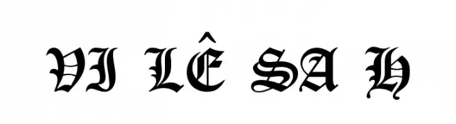
![VI Lê Sa H Frei Schriftart Herunterladen]() Herunterladen 2237 Downloads
Herunterladen 2237 Downloads -
![1543HumaneJenson Bold Frei Schriftart Herunterladen]() Herunterladen 2237 Downloads@WebFont
Herunterladen 2237 Downloads@WebFont -
-
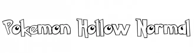
( Fonts by or from www.graffitifonts.net )
A playful, hollow, outlined font with a cartoon-like, comic book style.
![Pokemon Hollow Normal Frei Schriftart Herunterladen]() Herunterladen 2237 Downloads
Herunterladen 2237 Downloads -
( Fonts by zulkhairilettering - Zulkhairi M Saleh - Personal-use only. For commercial use please contact owner. )
A cursive, handwritten-style font with elegant, flowing strokes.
![celia Frei Schriftart Herunterladen]() Herunterladen 2236 Downloads@WebFont
Herunterladen 2236 Downloads@WebFont -
( Fonts by Castcraft Software - opti.netii.net - check the website before use )
A tall, narrow font with a sleek, modern design and consistent character height.
![OPTIJake Frei Schriftart Herunterladen]() Herunterladen 2236 Downloads@WebFont
Herunterladen 2236 Downloads@WebFont -
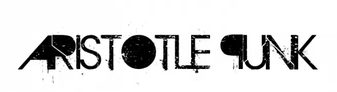
( Fonts by Andrew Hart - dirt2.com )
A bold, distressed font with a grunge aesthetic and rebellious style.
![Aristotle Punk Frei Schriftart Herunterladen]() Herunterladen 2236 Downloads@WebFont
Herunterladen 2236 Downloads@WebFont -
![Arakawa Plane Frei Schriftart Herunterladen]() Herunterladen 2236 Downloads@WebFont
Herunterladen 2236 Downloads@WebFont -
( Fonts by Type With Pride - www.typewithpride.com. For commercial use please contact owner. )
A bold, modern sans-serif font with geometric and clean lines.
![Gilbert Bold - Preview4 Frei Schriftart Herunterladen]() Herunterladen 2235 Downloads@WebFont
Herunterladen 2235 Downloads@WebFont -
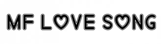
![Mf Love Song Frei Schriftart Herunterladen]() Herunterladen 2235 Downloads@WebFont
Herunterladen 2235 Downloads@WebFont -
( گالری فانت فارسی پژوهش آريانا - only compatible with Farsi and Arabic )
A bold, angular font with a futuristic and geometric style.
![Quark Frei Schriftart Herunterladen]() Herunterladen 2235 Downloads@WebFont
Herunterladen 2235 Downloads@WebFont -
( Aku Fadhl - www.behance.net/akufadhl )
A modern, rounded sans-serif font with clean lines and balanced spacing.
![RoladeFree Frei Schriftart Herunterladen]() Herunterladen 2234 Downloads@WebFont
Herunterladen 2234 Downloads@WebFont -
( Fonts by Castcraft Software - opti.netii.net - check the website before use )
A bold, geometric font with a modern and artistic style.
![OPTIAsian Frei Schriftart Herunterladen]() Herunterladen 2234 Downloads@WebFont
Herunterladen 2234 Downloads@WebFont -
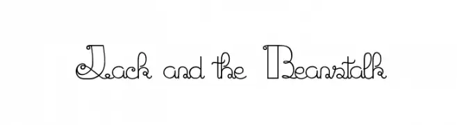
( Fonts by Maelle.K - Thomas Boucherie )
A whimsical and decorative font with intricate loops and curls.
![Jack and the Beanstalk Frei Schriftart Herunterladen]() Herunterladen 2234 Downloads@WebFont
Herunterladen 2234 Downloads@WebFont -
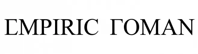
( Fonts by SDFonts - Ritzy )
A classic serif font with sharp serifs and a strong, authoritative presence.
![Empiric Roman Frei Schriftart Herunterladen]() Herunterladen 2234 Downloads@WebFont
Herunterladen 2234 Downloads@WebFont -
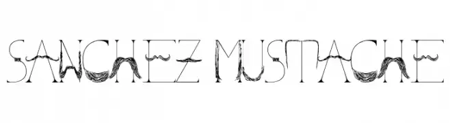
( Fonts by Kris Sanchez - www.krisdesign.me )
A whimsical font with mustache and beard motifs integrated into each character.
![Sanchez Mustache Frei Schriftart Herunterladen]() Herunterladen 2233 Downloads@WebFont
Herunterladen 2233 Downloads@WebFont -
![Portal Black Frei Schriftart Herunterladen]() Herunterladen 2233 Downloads@WebFont
Herunterladen 2233 Downloads@WebFont -
![Across The Stars Frei Schriftart Herunterladen]() Herunterladen 2233 Downloads@WebFont
Herunterladen 2233 Downloads@WebFont -
( Fonts by skomii - Personal-use only. For commercial use please contact owner. )
A modern, geometric sans-serif font with clean lines and balanced proportions.
![Stark Frei Schriftart Herunterladen]() Herunterladen 2232 Downloads@WebFont
Herunterladen 2232 Downloads@WebFont -
( Fonts by Lecter Johnson - doubletwostudios.tumblr.com )
An exotic, bold font with Middle Eastern calligraphic influences.
![XXII ARABIAN-ONENIGHTSTAND Bold Frei Schriftart Herunterladen]() Herunterladen 2232 Downloads@WebFont
Herunterladen 2232 Downloads@WebFont -
( Fonts by dustBUST - Andreas Nylin )
A futuristic, rounded font with a sleek, modern design.
![Sci Fied 2002 Frei Schriftart Herunterladen]() Herunterladen 2232 Downloads@WebFont
Herunterladen 2232 Downloads@WebFont -
( Fonts by www.fontmenu.com )
A modern, clean sans-serif font with uniform strokes and geometric influences.
![Normafixed Tryout Frei Schriftart Herunterladen]() Herunterladen 2232 Downloads@WebFont
Herunterladen 2232 Downloads@WebFont -
( Copyright (c) 2010, Google Corporation. )
A bold serif font with a classic and authoritative style.
![Tinos Bold Frei Schriftart Herunterladen]() Herunterladen 2231 Downloads@WebFont
Herunterladen 2231 Downloads@WebFont -
( Free for non-commercial use. For commercial use please buy a license. http://www.cape-arcona.com )
A bold, 3D-effect font with strong shadows and a playful, modern style.
![CAGingerMint Frei Schriftart Herunterladen]() Herunterladen 2231 Downloads@WebFont
Herunterladen 2231 Downloads@WebFont -
![Anitype Journal 5 Frei Schriftart Herunterladen]() Herunterladen 2230 Downloads@WebFont
Herunterladen 2230 Downloads@WebFont -
( Fonts by billyargel.blogspot.com - Billy Argel )
A bold, gothic-inspired font with sharp, angular lines and dramatic serifs.
![Argel Font Frei Schriftart Herunterladen]() Herunterladen 2230 Downloads@WebFont
Herunterladen 2230 Downloads@WebFont -
![SmithyXT-Heavy Frei Schriftart Herunterladen]() Herunterladen 2230 Downloads@WebFont
Herunterladen 2230 Downloads@WebFont -
![SchoolScriptDashed Frei Schriftart Herunterladen]() Herunterladen 2230 Downloads@WebFont
Herunterladen 2230 Downloads@WebFont -
( Fonts by www.peter-wiegel.de. Personal-use only. For commercial use please contact owner. )
A modern, rounded font with a sleek and futuristic style.
![SparTakusRound Frei Schriftart Herunterladen]() Herunterladen 2229 Downloads@WebFont
Herunterladen 2229 Downloads@WebFont -
( Copyright 2012 Google Inc. All Rights Reserved. )
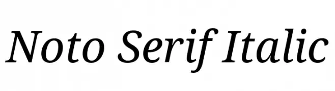
An elegant serif font with a classic italic style, perfect for sophisticated designs.
![Noto Serif Italic Frei Schriftart Herunterladen]() Herunterladen 2229 Downloads@WebFont
Herunterladen 2229 Downloads@WebFont -
![Matt Smith Doctor Who Regular Frei Schriftart Herunterladen]() Herunterladen 2229 Downloads@WebFont
Herunterladen 2229 Downloads@WebFont -
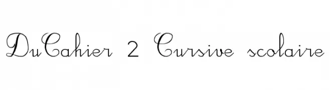
![DuCahier 2 Cursive scolaire Frei Schriftart Herunterladen]() Herunterladen 2229 Downloads@WebFont
Herunterladen 2229 Downloads@WebFont -
![Amrit-Lipi-Thick Regular Frei Schriftart Herunterladen]() Herunterladen 2229 Downloads@WebFont
Herunterladen 2229 Downloads@WebFont


Welche Schriften sind gerade am populärsten?
Poppins, Roboto, Montserrat, Open Sans und Lato sind wegen ihrer klaren Formen und breiten Einsetzbarkeit sehr gefragt – von Markenauftritt über Landingpages bis hin zu Postern.
Welche Fonts eignen sich für Logos?
Geometrische Sans‑Serifs (z. B. Poppins, Familien im Gotham‑Stil) sind ein häufiger Griff für sauberes, skalierbares Branding. Für eine persönlichere Note bleiben Scripts und Handschrift‑Stile beliebt. Kombinieren Sie einen prägnanten Headline‑Font mit einer neutralen Brotschrift für Wiedererkennung und Harmonie.
Wie oft wird die Top‑Liste aktualisiert?
Regelmäßig – basierend auf realen Downloads und Interaktionen. Schauen Sie öfter vorbei, um aufstrebende Favoriten früh zu entdecken.
💡 Tipp: Seite bookmarken – Trends wechseln schnell, und heutige Top‑Schriften inspirieren morgen vielleicht das Rebranding.