Willkommen bei den Top‑Schriften – hier treffen Beliebtheit und Qualität aufeinander. Das sind die in diesem Jahr am häufigsten heruntergeladenen und genutzten Fonts. Wenn Sie sichere Optionen für Logo, Web oder Social suchen, starten Sie hier.
Jeder Top‑Font überzeugt durch Balance, Lesbarkeit und Vielseitigkeit. Sie finden moderne Sans‑Serifs, elegante Scripts, Vintage‑Serifs und minimalistische Displays.
-
( Fonts by typenotfound )
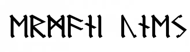
A geometric, blocky font with uniform line thickness and sharp angles.
 Herunterladen 527 Downloads@WebFont
 -
![Germanic Runes Frei Schriftart Herunterladen]() Herunterladen 527 Downloads
Herunterladen 527 Downloads -
( Fonts by Darko Kuzmanović )
A playful, rounded font with smooth curves and a friendly appearance.
![Loosey Sans Frei Schriftart Herunterladen]() Herunterladen 527 Downloads@WebFont
Herunterladen 527 Downloads@WebFont -
( Fonts by www.blambot.com )
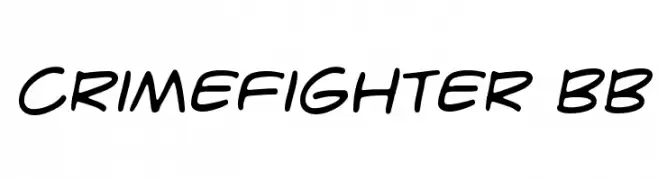
A bold, handwritten-style font with smooth, fluid strokes.
![CrimeFighter BB Frei Schriftart Herunterladen]() Herunterladen 527 Downloads@WebFont
Herunterladen 527 Downloads@WebFont -
( Fonts by Andi Moz )
Elegant script font with decorative flourishes.
![Blueline Frei Schriftart Herunterladen]() Herunterladen 527 Downloads@WebFont
Herunterladen 527 Downloads@WebFont -
-
( Fonts by www.junkohanhero.com - Personal-use only. For commercial use please contact owner. )
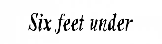
A bold, hand-drawn font with an expressive and artistic style.
![Six feet under Frei Schriftart Herunterladen]() Herunterladen 527 Downloads@WebFont
Herunterladen 527 Downloads@WebFont -
( Fonts by a Neale Davidson - www.pixelsagas.com. Personal-use only. For commercial use please contact owner. )
A pixelated, retro-style font ideal for nostalgic and tech-themed projects.
![Pixel Emulator Frei Schriftart Herunterladen]() Herunterladen 527 Downloads@WebFont
Herunterladen 527 Downloads@WebFont -
( Fonts by Daniel Zadorozny - www.iconian.com - Free for personal use )
A bold, geometric, and futuristic font with a condensed structure.
![Gemina Condensed Frei Schriftart Herunterladen]() Herunterladen 527 Downloads@WebFont
Herunterladen 527 Downloads@WebFont -
( Fonts by NJ Studio - Personal-use only. For commercial use please contact owner. )
A lively, flowing script font with elegant, cursive letterforms.
![feather Frei Schriftart Herunterladen]() Herunterladen 527 Downloads@WebFont
Herunterladen 527 Downloads@WebFont -
![splatter Frei Schriftart Herunterladen]() Herunterladen 527 Downloads@WebFont
Herunterladen 527 Downloads@WebFont


Welche Schriften sind gerade am populärsten?
Poppins, Roboto, Montserrat, Open Sans und Lato sind wegen ihrer klaren Formen und breiten Einsetzbarkeit sehr gefragt – von Markenauftritt über Landingpages bis hin zu Postern.
Welche Fonts eignen sich für Logos?
Geometrische Sans‑Serifs (z. B. Poppins, Familien im Gotham‑Stil) sind ein häufiger Griff für sauberes, skalierbares Branding. Für eine persönlichere Note bleiben Scripts und Handschrift‑Stile beliebt. Kombinieren Sie einen prägnanten Headline‑Font mit einer neutralen Brotschrift für Wiedererkennung und Harmonie.
Wie oft wird die Top‑Liste aktualisiert?
Regelmäßig – basierend auf realen Downloads und Interaktionen. Schauen Sie öfter vorbei, um aufstrebende Favoriten früh zu entdecken.
💡 Tipp: Seite bookmarken – Trends wechseln schnell, und heutige Top‑Schriften inspirieren morgen vielleicht das Rebranding.