Willkommen bei den Top‑Schriften – hier treffen Beliebtheit und Qualität aufeinander. Das sind die in diesem Jahr am häufigsten heruntergeladenen und genutzten Fonts. Wenn Sie sichere Optionen für Logo, Web oder Social suchen, starten Sie hier.
Jeder Top‑Font überzeugt durch Balance, Lesbarkeit und Vielseitigkeit. Sie finden moderne Sans‑Serifs, elegante Scripts, Vintage‑Serifs und minimalistische Displays.
-
( Copyright (c) 2015 Indian Type Foundry (info@indiantypefoundry.com) )
A bold, geometric font with sharp angles and consistent stroke width.
 Herunterladen 527 Downloads@WebFont
 -
![TheFaultInOurStars Frei Schriftart Herunterladen]() Herunterladen 527 Downloads@WebFont
Herunterladen 527 Downloads@WebFont -
( Fonts by Jeff Levine. FREEWARE )
A decorative display font inspired by vintage theater signs with an Art Deco flair.
![Vaudeville Theater Signs JL Frei Schriftart Herunterladen]() Herunterladen 527 Downloads@WebFont
Herunterladen 527 Downloads@WebFont -
( Fonts by Utopiafonts )
A whimsical, festive font with star-like embellishments and playful cutouts.
![Font in a Red Suit [The Christmas Font] Frei Schriftart Herunterladen]() Herunterladen 527 Downloads@WebFont
Herunterladen 527 Downloads@WebFont -
( Fonts by DumadiStyle )
A bold, dynamic font with a playful, edgy style and exaggerated serifs.
![Smooth Crime Frei Schriftart Herunterladen]() Herunterladen 527 Downloads@WebFont
Herunterladen 527 Downloads@WebFont -
-
( Fonts by www.typodermicfonts.com - Ray Larabie )
A classic serif font with a modern touch, offering elegance and versatility.
![CreditValley-Regular Frei Schriftart Herunterladen]() Herunterladen 527 Downloads@WebFont
Herunterladen 527 Downloads@WebFont -
( Fonts by typenotfound )
A geometric, blocky font with uniform line thickness and sharp angles.
![Dropy Frei Schriftart Herunterladen]() Herunterladen 527 Downloads@WebFont
Herunterladen 527 Downloads@WebFont -
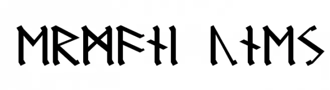
![Germanic Runes Frei Schriftart Herunterladen]() Herunterladen 527 Downloads
Herunterladen 527 Downloads -
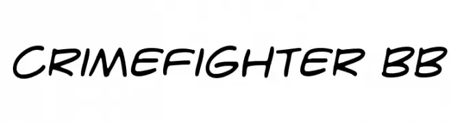
( Fonts by www.blambot.com )
A bold, handwritten-style font with smooth, fluid strokes.
![CrimeFighter BB Frei Schriftart Herunterladen]() Herunterladen 527 Downloads@WebFont
Herunterladen 527 Downloads@WebFont -
( Fonts by Andi Moz )
Elegant script font with decorative flourishes.
![Blueline Frei Schriftart Herunterladen]() Herunterladen 527 Downloads@WebFont
Herunterladen 527 Downloads@WebFont

![Font in a Red Suit [The Christmas Font] Frei Schriftart Herunterladen](https://d144mzi0q5mijx.cloudfront.net/img/F/O/Font-in-a-Red-Suit-The-Christmas-Font.webp)


Welche Schriften sind gerade am populärsten?
Poppins, Roboto, Montserrat, Open Sans und Lato sind wegen ihrer klaren Formen und breiten Einsetzbarkeit sehr gefragt – von Markenauftritt über Landingpages bis hin zu Postern.
Welche Fonts eignen sich für Logos?
Geometrische Sans‑Serifs (z. B. Poppins, Familien im Gotham‑Stil) sind ein häufiger Griff für sauberes, skalierbares Branding. Für eine persönlichere Note bleiben Scripts und Handschrift‑Stile beliebt. Kombinieren Sie einen prägnanten Headline‑Font mit einer neutralen Brotschrift für Wiedererkennung und Harmonie.
Wie oft wird die Top‑Liste aktualisiert?
Regelmäßig – basierend auf realen Downloads und Interaktionen. Schauen Sie öfter vorbei, um aufstrebende Favoriten früh zu entdecken.
💡 Tipp: Seite bookmarken – Trends wechseln schnell, und heutige Top‑Schriften inspirieren morgen vielleicht das Rebranding.