Willkommen bei den Top‑Schriften – hier treffen Beliebtheit und Qualität aufeinander. Das sind die in diesem Jahr am häufigsten heruntergeladenen und genutzten Fonts. Wenn Sie sichere Optionen für Logo, Web oder Social suchen, starten Sie hier.
Jeder Top‑Font überzeugt durch Balance, Lesbarkeit und Vielseitigkeit. Sie finden moderne Sans‑Serifs, elegante Scripts, Vintage‑Serifs und minimalistische Displays.
-
 Herunterladen 485 Downloads@WebFont
 -
( Fonts by Alan Carr )
A bold decorative font made up of filled arrow symbols in diverse styles.
![Carr Arrows [filled] Frei Schriftart Herunterladen]() Herunterladen 485 Downloads@WebFont
Herunterladen 485 Downloads@WebFont -
( Fonts by Md Shohail Bhuian )
A playful, bold font with rounded, thick strokes and a friendly appearance.
![Juicy Fruit Frei Schriftart Herunterladen]() Herunterladen 485 Downloads@WebFont
Herunterladen 485 Downloads@WebFont -
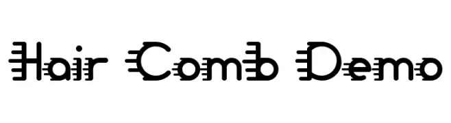
( Fonts by Noah Type )
A playful, decorative font with comb-like horizontal lines extending from each character.
![Hair Comb Demo Frei Schriftart Herunterladen]() Herunterladen 485 Downloads@WebFont
Herunterladen 485 Downloads@WebFont -
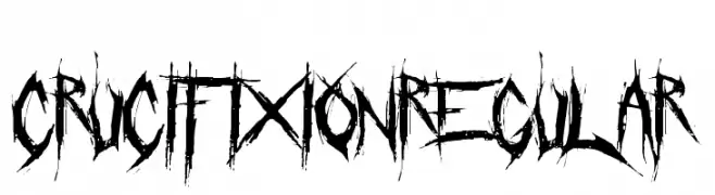
( Fonts by Chris Vile - fontmonger.com - Personal-use only. For commercial use please contact owner. )
A distressed, jagged font with a chaotic and rebellious style.
![Crucifixion Regular Frei Schriftart Herunterladen]() Herunterladen 485 Downloads@WebFont
Herunterladen 485 Downloads@WebFont -
-
![Sun Frei Schriftart Herunterladen]() Herunterladen 485 Downloads@WebFont
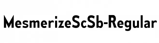
Herunterladen 485 Downloads@WebFont -
( Typodermic Fonts - Ray Larabie - www.typodermicfonts.com/ )
A bold, modern sans-serif font with clean lines and strong presence.
![MesmerizeScSb-Regular Frei Schriftart Herunterladen]() Herunterladen 485 Downloads@WebFont
Herunterladen 485 Downloads@WebFont -
( Fonts by Carolina Valtuille )
A playful, bold font with rounded, hand-drawn characters.
![Boquerón Regular Frei Schriftart Herunterladen]() Herunterladen 485 Downloads@WebFont
Herunterladen 485 Downloads@WebFont -
( Fonts by Hanoded )
A playful, hand-drawn font with bold outlines and a whimsical style.
![DKRosyLee Frei Schriftart Herunterladen]() Herunterladen 485 Downloads@WebFont
Herunterladen 485 Downloads@WebFont -
( Fonts by Manfred Klein Fonteria )
A classic serif font with bold, authoritative characters and sharp serifs.
![JustOldFashion Frei Schriftart Herunterladen]() Herunterladen 485 Downloads@WebFont
Herunterladen 485 Downloads@WebFont
![Carr Arrows [filled] Frei Schriftart Herunterladen](https://d144mzi0q5mijx.cloudfront.net/img/C/A/Carr-Arrows-filled.webp)


Welche Schriften sind gerade am populärsten?
Poppins, Roboto, Montserrat, Open Sans und Lato sind wegen ihrer klaren Formen und breiten Einsetzbarkeit sehr gefragt – von Markenauftritt über Landingpages bis hin zu Postern.
Welche Fonts eignen sich für Logos?
Geometrische Sans‑Serifs (z. B. Poppins, Familien im Gotham‑Stil) sind ein häufiger Griff für sauberes, skalierbares Branding. Für eine persönlichere Note bleiben Scripts und Handschrift‑Stile beliebt. Kombinieren Sie einen prägnanten Headline‑Font mit einer neutralen Brotschrift für Wiedererkennung und Harmonie.
Wie oft wird die Top‑Liste aktualisiert?
Regelmäßig – basierend auf realen Downloads und Interaktionen. Schauen Sie öfter vorbei, um aufstrebende Favoriten früh zu entdecken.
💡 Tipp: Seite bookmarken – Trends wechseln schnell, und heutige Top‑Schriften inspirieren morgen vielleicht das Rebranding.