Willkommen bei den Top‑Schriften – hier treffen Beliebtheit und Qualität aufeinander. Das sind die in diesem Jahr am häufigsten heruntergeladenen und genutzten Fonts. Wenn Sie sichere Optionen für Logo, Web oder Social suchen, starten Sie hier.
Jeder Top‑Font überzeugt durch Balance, Lesbarkeit und Vielseitigkeit. Sie finden moderne Sans‑Serifs, elegante Scripts, Vintage‑Serifs und minimalistische Displays.
-
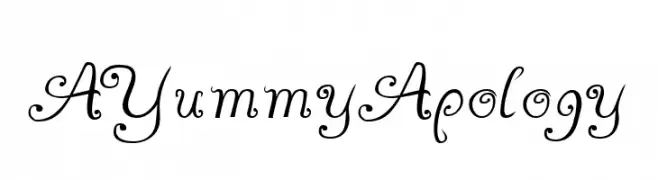
( Fonts by GemFonts - Typotheticals - Graham Meade - Personal-use only. For commercial use please contact owner. )
An elegant, decorative script font with intricate swirls and embellishments.
 Herunterladen 75 Downloads@WebFont
 -
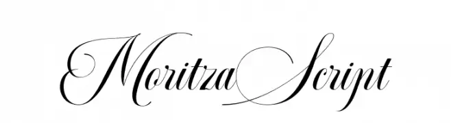
( Fonts by Teuku Rinaldi Novianda - Personal-use only. For commercial use please contact owner. )
An elegant script font with flowing letterforms and intricate swashes.
![MoritzaScript Frei Schriftart Herunterladen]() Herunterladen 75 Downloads@WebFont
Herunterladen 75 Downloads@WebFont -
( Fonts by Inermedia Studio )
Elegant handwritten script font.
![Kikio Frei Schriftart Herunterladen]() Herunterladen 75 Downloads@WebFont
Herunterladen 75 Downloads@WebFont -
( Fonts by Fanastudio - Personal-use only. For commercial use please contact owner. )
An elegant and flowing script font with graceful curves and loops.
![Viona Frei Schriftart Herunterladen]() Herunterladen 75 Downloads@WebFont
Herunterladen 75 Downloads@WebFont -
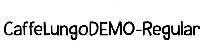
( Fonts by Hanoded - David Kerkhoff - Personal-use only. For commercial use please contact owner. )
A playful, hand-drawn font with rounded edges and unique coffee cup icons.
![CaffeLungoDEMO-Regular Frei Schriftart Herunterladen]() Herunterladen 75 Downloads@WebFont
Herunterladen 75 Downloads@WebFont -
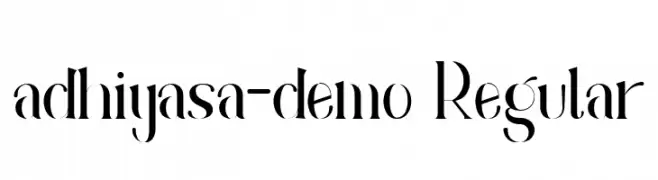
( Fonts by Irfan Hidayat - Personal-use only. For commercial use please contact owner. )
A high-contrast, elegant font with modern and classic elements.
![adhiyasa-demo Regular Frei Schriftart Herunterladen]() Herunterladen 75 Downloads@WebFont
Herunterladen 75 Downloads@WebFont -
( CrazeCo.com.au - Craze™ Co - CrazeCo.com.au )
A bold, playful handwritten font with thick, rounded strokes and a lively appearance.
![Mop Top Frei Schriftart Herunterladen]() Herunterladen 75 Downloads@WebFont
Herunterladen 75 Downloads@WebFont -
( Fonts by Sreekumar M )
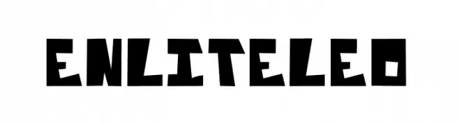
A bold, angular font with geometric shapes and a striking, edgy design.
![Enliteleo Frei Schriftart Herunterladen]() Herunterladen 75 Downloads@WebFont
Herunterladen 75 Downloads@WebFont -
![Eszty Script Demo Frei Schriftart Herunterladen]() Herunterladen 75 Downloads@WebFont
Herunterladen 75 Downloads@WebFont -
( Fonts by Vladimir Nikolic - https://www.creativefabrica.com/product/educated-deers/ref/144265/ - Personal-use only. For commercial use please contact owner. )
A bold, italic font with a dynamic and modern style.
![Housebreak Italic Frei Schriftart Herunterladen]() Herunterladen 75 Downloads@WebFont
Herunterladen 75 Downloads@WebFont -
( Fonts by Mister Chek - Andrey Chernevich - Personal-use only. For commercial use please contact owner. )
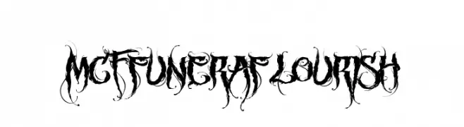
An ornate, gothic-style font with intricate flourishes and bold strokes.
![MCF funera flourish Frei Schriftart Herunterladen]() Herunterladen 75 Downloads@WebFont
Herunterladen 75 Downloads@WebFont -
( Blue Jay Font Studio - katzfonts.50megs.com/bj1.html )
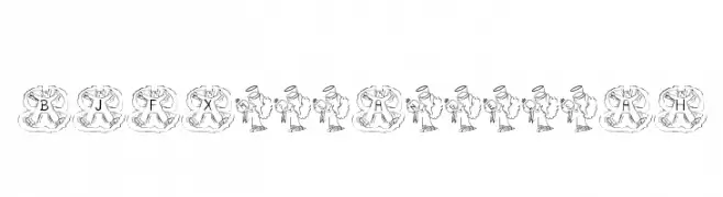
A decorative font with angel illustrations for each character, perfect for festive designs.
![BJF Xmas Angels AH Frei Schriftart Herunterladen]() Herunterladen 75 Downloads@WebFont
Herunterladen 75 Downloads@WebFont -
( Fonts by Hawtpixel )
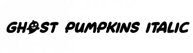
A bold, playful font with ghostly elements and a Halloween theme.
![Ghost Pumpkins Italic Frei Schriftart Herunterladen]() Herunterladen 75 Downloads@WebFont
Herunterladen 75 Downloads@WebFont -
( Noto is a trademark of Google Inc. Noto fonts are open source. All Noto fonts are published under the SIL Open Font License, Version 1.1 )
A clean, thin, and modern font ideal for digital interfaces.
![Noto Sans Bengali UI Thin Frei Schriftart Herunterladen]() Herunterladen 75 Downloads@WebFont
Herunterladen 75 Downloads@WebFont -
( Fonts by Namara Creative Studio - Personal-use only. For commercial use please contact owner. )
A casual, elegant handwritten font with fluid, connected letters.
![The Coastal Frei Schriftart Herunterladen]() Herunterladen 75 Downloads@WebFont
Herunterladen 75 Downloads@WebFont -
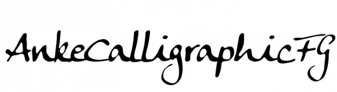
( Fonts by FontGrube AH - Andreas Höfeld - Personal-use only. For commercial use please contact owner. )
A dynamic calligraphic font with elegant, flowing strokes.
![Anke Calligraphic FG Frei Schriftart Herunterladen]() Herunterladen 75 Downloads@WebFont
Herunterladen 75 Downloads@WebFont -
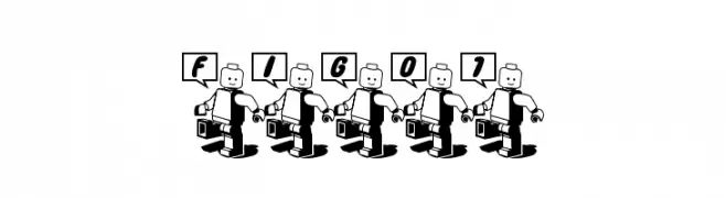
( 05cube - www.age.ne.jp/x/ishi/05cube.htm )
A playful, cartoonish font with characters held by a stylized figure.
![fig01 Frei Schriftart Herunterladen]() Herunterladen 75 Downloads@WebFont
Herunterladen 75 Downloads@WebFont -
![Electricity Personal Use Regular Frei Schriftart Herunterladen]() Herunterladen 75 Downloads@WebFont
Herunterladen 75 Downloads@WebFont -
( Fonts by AminMario - Amin Mario - Personal-use only. For commercial use please contact owner. )
An elegant script font with flowing, cursive letterforms and moderate contrast.
![Moline Frei Schriftart Herunterladen]() Herunterladen 75 Downloads@WebFont
Herunterladen 75 Downloads@WebFont -
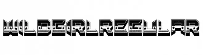
( Fonts by Vladimir Nikolic )
A bold, decorative font with a 3D effect and star embellishments.
![Wild Girl Regular Frei Schriftart Herunterladen]() Herunterladen 75 Downloads@WebFont
Herunterladen 75 Downloads@WebFont -
( Fonts by weknow - Wino S Kadir - Personal-use only. For commercial use please contact owner. )
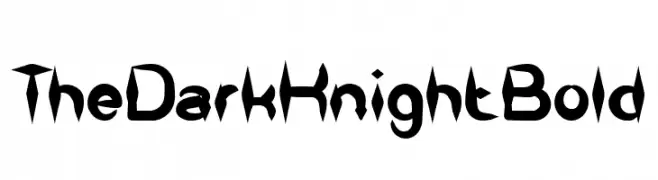
A bold, edgy font with sharp, angular elements for dramatic impact.
![The Dark Knight Bold Frei Schriftart Herunterladen]() Herunterladen 75 Downloads@WebFont
Herunterladen 75 Downloads@WebFont -
( Fonts by GemFonts - Typotheticals - Graham Meade - Personal-use only. For commercial use please contact owner. )
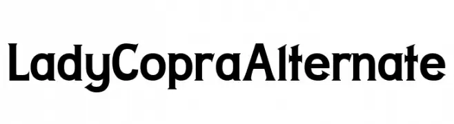
A bold serif font with a classic yet modern appeal, perfect for impactful headlines.
![Lady Copra Alternate Frei Schriftart Herunterladen]() Herunterladen 75 Downloads@WebFont
Herunterladen 75 Downloads@WebFont -
( Fonts by Woodcutter )
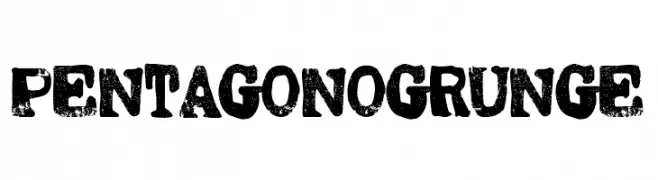
A bold, distressed font with a grunge aesthetic and textured appearance.
![Pentagono Grunge Frei Schriftart Herunterladen]() Herunterladen 75 Downloads@WebFont
Herunterladen 75 Downloads@WebFont -
( Fonts by Indriyanti - Personal-use only. For commercial use please contact owner. )
A graceful script font with fluid, cursive strokes and elegant curves.
![Nofhistica Frei Schriftart Herunterladen]() Herunterladen 75 Downloads@WebFont
Herunterladen 75 Downloads@WebFont -
( Fonts by Kat`s Fun Fonts - Personal-use only. For commercial use please contact owner. )
A decorative font with playful holiday-themed icons.
![KR More Holidays Frei Schriftart Herunterladen]() Herunterladen 75 Downloads@WebFont
Herunterladen 75 Downloads@WebFont -
( Fonts by kizzles the cat - Personal-use only. For commercial use please contact owner. )
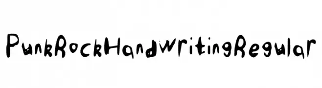
A bold, hand-drawn font with a punk rock vibe and irregular, dynamic shapes.
![Punk Rock Handwriting Regular Frei Schriftart Herunterladen]() Herunterladen 75 Downloads@WebFont
Herunterladen 75 Downloads@WebFont -
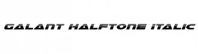
( Iconian Fonts - Daniel Zadorozny - www.iconian.com )
A bold, italicized font with a halftone effect, ideal for modern and dynamic designs.
![Galant Halftone Italic Frei Schriftart Herunterladen]() Herunterladen 75 Downloads@WebFont
Herunterladen 75 Downloads@WebFont -
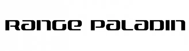
( Iconian Fonts - Daniel Zadorozny - www.iconian.com )
A bold, futuristic font with geometric and angular design elements.
![Range Paladin Frei Schriftart Herunterladen]() Herunterladen 75 Downloads@WebFont
Herunterladen 75 Downloads@WebFont -
( Fonts by Khurasan )
A bold, playful font with a hand-drawn, quirky style.
![Newyear Coffee Frei Schriftart Herunterladen]() Herunterladen 75 Downloads@WebFont
Herunterladen 75 Downloads@WebFont -
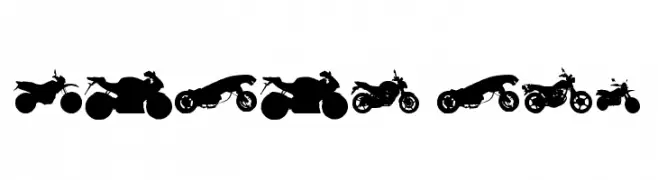
( Fonts by Zanatlija - Personal-use only. For commercial use please contact owner. )
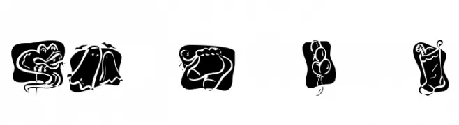
Motorcycle silhouette dingbat font.
![motos tfb Frei Schriftart Herunterladen]() Herunterladen 75 Downloads@WebFont
Herunterladen 75 Downloads@WebFont -
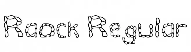
( Fonts by Rakhna Hideny )
A playful, bubble-like font with interconnected strokes and an artistic flair.
![Raock Regular Frei Schriftart Herunterladen]() Herunterladen 75 Downloads@WebFont
Herunterladen 75 Downloads@WebFont -
( Noto is a trademark of Google Inc. Noto fonts are open source. All Noto fonts are published under the SIL Open Font License, Version 1.1 )
Invalid font sample; only placeholder glyphs are visible.
![Noto Sans Thai UI SemiCondensed SemiBold Frei Schriftart Herunterladen]() Herunterladen 75 Downloads@WebFont
Herunterladen 75 Downloads@WebFont -
![Broken Black Condensed Frei Schriftart Herunterladen]() Herunterladen 75 Downloads@WebFont
Herunterladen 75 Downloads@WebFont -
( Josen Tan - www.roblox.com )
A bold, geometric font with angular letterforms and a strong, modern aesthetic.
![xxjjoosengx33xx Bold Frei Schriftart Herunterladen]() Herunterladen 75 Downloads@WebFont
Herunterladen 75 Downloads@WebFont -
( Fonts by Biham Santoso - Personal-use only. For commercial use please contact owner. )
A classic serif font with bold strokes and high contrast, ideal for formal and authoritative designs.
![Blighia Frei Schriftart Herunterladen]() Herunterladen 75 Downloads@WebFont
Herunterladen 75 Downloads@WebFont


Welche Schriften sind gerade am populärsten?
Poppins, Roboto, Montserrat, Open Sans und Lato sind wegen ihrer klaren Formen und breiten Einsetzbarkeit sehr gefragt – von Markenauftritt über Landingpages bis hin zu Postern.
Welche Fonts eignen sich für Logos?
Geometrische Sans‑Serifs (z. B. Poppins, Familien im Gotham‑Stil) sind ein häufiger Griff für sauberes, skalierbares Branding. Für eine persönlichere Note bleiben Scripts und Handschrift‑Stile beliebt. Kombinieren Sie einen prägnanten Headline‑Font mit einer neutralen Brotschrift für Wiedererkennung und Harmonie.
Wie oft wird die Top‑Liste aktualisiert?
Regelmäßig – basierend auf realen Downloads und Interaktionen. Schauen Sie öfter vorbei, um aufstrebende Favoriten früh zu entdecken.
💡 Tipp: Seite bookmarken – Trends wechseln schnell, und heutige Top‑Schriften inspirieren morgen vielleicht das Rebranding.