Willkommen bei den Top‑Schriften – hier treffen Beliebtheit und Qualität aufeinander. Das sind die in diesem Jahr am häufigsten heruntergeladenen und genutzten Fonts. Wenn Sie sichere Optionen für Logo, Web oder Social suchen, starten Sie hier.
Jeder Top‑Font überzeugt durch Balance, Lesbarkeit und Vielseitigkeit. Sie finden moderne Sans‑Serifs, elegante Scripts, Vintage‑Serifs und minimalistische Displays.
-
Schriftart von defharo. For commercial use please contact the owner.
 Herunterladen 462 Downloads@WebFont
 -
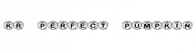
![KR Perfect Pumpkin Frei Schriftart Herunterladen]() Herunterladen 462 Downloads@WebFont
Herunterladen 462 Downloads@WebFont -
( Fonts by Zetafonts )
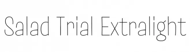
A clean, minimalist font with thin, uniform strokes and a modern aesthetic.
![Salad Trial Extralight Frei Schriftart Herunterladen]() Herunterladen 462 Downloads@WebFont
Herunterladen 462 Downloads@WebFont -
( Fonts by Febri_Creative - Febrianto Yuwono - Personal-use only. For commercial use please contact owner. )
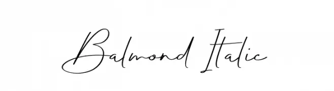
A flowing, cursive script font with elegant, connected characters.
![Balmond Italic Frei Schriftart Herunterladen]() Herunterladen 462 Downloads@WebFont
Herunterladen 462 Downloads@WebFont -
( Fonts by Raul Andres Perez Canseco [Grafito Design] - Personal-use only. For commercial use please contact owner. )
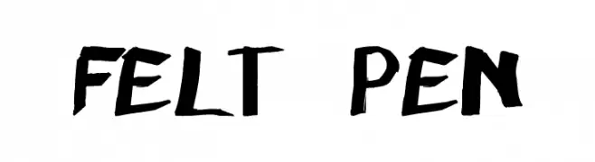
A bold, hand-drawn style font with an expressive and dynamic feel.
![felt pen Frei Schriftart Herunterladen]() Herunterladen 462 Downloads@WebFont
Herunterladen 462 Downloads@WebFont -
-
( Fonts by Subectype & Orenari )
A playful, bold font with rounded, bubbly characters perfect for informal designs.
![HolaZozo Frei Schriftart Herunterladen]() Herunterladen 462 Downloads@WebFont
Herunterladen 462 Downloads@WebFont -
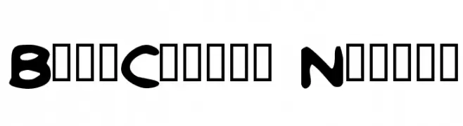
![BritComics Normal Frei Schriftart Herunterladen]() Herunterladen 462 Downloads@WebFont
Herunterladen 462 Downloads@WebFont -
( Fonts by Rick Mueller )
A bold, distressed font with star patterns and a vintage feel.
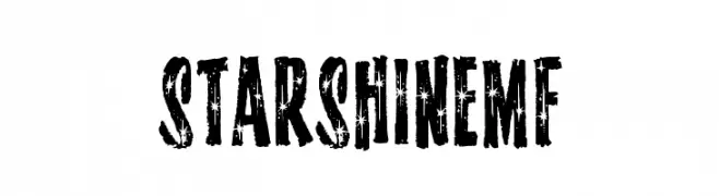
![StarshineMF Frei Schriftart Herunterladen]() Herunterladen 462 Downloads@WebFont
Herunterladen 462 Downloads@WebFont -
( Fonts by CannotIntoSpaceFonts - KineticPlasma Fonts - Personal-use only. For commercial use please contact owner. )
A bold, oblique font with a dynamic and energetic style.
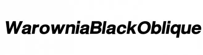
![Warownia Black Oblique Frei Schriftart Herunterladen]() Herunterladen 462 Downloads@WebFont
Herunterladen 462 Downloads@WebFont -
( Darrell Flood )
A bold, impactful font with strong, thick strokes and geometric shapes.
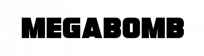
![Megabomb Frei Schriftart Herunterladen]() Herunterladen 462 Downloads@WebFont
Herunterladen 462 Downloads@WebFont

Welche Schriften sind gerade am populärsten?
Poppins, Roboto, Montserrat, Open Sans und Lato sind wegen ihrer klaren Formen und breiten Einsetzbarkeit sehr gefragt – von Markenauftritt über Landingpages bis hin zu Postern.
Welche Fonts eignen sich für Logos?
Geometrische Sans‑Serifs (z. B. Poppins, Familien im Gotham‑Stil) sind ein häufiger Griff für sauberes, skalierbares Branding. Für eine persönlichere Note bleiben Scripts und Handschrift‑Stile beliebt. Kombinieren Sie einen prägnanten Headline‑Font mit einer neutralen Brotschrift für Wiedererkennung und Harmonie.
Wie oft wird die Top‑Liste aktualisiert?
Regelmäßig – basierend auf realen Downloads und Interaktionen. Schauen Sie öfter vorbei, um aufstrebende Favoriten früh zu entdecken.
💡 Tipp: Seite bookmarken – Trends wechseln schnell, und heutige Top‑Schriften inspirieren morgen vielleicht das Rebranding.