Willkommen bei den Top‑Schriften – hier treffen Beliebtheit und Qualität aufeinander. Das sind die in diesem Jahr am häufigsten heruntergeladenen und genutzten Fonts. Wenn Sie sichere Optionen für Logo, Web oder Social suchen, starten Sie hier.
Jeder Top‑Font überzeugt durch Balance, Lesbarkeit und Vielseitigkeit. Sie finden moderne Sans‑Serifs, elegante Scripts, Vintage‑Serifs und minimalistische Displays.
-
( Fonts by Alit Suarnegara - Alit Design - www.alitdesign.net - Personal-use only. For commercial use please contact owner. )
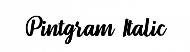
A bold, italic script font with connected letters and a dynamic style.
 Herunterladen 455 Downloads@WebFont
 -
( Fonts by Woodcutter )
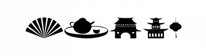
Iconic dingbat font showcasing Chinese cultural symbols.
![China Frei Schriftart Herunterladen]() Herunterladen 455 Downloads@WebFont
Herunterladen 455 Downloads@WebFont -
( Fonts by Lettersiro Studio )
A playful, bold, and cartoonish font with rounded, hand-drawn characters.
![Monster World Frei Schriftart Herunterladen]() Herunterladen 455 Downloads@WebFont
Herunterladen 455 Downloads@WebFont -
Schriftart von HammerBro101. For commercial use please contact the owner.
![Trak-SemiBoldItalic Frei Schriftart Herunterladen]() Herunterladen 455 Downloads@WebFont
Herunterladen 455 Downloads@WebFont -
( Fonts by Maelle.K - Thomas Boucherie )
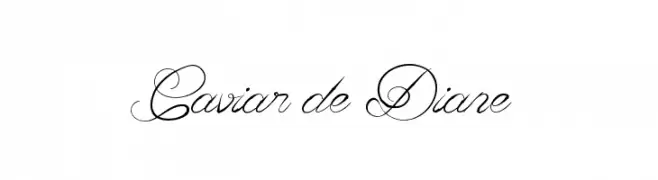
An elegant script font with intricate flourishes and a refined style.
![Caviar de Diane Frei Schriftart Herunterladen]() Herunterladen 455 Downloads@WebFont
Herunterladen 455 Downloads@WebFont -
-
![Spy Lord Frei Schriftart Herunterladen]() Herunterladen 455 Downloads@WebFont
Herunterladen 455 Downloads@WebFont -
Schriftart von HammerBro101. For commercial use please contact the owner.
![LubalinGraphStd-BoldCondObl Frei Schriftart Herunterladen]() Herunterladen 455 Downloads@WebFont
Herunterladen 455 Downloads@WebFont -
Schriftart von twinletter. For commercial use please contact the owner.
( This font is free for PERSONAL USE only. My fonts for free use allowed only in personal project , non-profit and charity use. But any donation are very appreciated. PayPal account for donation : https://paypal.me/abahrozi Download Commercial License If )
A bold, playful script font with rounded strokes and a friendly, handwritten style.
![Bester Keefi Personal Use Frei Schriftart Herunterladen]() Herunterladen 455 Downloads@WebFont
Herunterladen 455 Downloads@WebFont -
( Fonts by Arkandis Digital Foundry )
A classic italic serif typeface with elegant curves and a refined appearance.
![VenturisADFCd-Italic Frei Schriftart Herunterladen]() Herunterladen 454 Downloads@WebFont
Herunterladen 454 Downloads@WebFont -
( Fonts by Tigadestd )
A bold, playful font with rounded, hand-drawn characters.
![Little Paws Frei Schriftart Herunterladen]() Herunterladen 454 Downloads@WebFont
Herunterladen 454 Downloads@WebFont

Welche Schriften sind gerade am populärsten?
Poppins, Roboto, Montserrat, Open Sans und Lato sind wegen ihrer klaren Formen und breiten Einsetzbarkeit sehr gefragt – von Markenauftritt über Landingpages bis hin zu Postern.
Welche Fonts eignen sich für Logos?
Geometrische Sans‑Serifs (z. B. Poppins, Familien im Gotham‑Stil) sind ein häufiger Griff für sauberes, skalierbares Branding. Für eine persönlichere Note bleiben Scripts und Handschrift‑Stile beliebt. Kombinieren Sie einen prägnanten Headline‑Font mit einer neutralen Brotschrift für Wiedererkennung und Harmonie.
Wie oft wird die Top‑Liste aktualisiert?
Regelmäßig – basierend auf realen Downloads und Interaktionen. Schauen Sie öfter vorbei, um aufstrebende Favoriten früh zu entdecken.
💡 Tipp: Seite bookmarken – Trends wechseln schnell, und heutige Top‑Schriften inspirieren morgen vielleicht das Rebranding.