Willkommen bei den Top‑Schriften – hier treffen Beliebtheit und Qualität aufeinander. Das sind die in diesem Jahr am häufigsten heruntergeladenen und genutzten Fonts. Wenn Sie sichere Optionen für Logo, Web oder Social suchen, starten Sie hier.
Jeder Top‑Font überzeugt durch Balance, Lesbarkeit und Vielseitigkeit. Sie finden moderne Sans‑Serifs, elegante Scripts, Vintage‑Serifs und minimalistische Displays.
-
 Herunterladen 61 Downloads@WebFont
 -
( Fonts by www.chequered.ink - Chequered Ink - Personal-use only. For commercial use please contact owner. )
A bold, decorative font with a retro-futuristic style and intricate line work.
![Disco Everyday Value Regular Frei Schriftart Herunterladen]() Herunterladen 61 Downloads@WebFont
Herunterladen 61 Downloads@WebFont -
( Fonts by Perspectype Studio - Personal-use only. For commercial use please contact owner. )
A bold, cursive font with a handwritten, elegant style.
![Holiday Italic Frei Schriftart Herunterladen]() Herunterladen 61 Downloads@WebFont
Herunterladen 61 Downloads@WebFont -
( Fonts by Erik Studio - Personal-use only. For commercial use please contact owner. )
A playful, casual handwritten font with smooth, flowing lines and a whimsical touch.
![Journey Frei Schriftart Herunterladen]() Herunterladen 61 Downloads@WebFont
Herunterladen 61 Downloads@WebFont -
( Malvolio )
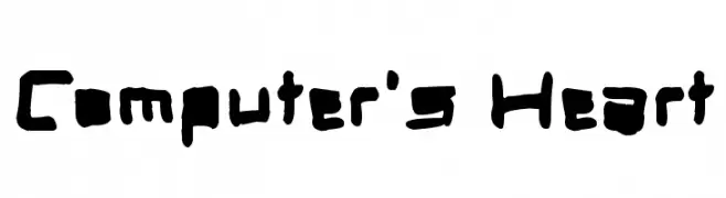
A bold, hand-drawn font with an artistic and playful style.
![Computer's Heart Frei Schriftart Herunterladen]() Herunterladen 61 Downloads@WebFont
Herunterladen 61 Downloads@WebFont -
( Tom Booth - www.badtown.co.uk/ )
A bold, geometric font with intricate triangular patterns.
![Sheff Frei Schriftart Herunterladen]() Herunterladen 61 Downloads@WebFont
Herunterladen 61 Downloads@WebFont -
( Fonts by Daniel Zadorozny - www.iconian.com - Personal-use only. For commercial use please contact owner. )
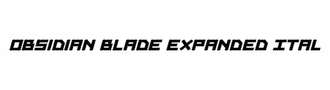
A bold, angular font with jagged edges and an expanded italic style.
![Obsidian Blade Expanded Ital Frei Schriftart Herunterladen]() Herunterladen 61 Downloads@WebFont
Herunterladen 61 Downloads@WebFont -
( Fonts by Din Studio - Donis Miftahudin - Personal-use only. For commercial use please contact owner. )
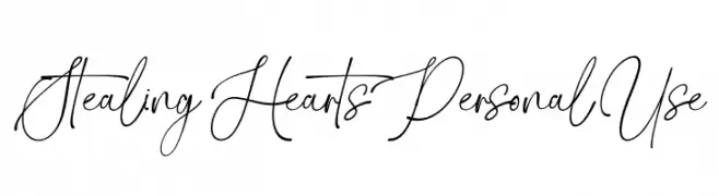
An elegant, flowing script font with high contrast and intricate letterforms.
![Stealing Hearts Personal Use Frei Schriftart Herunterladen]() Herunterladen 61 Downloads@WebFont
Herunterladen 61 Downloads@WebFont -
( Collection of Korean web fonts - Personal-use only. For commercial use please contact owner. )
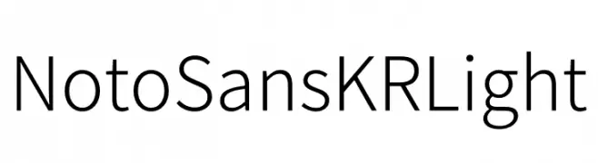
A clean, modern sans-serif font with a minimalistic and balanced design.
![Noto Sans KR Light Frei Schriftart Herunterladen]() Herunterladen 61 Downloads@WebFont
Herunterladen 61 Downloads@WebFont -
( Fonts by BrandSemut - A Sidiq - Personal-use only. For commercial use please contact owner. )
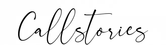
A flowing, elegant script font with a handwritten style.
![Callstories Frei Schriftart Herunterladen]() Herunterladen 61 Downloads@WebFont
Herunterladen 61 Downloads@WebFont -
( Fonts by DmLetter31 - Dimas Prasetyo - Personal-use only. For commercial use please contact owner. )
A bold, handwritten-style font with brush-like strokes and playful energy.
![Amavos Frei Schriftart Herunterladen]() Herunterladen 61 Downloads@WebFont
Herunterladen 61 Downloads@WebFont -
( Fonts by Letterhend Studio - Hendry Juanda - Personal-use only. For commercial use please contact owner. )
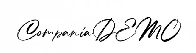
An elegant, flowing script font with interconnected, cursive strokes.
![CompaniaDEMO Frei Schriftart Herunterladen]() Herunterladen 61 Downloads@WebFont
Herunterladen 61 Downloads@WebFont -
( Fonts by Rahagita Studio - - Personal-use only. For commercial use please contact owner. )
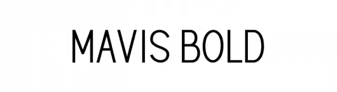
A bold, modern sans-serif font with a clean and geometric design.
![MAVIS Bold Frei Schriftart Herunterladen]() Herunterladen 61 Downloads@WebFont
Herunterladen 61 Downloads@WebFont -
( Fonts by Tomasz Skowronski - Personal-use only. For commercial use please contact owner. )
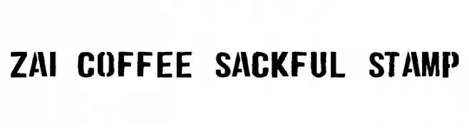
A bold, distressed font with a vintage industrial stamp style.
![zai Coffee Sackful Stamp Frei Schriftart Herunterladen]() Herunterladen 61 Downloads@WebFont
Herunterladen 61 Downloads@WebFont -
( Fonts by Zanatlija - Personal-use only. For commercial use please contact owner. )
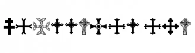
A decorative collection of diverse cross symbols with intricate designs.
![crossbats tfb Frei Schriftart Herunterladen]() Herunterladen 61 Downloads@WebFont
Herunterladen 61 Downloads@WebFont -
( Fonts by Daniel Zadorozny - www.iconian.com - Personal-use only. For commercial use please contact owner. )
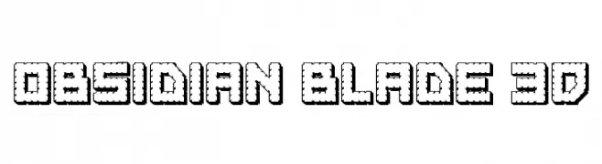
A bold, 3D font with a textured, serrated design and strong visual impact.
![Obsidian Blade 3D Frei Schriftart Herunterladen]() Herunterladen 61 Downloads@WebFont
Herunterladen 61 Downloads@WebFont -
( Iconian Fonts - Daniel Zadorozny - www.iconian.com )
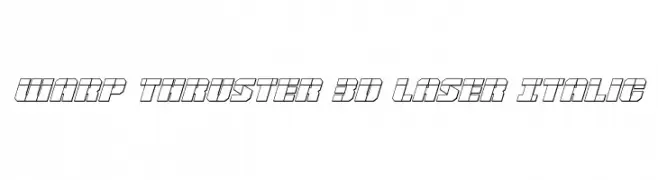
A futuristic 3D laser-cut italic font with bold, angular outlines.
![Warp Thruster 3D Laser Italic Frei Schriftart Herunterladen]() Herunterladen 61 Downloads@WebFont
Herunterladen 61 Downloads@WebFont -
( Fonts by Mr.Soon Design )
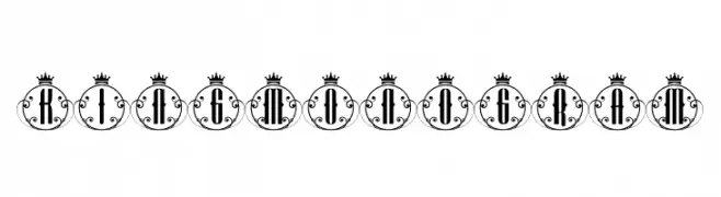
An ornate, regal font with crowned circular frames and intricate flourishes.
![King Monogram Frei Schriftart Herunterladen]() Herunterladen 61 Downloads@WebFont
Herunterladen 61 Downloads@WebFont -
( Fonts by Vladimir Nikolic - www.creativefabrica.com/designer/vladimirnikolic/ - Personal-use only. For commercial use please contact owner. )
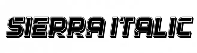
A bold, geometric font with a three-dimensional outline effect.
![Sierra Italic Frei Schriftart Herunterladen]() Herunterladen 61 Downloads@WebFont
Herunterladen 61 Downloads@WebFont -
( Fonts by a cenz qobbal - www.facebook.com/cenzqobbalfonts. Personal-use only. For commercial use please contact owner. )
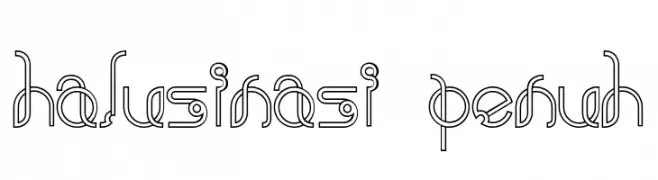
A futuristic and geometric font with continuous line designs and a modern aesthetic.
![halusinasi penuh Frei Schriftart Herunterladen]() Herunterladen 61 Downloads@WebFont
Herunterladen 61 Downloads@WebFont -
( Fonts by Mans Greback - Personal-use only. For commercial use please contact owner. )
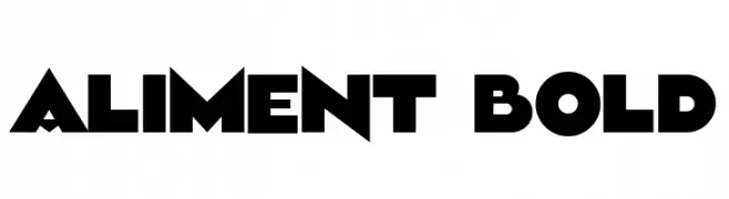
A bold, geometric font with sharp angles and a modern style.
![Aliment Bold Frei Schriftart Herunterladen]() Herunterladen 61 Downloads@WebFont
Herunterladen 61 Downloads@WebFont -
( Fonts by PutraCetol Studio )
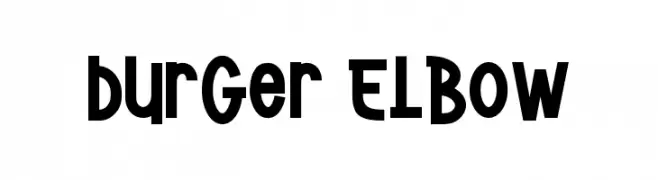
A bold, playful font with rounded, slightly condensed characters.
![Burger Elbow Frei Schriftart Herunterladen]() Herunterladen 61 Downloads@WebFont
Herunterladen 61 Downloads@WebFont -
( Noto is a trademark of Google Inc. Noto fonts are open source. All Noto fonts are published under the SIL Open Font License, Version 1.1 )
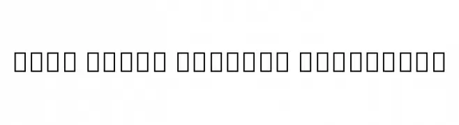
No valid font characters are visible.
![Noto Serif Myanmar Condensed Frei Schriftart Herunterladen]() Herunterladen 61 Downloads@WebFont
Herunterladen 61 Downloads@WebFont -
( Fonts by Daniel Zadorozny - www.iconian.com - Personal-use only. For commercial use please contact owner. )
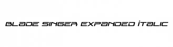
A futuristic, expanded italic font with a sleek, angular design.
![Blade Singer Expanded Italic Frei Schriftart Herunterladen]() Herunterladen 61 Downloads@WebFont
Herunterladen 61 Downloads@WebFont -
( Fonts by Sudarman Mulka - Personal-use only. For commercial use please contact owner. )
A playful, hand-drawn font with a sketch-like, informal style.
![Sketchies Frei Schriftart Herunterladen]() Herunterladen 61 Downloads@WebFont
Herunterladen 61 Downloads@WebFont -
( Noto is a trademark of Google Inc. Noto fonts are open source. All Noto fonts are published under the SIL Open Font License, Version 1.1 )
A semi-condensed, semi-bold font for the Myanmar script, offering modern and clear readability.
![Noto Sans Myanmar SemiCondensed SemiBold Frei Schriftart Herunterladen]() Herunterladen 61 Downloads@WebFont
Herunterladen 61 Downloads@WebFont -
( Fonts by Vladimir Nikolic )
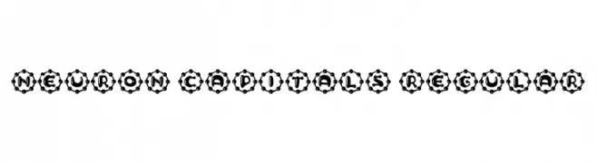
A bold, decorative font with gear-like circular enclosures around each character.
![Neuron Capitals Regular Frei Schriftart Herunterladen]() Herunterladen 61 Downloads@WebFont
Herunterladen 61 Downloads@WebFont -
( Fonts by Maulana Creative - Gilang Maulana - Personal-use only. For commercial use please contact owner. )
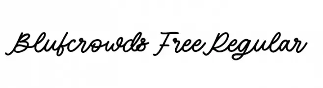
A flowing, cursive script font with a handwritten, elegant style.
![Blufcrowds Free Regular Frei Schriftart Herunterladen]() Herunterladen 61 Downloads@WebFont
Herunterladen 61 Downloads@WebFont -
( Fonts by Peter Wiegel - www.peter-wiegel.de - Personal-use only. For commercial use please contact owner. )
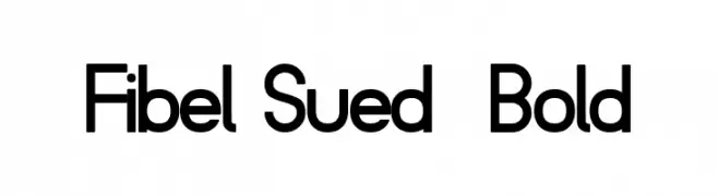
A bold, modern sans-serif font with clean lines and geometric shapes.
![Fibel Sued Bold Frei Schriftart Herunterladen]() Herunterladen 61 Downloads@WebFont
Herunterladen 61 Downloads@WebFont -
( Fonts by Aluyeah Studio - Personal-use only. For commercial use please contact owner. )
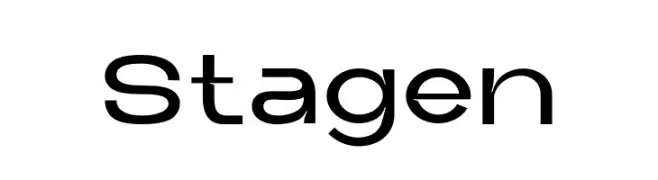
A modern, geometric font with clean lines and a minimalist style.
![Stagen Frei Schriftart Herunterladen]() Herunterladen 61 Downloads@WebFont
Herunterladen 61 Downloads@WebFont -
( Fonts by Wino S Kadir - weknow - www.revolge.com/shop/weknow/ - Personal-use only. For commercial use please contact owner. )
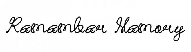
A flowing cursive font with elegant loops and connected characters.
![Remember Memory Frei Schriftart Herunterladen]() Herunterladen 61 Downloads@WebFont
Herunterladen 61 Downloads@WebFont -
( Fonts by Manjali Studio - Personal-use only. For commercial use please contact owner. )
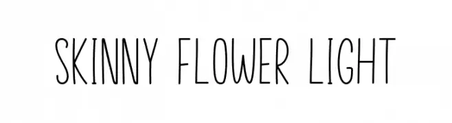
A tall, slender, and playful handwritten font with a modern touch.
![Skinny Flower Light Frei Schriftart Herunterladen]() Herunterladen 61 Downloads@WebFont
Herunterladen 61 Downloads@WebFont -
( Fonts by StringLabs - stringlabscreative.com - Personal-use only. For commercial use please contact owner. )
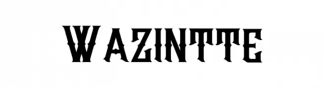
A bold, angular font with a gothic influence and dramatic style.
![Wazintte Frei Schriftart Herunterladen]() Herunterladen 61 Downloads@WebFont
Herunterladen 61 Downloads@WebFont -
( Digital Magic - www.graphicdesignplus.com/helen/digitalmagic/ )
Religious pictogram dingbat font with bold, high-contrast icons.
![Religious 2 Frei Schriftart Herunterladen]() Herunterladen 61 Downloads@WebFont
Herunterladen 61 Downloads@WebFont -
( Fonts by Woodcutter )
A bold, playful font with exaggerated, rounded forms and a whimsical style.
![Calypso Soundsystem Frei Schriftart Herunterladen]() Herunterladen 61 Downloads@WebFont
Herunterladen 61 Downloads@WebFont


Welche Schriften sind gerade am populärsten?
Poppins, Roboto, Montserrat, Open Sans und Lato sind wegen ihrer klaren Formen und breiten Einsetzbarkeit sehr gefragt – von Markenauftritt über Landingpages bis hin zu Postern.
Welche Fonts eignen sich für Logos?
Geometrische Sans‑Serifs (z. B. Poppins, Familien im Gotham‑Stil) sind ein häufiger Griff für sauberes, skalierbares Branding. Für eine persönlichere Note bleiben Scripts und Handschrift‑Stile beliebt. Kombinieren Sie einen prägnanten Headline‑Font mit einer neutralen Brotschrift für Wiedererkennung und Harmonie.
Wie oft wird die Top‑Liste aktualisiert?
Regelmäßig – basierend auf realen Downloads und Interaktionen. Schauen Sie öfter vorbei, um aufstrebende Favoriten früh zu entdecken.
💡 Tipp: Seite bookmarken – Trends wechseln schnell, und heutige Top‑Schriften inspirieren morgen vielleicht das Rebranding.