Willkommen bei den Top‑Schriften – hier treffen Beliebtheit und Qualität aufeinander. Das sind die in diesem Jahr am häufigsten heruntergeladenen und genutzten Fonts. Wenn Sie sichere Optionen für Logo, Web oder Social suchen, starten Sie hier.
Jeder Top‑Font überzeugt durch Balance, Lesbarkeit und Vielseitigkeit. Sie finden moderne Sans‑Serifs, elegante Scripts, Vintage‑Serifs und minimalistische Displays.
-
( Fonts by Misti's Fonts )
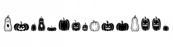
Whimsical pumpkin and jack-o'-lantern icon font.
 Herunterladen 58 Downloads@WebFont
 -
( Fonts by cropstudio - crop studio - Personal-use only. For commercial use please contact owner. )
An elegant and decorative script font with flowing, interconnected strokes.
![Gerhana Frei Schriftart Herunterladen]() Herunterladen 58 Downloads@WebFont
Herunterladen 58 Downloads@WebFont -
( imagex - www.imagex-fonts.com )
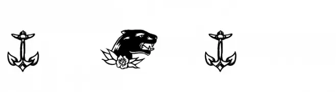
Tattoo flash art icons in a bold, hand-drawn style.
![True Man Tattoos Frei Schriftart Herunterladen]() Herunterladen 58 Downloads@WebFont
Herunterladen 58 Downloads@WebFont -
( Fonts by Ivan Gladkikh )
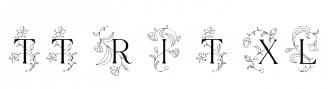
An elegant serif font with intricate floral embellishments.
![TT Ramillas Initials Trl XLt Frei Schriftart Herunterladen]() Herunterladen 58 Downloads@WebFont
Herunterladen 58 Downloads@WebFont -
( Fonts by StringLabs - stringlabscreative.com - Personal-use only. For commercial use please contact owner. )
A bold, playful handwritten font with thick, rounded strokes.
![Gotten Frei Schriftart Herunterladen]() Herunterladen 58 Downloads@WebFont
Herunterladen 58 Downloads@WebFont -
-
( Fonts by MrtheNoronha - Daniel Noronha - Personal-use only. For commercial use please contact owner. )
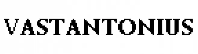
A bold, serif font with a classic yet modern style.
![Vastantonius Frei Schriftart Herunterladen]() Herunterladen 58 Downloads@WebFont
Herunterladen 58 Downloads@WebFont -
( PlumbobsandHolosprites - Flore Creations - plumbobsandholosprites.tumblr.com )
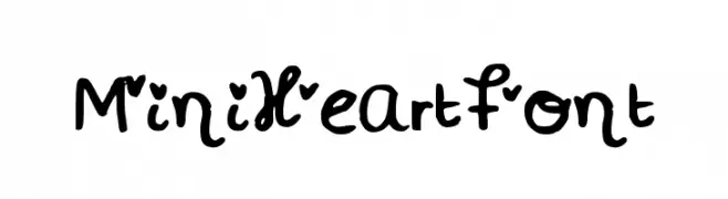
A playful, heart-themed font with bold, rounded characters and a hand-drawn style.
![MiniHeartFont Frei Schriftart Herunterladen]() Herunterladen 58 Downloads@WebFont
Herunterladen 58 Downloads@WebFont -
( Katz Fontz - katzfonts.50megs.com/kg.html )
A whimsical decorative font with cartoon characters integrated into each letter.
![EEK!_KG Frei Schriftart Herunterladen]() Herunterladen 58 Downloads@WebFont
Herunterladen 58 Downloads@WebFont -
( Fonts by Iconian Fonts )
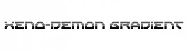
A futuristic, digital font with a bold, geometric design and gradient line effects.
![Xeno-Demon Gradient Frei Schriftart Herunterladen]() Herunterladen 58 Downloads@WebFont
Herunterladen 58 Downloads@WebFont -
( Fonts by Erik Studio - Personal-use only. For commercial use please contact owner. )
A lively and expressive script font with fluid, dynamic letterforms.
![Kamilla Frei Schriftart Herunterladen]() Herunterladen 58 Downloads@WebFont
Herunterladen 58 Downloads@WebFont -
( Fonts by Darrell Flood - Personal-use only. For commercial use please contact owner. )
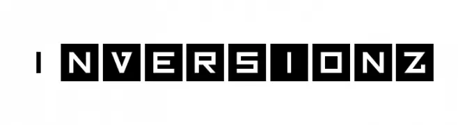
A bold, geometric font with a futuristic, digital aesthetic.
![Inversionz Frei Schriftart Herunterladen]() Herunterladen 58 Downloads@WebFont
Herunterladen 58 Downloads@WebFont -
( Intellecta Design - new.myfonts.com/search/intellecta/fonts/?sort=sales?refby=paulow )
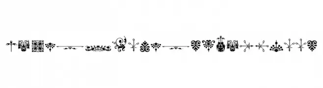
Ornamental floral and flourish dingbats with a vintage feel.
![Micro Fleurons Eighteen Frei Schriftart Herunterladen]() Herunterladen 58 Downloads@WebFont
Herunterladen 58 Downloads@WebFont -
( Fonts by twinletter )
A bold, playful font with rounded edges and a whimsical style.
![MILAYU Trial Regular Frei Schriftart Herunterladen]() Herunterladen 58 Downloads@WebFont
Herunterladen 58 Downloads@WebFont -
( Iconian Fonts - Daniel Zadorozny - www.iconian.com )
A bold, italic, futuristic font with sharp angles and a strong presence.
![Command Override Italic Frei Schriftart Herunterladen]() Herunterladen 58 Downloads@WebFont
Herunterladen 58 Downloads@WebFont -
( Fonts by Wahyu Eka Prasetya - wepfont.com - Personal-use only. For commercial use please contact owner. )
A graceful cursive font with elegant, flowing strokes and medium contrast.
![Equestrian Winter Frei Schriftart Herunterladen]() Herunterladen 58 Downloads@WebFont
Herunterladen 58 Downloads@WebFont -
( Fonts by Daniel Zadorozny - www.iconian.com - Personal-use only. For commercial use please contact owner. )
A bold, futuristic font with angular, geometric characters and an expanded width.
![Laser Corps Expanded Frei Schriftart Herunterladen]() Herunterladen 58 Downloads@WebFont
Herunterladen 58 Downloads@WebFont -
( Fonts by Maulana Creative - Gilang Maulana - Personal-use only. For commercial use please contact owner. )
A bold, hand-drawn script font with dynamic, interconnected strokes.
![Torches Free Regular Frei Schriftart Herunterladen]() Herunterladen 58 Downloads@WebFont
Herunterladen 58 Downloads@WebFont -
( Noto is a trademark of Google Inc. Noto fonts are open source. All Noto fonts are published under the SIL Open Font License, Version 1.1 )
No valid font is displayed.
![Noto Sans Lao Condensed ExtraLight Frei Schriftart Herunterladen]() Herunterladen 58 Downloads@WebFont
Herunterladen 58 Downloads@WebFont -
( weknow - Wino S Kadir - www.creativefabrica.com/designer/weknow/ )
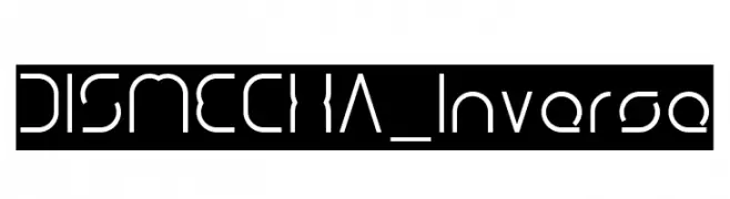
A futuristic, geometric font with clean lines and unique cut-out shapes.
![DISMECHA_Inverse Frei Schriftart Herunterladen]() Herunterladen 58 Downloads@WebFont
Herunterladen 58 Downloads@WebFont -
( Dan Smith's Fantasy Fonts - www.acondia.com/fonts/index.html )
A bold, abstract font with geometric and artistic elements.
![DS_Aqua 1 Frei Schriftart Herunterladen]() Herunterladen 58 Downloads
Herunterladen 58 Downloads -
( Fonts by Vladimir Nikolic - www.creativefabrica.com/designer/vladimirnikolic/ - Personal-use only. For commercial use please contact owner. )
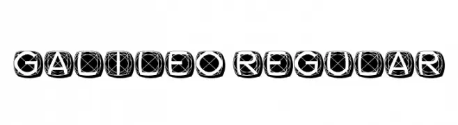
A bold, geometric font with characters enclosed in rounded squares and intricate line patterns.
![Galileo Regular Frei Schriftart Herunterladen]() Herunterladen 58 Downloads@WebFont
Herunterladen 58 Downloads@WebFont -
( font studio four - www.hellofont.com/fonts/843?a=EL1 )
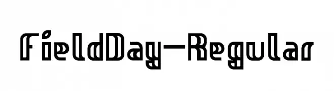
A bold, geometric font with a modern and structured design.
![FieldDay-Regular Frei Schriftart Herunterladen]() Herunterladen 58 Downloads@WebFont
Herunterladen 58 Downloads@WebFont -
( imagex - www.imagex-fonts.com )
A dynamic, hand-drawn font with bold, irregular strokes and a playful style.
![Urban Fresh Air Frei Schriftart Herunterladen]() Herunterladen 58 Downloads@WebFont
Herunterladen 58 Downloads@WebFont -
( Fonts by Edric Studio - Personal-use only. For commercial use please contact owner. )
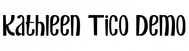
A playful and whimsical font with bold, quirky letterforms.
![Kathleen Tico Demo Frei Schriftart Herunterladen]() Herunterladen 58 Downloads@WebFont
Herunterladen 58 Downloads@WebFont -
( Fonts by Yumna Family - yumna Type - Personal-use only. For commercial use please contact owner. )
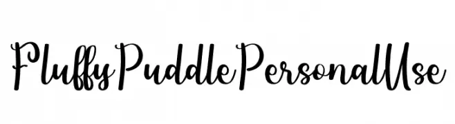
A playful, cursive font with bold strokes and a whimsical style.
![Fluffy Puddle Personal Use Frei Schriftart Herunterladen]() Herunterladen 58 Downloads@WebFont
Herunterladen 58 Downloads@WebFont -
( Iconian Fonts - Daniel Zadorozny - www.iconian.com )
A bold, dynamic font with sharp angles and a slanted orientation.
![Monster HunterLeftalic Frei Schriftart Herunterladen]() Herunterladen 58 Downloads@WebFont
Herunterladen 58 Downloads@WebFont -
( imagex - www.imagex-fonts.com )
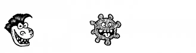
A playful and whimsical collection of unique monster illustrations.
![Happy Monsters Frei Schriftart Herunterladen]() Herunterladen 58 Downloads@WebFont
Herunterladen 58 Downloads@WebFont -
( Fonts by Allouse Studio - Personal-use only. For commercial use please contact owner. )
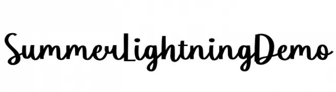
A bold, playful script font with flowing, energetic letterforms.
![Summer Lightning Demo Frei Schriftart Herunterladen]() Herunterladen 58 Downloads@WebFont
Herunterladen 58 Downloads@WebFont -
( Fonts by Hardiboy Design - Personal-use only. For commercial use please contact owner. )
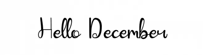
A playful, handwritten font with elegant loops and curls.
![Hello December Frei Schriftart Herunterladen]() Herunterladen 58 Downloads@WebFont
Herunterladen 58 Downloads@WebFont -
( Iconian Fonts - Daniel Zadorozny - www.iconian.com )
A bold, futuristic font with geometric, tech-inspired design.
![Searider Falcon Punch Frei Schriftart Herunterladen]() Herunterladen 58 Downloads@WebFont
Herunterladen 58 Downloads@WebFont -
( aldedesign - Alde Saputro - creativemarket.com/aldedesign?u=aldedesign )
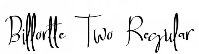
A dynamic, cursive script font with flowing, expressive characters.
![Billortte Two_Regular Frei Schriftart Herunterladen]() Herunterladen 58 Downloads@WebFont
Herunterladen 58 Downloads@WebFont -
( Fonts by Kong Font - fontkong.com - Personal-use only. For commercial use please contact owner. )
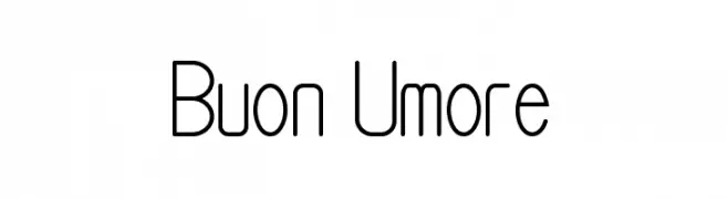
A modern, rounded font with a clean, geometric style.
![Buon Umore Frei Schriftart Herunterladen]() Herunterladen 58 Downloads@WebFont
Herunterladen 58 Downloads@WebFont -
( Fonts by Hardiboy Design - Personal-use only. For commercial use please contact owner. )
A playful and dynamic script font with flowing, cursive-like strokes.
![Fly Away Frei Schriftart Herunterladen]() Herunterladen 58 Downloads@WebFont
Herunterladen 58 Downloads@WebFont -
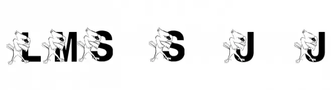
( London's Letters - www.londonsletters.com/ )
A playful, decorative font with cartoon characters integrated into each letter.
![LMS St. Joe's Jayhawk Frei Schriftart Herunterladen]() Herunterladen 58 Downloads@WebFont
Herunterladen 58 Downloads@WebFont -
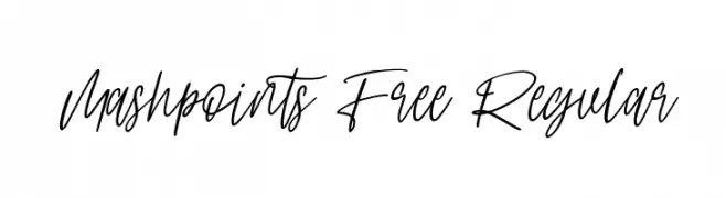
( Fonts by Maulana Creative )
A modern handwritten script font with fluid, elegant strokes.
![Mashpoints Free Regular Frei Schriftart Herunterladen]() Herunterladen 58 Downloads@WebFont
Herunterladen 58 Downloads@WebFont


Welche Schriften sind gerade am populärsten?
Poppins, Roboto, Montserrat, Open Sans und Lato sind wegen ihrer klaren Formen und breiten Einsetzbarkeit sehr gefragt – von Markenauftritt über Landingpages bis hin zu Postern.
Welche Fonts eignen sich für Logos?
Geometrische Sans‑Serifs (z. B. Poppins, Familien im Gotham‑Stil) sind ein häufiger Griff für sauberes, skalierbares Branding. Für eine persönlichere Note bleiben Scripts und Handschrift‑Stile beliebt. Kombinieren Sie einen prägnanten Headline‑Font mit einer neutralen Brotschrift für Wiedererkennung und Harmonie.
Wie oft wird die Top‑Liste aktualisiert?
Regelmäßig – basierend auf realen Downloads und Interaktionen. Schauen Sie öfter vorbei, um aufstrebende Favoriten früh zu entdecken.
💡 Tipp: Seite bookmarken – Trends wechseln schnell, und heutige Top‑Schriften inspirieren morgen vielleicht das Rebranding.