Willkommen bei den Top‑Schriften – hier treffen Beliebtheit und Qualität aufeinander. Das sind die in diesem Jahr am häufigsten heruntergeladenen und genutzten Fonts. Wenn Sie sichere Optionen für Logo, Web oder Social suchen, starten Sie hier.
Jeder Top‑Font überzeugt durch Balance, Lesbarkeit und Vielseitigkeit. Sie finden moderne Sans‑Serifs, elegante Scripts, Vintage‑Serifs und minimalistische Displays.
-
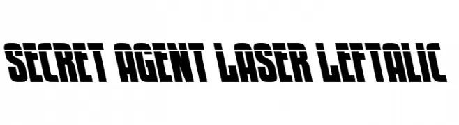
( Fonts by Daniel Zadorozny - www.iconian.com - Personal-use only. For commercial use please contact owner. )
A bold, left-leaning font with a futuristic and dynamic style.
 Herunterladen 57 Downloads@WebFont
 -
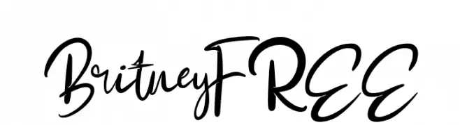
( Fonts by Vunira Design - Personal-use only. For commercial use please contact owner. )
A lively and expressive script font with fluid, dynamic strokes.
![BritneyFREE Frei Schriftart Herunterladen]() Herunterladen 57 Downloads@WebFont
Herunterladen 57 Downloads@WebFont -
( Fonts by NihStudio )
A bold, geometric font with sharp, angular features and a modern edge.
![Foxspeed Demo Frei Schriftart Herunterladen]() Herunterladen 57 Downloads@WebFont
Herunterladen 57 Downloads@WebFont -
( Fonts by Ibram Syah - Personal-use only. For commercial use please contact owner. )
A bold, decorative font with star motifs and intricate flourishes.
![FORESTER Frei Schriftart Herunterladen]() Herunterladen 57 Downloads@WebFont
Herunterladen 57 Downloads@WebFont -
( Fonts by twinletter - Rozikan - Personal-use only. For commercial use please contact owner. )
A bold, hand-drawn font with a playful and artistic style.
![Bregedelpersonaluse Frei Schriftart Herunterladen]() Herunterladen 57 Downloads@WebFont
Herunterladen 57 Downloads@WebFont -
-
( Fonts by scratchones )
Elegant script font with a handwritten style.
![Hellonita Frei Schriftart Herunterladen]() Herunterladen 57 Downloads@WebFont
Herunterladen 57 Downloads@WebFont -
( Fonts by Koplexs Studio - Ahmad Muslimin - Personal-use only. For commercial use please contact owner. )
A graceful and fluid script font with elegant, flowing lines.
![Sallytta Frei Schriftart Herunterladen]() Herunterladen 57 Downloads@WebFont
Herunterladen 57 Downloads@WebFont -
( Fonts by Televo - Personal-use only. For commercial use please contact owner. )
A bold, decorative font with gothic and tribal influences, featuring intricate and angular designs.
![KHScala Regular Frei Schriftart Herunterladen]() Herunterladen 57 Downloads@WebFont
Herunterladen 57 Downloads@WebFont -
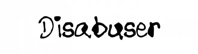
( Philip Tronolone - www.clrprintplus.com )
A bold, expressive handwritten font with dynamic strokes and playful character.
![Disabuser Frei Schriftart Herunterladen]() Herunterladen 57 Downloads@WebFont
Herunterladen 57 Downloads@WebFont -
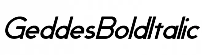
( Fonts by Pixel Sagas - Neale and Shayna Davidson - Personal-use only. For commercial use please contact owner. )
A bold, italicized font with a modern and dynamic style.
![Geddes Bold Italic Frei Schriftart Herunterladen]() Herunterladen 57 Downloads@WebFont
Herunterladen 57 Downloads@WebFont -
( Fonts by Ef Studio )
A bold, playful font with rounded, hand-drawn characters.
![WUSH - Personal Use Frei Schriftart Herunterladen]() Herunterladen 57 Downloads@WebFont
Herunterladen 57 Downloads@WebFont -
( Fonts by douglas vitkauskas - Personal-use only. For commercial use please contact owner. )
A bold, brush-style font with dynamic, hand-drawn characteristics.
![Vtks Mercado Frei Schriftart Herunterladen]() Herunterladen 57 Downloads@WebFont
Herunterladen 57 Downloads@WebFont -
( Noto is a trademark of Google Inc. Noto fonts are open source. All Noto fonts are published under the SIL Open Font License, Version 1.1 )
A highly condensed, medium-weight sans-serif font with a modern, efficient look.
![Noto Sans Hebrew ExtraCondensed Medium Frei Schriftart Herunterladen]() Herunterladen 57 Downloads@WebFont
Herunterladen 57 Downloads@WebFont -
( Fonts by Garisman Studio - Risman Ginarwan - Personal-use only. For commercial use please contact owner. )
A bold, geometric font with a modern, industrial feel.
![Garaga Frei Schriftart Herunterladen]() Herunterladen 57 Downloads@WebFont
Herunterladen 57 Downloads@WebFont -
( weknow - Wino S Kadir - www.creativefabrica.com/designer/weknow/ )
A bold, dynamic script font with connected characters and a flowing style.
![Black Stallion Bold Frei Schriftart Herunterladen]() Herunterladen 57 Downloads@WebFont
Herunterladen 57 Downloads@WebFont -
( Fonts by Yoga Letter - Isroni Yoga Prasetya - Personal-use only. For commercial use please contact owner. )
A cursive, handwritten-style font with smooth, connected letters.
![Amelline Italic Frei Schriftart Herunterladen]() Herunterladen 57 Downloads@WebFont
Herunterladen 57 Downloads@WebFont -
( Fonts by wep - Wahyu Eka Prasetya - Personal-use only. For commercial use please contact owner. )
A bold, textured font with a distressed, grunge aesthetic.
![DERU Frei Schriftart Herunterladen]() Herunterladen 57 Downloads@WebFont
Herunterladen 57 Downloads@WebFont -
( Fonts by Daniel Zadorozny - www.iconian.com )
A modern, expanded, and italicized font with decorative circular accents.
![Underground Rose Expanded Italic Frei Schriftart Herunterladen]() Herunterladen 57 Downloads@WebFont
Herunterladen 57 Downloads@WebFont -
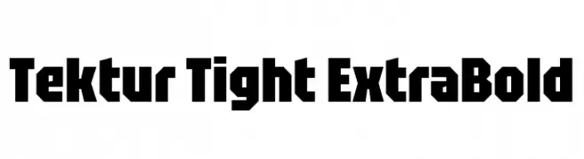
( Fonts by Adam Jagosz - Personal-use only. For commercial use please contact owner. )
A bold, geometric font with strong, angular lines and tight spacing.
![Tektur Tight ExtraBold Frei Schriftart Herunterladen]() Herunterladen 57 Downloads@WebFont
Herunterladen 57 Downloads@WebFont -
( Fonts by Alice Wolski - Personal-use only. For commercial use please contact owner. )
A playful, hand-drawn font with tall, narrow letters and a whimsical style.
![Zion Frei Schriftart Herunterladen]() Herunterladen 57 Downloads@WebFont
Herunterladen 57 Downloads@WebFont -
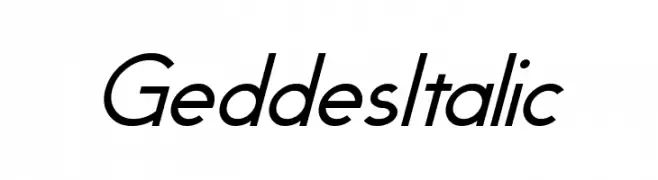
( Fonts by Pixel Sagas - Neale and Shayna Davidson - Personal-use only. For commercial use please contact owner. )
A modern, italicized font with sleek lines and fluid motion.
![Geddes Italic Frei Schriftart Herunterladen]() Herunterladen 57 Downloads@WebFont
Herunterladen 57 Downloads@WebFont -
( Fonts by Wahyu Eka Prasetya - wepfont.com - Personal-use only. For commercial use please contact owner. )
A bold, textured, and expressive handwritten font with a brush-like appearance.
![Cireng Frei Schriftart Herunterladen]() Herunterladen 57 Downloads@WebFont
Herunterladen 57 Downloads@WebFont -
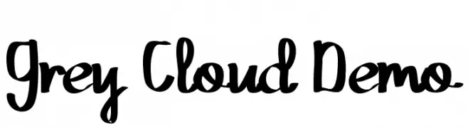
( Fonts by Edric Studio - Personal-use only. For commercial use please contact owner. )
A playful, bold handwritten font with smooth curves and a casual style.
![Grey Cloud Demo Frei Schriftart Herunterladen]() Herunterladen 57 Downloads@WebFont
Herunterladen 57 Downloads@WebFont -
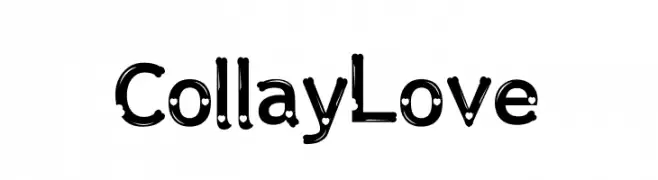
( Fonts by Koplexs Studio - Ahmad Muslimin - Personal-use only. For commercial use please contact owner. )
A playful, decorative font with circular embellishments and bold lines.
![Collay Love Frei Schriftart Herunterladen]() Herunterladen 57 Downloads@WebFont
Herunterladen 57 Downloads@WebFont -
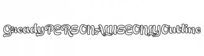
( Fonts by Mans Greback - Personal-use only. For commercial use please contact owner. )
A playful, bold outline font with whimsical curves and rounded edges.
![Gready PERSONAL USE ONLY Outline Frei Schriftart Herunterladen]() Herunterladen 57 Downloads@WebFont
Herunterladen 57 Downloads@WebFont -
( Fonts by weknow - Wino S Kadir - Personal-use only. For commercial use please contact owner. )
A bold, playful font with a hand-drawn, rounded style.
![Back To Nature Bold Frei Schriftart Herunterladen]() Herunterladen 57 Downloads@WebFont
Herunterladen 57 Downloads@WebFont -
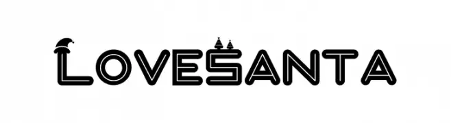
( Fonts by Illushvara - Bayu Suwirya - Personal-use only. For commercial use please contact owner. )
A festive, decorative font with Christmas-themed embellishments on uppercase letters.
![Love Santa Frei Schriftart Herunterladen]() Herunterladen 57 Downloads@WebFont
Herunterladen 57 Downloads@WebFont -
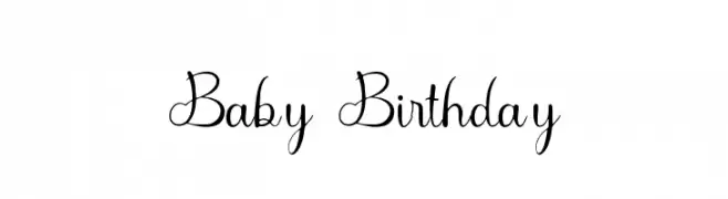
( Fonts by Sugeng Choirul - Personal-use only. For commercial use please contact owner. )
A playful and whimsical font with curly, decorative letterforms.
![Baby Birthday Frei Schriftart Herunterladen]() Herunterladen 57 Downloads@WebFont
Herunterladen 57 Downloads@WebFont -
( Fonts by Daniel Zadorozny - www.iconian.com - Personal-use only. For commercial use please contact owner. )
A futuristic, bold, and italicized font with sharp angles and a sleek design.
![Yeoman Jack Laser Italic Frei Schriftart Herunterladen]() Herunterladen 57 Downloads@WebFont
Herunterladen 57 Downloads@WebFont -
( Fonts by patch po - Personal-use only. For commercial use please contact owner. )
A playful, hand-drawn font with irregular strokes and a casual style.
![Labai Frei Schriftart Herunterladen]() Herunterladen 57 Downloads@WebFont
Herunterladen 57 Downloads@WebFont -
( Fonts by Ronny Studio )
A bold, graffiti-inspired font with sharp, angular lines and dynamic style.
![Wildside Regular Frei Schriftart Herunterladen]() Herunterladen 57 Downloads@WebFont
Herunterladen 57 Downloads@WebFont -
( Fonts by Fontaris Studio - Aris Dpu - Personal-use only. For commercial use please contact owner. )
A dynamic and fluid script font with elegant, flowing letterforms.
![Amelli Frei Schriftart Herunterladen]() Herunterladen 57 Downloads@WebFont
Herunterladen 57 Downloads@WebFont -
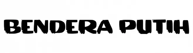
( Fonts by wep - Wahyu Eka Prasetya - Personal-use only. For commercial use please contact owner. )
A bold, brushstroke-style font with dynamic, uneven strokes.
![BENDERA PUTIH Frei Schriftart Herunterladen]() Herunterladen 57 Downloads@WebFont
Herunterladen 57 Downloads@WebFont -
( Noto is a trademark of Google Inc. Noto fonts are open source. All Noto fonts are published under the SIL Open Font License, Version 1.1 )
A modern, thin, and elegant font with uniform strokes and excellent legibility.
![Noto Sans Ethiopic Thin Frei Schriftart Herunterladen]() Herunterladen 57 Downloads@WebFont
Herunterladen 57 Downloads@WebFont -
( Fonts by Kat`s Fun Fonts - Personal-use only. For commercial use please contact owner. )
A collection of St. Patrick's Day themed decorative symbols and illustrations.
![KR Irish Kat 4 Frei Schriftart Herunterladen]() Herunterladen 57 Downloads@WebFont
Herunterladen 57 Downloads@WebFont


Welche Schriften sind gerade am populärsten?
Poppins, Roboto, Montserrat, Open Sans und Lato sind wegen ihrer klaren Formen und breiten Einsetzbarkeit sehr gefragt – von Markenauftritt über Landingpages bis hin zu Postern.
Welche Fonts eignen sich für Logos?
Geometrische Sans‑Serifs (z. B. Poppins, Familien im Gotham‑Stil) sind ein häufiger Griff für sauberes, skalierbares Branding. Für eine persönlichere Note bleiben Scripts und Handschrift‑Stile beliebt. Kombinieren Sie einen prägnanten Headline‑Font mit einer neutralen Brotschrift für Wiedererkennung und Harmonie.
Wie oft wird die Top‑Liste aktualisiert?
Regelmäßig – basierend auf realen Downloads und Interaktionen. Schauen Sie öfter vorbei, um aufstrebende Favoriten früh zu entdecken.
💡 Tipp: Seite bookmarken – Trends wechseln schnell, und heutige Top‑Schriften inspirieren morgen vielleicht das Rebranding.