Willkommen bei den Top‑Schriften – hier treffen Beliebtheit und Qualität aufeinander. Das sind die in diesem Jahr am häufigsten heruntergeladenen und genutzten Fonts. Wenn Sie sichere Optionen für Logo, Web oder Social suchen, starten Sie hier.
Jeder Top‑Font überzeugt durch Balance, Lesbarkeit und Vielseitigkeit. Sie finden moderne Sans‑Serifs, elegante Scripts, Vintage‑Serifs und minimalistische Displays.
-
( Fonts by zone108.main.jp - Personal-use only. For commercial use please contact owner. )
A refined serif font with thin strokes and elongated letterforms, exuding elegance.
 Herunterladen 48 Downloads@WebFont
 -
( Noto is a trademark of Google Inc. Noto fonts are open source. All Noto fonts are published under the SIL Open Font License, Version 1.1 )
Invalid font with placeholder characters.
![Noto Serif Lao Condensed SemiBold Frei Schriftart Herunterladen]() Herunterladen 48 Downloads@WebFont
Herunterladen 48 Downloads@WebFont -
( Fonts by Luluk Surotul - Personal-use only. For commercial use please contact owner. )
A playful, handwritten script font with medium contrast and dynamic strokes.
![Sunrise Frei Schriftart Herunterladen]() Herunterladen 48 Downloads@WebFont
Herunterladen 48 Downloads@WebFont -
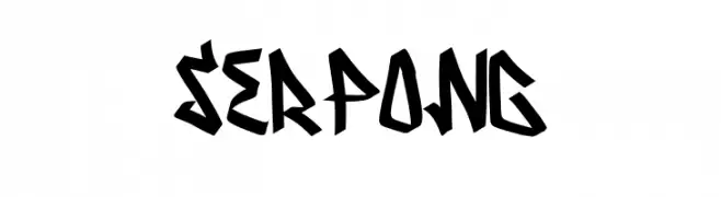
( Fonts by Graphicfresh )
A bold, angular font with a graffiti-inspired style.
![Serpong Frei Schriftart Herunterladen]() Herunterladen 48 Downloads@WebFont
Herunterladen 48 Downloads@WebFont -
( Fonts by Edric Studio - Personal-use only. For commercial use please contact owner. )
A bold serif font with a vintage yet modern style, featuring sharp serifs and a strong presence.
![Kempton Demo Serif Frei Schriftart Herunterladen]() Herunterladen 48 Downloads@WebFont
Herunterladen 48 Downloads@WebFont -
-
( Fonts by madeDeduk - Personal-use only. For commercial use please contact owner. )
A vintage italic font with a textured, elegant style.
![TheDarkTitanVintageItalic Frei Schriftart Herunterladen]() Herunterladen 48 Downloads@WebFont
Herunterladen 48 Downloads@WebFont -
( Noto is a trademark of Google Inc. Noto fonts are open source. All Noto fonts are published under the SIL Open Font License, Version 1.1 )
A bold, semi-condensed sans-serif font with geometric shapes and strong presence.
![Noto Sans Lao UI SemiCondensed Black Frei Schriftart Herunterladen]() Herunterladen 48 Downloads@WebFont
Herunterladen 48 Downloads@WebFont -
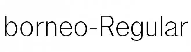
( Fonts by Lemon Studio Type - Herpin Maulana - Personal-use only. For commercial use please contact owner. )
A modern, geometric sans-serif font with clean lines and balanced spacing.
![borneo-Regular Frei Schriftart Herunterladen]() Herunterladen 48 Downloads@WebFont
Herunterladen 48 Downloads@WebFont -
( weknow - Wino S Kadir - www.creativefabrica.com/designer/weknow/ )
A modern, italic, bold font with smooth, continuous strokes and a dynamic appearance.
![EVERYTHING Bold Italic Frei Schriftart Herunterladen]() Herunterladen 48 Downloads@WebFont
Herunterladen 48 Downloads@WebFont -
( Fonts by Almarkhatype - Abdul Malik Wisnu - Personal-use only. For commercial use please contact owner. )
An elegant, flowing script font with intricate swirls and loops.
![Beautimy Frei Schriftart Herunterladen]() Herunterladen 48 Downloads@WebFont
Herunterladen 48 Downloads@WebFont -
( Fonts by Creaditive Design - Aditiyo DP - Personal-use only. For commercial use please contact owner. )
An elegant, flowing script font with graceful curves and ornate uppercase letters.
![Berthalia Frei Schriftart Herunterladen]() Herunterladen 48 Downloads@WebFont
Herunterladen 48 Downloads@WebFont -
( Fonts by Din Studio - Donis Miftahudin - Personal-use only. For commercial use please contact owner. )
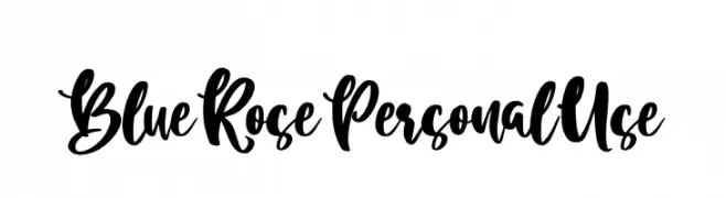
A bold, expressive script font with a flowing, hand-drawn style.
![Blue Rose Personal Use Frei Schriftart Herunterladen]() Herunterladen 48 Downloads@WebFont
Herunterladen 48 Downloads@WebFont -
( Fonts by Vunira Design - Personal-use only. For commercial use please contact owner. )
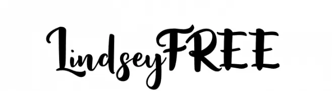
A bold, cursive script with elegant, flowing strokes and playful flourishes.
![LindseyFREE Frei Schriftart Herunterladen]() Herunterladen 48 Downloads@WebFont
Herunterladen 48 Downloads@WebFont -
( Iconian Fonts - Daniel Zadorozny - www.iconian.com )
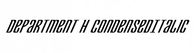
A sleek, condensed italic font with a modern and dynamic appearance.
![Department H CondensedItalic Frei Schriftart Herunterladen]() Herunterladen 48 Downloads@WebFont
Herunterladen 48 Downloads@WebFont -
( Fonts by StringLabs - stringlabscreative.com - Personal-use only. For commercial use please contact owner. )
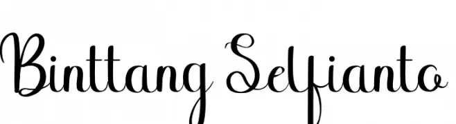
A playful and elegant script font with modern, graceful curves.
![Binttang Selfianto Frei Schriftart Herunterladen]() Herunterladen 48 Downloads@WebFont
Herunterladen 48 Downloads@WebFont -
( Fonts by Vladimir Nikolic - www.creativefabrica.com/designer/vladimirnikolic/ - Personal-use only. For commercial use please contact owner. )
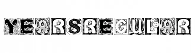
An ornate, decorative font with intricate patterns and vintage flair.
![Years Regular Frei Schriftart Herunterladen]() Herunterladen 48 Downloads@WebFont
Herunterladen 48 Downloads@WebFont -
( Fonts by DmLetter31 - Dimas Prasetyo - Personal-use only. For commercial use please contact owner. )
A playful, handwritten font with whimsical embellishments.
![Mary Quincy Frei Schriftart Herunterladen]() Herunterladen 48 Downloads@WebFont
Herunterladen 48 Downloads@WebFont -
( Fonts by Rissyletter Studio - Personal-use only. For commercial use please contact owner. )
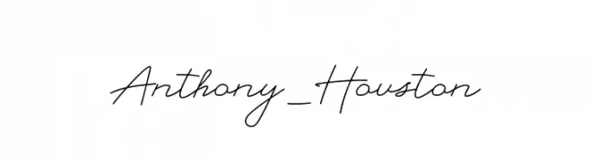
An elegant, flowing script font with a refined, handwritten style.
![Anthony_Houston Frei Schriftart Herunterladen]() Herunterladen 48 Downloads@WebFont
Herunterladen 48 Downloads@WebFont -
( Fonts by Rama type - Rama ziana - Personal-use only. For commercial use please contact owner. )
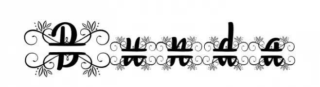
An ornate script font with intricate floral embellishments.
![Bunda Frei Schriftart Herunterladen]() Herunterladen 48 Downloads@WebFont
Herunterladen 48 Downloads@WebFont -
( Fonts by Bangkit Tri Setiadi )
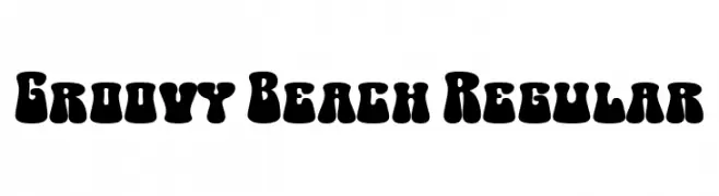
A bold, retro-inspired font with a playful, bubbly design.
![Groovy Beach Regular Frei Schriftart Herunterladen]() Herunterladen 48 Downloads@WebFont
Herunterladen 48 Downloads@WebFont -
( Fonts by Balpirick Studio - https://www.creativefabrica.com/designer/balpirick/ref/308299/ - Personal-use only. For commercial use please contact owner. )
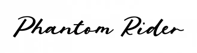
A dynamic and flowing script font with elegant cursive letterforms.
![Phantom Rider Frei Schriftart Herunterladen]() Herunterladen 48 Downloads@WebFont
Herunterladen 48 Downloads@WebFont -
( Fonts by Javatype Studio - Tio Yulianto - Personal-use only. For commercial use please contact owner. )
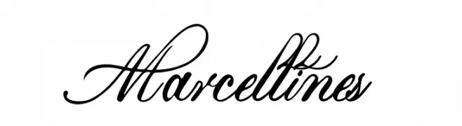
An elegant script font with intricate, flowing lines and a classic calligraphic style.
![Marcellines Frei Schriftart Herunterladen]() Herunterladen 48 Downloads@WebFont
Herunterladen 48 Downloads@WebFont -
( Fonts by Prioritype Co - Prio Nurokhim Aji - Personal-use only. For commercial use please contact owner. )
A lively and flowing script font with elegant, dynamic curves.
![Launsela Frei Schriftart Herunterladen]() Herunterladen 48 Downloads@WebFont
Herunterladen 48 Downloads@WebFont -
( Fonts by Creative Lab - Creative LAB - Personal-use only. For commercial use please contact owner. )
An elegant script font with graceful curves and intricate swashes.
![Deliya Frei Schriftart Herunterladen]() Herunterladen 48 Downloads@WebFont
Herunterladen 48 Downloads@WebFont -
( Fonts by zone108.main.jp - Personal-use only. For commercial use please contact owner. )
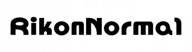
A bold, geometric font with rounded edges and a modern style.
![Rikon Normal Frei Schriftart Herunterladen]() Herunterladen 48 Downloads@WebFont
Herunterladen 48 Downloads@WebFont -
( Fonts by Huston Vincen - Personal-use only. For commercial use please contact owner. )
A lively, expressive handwritten font with a dynamic slant.
![Alliska Frei Schriftart Herunterladen]() Herunterladen 48 Downloads@WebFont
Herunterladen 48 Downloads@WebFont -
( Fonts by Inayati Thahir - Personal-use only. For commercial use please contact owner. )
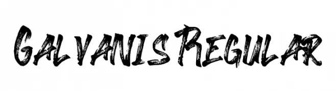
A bold, brush-style font with dynamic and expressive strokes.
![Galvanis Regular Frei Schriftart Herunterladen]() Herunterladen 48 Downloads@WebFont
Herunterladen 48 Downloads@WebFont -
( Fonts by Edric Studio - Personal-use only. For commercial use please contact owner. )
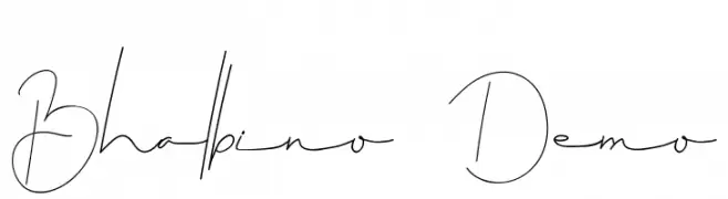
A delicate, flowing script font with thin, elegant lines and a modern calligraphic style.
![Bhalbino Demo Frei Schriftart Herunterladen]() Herunterladen 48 Downloads@WebFont
Herunterladen 48 Downloads@WebFont -
( Fonts by DmLetter31 - Dimas Prasetyo - Personal-use only. For commercial use please contact owner. )
A playful, handwritten font with bold strokes and a lively, casual style.
![Joyfull Summer Frei Schriftart Herunterladen]() Herunterladen 48 Downloads@WebFont
Herunterladen 48 Downloads@WebFont -
( Fonts by Saridezra - Personal-use only. For commercial use please contact owner. )
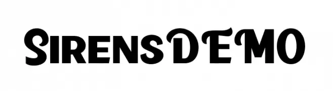
A bold and dynamic font with thick strokes and a unique curvature.
![SirensDEMO Frei Schriftart Herunterladen]() Herunterladen 48 Downloads@WebFont
Herunterladen 48 Downloads@WebFont -
( Fonts by UI Creative - Personal-use only. For commercial use please contact owner. )
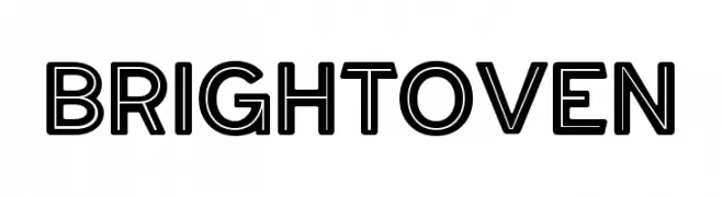
A bold, geometric sans-serif font with outlined characters for a modern look.
![BRIGHTOVEN Frei Schriftart Herunterladen]() Herunterladen 48 Downloads@WebFont
Herunterladen 48 Downloads@WebFont -
( Fonts by Gassstype - Anang Fibriyanto - www.gassstype.com - Personal-use only. For commercial use please contact owner. )
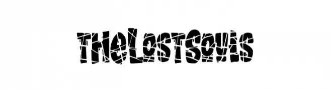
A bold, fragmented font with a chaotic and distressed appearance.
![the Lost Souls Frei Schriftart Herunterladen]() Herunterladen 48 Downloads@WebFont
Herunterladen 48 Downloads@WebFont -
( Fonts by Saridezra )
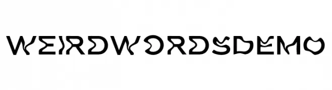
A bold, artistic font with playful, irregular strokes and a hand-drawn feel.
![Weird Words DEMO Frei Schriftart Herunterladen]() Herunterladen 48 Downloads@WebFont
Herunterladen 48 Downloads@WebFont -
( Fonts by GGBot - www.ggbot.net - Personal-use only. For commercial use please contact owner. )
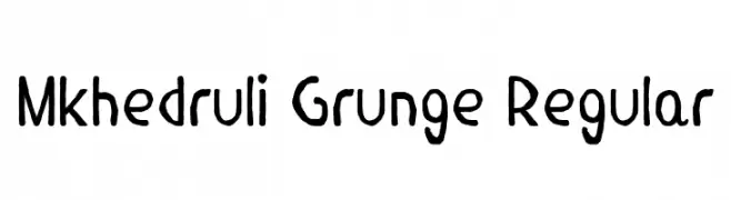
A grunge-inspired, hand-drawn font with a casual and artistic feel.
![Mkhedruli Grunge Regular Frei Schriftart Herunterladen]() Herunterladen 48 Downloads@WebFont
Herunterladen 48 Downloads@WebFont -
( Fonts by AlifRyanZulfikar - Personal-use only. For commercial use please contact owner. )
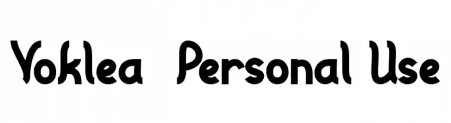
A bold, playful font with a hand-drawn, dynamic style.
![Voklea - Personal Use Frei Schriftart Herunterladen]() Herunterladen 48 Downloads@WebFont
Herunterladen 48 Downloads@WebFont


Welche Schriften sind gerade am populärsten?
Poppins, Roboto, Montserrat, Open Sans und Lato sind wegen ihrer klaren Formen und breiten Einsetzbarkeit sehr gefragt – von Markenauftritt über Landingpages bis hin zu Postern.
Welche Fonts eignen sich für Logos?
Geometrische Sans‑Serifs (z. B. Poppins, Familien im Gotham‑Stil) sind ein häufiger Griff für sauberes, skalierbares Branding. Für eine persönlichere Note bleiben Scripts und Handschrift‑Stile beliebt. Kombinieren Sie einen prägnanten Headline‑Font mit einer neutralen Brotschrift für Wiedererkennung und Harmonie.
Wie oft wird die Top‑Liste aktualisiert?
Regelmäßig – basierend auf realen Downloads und Interaktionen. Schauen Sie öfter vorbei, um aufstrebende Favoriten früh zu entdecken.
💡 Tipp: Seite bookmarken – Trends wechseln schnell, und heutige Top‑Schriften inspirieren morgen vielleicht das Rebranding.