Willkommen bei den Top‑Schriften – hier treffen Beliebtheit und Qualität aufeinander. Das sind die in diesem Jahr am häufigsten heruntergeladenen und genutzten Fonts. Wenn Sie sichere Optionen für Logo, Web oder Social suchen, starten Sie hier.
Jeder Top‑Font überzeugt durch Balance, Lesbarkeit und Vielseitigkeit. Sie finden moderne Sans‑Serifs, elegante Scripts, Vintage‑Serifs und minimalistische Displays.
-
 Herunterladen 49 Downloads@WebFont
 -
( Fonts by Abo Daniel Studio )
A playful, handwritten font with tall, narrow letters and a casual style.
![Farmhouse Village B Frei Schriftart Herunterladen]() Herunterladen 49 Downloads@WebFont
Herunterladen 49 Downloads@WebFont -
( Fonts by Md Shohail Bhuian - Personal-use only. For commercial use please contact owner. )
A bold, grungy font with a spooky, distressed texture.
![Spooky Sphere Frei Schriftart Herunterladen]() Herunterladen 49 Downloads@WebFont
Herunterladen 49 Downloads@WebFont -
( Fonts by StringLabs - stringlabscreative.com - Personal-use only. For commercial use please contact owner. )
A decorative font with elongated serifs and a regal, sophisticated style.
![Spider King Frei Schriftart Herunterladen]() Herunterladen 49 Downloads@WebFont
Herunterladen 49 Downloads@WebFont -
( Fonts by Zetafonts - Personal-use only. For commercial use please contact owner. )
A bold, italic font with a modern and dynamic style.
![Asgard Trial Fit Bold Italic Frei Schriftart Herunterladen]() Herunterladen 49 Downloads@WebFont
Herunterladen 49 Downloads@WebFont -
-
( Fonts by Zanatlija - Personal-use only. For commercial use please contact owner. )
A modern, geometric font with a digital, tech-inspired aesthetic.
![QUIWO LUSE TFB Frei Schriftart Herunterladen]() Herunterladen 49 Downloads@WebFont
Herunterladen 49 Downloads@WebFont -
( Fonts by Daniel Zadorozny - www.iconian.com - Personal-use only. For commercial use please contact owner. )
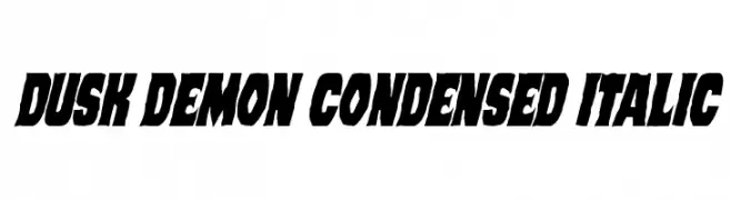
A bold, condensed, and italicized font with dynamic and energetic styling.
![Dusk Demon Condensed Italic Frei Schriftart Herunterladen]() Herunterladen 49 Downloads@WebFont
Herunterladen 49 Downloads@WebFont -
( Fonts by Vultype - Candra Hamdani - Personal-use only. For commercial use please contact owner. )
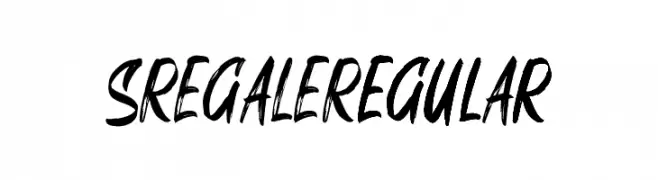
A bold and dynamic brush script font with energetic, fluid strokes.
![SREGALE Regular Frei Schriftart Herunterladen]() Herunterladen 49 Downloads@WebFont
Herunterladen 49 Downloads@WebFont -
( Fonts by Graphix Line Studio - Personal-use only. For commercial use please contact owner. )
A bold, expressive handwritten font with calligraphic influences.
![Natural Frei Schriftart Herunterladen]() Herunterladen 49 Downloads@WebFont
Herunterladen 49 Downloads@WebFont -
( Blackstar - www.facebook.com/xoxoblackstar13xoxo )
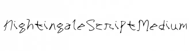
A flowing, cursive script with elegant, connected characters and dynamic stroke variations.
![Nightingale Script Medium Frei Schriftart Herunterladen]() Herunterladen 49 Downloads@WebFont
Herunterladen 49 Downloads@WebFont -
( Fonts by Maulana Creative - Gilang Maulana - Personal-use only. For commercial use please contact owner. )
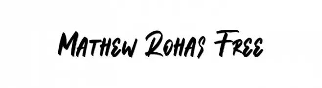
A bold, energetic script font with a hand-drawn, dynamic style.
![Mathew Rohas Free Frei Schriftart Herunterladen]() Herunterladen 49 Downloads@WebFont
Herunterladen 49 Downloads@WebFont -
( Fonts by Yoga Letter - Isroni Yoga Prasetya - Personal-use only. For commercial use please contact owner. )
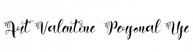
An elegant script font with decorative swirls and medium contrast, perfect for romantic designs.
![Art Valentine - Personal Use Frei Schriftart Herunterladen]() Herunterladen 49 Downloads@WebFont
Herunterladen 49 Downloads@WebFont -
( Fonts by Lukas Krakora - Personal-use only. For commercial use please contact owner. )
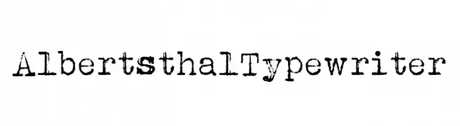
A vintage typewriter-style font with a distressed, textured appearance.
![Albertsthal Typewriter Frei Schriftart Herunterladen]() Herunterladen 49 Downloads@WebFont
Herunterladen 49 Downloads@WebFont -
( Fonts by Typer Std - Personal-use only. For commercial use please contact owner. )
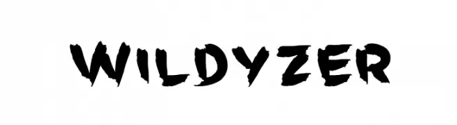
A bold, brush-style font with dynamic, angular strokes.
![Wildyzer Frei Schriftart Herunterladen]() Herunterladen 49 Downloads@WebFont
Herunterladen 49 Downloads@WebFont -
( Fonts by Daniel Zadorozny - www.iconian.com - Personal-use only. For commercial use please contact owner. )
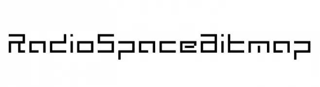
A pixelated, retro-style font with a blocky, geometric design.
![Radio Space Bitmap Frei Schriftart Herunterladen]() Herunterladen 49 Downloads@WebFont
Herunterladen 49 Downloads@WebFont -
( Fonts by Shahadat Rahman - Personal-use only. For commercial use please contact owner. )
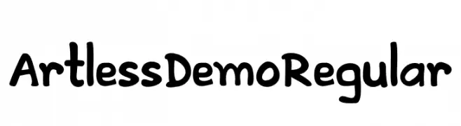
A playful, bold font with rounded, thick strokes and a hand-drawn feel.
![ArtlessDemoRegular Frei Schriftart Herunterladen]() Herunterladen 49 Downloads@WebFont
Herunterladen 49 Downloads@WebFont -
( Fonts by Mozatype )
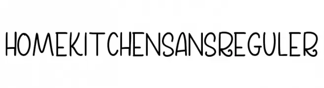
Playful handwritten sans-serif font.
![Home Kitchen Sans Reguler Frei Schriftart Herunterladen]() Herunterladen 49 Downloads@WebFont
Herunterladen 49 Downloads@WebFont -
( Noto is a trademark of Google Inc. Noto fonts are open source. All Noto fonts are published under the SIL Open Font License, Version 1.1 )
A modern, extra-condensed, bold sans-serif font with tight spacing.
![Noto Sans Lao UI ExtraCondensed Black Frei Schriftart Herunterladen]() Herunterladen 49 Downloads@WebFont
Herunterladen 49 Downloads@WebFont -
( Fonts by SSI.Scraps - Syukur Setiyadi - Personal-use only. For commercial use please contact owner. )
A bold, flowing script font with connected characters and medium contrast.
![Angellife Frei Schriftart Herunterladen]() Herunterladen 49 Downloads@WebFont
Herunterladen 49 Downloads@WebFont -
( Fonts by Toko Laris Djaja - Dicky Syafaat - Personal-use only. For commercial use please contact owner. )
A bold, angular font with a modern gothic style, perfect for striking headlines.
![Robus Frei Schriftart Herunterladen]() Herunterladen 49 Downloads@WebFont
Herunterladen 49 Downloads@WebFont -
( Fonts by Eknoji Studio - Personal-use only. For commercial use please contact owner. )
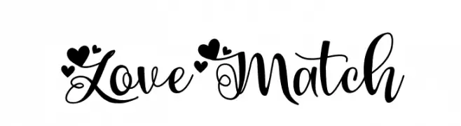
A whimsical, decorative font with heart motifs and elegant script elements.
![Love Match Frei Schriftart Herunterladen]() Herunterladen 49 Downloads@WebFont
Herunterladen 49 Downloads@WebFont -
( Fonts by Vigilante Typeface Corporation Larry Yerkes. Personal-use only. For commercial use please contact owner. )
A bold, playful handwritten font with a casual and dynamic style.
![VTC-KomikSkans-Two Frei Schriftart Herunterladen]() Herunterladen 49 Downloads@WebFont
Herunterladen 49 Downloads@WebFont -
( Fonts by Yoga Letter - Isroni Yoga Prasetya - Personal-use only. For commercial use please contact owner. )
A dripping, horror-themed font with a bold, eerie style.
![Monster Blood Frei Schriftart Herunterladen]() Herunterladen 49 Downloads@WebFont
Herunterladen 49 Downloads@WebFont -
( Fonts by HandletterYean - Yean Aguste - Personal-use only. For commercial use please contact owner. )
A sophisticated script font with elegant, flowing cursive letterforms.
![Harlane Frei Schriftart Herunterladen]() Herunterladen 49 Downloads@WebFont
Herunterladen 49 Downloads@WebFont -
( Fonts by Graphicfresh )
A bold, angular font with a graffiti-inspired style.
![Serpong Frei Schriftart Herunterladen]() Herunterladen 49 Downloads@WebFont
Herunterladen 49 Downloads@WebFont -
( Fonts by Wahyu Studio )
Tall, narrow, handwritten script with a casual and playful style.
![Simple Farmhouse Frei Schriftart Herunterladen]() Herunterladen 49 Downloads@WebFont
Herunterladen 49 Downloads@WebFont -
( Fonts by AlifRyanZulfikar - Personal-use only. For commercial use please contact owner. )
A playful, bold script font with a whimsical, hand-drawn style.
![Hello Sweet - Personal Use Frei Schriftart Herunterladen]() Herunterladen 49 Downloads@WebFont
Herunterladen 49 Downloads@WebFont -
( Iconian Fonts - Daniel Zadorozny - www.iconian.com )
A dot-matrix style font with a retro digital display look.
![Byte Police Leftalic Frei Schriftart Herunterladen]() Herunterladen 49 Downloads@WebFont
Herunterladen 49 Downloads@WebFont -
( Fonts by Daniel Zadorozny - www.iconian.com - Personal-use only. For commercial use please contact owner. )
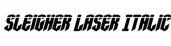
A bold, angular, and slanted font with a futuristic and edgy style.
![Sleigher Laser Italic Frei Schriftart Herunterladen]() Herunterladen 49 Downloads@WebFont
Herunterladen 49 Downloads@WebFont -
( weknow - Wino S Kadir - www.creativefabrica.com/designer/weknow/ )
A modern, italic, bold font with smooth, continuous strokes and a dynamic appearance.
![EVERYTHING Bold Italic Frei Schriftart Herunterladen]() Herunterladen 49 Downloads@WebFont
Herunterladen 49 Downloads@WebFont -
( Noto is a trademark of Google Inc. Noto fonts are open source. All Noto fonts are published under the SIL Open Font License, Version 1.1 )
A bold, semi-condensed font with high contrast and modern styling.
![Noto Sans Armenian SemiCondensed Black Frei Schriftart Herunterladen]() Herunterladen 49 Downloads@WebFont
Herunterladen 49 Downloads@WebFont -
( Fonts by Din Studio - Donis Miftahudin - Personal-use only. For commercial use please contact owner. )
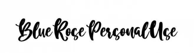
A bold, expressive script font with a flowing, hand-drawn style.
![Blue Rose Personal Use Frei Schriftart Herunterladen]() Herunterladen 49 Downloads@WebFont
Herunterladen 49 Downloads@WebFont -
( Fonts by Eddy Goodboy - Personal-use only. For commercial use please contact owner. )
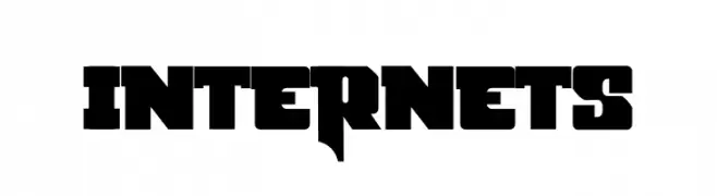
A bold, geometric font with a strong, industrial style.
![Internets Frei Schriftart Herunterladen]() Herunterladen 49 Downloads@WebFont
Herunterladen 49 Downloads@WebFont -
( Fonts by Muhammad Zulkifly Suradin - Personal-use only. For commercial use please contact owner. )
Invalid font representation.
![California Swashes Frei Schriftart Herunterladen]() Herunterladen 49 Downloads@WebFont
Herunterladen 49 Downloads@WebFont -
( Iconian Fonts - Daniel Zadorozny - www.iconian.com )
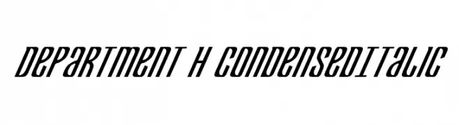
A sleek, condensed italic font with a modern and dynamic appearance.
![Department H CondensedItalic Frei Schriftart Herunterladen]() Herunterladen 49 Downloads@WebFont
Herunterladen 49 Downloads@WebFont


Welche Schriften sind gerade am populärsten?
Poppins, Roboto, Montserrat, Open Sans und Lato sind wegen ihrer klaren Formen und breiten Einsetzbarkeit sehr gefragt – von Markenauftritt über Landingpages bis hin zu Postern.
Welche Fonts eignen sich für Logos?
Geometrische Sans‑Serifs (z. B. Poppins, Familien im Gotham‑Stil) sind ein häufiger Griff für sauberes, skalierbares Branding. Für eine persönlichere Note bleiben Scripts und Handschrift‑Stile beliebt. Kombinieren Sie einen prägnanten Headline‑Font mit einer neutralen Brotschrift für Wiedererkennung und Harmonie.
Wie oft wird die Top‑Liste aktualisiert?
Regelmäßig – basierend auf realen Downloads und Interaktionen. Schauen Sie öfter vorbei, um aufstrebende Favoriten früh zu entdecken.
💡 Tipp: Seite bookmarken – Trends wechseln schnell, und heutige Top‑Schriften inspirieren morgen vielleicht das Rebranding.