Willkommen bei den Top‑Schriften – hier treffen Beliebtheit und Qualität aufeinander. Das sind die in diesem Jahr am häufigsten heruntergeladenen und genutzten Fonts. Wenn Sie sichere Optionen für Logo, Web oder Social suchen, starten Sie hier.
Jeder Top‑Font überzeugt durch Balance, Lesbarkeit und Vielseitigkeit. Sie finden moderne Sans‑Serifs, elegante Scripts, Vintage‑Serifs und minimalistische Displays.
-
( Free for a personal use. For a commercial use please visit www.kevinandamanda.com )
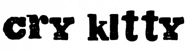
A bold, distressed font with a vintage, grunge aesthetic.
 Herunterladen 399 Downloads@WebFont
 -
![Sportsquake Frei Schriftart Herunterladen]() Herunterladen 399 Downloads@WebFont
Herunterladen 399 Downloads@WebFont -
![Smooth Elegant Regular Frei Schriftart Herunterladen]() Herunterladen 399 Downloads@WebFont
Herunterladen 399 Downloads@WebFont -
![Lovely Madness Frei Schriftart Herunterladen]() Herunterladen 399 Downloads@WebFont
Herunterladen 399 Downloads@WebFont -
( Fonts by ijem - Ferdiansyah Ferdiansyah - Personal-use only. For commercial use please contact owner. )
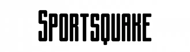
A bold, modern font with thick, uniform strokes ideal for impactful headlines.
![BERRYBOLD-Bold Frei Schriftart Herunterladen]() Herunterladen 399 Downloads@WebFont
Herunterladen 399 Downloads@WebFont -
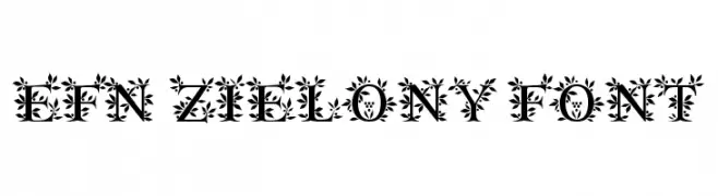
-
![EFN Zielony Font Frei Schriftart Herunterladen]() Herunterladen 399 Downloads@WebFont
Herunterladen 399 Downloads@WebFont -
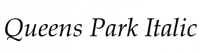
( Roger White - web.archive.org/web/20120416090521/www.rogersfonts.org.uk/ )
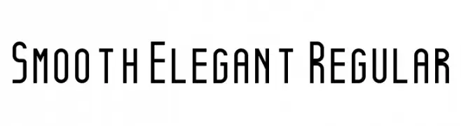
An elegant italic serif font with smooth curves and a refined, classic style.
![Queens Park Italic Frei Schriftart Herunterladen]() Herunterladen 399 Downloads@WebFont
Herunterladen 399 Downloads@WebFont -
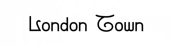
( Fonts by www.feorag.com )
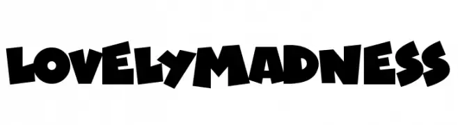
A modern decorative font with playful curves and loops.
![London Town Frei Schriftart Herunterladen]() Herunterladen 399 Downloads@WebFont
Herunterladen 399 Downloads@WebFont -
![Daggmask Normal Frei Schriftart Herunterladen]() Herunterladen 399 Downloads@WebFont
Herunterladen 399 Downloads@WebFont -
( Fonts by dustBUST - Andreas Nylin )
A bold, geometric font with a futuristic, digital style.
![Dusty Frei Schriftart Herunterladen]() Herunterladen 399 Downloads@WebFont
Herunterladen 399 Downloads@WebFont


Welche Schriften sind gerade am populärsten?
Poppins, Roboto, Montserrat, Open Sans und Lato sind wegen ihrer klaren Formen und breiten Einsetzbarkeit sehr gefragt – von Markenauftritt über Landingpages bis hin zu Postern.
Welche Fonts eignen sich für Logos?
Geometrische Sans‑Serifs (z. B. Poppins, Familien im Gotham‑Stil) sind ein häufiger Griff für sauberes, skalierbares Branding. Für eine persönlichere Note bleiben Scripts und Handschrift‑Stile beliebt. Kombinieren Sie einen prägnanten Headline‑Font mit einer neutralen Brotschrift für Wiedererkennung und Harmonie.
Wie oft wird die Top‑Liste aktualisiert?
Regelmäßig – basierend auf realen Downloads und Interaktionen. Schauen Sie öfter vorbei, um aufstrebende Favoriten früh zu entdecken.
💡 Tipp: Seite bookmarken – Trends wechseln schnell, und heutige Top‑Schriften inspirieren morgen vielleicht das Rebranding.