Willkommen bei den Top‑Schriften – hier treffen Beliebtheit und Qualität aufeinander. Das sind die in diesem Jahr am häufigsten heruntergeladenen und genutzten Fonts. Wenn Sie sichere Optionen für Logo, Web oder Social suchen, starten Sie hier.
Jeder Top‑Font überzeugt durch Balance, Lesbarkeit und Vielseitigkeit. Sie finden moderne Sans‑Serifs, elegante Scripts, Vintage‑Serifs und minimalistische Displays.
-
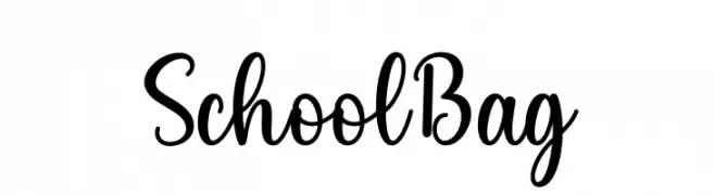
( Fonts by Wahyu Studio )
A playful, handwritten script font with medium contrast and decorative flair.
 Herunterladen 398 Downloads@WebFont
 -
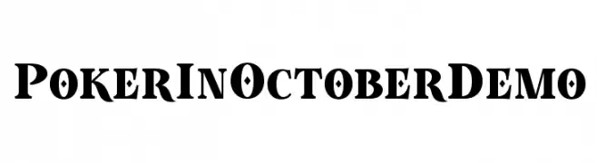
( Roland Huse Design - Roland Huse - rolandhuse.com )
A bold, high-contrast serif font with distinctive decorative elements.
![Poker In October Demo Frei Schriftart Herunterladen]() Herunterladen 398 Downloads@WebFont
Herunterladen 398 Downloads@WebFont -
( Fonts by Kong Font - https://fontkong.com/ - Personal-use only. For commercial use please contact owner. )
An elegant, flowing script font with interconnected, cursive strokes.
![Northwest Signature Italic Frei Schriftart Herunterladen]() Herunterladen 398 Downloads@WebFont
Herunterladen 398 Downloads@WebFont -
( Fonts by a Max Infeld - XEROGRAPHER FONTS - xerographer.blogspot.com . Personal-use only. For commercial use please contact owner. )
A bold, expressive font with a dynamic, handwritten style.
![FairBanks Frei Schriftart Herunterladen]() Herunterladen 398 Downloads@WebFont
Herunterladen 398 Downloads@WebFont -
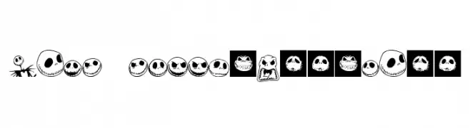
![Jack Skellingtonbats Frei Schriftart Herunterladen]() Herunterladen 398 Downloads@WebFont
Herunterladen 398 Downloads@WebFont -
-
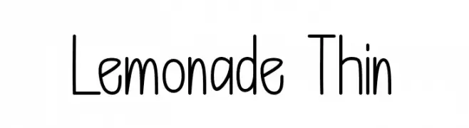
( Fonts by Bringtype Studio )
A playful, hand-drawn style font with tall, narrow letters and consistent stroke thickness.
![Lemonade Thin Frei Schriftart Herunterladen]() Herunterladen 398 Downloads@WebFont
Herunterladen 398 Downloads@WebFont -
( Fonts by Alde Saputro - aldedesign - https://www.creativefabrica.com/product/the-crafty-holiday-font-bundle/ref/125925/ - Personal-use only. For commercial use please contact owner. )
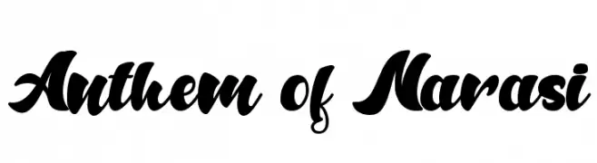
A bold, flowing script font with interconnected, ornate characters.
![Anthem of Narasi Frei Schriftart Herunterladen]() Herunterladen 398 Downloads@WebFont
Herunterladen 398 Downloads@WebFont -
( Iconian Fonts - Daniel Zadorozny - www.iconian.com )
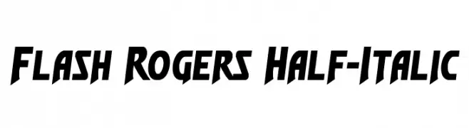
A bold, dynamic font with sharp angles and a slanted, energetic style.
![Flash Rogers Half-Italic Frei Schriftart Herunterladen]() Herunterladen 398 Downloads@WebFont
Herunterladen 398 Downloads@WebFont -
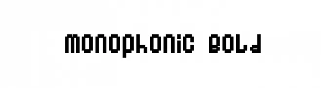
( Fonts by www.fontalicious.com )
A bold, pixelated font with a retro digital style.
![Monophonic Bold Frei Schriftart Herunterladen]() Herunterladen 398 Downloads@WebFont
Herunterladen 398 Downloads@WebFont -
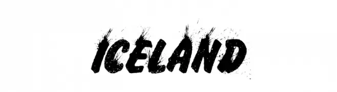
( Fonts by Billy Argel Fonts - www.billyargel.com - Personal-use only. For commercial use please contact owner. )
A bold, distressed font with a textured, brush-like appearance.
![ICELAND Frei Schriftart Herunterladen]() Herunterladen 398 Downloads@WebFont
Herunterladen 398 Downloads@WebFont


Welche Schriften sind gerade am populärsten?
Poppins, Roboto, Montserrat, Open Sans und Lato sind wegen ihrer klaren Formen und breiten Einsetzbarkeit sehr gefragt – von Markenauftritt über Landingpages bis hin zu Postern.
Welche Fonts eignen sich für Logos?
Geometrische Sans‑Serifs (z. B. Poppins, Familien im Gotham‑Stil) sind ein häufiger Griff für sauberes, skalierbares Branding. Für eine persönlichere Note bleiben Scripts und Handschrift‑Stile beliebt. Kombinieren Sie einen prägnanten Headline‑Font mit einer neutralen Brotschrift für Wiedererkennung und Harmonie.
Wie oft wird die Top‑Liste aktualisiert?
Regelmäßig – basierend auf realen Downloads und Interaktionen. Schauen Sie öfter vorbei, um aufstrebende Favoriten früh zu entdecken.
💡 Tipp: Seite bookmarken – Trends wechseln schnell, und heutige Top‑Schriften inspirieren morgen vielleicht das Rebranding.