Willkommen bei den Top‑Schriften – hier treffen Beliebtheit und Qualität aufeinander. Das sind die in diesem Jahr am häufigsten heruntergeladenen und genutzten Fonts. Wenn Sie sichere Optionen für Logo, Web oder Social suchen, starten Sie hier.
Jeder Top‑Font überzeugt durch Balance, Lesbarkeit und Vielseitigkeit. Sie finden moderne Sans‑Serifs, elegante Scripts, Vintage‑Serifs und minimalistische Displays.
-
( Fonts by www.alphabetype.it )
A bold, angular font with a geometric, hieroglyphic-inspired design.
 Herunterladen 1427 Downloads@WebFont
 -
( Fonts by Manfred Klein. Free for private and charity use. Free for commercial with donation to organizations )
Hand-drawn decorative font with planet and space motifs.
![Planets Frei Schriftart Herunterladen]() Herunterladen 1427 Downloads@WebFont
Herunterladen 1427 Downloads@WebFont -
( Free for non-commercial use. www.johnmartz.com )
A bold, angular font with a futuristic and industrial design.
![Science Project Frei Schriftart Herunterladen]() Herunterladen 1427 Downloads@WebFont
Herunterladen 1427 Downloads@WebFont -
( Fonts by dcoxy )
An intricate decorative font with elaborate ornamental designs.
![Ornamentis_PersonalUseOnly Frei Schriftart Herunterladen]() Herunterladen 1426 Downloads@WebFont
Herunterladen 1426 Downloads@WebFont -
( Fonts by Adrien Coquet - Personal-use only. For commercial use please contact owner. )
A bold, geometric font with a modern and assertive style.
![FARRAY Frei Schriftart Herunterladen]() Herunterladen 1426 Downloads@WebFont
Herunterladen 1426 Downloads@WebFont -
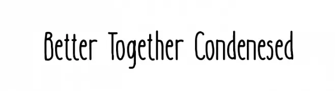
( Fonts by Katsia Jazwinska )
A playful, condensed font with a hand-drawn feel and medium contrast.
![Better Together Condenesed Frei Schriftart Herunterladen]() Herunterladen 1426 Downloads@WebFont
Herunterladen 1426 Downloads@WebFont -
( Copyright (c) 2015, Christian Thalmann and the Cormorant Project Authors (github.com/CatharsisFonts/Cormorant) )
A classic serif font with medium weight and elegant proportions.
![Cormorant Medium Frei Schriftart Herunterladen]() Herunterladen 1426 Downloads@WebFont
Herunterladen 1426 Downloads@WebFont -
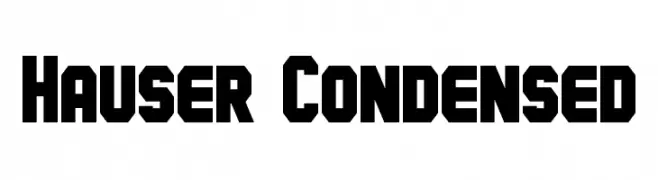
( Fonts by a Neale Davidson - www.pixelsagas.com. Personal-use only. For commercial use please contact owner. )
A bold, geometric, and condensed font with a modern industrial style.
![Hauser Condensed Frei Schriftart Herunterladen]() Herunterladen 1426 Downloads@WebFont
Herunterladen 1426 Downloads@WebFont -
( Copyright (c) 2011 Fontstage (info@fontstage.com) )
A bold, impactful typeface with thick strokes and strong presence.
![PassionOne-Black Frei Schriftart Herunterladen]() Herunterladen 1426 Downloads@WebFont
Herunterladen 1426 Downloads@WebFont -
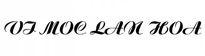
![VI Moc Lan Hoa Frei Schriftart Herunterladen]() Herunterladen 1426 Downloads@WebFont
Herunterladen 1426 Downloads@WebFont -
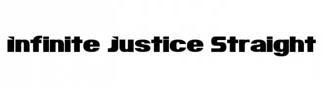
( Fonts by Insanitype )
A bold, geometric font with strong, angular lines and a modern, assertive style.
![Infinite Justice Straight Frei Schriftart Herunterladen]() Herunterladen 1426 Downloads@WebFont
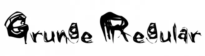
Herunterladen 1426 Downloads@WebFont -
![Grunge Regular Frei Schriftart Herunterladen]() Herunterladen 1426 Downloads@WebFont
Herunterladen 1426 Downloads@WebFont -
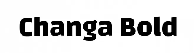
( Copyright 2011 Eduardo Tunni (www.tipo.net.ar) )
A bold, modern sans-serif font with strong, thick strokes.
![Changa Bold Frei Schriftart Herunterladen]() Herunterladen 1425 Downloads@WebFont
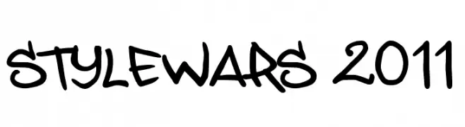
Herunterladen 1425 Downloads@WebFont -
![STYLEWARS 2011 Frei Schriftart Herunterladen]() Herunterladen 1425 Downloads@WebFont
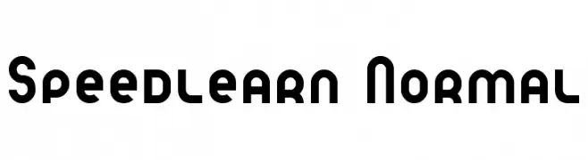
Herunterladen 1425 Downloads@WebFont -
( Fonts by SDFonts - Ritzy )
A bold, modern font with geometric and uniform characters.
![Speedlearn Normal Frei Schriftart Herunterladen]() Herunterladen 1425 Downloads@WebFont
Herunterladen 1425 Downloads@WebFont -
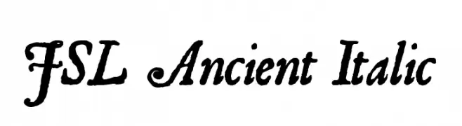
![JSL Ancient Italic Frei Schriftart Herunterladen]() Herunterladen 1425 Downloads@WebFont
Herunterladen 1425 Downloads@WebFont -
( Fonts by Mustofa Nur Sidiq )
A playful, hand-drawn font with rounded, irregular strokes.
![Rafa Kids Frei Schriftart Herunterladen]() Herunterladen 1424 Downloads@WebFont
Herunterladen 1424 Downloads@WebFont -
Schriftart von bluestype123. For commercial use please contact the owner.
( NOTE: This font is FREE FOR PERSONAL USE! Email : bluestype.studio123@gmail.com Please visit our store for commercial use : https://creativemarket.com/bluestype-studio https://www.creativefabrica.com/designer/bluestype-studio/ref/235830/ https://font )
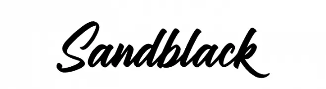
A bold, cursive font with interconnected, flowing letters and strong strokes.
![Sandblack Frei Schriftart Herunterladen]() Herunterladen 1424 Downloads@WebFont
Herunterladen 1424 Downloads@WebFont -
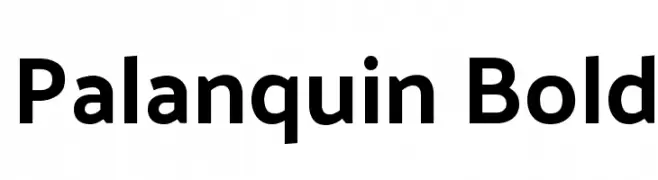
( Copyright 2014 Pria Ravichandran (pria.ravichandran@gmail.com) )
A modern, bold typeface with clean lines and excellent readability.
![Palanquin Bold Frei Schriftart Herunterladen]() Herunterladen 1424 Downloads@WebFont
Herunterladen 1424 Downloads@WebFont -
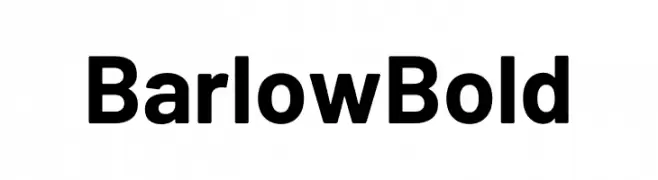
( Fonts by Tribby )
A bold, modern sans-serif font with strong, uniform strokes and high legibility.
![Barlow Bold Frei Schriftart Herunterladen]() Herunterladen 1423 Downloads@WebFont
Herunterladen 1423 Downloads@WebFont -
( Fonts by Ilham Herry - Personal-use only. For commercial use please contact owner. )
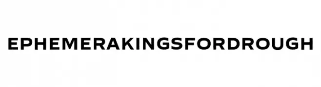
A bold, rugged font with a vintage, handcrafted feel.
![Ephemera Kingsford Rough Frei Schriftart Herunterladen]() Herunterladen 1423 Downloads@WebFont
Herunterladen 1423 Downloads@WebFont -
Schriftart von gatype. For commercial use please contact the owner.
( Free for personal use )
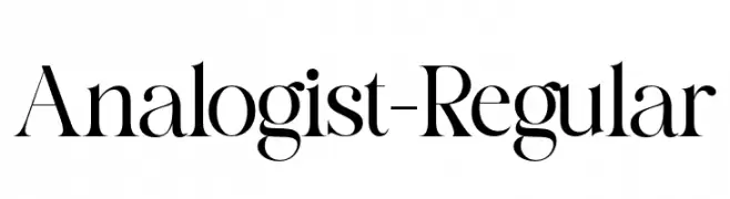
A high-contrast, elegant serif typeface with sharp serifs and a classic style.
![Analogist-Regular Frei Schriftart Herunterladen]() Herunterladen 1423 Downloads@WebFont
Herunterladen 1423 Downloads@WebFont -
( Chequered Ink - chequered.ink/ )
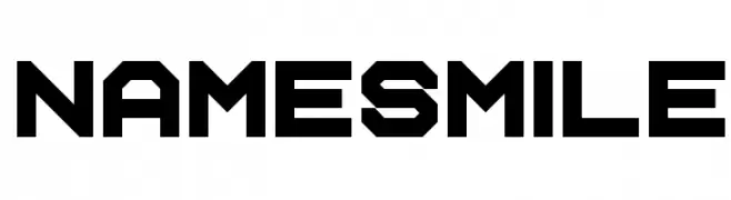
A bold, geometric font with angular, industrial design.
![Name Smile Frei Schriftart Herunterladen]() Herunterladen 1423 Downloads@WebFont
Herunterladen 1423 Downloads@WebFont -
( Bangkit Tri Setiadi - creativemarket.com/bangkit.tri.setiadi )
A graceful script font with fluid, interconnected strokes and ornate flourishes.
![Flanella Frei Schriftart Herunterladen]() Herunterladen 1423 Downloads@WebFont
Herunterladen 1423 Downloads@WebFont -
Schriftart von danny91194. For commercial use please contact the owner.
( tricky )
A playful, bold font with rounded, thick letters ideal for whimsical projects.
![Especially Mine Frei Schriftart Herunterladen]() Herunterladen 1423 Downloads@WebFont
Herunterladen 1423 Downloads@WebFont -
( Fonts by prescottdesignshop.com - Personal-use only. For commercial use please contact owner. )
A modern, light sans-serif font with clean lines and a minimalist design.
![PassionSansPDbc-LightSmallCaps Frei Schriftart Herunterladen]() Herunterladen 1423 Downloads@WebFont
Herunterladen 1423 Downloads@WebFont -
![FIBoxBB Frei Schriftart Herunterladen]() Herunterladen 1423 Downloads@WebFont
Herunterladen 1423 Downloads@WebFont -
( Fonts by Benoit Sjoholm - www.benoitsjoholm.com - All my fonts are for sale )
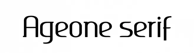
A sleek, modern font with geometric structure and consistent stroke width.
![Ageone serif Frei Schriftart Herunterladen]() Herunterladen 1423 Downloads@WebFont
Herunterladen 1423 Downloads@WebFont -
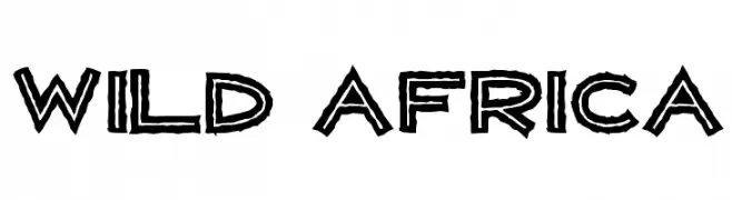
( Fonts by Andrew Hart - dirt2.com )
A bold, adventurous font inspired by African wildlife and culture.
![WILD AFRICA Frei Schriftart Herunterladen]() Herunterladen 1423 Downloads@WebFont
Herunterladen 1423 Downloads@WebFont -
![JLR Star Shrek Frei Schriftart Herunterladen]() Herunterladen 1423 Downloads@WebFont
Herunterladen 1423 Downloads@WebFont -
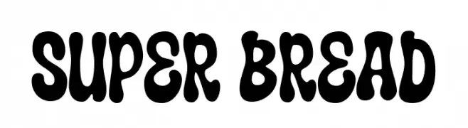
( Fonts by allsuperfont.com - Personal-use only. For commercial use please contact owner. )
A bold, playful font with thick, rounded strokes and a retro vibe.
![Super Bread Frei Schriftart Herunterladen]() Herunterladen 1422 Downloads@WebFont
Herunterladen 1422 Downloads@WebFont -
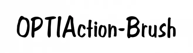
( Fonts by Castcraft Software - opti.netii.net - check the website before use )
A lively brush-style font with fluid, hand-drawn strokes.
![OPTIAction-Brush Frei Schriftart Herunterladen]() Herunterladen 1422 Downloads@WebFont
Herunterladen 1422 Downloads@WebFont -
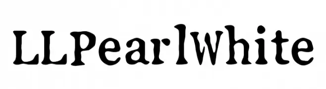
( Free for personal use - www.mschroeppel.de/ )
A whimsical, hand-drawn style font with bold, rounded characters.
![LLPearlWhite Frei Schriftart Herunterladen]() Herunterladen 1422 Downloads@WebFont
Herunterladen 1422 Downloads@WebFont -
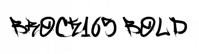
( www.behance.net/BrockMarques )
A bold, jagged, and dynamic brush-style font with an aggressive edge.
![Brock165 Bold Frei Schriftart Herunterladen]() Herunterladen 1422 Downloads@WebFont
Herunterladen 1422 Downloads@WebFont -
![KR Kube Frei Schriftart Herunterladen]() Herunterladen 1422 Downloads@WebFont
Herunterladen 1422 Downloads@WebFont


Welche Schriften sind gerade am populärsten?
Poppins, Roboto, Montserrat, Open Sans und Lato sind wegen ihrer klaren Formen und breiten Einsetzbarkeit sehr gefragt – von Markenauftritt über Landingpages bis hin zu Postern.
Welche Fonts eignen sich für Logos?
Geometrische Sans‑Serifs (z. B. Poppins, Familien im Gotham‑Stil) sind ein häufiger Griff für sauberes, skalierbares Branding. Für eine persönlichere Note bleiben Scripts und Handschrift‑Stile beliebt. Kombinieren Sie einen prägnanten Headline‑Font mit einer neutralen Brotschrift für Wiedererkennung und Harmonie.
Wie oft wird die Top‑Liste aktualisiert?
Regelmäßig – basierend auf realen Downloads und Interaktionen. Schauen Sie öfter vorbei, um aufstrebende Favoriten früh zu entdecken.
💡 Tipp: Seite bookmarken – Trends wechseln schnell, und heutige Top‑Schriften inspirieren morgen vielleicht das Rebranding.