Willkommen bei den Top‑Schriften – hier treffen Beliebtheit und Qualität aufeinander. Das sind die in diesem Jahr am häufigsten heruntergeladenen und genutzten Fonts. Wenn Sie sichere Optionen für Logo, Web oder Social suchen, starten Sie hier.
Jeder Top‑Font überzeugt durch Balance, Lesbarkeit und Vielseitigkeit. Sie finden moderne Sans‑Serifs, elegante Scripts, Vintage‑Serifs und minimalistische Displays.
-
( Fonts by www.gaiapro.co.jp )
A bold, brush-style font with an expressive and artistic appearance.
 Herunterladen 1389 Downloads@WebFont
 -
( Fonts by DesignByPlatform - Studio Aurora - https://creativemarket.com/studioaurora - Personal-use only. For commercial use please contact owner. )
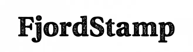
A bold, textured serif font with a vintage, handcrafted appearance.
![Fjord Stamp Frei Schriftart Herunterladen]() Herunterladen 1388 Downloads@WebFont
Herunterladen 1388 Downloads@WebFont -
( Fonts by Geronimo Fonts - Personal-use only. For commercial use please contact owner. )
A playful, rounded font with a friendly and approachable style.
![Back to School Frei Schriftart Herunterladen]() Herunterladen 1388 Downloads@WebFont
Herunterladen 1388 Downloads@WebFont -
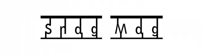
![Snag Mag Frei Schriftart Herunterladen]() Herunterladen 1388 Downloads@WebFont
Herunterladen 1388 Downloads@WebFont -
( Fonts by Apostrophic Lab )
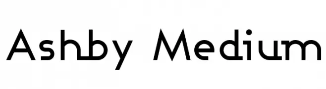
A modern, geometric font with clean lines and uniform stroke width.
![Ashby Medium Frei Schriftart Herunterladen]() Herunterladen 1388 Downloads@WebFont
Herunterladen 1388 Downloads@WebFont -
-
( Fonts by www.stimuleyefonts.com )
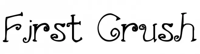
A whimsical decorative font with curly and swirly elements.
![First Crush Frei Schriftart Herunterladen]() Herunterladen 1388 Downloads@WebFont
Herunterladen 1388 Downloads@WebFont -
![Awesome Season Personal Use Regular Frei Schriftart Herunterladen]() Herunterladen 1387 Downloads@WebFont
Herunterladen 1387 Downloads@WebFont -
( Fonts by Yasir Ekinci )
A playful and elegant script font with smooth, flowing curves.
![BeautifyScript Frei Schriftart Herunterladen]() Herunterladen 1387 Downloads@WebFont
Herunterladen 1387 Downloads@WebFont -
( Fonts by Fajar Wahyu Pribadi )
A graceful and elegant script font with flowing, high-contrast strokes.
![Anomaly Frei Schriftart Herunterladen]() Herunterladen 1387 Downloads@WebFont
Herunterladen 1387 Downloads@WebFont -
![Minecrafter Frei Schriftart Herunterladen]() Herunterladen 1387 Downloads@WebFont
Herunterladen 1387 Downloads@WebFont -
![Leafy font Frei Schriftart Herunterladen]() Herunterladen 1387 Downloads@WebFont
Herunterladen 1387 Downloads@WebFont -
( Fonts by David Kerkhoff - www.hanodedphotography.com )
A whimsical, handwritten font with tall, narrow letters and a playful style.
![DKLampion Frei Schriftart Herunterladen]() Herunterladen 1387 Downloads@WebFont
Herunterladen 1387 Downloads@WebFont -
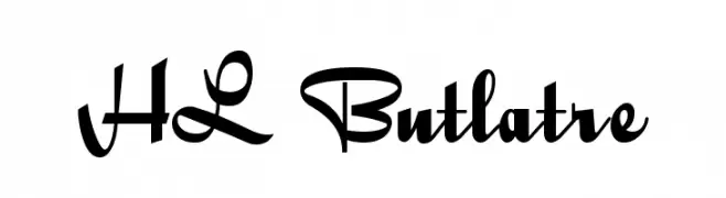
( Fonts by HungLan Design - www.hunglandesign.com )
A bold, decorative script font with expressive, sweeping strokes.
![HL Butlatre Frei Schriftart Herunterladen]() Herunterladen 1387 Downloads@WebFont
Herunterladen 1387 Downloads@WebFont -
![Oncial Frei Schriftart Herunterladen]() Herunterladen 1387 Downloads@WebFont
Herunterladen 1387 Downloads@WebFont -
( Fonts by www.fontalicious.com )
A playful, snowflake-adorned font with bold, whimsical letterforms.
![Frosty Frei Schriftart Herunterladen]() Herunterladen 1387 Downloads@WebFont
Herunterladen 1387 Downloads@WebFont -
( Fonts by Galdino Otten Fonts - www.galdinootten.com - Personal-use only. For commercial use please contact owner. )
A bold, pixelated font with a retro digital aesthetic.
![Pixel Book Frei Schriftart Herunterladen]() Herunterladen 1386 Downloads@WebFont
Herunterladen 1386 Downloads@WebFont -
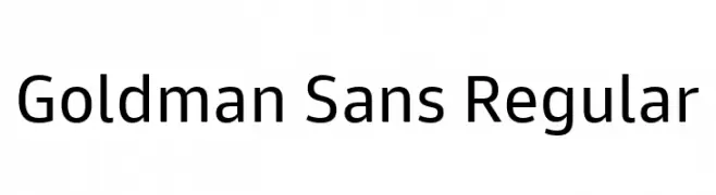
( Fonts by Goldman Sans - https://design.gs.com/d/design-system/foundation/typography/ - Personal-use only. For commercial use please contact owner. )
A clean, modern sans-serif typeface with uniform stroke thickness and balanced spacing.
![Goldman Sans Regular Frei Schriftart Herunterladen]() Herunterladen 1386 Downloads@WebFont
Herunterladen 1386 Downloads@WebFont -
( Muammar Khalid - creativemarket.com/kang1993 )
A playful, hand-drawn font with bold, rounded characters and a whimsical style.
![Avocados Frei Schriftart Herunterladen]() Herunterladen 1386 Downloads@WebFont
Herunterladen 1386 Downloads@WebFont -
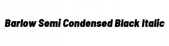
( Copyright 2017 The Barlow Project Authors (https://github.com/jpt/barlow) )
Bold, semi-condensed italic typeface with a strong, modern style.
![Barlow Semi Condensed Black Italic Frei Schriftart Herunterladen]() Herunterladen 1386 Downloads@WebFont
Herunterladen 1386 Downloads@WebFont -
( Copyright 2014 Adobe Systems Incorporated (http://www.adobe.com/), with Reserved Font Name 'Source'. All Rights Reserved. Source is a trademark of Adobe Systems Incorporated in the United States and/or other countries. )
A refined serif typeface with balanced proportions and elegant details.
![Source Serif Pro Light Frei Schriftart Herunterladen]() Herunterladen 1386 Downloads@WebFont
Herunterladen 1386 Downloads@WebFont -
Schriftart von TGIFStudio. For commercial use please contact the owner.
( Thank you for downloading this font This font is free for PERSONAL USE ONLY! Commercial license for this font can be purchased at: http://bit.ly/2wjqsZv )
A bold, Gothic-inspired font with angular lines and high contrast, perfect for dramatic designs.
![Hodor Regular Frei Schriftart Herunterladen]() Herunterladen 1386 Downloads@WebFont
Herunterladen 1386 Downloads@WebFont -
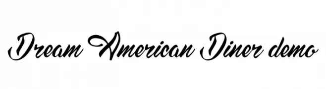
( Fonts by fontsandfashion.com. Personal-use only. For commercial use please contact owner. )
A bold, flowing script font with vintage American diner charm.
![Dream American Diner demo Frei Schriftart Herunterladen]() Herunterladen 1386 Downloads@WebFont
Herunterladen 1386 Downloads@WebFont -
( Fonts by a Neale Davidson - www.pixelsagas.com. Personal-use only. For commercial use please contact owner. )
A bold, geometric font with sharp angles and a futuristic style.
![Megatron Frei Schriftart Herunterladen]() Herunterladen 1386 Downloads@WebFont
Herunterladen 1386 Downloads@WebFont -
![VI Cam Huong Frei Schriftart Herunterladen]() Herunterladen 1386 Downloads@WebFont
Herunterladen 1386 Downloads@WebFont -
( Phitradesign - Philip Trautmann - www.phitradesign-fonts.com )
A bold, geometric font with a modern and technical design.
![LEIXO DEMO Frei Schriftart Herunterladen]() Herunterladen 1385 Downloads@WebFont
Herunterladen 1385 Downloads@WebFont -
( Copyright (c) 2014 Pooja Saxena (www.poojasaxena.in) )
A modern, clean typeface with excellent readability and versatility.
![Cambay Regular Frei Schriftart Herunterladen]() Herunterladen 1385 Downloads@WebFont
Herunterladen 1385 Downloads@WebFont -
![Evelyn Frei Schriftart Herunterladen]() Herunterladen 1385 Downloads@WebFont
Herunterladen 1385 Downloads@WebFont -
( Fonts by herofonts.com. Personal-use only. For commercial use please contact owner. )
An elegant, flowing script font with smooth, cursive letterforms.
![Delicacy Frei Schriftart Herunterladen]() Herunterladen 1385 Downloads@WebFont
Herunterladen 1385 Downloads@WebFont -
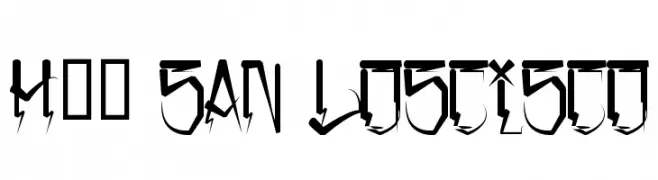
( Fonts by www.legacyofdefeat.com )
A bold, edgy font with sharp angles and dynamic extensions, perfect for eye-catching designs.
![H74 San Loscisco Frei Schriftart Herunterladen]() Herunterladen 1385 Downloads@WebFont
Herunterladen 1385 Downloads@WebFont -
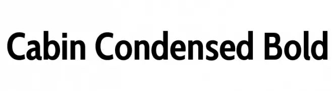
( Copyright 2016 The Cabin Project Authors (impallari@gmail.com) )
A modern, bold, and condensed sans-serif font ideal for impactful headlines.
![Cabin Condensed Bold Frei Schriftart Herunterladen]() Herunterladen 1385 Downloads@WebFont
Herunterladen 1385 Downloads@WebFont -
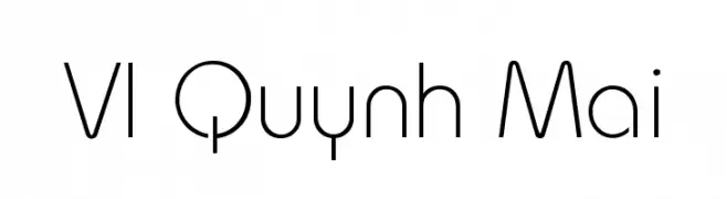
![VI Quynh Mai Frei Schriftart Herunterladen]() Herunterladen 1385 Downloads@WebFont
Herunterladen 1385 Downloads@WebFont -
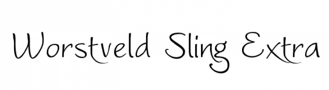
( Fonts by Graham Meade - GemFonts )
A whimsical, cursive-like font with elegant curves and a playful style.
![Worstveld Sling Extra Frei Schriftart Herunterladen]() Herunterladen 1385 Downloads@WebFont
Herunterladen 1385 Downloads@WebFont -
( Fonts by Dieter Steffmann )
An ornate, vintage-style decorative font with intricate detailing.
![Romantiques Frei Schriftart Herunterladen]() Herunterladen 1385 Downloads@WebFont
Herunterladen 1385 Downloads@WebFont -
( Fonts by Jens R. Ziehn - www.filmhimmel.com )
A bold, distressed font with horror-themed elements and rugged textures.
![Shaun of the Dead Frei Schriftart Herunterladen]() Herunterladen 1385 Downloads@WebFont
Herunterladen 1385 Downloads@WebFont -
![BadBlocks TT Frei Schriftart Herunterladen]() Herunterladen 1385 Downloads@WebFont
Herunterladen 1385 Downloads@WebFont


Welche Schriften sind gerade am populärsten?
Poppins, Roboto, Montserrat, Open Sans und Lato sind wegen ihrer klaren Formen und breiten Einsetzbarkeit sehr gefragt – von Markenauftritt über Landingpages bis hin zu Postern.
Welche Fonts eignen sich für Logos?
Geometrische Sans‑Serifs (z. B. Poppins, Familien im Gotham‑Stil) sind ein häufiger Griff für sauberes, skalierbares Branding. Für eine persönlichere Note bleiben Scripts und Handschrift‑Stile beliebt. Kombinieren Sie einen prägnanten Headline‑Font mit einer neutralen Brotschrift für Wiedererkennung und Harmonie.
Wie oft wird die Top‑Liste aktualisiert?
Regelmäßig – basierend auf realen Downloads und Interaktionen. Schauen Sie öfter vorbei, um aufstrebende Favoriten früh zu entdecken.
💡 Tipp: Seite bookmarken – Trends wechseln schnell, und heutige Top‑Schriften inspirieren morgen vielleicht das Rebranding.