Willkommen bei den Top‑Schriften – hier treffen Beliebtheit und Qualität aufeinander. Das sind die in diesem Jahr am häufigsten heruntergeladenen und genutzten Fonts. Wenn Sie sichere Optionen für Logo, Web oder Social suchen, starten Sie hier.
Jeder Top‑Font überzeugt durch Balance, Lesbarkeit und Vielseitigkeit. Sie finden moderne Sans‑Serifs, elegante Scripts, Vintage‑Serifs und minimalistische Displays.
-
 Herunterladen 368 Downloads@WebFont
 -
( Fonts by Burhan Afif - hanscostudio.com - Personal-use only. For commercial use please contact owner. )
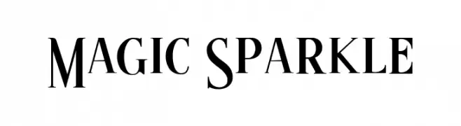
An elegant serif font with elongated strokes and a refined, classic appearance.
![Magic Sparkle Frei Schriftart Herunterladen]() Herunterladen 368 Downloads@WebFont
Herunterladen 368 Downloads@WebFont -
( Fonts by LyonsType )
A bold slab serif font with strong, block-like serifs and a modern classic feel.
![LT Leap Medium Frei Schriftart Herunterladen]() Herunterladen 368 Downloads@WebFont
Herunterladen 368 Downloads@WebFont -
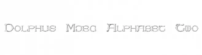
![Dolphus-Mieg Alphabet Two Frei Schriftart Herunterladen]() Herunterladen 368 Downloads@WebFont
Herunterladen 368 Downloads@WebFont -
( Fonts by p joks )
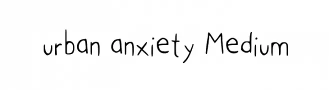
A playful, hand-drawn font with tall, narrow characters and a whimsical style.
![urban anxiety Medium Frei Schriftart Herunterladen]() Herunterladen 368 Downloads@WebFont
Herunterladen 368 Downloads@WebFont -
-
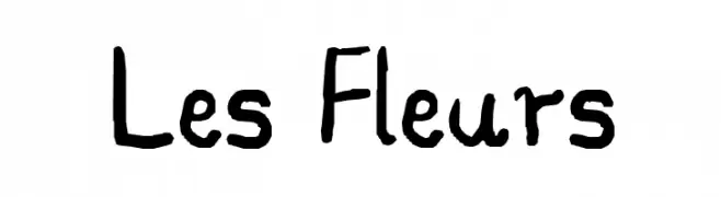
![Les Fleurs Frei Schriftart Herunterladen]() Herunterladen 368 Downloads@WebFont
Herunterladen 368 Downloads@WebFont -
( Fonts by Daniel Gauthier )
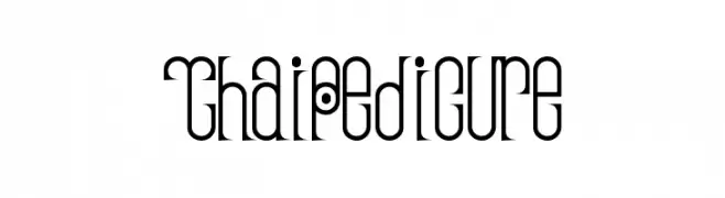
A decorative font with elongated, narrow letterforms and circular motifs.
![ThaiPedicure Frei Schriftart Herunterladen]() Herunterladen 368 Downloads@WebFont
Herunterladen 368 Downloads@WebFont -
( Fonts by Woodcutter Manero - www.woodcutter.es - Personal-use only. For commercial use please contact owner. )
A bold, distressed font with a vintage, rugged appearance.
![Scratch Night Team Frei Schriftart Herunterladen]() Herunterladen 368 Downloads@WebFont
Herunterladen 368 Downloads@WebFont -
( Fonts by Andrew McCluskey - nalgames.com. Personal-use only. For commercial use please contact owner. )
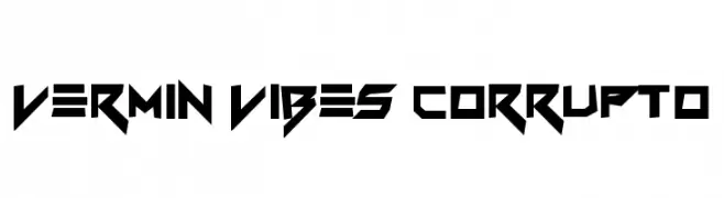
A bold, angular font with a futuristic and edgy design.
![Vermin Vibes Corrupto Frei Schriftart Herunterladen]() Herunterladen 368 Downloads@WebFont
Herunterladen 368 Downloads@WebFont -
( Fonts by Nick Curtis - www.nicksfonts.com )
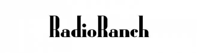
A bold, high-contrast font with sharp serifs and a vintage-modern appeal.
![RadioRanch Frei Schriftart Herunterladen]() Herunterladen 368 Downloads
Herunterladen 368 Downloads


Welche Schriften sind gerade am populärsten?
Poppins, Roboto, Montserrat, Open Sans und Lato sind wegen ihrer klaren Formen und breiten Einsetzbarkeit sehr gefragt – von Markenauftritt über Landingpages bis hin zu Postern.
Welche Fonts eignen sich für Logos?
Geometrische Sans‑Serifs (z. B. Poppins, Familien im Gotham‑Stil) sind ein häufiger Griff für sauberes, skalierbares Branding. Für eine persönlichere Note bleiben Scripts und Handschrift‑Stile beliebt. Kombinieren Sie einen prägnanten Headline‑Font mit einer neutralen Brotschrift für Wiedererkennung und Harmonie.
Wie oft wird die Top‑Liste aktualisiert?
Regelmäßig – basierend auf realen Downloads und Interaktionen. Schauen Sie öfter vorbei, um aufstrebende Favoriten früh zu entdecken.
💡 Tipp: Seite bookmarken – Trends wechseln schnell, und heutige Top‑Schriften inspirieren morgen vielleicht das Rebranding.