Willkommen bei den Top‑Schriften – hier treffen Beliebtheit und Qualität aufeinander. Das sind die in diesem Jahr am häufigsten heruntergeladenen und genutzten Fonts. Wenn Sie sichere Optionen für Logo, Web oder Social suchen, starten Sie hier.
Jeder Top‑Font überzeugt durch Balance, Lesbarkeit und Vielseitigkeit. Sie finden moderne Sans‑Serifs, elegante Scripts, Vintage‑Serifs und minimalistische Displays.
-
Schriftart von defharo. For commercial use please contact the owner.
 Herunterladen 369 Downloads@WebFont
 -
( گالری فانت فارسی پژوهش آريانا - only compatible with Farsi and Arabic )
An Arabic-inspired font with flowing, calligraphic strokes.
![Arabic Style I Frei Schriftart Herunterladen]() Herunterladen 369 Downloads@WebFont
Herunterladen 369 Downloads@WebFont -
( Fonts by Spork Thug Typography - Josh Wilhelm - www.lifewithouttaffy.com/taffy/blog )
A playful, casual handwritten font with smooth, rounded strokes.
![REVEREND JOSH Frei Schriftart Herunterladen]() Herunterladen 369 Downloads@WebFont
Herunterladen 369 Downloads@WebFont -
![Concept Frei Schriftart Herunterladen]() Herunterladen 369 Downloads@WebFont
Herunterladen 369 Downloads@WebFont -
( Personal-use only. For commercial use please contact owner. )
A bold, modern font with a geometric and condensed style.
![Bizmeud Frei Schriftart Herunterladen]() Herunterladen 369 Downloads@WebFont
Herunterladen 369 Downloads@WebFont -
-
( Fonts by Ira Joyce Alvarez )
A bold, expressive handwritten font with brush-like strokes and playful forms.
![Joyce Regular Frei Schriftart Herunterladen]() Herunterladen 369 Downloads@WebFont
Herunterladen 369 Downloads@WebFont -
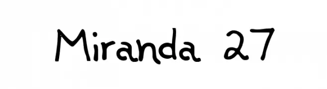
( Fonts by Kreative Korporation - www.kreativekorp.com )
A playful, handwritten font with a casual and friendly style.
![Miranda 27 Frei Schriftart Herunterladen]() Herunterladen 369 Downloads@WebFont
Herunterladen 369 Downloads@WebFont -
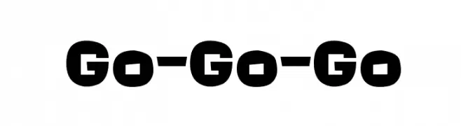
( Fonts by Colorful Typhoon - http://orange.s56.xrea.com/blog/ )
A bold, playful font with chunky, rounded characters.
![Go-Go-Go Frei Schriftart Herunterladen]() Herunterladen 369 Downloads@WebFont
Herunterladen 369 Downloads@WebFont -
( Fonts by Bree Gorton )
A bold, outlined font with a strong, decorative style.
![Fat Legs Outline Frei Schriftart Herunterladen]() Herunterladen 369 Downloads@WebFont
Herunterladen 369 Downloads@WebFont -
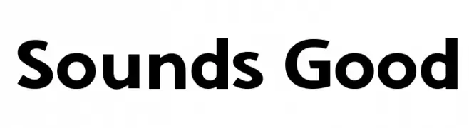
( Fonts by a Galdino Otten - galdinootten.com . Personal-use only. For commercial use please contact owner. )
A bold, modern sans-serif font with geometric shapes and uniform strokes.
![Sounds Good Frei Schriftart Herunterladen]() Herunterladen 369 Downloads@WebFont
Herunterladen 369 Downloads@WebFont


Welche Schriften sind gerade am populärsten?
Poppins, Roboto, Montserrat, Open Sans und Lato sind wegen ihrer klaren Formen und breiten Einsetzbarkeit sehr gefragt – von Markenauftritt über Landingpages bis hin zu Postern.
Welche Fonts eignen sich für Logos?
Geometrische Sans‑Serifs (z. B. Poppins, Familien im Gotham‑Stil) sind ein häufiger Griff für sauberes, skalierbares Branding. Für eine persönlichere Note bleiben Scripts und Handschrift‑Stile beliebt. Kombinieren Sie einen prägnanten Headline‑Font mit einer neutralen Brotschrift für Wiedererkennung und Harmonie.
Wie oft wird die Top‑Liste aktualisiert?
Regelmäßig – basierend auf realen Downloads und Interaktionen. Schauen Sie öfter vorbei, um aufstrebende Favoriten früh zu entdecken.
💡 Tipp: Seite bookmarken – Trends wechseln schnell, und heutige Top‑Schriften inspirieren morgen vielleicht das Rebranding.