Willkommen bei den Top‑Schriften – hier treffen Beliebtheit und Qualität aufeinander. Das sind die in diesem Jahr am häufigsten heruntergeladenen und genutzten Fonts. Wenn Sie sichere Optionen für Logo, Web oder Social suchen, starten Sie hier.
Jeder Top‑Font überzeugt durch Balance, Lesbarkeit und Vielseitigkeit. Sie finden moderne Sans‑Serifs, elegante Scripts, Vintage‑Serifs und minimalistische Displays.
-
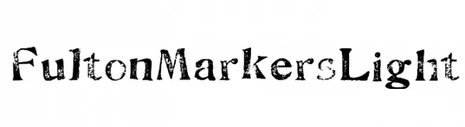
( Fonts by www.abecedarienne.com )
A distressed serif font with a vintage, grunge aesthetic.
 Herunterladen 368 Downloads@WebFont
 -
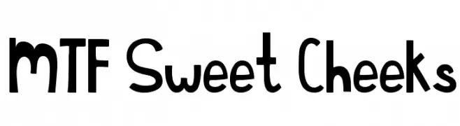
( Fonts by Miss Tiina at www.misstiina.com (please check the website before use) )
A playful and whimsical font with bold, rounded characters and a fun, informal style.
![MTF Sweet Cheeks Frei Schriftart Herunterladen]() Herunterladen 368 Downloads@WebFont
Herunterladen 368 Downloads@WebFont -
![LJ Design Studios IS Frei Schriftart Herunterladen]() Herunterladen 368 Downloads@WebFont
Herunterladen 368 Downloads@WebFont -
( Fonts by Chequered Ink - chequered.ink - Personal-use only. For commercial use please contact owner. )
A bold, vintage-style serif font with strong, squared serifs.
![Milletun Frei Schriftart Herunterladen]() Herunterladen 368 Downloads@WebFont
Herunterladen 368 Downloads@WebFont -
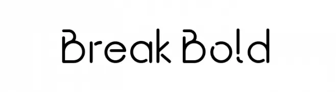
( Fonts by Rajesh Rajput - gumroad.com/rajputrajesh_448 - Personal-use only. For commercial use please contact owner. )
A modern, geometric font with clean lines and a futuristic aesthetic.
![Break Bold Frei Schriftart Herunterladen]() Herunterladen 368 Downloads@WebFont
Herunterladen 368 Downloads@WebFont -
-
( Fonts by a Neale Davidson - www.pixelsagas.com. Personal-use only. For commercial use please contact owner. )
A modern, geometric font with a condensed and uniform appearance.
![Carlton Frei Schriftart Herunterladen]() Herunterladen 368 Downloads@WebFont
Herunterladen 368 Downloads@WebFont -
( Fonts by www.chequered.ink - Chequered Ink - Personal-use only. For commercial use please contact owner. )
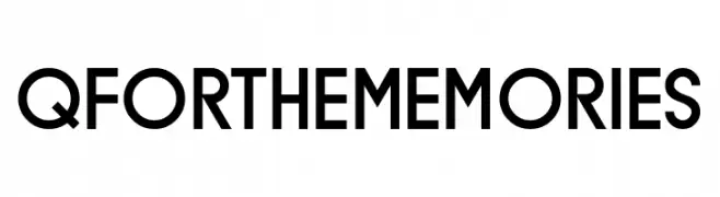
A modern sans-serif font with geometric shapes and uniform stroke width.
![Q for the Memories Frei Schriftart Herunterladen]() Herunterladen 368 Downloads@WebFont
Herunterladen 368 Downloads@WebFont -
( Fonts by junkohanhero )
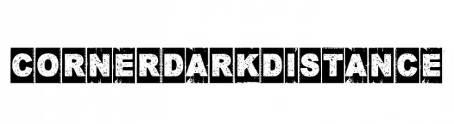
A bold, distressed font with a vintage, grunge texture.
![Corner Dark Distance Frei Schriftart Herunterladen]() Herunterladen 368 Downloads@WebFont
Herunterladen 368 Downloads@WebFont -
( Fonts by MonkeyRoodles Fonts )
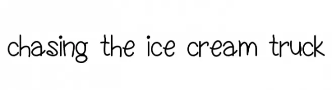
A playful, handwritten font with a casual and whimsical style.
![chasing the ice cream truck Frei Schriftart Herunterladen]() Herunterladen 368 Downloads@WebFont
Herunterladen 368 Downloads@WebFont -
( Fonts by www.Fontfabric.com )
A bold, geometric stencil font with rounded shapes and strategic cutouts.
![VALStencil Frei Schriftart Herunterladen]() Herunterladen 368 Downloads@WebFont
Herunterladen 368 Downloads@WebFont


Welche Schriften sind gerade am populärsten?
Poppins, Roboto, Montserrat, Open Sans und Lato sind wegen ihrer klaren Formen und breiten Einsetzbarkeit sehr gefragt – von Markenauftritt über Landingpages bis hin zu Postern.
Welche Fonts eignen sich für Logos?
Geometrische Sans‑Serifs (z. B. Poppins, Familien im Gotham‑Stil) sind ein häufiger Griff für sauberes, skalierbares Branding. Für eine persönlichere Note bleiben Scripts und Handschrift‑Stile beliebt. Kombinieren Sie einen prägnanten Headline‑Font mit einer neutralen Brotschrift für Wiedererkennung und Harmonie.
Wie oft wird die Top‑Liste aktualisiert?
Regelmäßig – basierend auf realen Downloads und Interaktionen. Schauen Sie öfter vorbei, um aufstrebende Favoriten früh zu entdecken.
💡 Tipp: Seite bookmarken – Trends wechseln schnell, und heutige Top‑Schriften inspirieren morgen vielleicht das Rebranding.