Willkommen bei den Top‑Schriften – hier treffen Beliebtheit und Qualität aufeinander. Das sind die in diesem Jahr am häufigsten heruntergeladenen und genutzten Fonts. Wenn Sie sichere Optionen für Logo, Web oder Social suchen, starten Sie hier.
Jeder Top‑Font überzeugt durch Balance, Lesbarkeit und Vielseitigkeit. Sie finden moderne Sans‑Serifs, elegante Scripts, Vintage‑Serifs und minimalistische Displays.
-
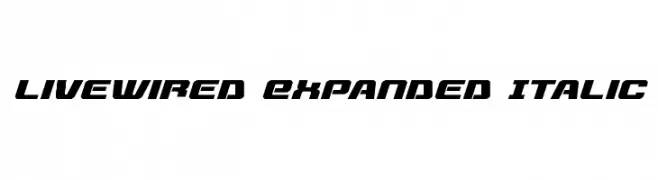
( Fonts by Daniel Zadorozny - www.iconian.com - Free for personal use )
A bold, italic, and futuristic font with sharp angles and high contrast.
 Herunterladen 367 Downloads@WebFont
 -
( Fonts by Manfred Klein - manfred-klein.ina-mar.com )
A bold, Gothic-style font with intricate flourishes and a dramatic presence.
![ZenFrax Frei Schriftart Herunterladen]() Herunterladen 367 Downloads@WebFont
Herunterladen 367 Downloads@WebFont -
( Fonts by a Neale Davidson - www.pixelsagas.com. Personal-use only. For commercial use please contact owner. )
A modern, condensed italic font with a sleek and dynamic style.
![Imaki Condensed Italic Frei Schriftart Herunterladen]() Herunterladen 367 Downloads@WebFont
Herunterladen 367 Downloads@WebFont -
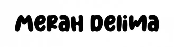
( Fonts by Four Lines )
A playful, bold font with rounded, thick characters and a whimsical style.
![Merah Delima Frei Schriftart Herunterladen]() Herunterladen 367 Downloads@WebFont
Herunterladen 367 Downloads@WebFont -
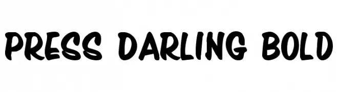
( Fonts by Daniel Zadorozny - www.iconian.com - Free for personal use )
A bold, playful font with rounded strokes and a dynamic slant.
![Press Darling Bold Frei Schriftart Herunterladen]() Herunterladen 367 Downloads@WebFont
Herunterladen 367 Downloads@WebFont -
-
( Fonts by Steve Cloutier - www.cloutierfontes.ca )
A playful, hand-drawn font with bold, expressive strokes and a whimsical style.
![CF Life is beautiful Regular Frei Schriftart Herunterladen]() Herunterladen 367 Downloads@WebFont
Herunterladen 367 Downloads@WebFont -
![POE Sans New Bold Italic Frei Schriftart Herunterladen]() Herunterladen 367 Downloads@WebFont
Herunterladen 367 Downloads@WebFont -
( Fonts by www.peter-wiegel.de. Personal-use only. For commercial use please contact owner. )
A bold, dynamic font with sharp edges and smooth curves, perfect for dramatic designs.
![FetteMikado Frei Schriftart Herunterladen]() Herunterladen 367 Downloads@WebFont
Herunterladen 367 Downloads@WebFont -
![RIOLO Frei Schriftart Herunterladen]() Herunterladen 367 Downloads@WebFont
Herunterladen 367 Downloads@WebFont -
![Heartless Valiumwhore Frei Schriftart Herunterladen]() Herunterladen 367 Downloads@WebFont
Herunterladen 367 Downloads@WebFont


Welche Schriften sind gerade am populärsten?
Poppins, Roboto, Montserrat, Open Sans und Lato sind wegen ihrer klaren Formen und breiten Einsetzbarkeit sehr gefragt – von Markenauftritt über Landingpages bis hin zu Postern.
Welche Fonts eignen sich für Logos?
Geometrische Sans‑Serifs (z. B. Poppins, Familien im Gotham‑Stil) sind ein häufiger Griff für sauberes, skalierbares Branding. Für eine persönlichere Note bleiben Scripts und Handschrift‑Stile beliebt. Kombinieren Sie einen prägnanten Headline‑Font mit einer neutralen Brotschrift für Wiedererkennung und Harmonie.
Wie oft wird die Top‑Liste aktualisiert?
Regelmäßig – basierend auf realen Downloads und Interaktionen. Schauen Sie öfter vorbei, um aufstrebende Favoriten früh zu entdecken.
💡 Tipp: Seite bookmarken – Trends wechseln schnell, und heutige Top‑Schriften inspirieren morgen vielleicht das Rebranding.