Willkommen bei den Top‑Schriften – hier treffen Beliebtheit und Qualität aufeinander. Das sind die in diesem Jahr am häufigsten heruntergeladenen und genutzten Fonts. Wenn Sie sichere Optionen für Logo, Web oder Social suchen, starten Sie hier.
Jeder Top‑Font überzeugt durch Balance, Lesbarkeit und Vielseitigkeit. Sie finden moderne Sans‑Serifs, elegante Scripts, Vintage‑Serifs und minimalistische Displays.
-
( Fonts by www.blambot.com )
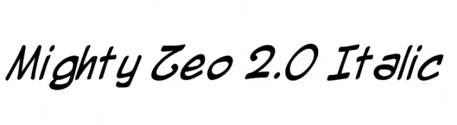
A dynamic, italic script font with fluid strokes and a playful vibe.
 Herunterladen 368 Downloads@WebFont
 -
( Fonts by Manfred Klein - manfred-klein.ina-mar.com )
A bold, Gothic-style font with intricate flourishes and a dramatic presence.
![ZenFrax Frei Schriftart Herunterladen]() Herunterladen 368 Downloads@WebFont
Herunterladen 368 Downloads@WebFont -
( Fonts by Steve Cloutier - www.cloutierfontes.ca )
A playful, hand-drawn font with bold, expressive strokes and a whimsical style.
![CF Life is beautiful Regular Frei Schriftart Herunterladen]() Herunterladen 368 Downloads@WebFont
Herunterladen 368 Downloads@WebFont -
( Fonts by www.theboutons.com - Gary David Bouton )
A bold, geometric collection of symbols and shapes within squares.
![GeoType Frei Schriftart Herunterladen]() Herunterladen 368 Downloads@WebFont
Herunterladen 368 Downloads@WebFont -
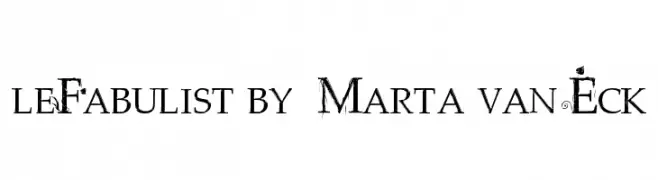
![leFabulist by Marta van Eck Frei Schriftart Herunterladen]() Herunterladen 368 Downloads@WebFont
Herunterladen 368 Downloads@WebFont -
-
( Fonts by Daniel Zadorozny - www.iconian.com - Free for personal use )
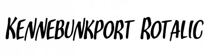
A bold, handwritten font with a dynamic and energetic style.
![Kennebunkport Rotalic Frei Schriftart Herunterladen]() Herunterladen 368 Downloads@WebFont
Herunterladen 368 Downloads@WebFont -
( Fonts by www.houseoflime.com )
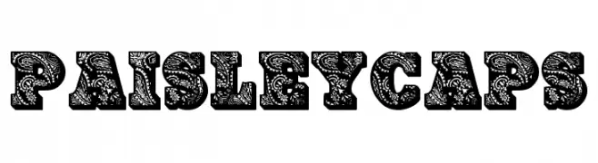
A decorative font with intricate paisley patterns filling each character.
![PaisleyCaps Frei Schriftart Herunterladen]() Herunterladen 368 Downloads@WebFont
Herunterladen 368 Downloads@WebFont -
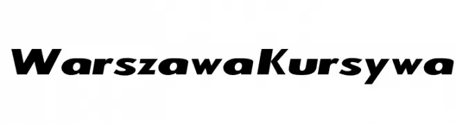
![Warszawa Kursywa Frei Schriftart Herunterladen]() Herunterladen 368 Downloads@WebFont
Herunterladen 368 Downloads@WebFont -
![NHL EAST Frei Schriftart Herunterladen]() Herunterladen 368 Downloads@WebFont
Herunterladen 368 Downloads@WebFont -
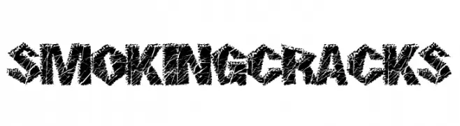
( Fonts by a Max Infeld - XEROGRAPHER FONTS - xerographer.blogspot.com . Personal-use only. For commercial use please contact owner. )
A bold, cracked texture font with an edgy, distressed style.
![SmokingCracks Frei Schriftart Herunterladen]() Herunterladen 368 Downloads@WebFont
Herunterladen 368 Downloads@WebFont


Welche Schriften sind gerade am populärsten?
Poppins, Roboto, Montserrat, Open Sans und Lato sind wegen ihrer klaren Formen und breiten Einsetzbarkeit sehr gefragt – von Markenauftritt über Landingpages bis hin zu Postern.
Welche Fonts eignen sich für Logos?
Geometrische Sans‑Serifs (z. B. Poppins, Familien im Gotham‑Stil) sind ein häufiger Griff für sauberes, skalierbares Branding. Für eine persönlichere Note bleiben Scripts und Handschrift‑Stile beliebt. Kombinieren Sie einen prägnanten Headline‑Font mit einer neutralen Brotschrift für Wiedererkennung und Harmonie.
Wie oft wird die Top‑Liste aktualisiert?
Regelmäßig – basierend auf realen Downloads und Interaktionen. Schauen Sie öfter vorbei, um aufstrebende Favoriten früh zu entdecken.
💡 Tipp: Seite bookmarken – Trends wechseln schnell, und heutige Top‑Schriften inspirieren morgen vielleicht das Rebranding.