Willkommen bei den Top‑Schriften – hier treffen Beliebtheit und Qualität aufeinander. Das sind die in diesem Jahr am häufigsten heruntergeladenen und genutzten Fonts. Wenn Sie sichere Optionen für Logo, Web oder Social suchen, starten Sie hier.
Jeder Top‑Font überzeugt durch Balance, Lesbarkeit und Vielseitigkeit. Sie finden moderne Sans‑Serifs, elegante Scripts, Vintage‑Serifs und minimalistische Displays.
-
( Fonts by Hanna Bie - Personal-use only. For commercial use please contact owner. )
A bold, modern sans-serif font with a condensed and geometric style.
 Herunterladen 367 Downloads@WebFont
 -
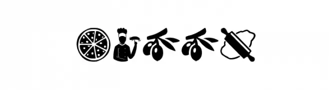
( Fonts by www.woodcutter.es - woodcutter Manero - Personal-use only. For commercial use please contact owner. )
Playful pizza-themed icon font with bold, decorative glyphs.
![Pizza Frei Schriftart Herunterladen]() Herunterladen 367 Downloads@WebFont
Herunterladen 367 Downloads@WebFont -
( Fonts by Jayde Garrow - GarrowGlitch - http://jaydegarrow.wix.com/jaydefonts. Personal-use only. For commercial use please contact owner. )
A bold, geometric font with a modern and playful style, perfect for eye-catching designs.
![American DAD! Frei Schriftart Herunterladen]() Herunterladen 367 Downloads@WebFont
Herunterladen 367 Downloads@WebFont -
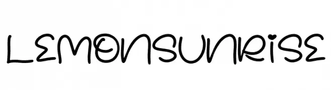
( Fonts by Perspectype Studio - Letterena.com - Personal-use only. For commercial use please contact owner. )
A playful, handwritten font with rounded, whimsical characters.
![LEMON SUNRISE Frei Schriftart Herunterladen]() Herunterladen 367 Downloads@WebFont
Herunterladen 367 Downloads@WebFont -
( Fonts by Hanken Design Co. - Personal-use only. For commercial use please contact owner. )
A modern, geometric sans-serif font with uniform strokes and clear characters.
![HK Grotesk Regular Frei Schriftart Herunterladen]() Herunterladen 367 Downloads@WebFont
Herunterladen 367 Downloads@WebFont -
-
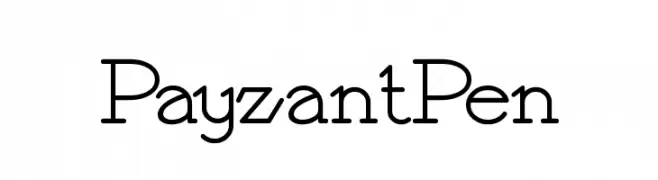
( Fonts by Nick Curtis - www.nicksfonts.com )
A modern vintage font with elegant curves and sharp angles, perfect for creative projects.
![PayzantPen Frei Schriftart Herunterladen]() Herunterladen 367 Downloads@WebFont
Herunterladen 367 Downloads@WebFont -
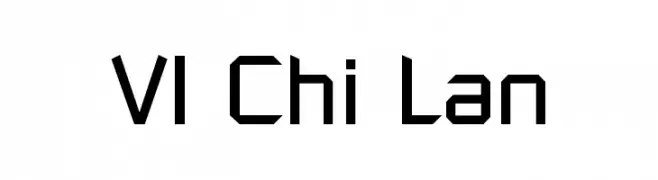
![VI Chi Lan Frei Schriftart Herunterladen]() Herunterladen 367 Downloads@WebFont
Herunterladen 367 Downloads@WebFont -
![Ceasar Frei Schriftart Herunterladen]() Herunterladen 367 Downloads@WebFont
Herunterladen 367 Downloads@WebFont -
( Fonts by Fabien Despinoy - Personal-use only. For commercial use please contact owner. )
A modern, minimalist font with tall, narrow characters and consistent stroke width.
![Fabiolo Light Regular Frei Schriftart Herunterladen]() Herunterladen 367 Downloads@WebFont
Herunterladen 367 Downloads@WebFont -
![Gutter Vomit Frei Schriftart Herunterladen]() Herunterladen 367 Downloads@WebFont
Herunterladen 367 Downloads@WebFont


Welche Schriften sind gerade am populärsten?
Poppins, Roboto, Montserrat, Open Sans und Lato sind wegen ihrer klaren Formen und breiten Einsetzbarkeit sehr gefragt – von Markenauftritt über Landingpages bis hin zu Postern.
Welche Fonts eignen sich für Logos?
Geometrische Sans‑Serifs (z. B. Poppins, Familien im Gotham‑Stil) sind ein häufiger Griff für sauberes, skalierbares Branding. Für eine persönlichere Note bleiben Scripts und Handschrift‑Stile beliebt. Kombinieren Sie einen prägnanten Headline‑Font mit einer neutralen Brotschrift für Wiedererkennung und Harmonie.
Wie oft wird die Top‑Liste aktualisiert?
Regelmäßig – basierend auf realen Downloads und Interaktionen. Schauen Sie öfter vorbei, um aufstrebende Favoriten früh zu entdecken.
💡 Tipp: Seite bookmarken – Trends wechseln schnell, und heutige Top‑Schriften inspirieren morgen vielleicht das Rebranding.