Willkommen bei den Top‑Schriften – hier treffen Beliebtheit und Qualität aufeinander. Das sind die in diesem Jahr am häufigsten heruntergeladenen und genutzten Fonts. Wenn Sie sichere Optionen für Logo, Web oder Social suchen, starten Sie hier.
Jeder Top‑Font überzeugt durch Balance, Lesbarkeit und Vielseitigkeit. Sie finden moderne Sans‑Serifs, elegante Scripts, Vintage‑Serifs und minimalistische Displays.
-
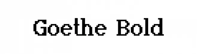
( Fonts by Kreative Korporation - www.kreativekorp.com )
A bold serif font with strong vertical strokes and classic proportions.
 Herunterladen 365 Downloads@WebFont
 -
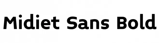
( Fonts by YOFonts - Yasuhiro Yamaoka - yoworks.com - Personal-use only. For commercial use please contact owner. )
A bold, modern sans-serif font with clean lines and excellent legibility.
![Midiet Sans Bold Frei Schriftart Herunterladen]() Herunterladen 365 Downloads@WebFont
Herunterladen 365 Downloads@WebFont -
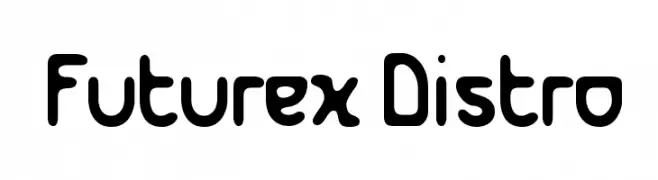
( Fonts by Apostrophic Lab )
A bold, rounded font with a playful, futuristic style.
![Futurex Distro Frei Schriftart Herunterladen]() Herunterladen 365 Downloads@WebFont
Herunterladen 365 Downloads@WebFont -
![SA-Boston Blvd Frei Schriftart Herunterladen]() Herunterladen 365 Downloads@WebFont
Herunterladen 365 Downloads@WebFont -
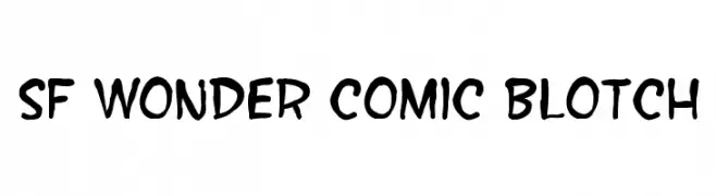
( Fonts by ShyFonts )
A playful, hand-drawn style font with bold, irregular strokes perfect for comic or casual designs.
![SF Wonder Comic Blotch Frei Schriftart Herunterladen]() Herunterladen 365 Downloads@WebFont
Herunterladen 365 Downloads@WebFont -
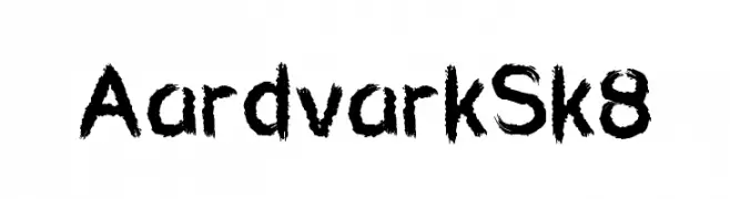
-
![Aardvark Sk8 Frei Schriftart Herunterladen]() Herunterladen 365 Downloads@WebFont
Herunterladen 365 Downloads@WebFont -
( Fonts by weknow - Wino S Kadir )
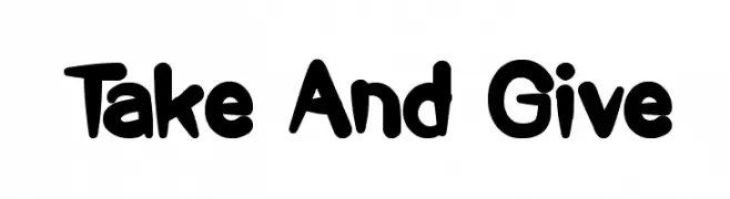
A playful, bold font with rounded, thick strokes and a friendly appearance.
![Take And Give Frei Schriftart Herunterladen]() Herunterladen 365 Downloads@WebFont
Herunterladen 365 Downloads@WebFont -
( Fonts by Darrell Flood )
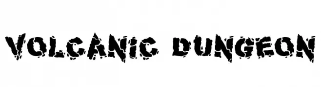
A bold, distressed font with a rugged, volcanic texture.
![Volcanic Dungeon Frei Schriftart Herunterladen]() Herunterladen 365 Downloads@WebFont
Herunterladen 365 Downloads@WebFont -
( Fonts by JSH creates )
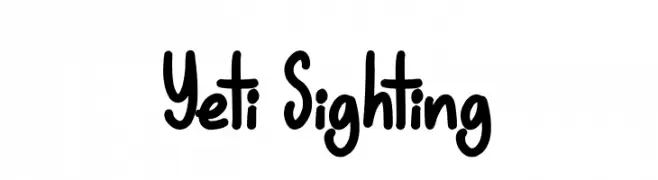
Playful handwritten font with rounded edges.
![Yeti Sighting Frei Schriftart Herunterladen]() Herunterladen 365 Downloads@WebFont
Herunterladen 365 Downloads@WebFont -
![Grimace Frei Schriftart Herunterladen]() Herunterladen 365 Downloads@WebFont
Herunterladen 365 Downloads@WebFont


Welche Schriften sind gerade am populärsten?
Poppins, Roboto, Montserrat, Open Sans und Lato sind wegen ihrer klaren Formen und breiten Einsetzbarkeit sehr gefragt – von Markenauftritt über Landingpages bis hin zu Postern.
Welche Fonts eignen sich für Logos?
Geometrische Sans‑Serifs (z. B. Poppins, Familien im Gotham‑Stil) sind ein häufiger Griff für sauberes, skalierbares Branding. Für eine persönlichere Note bleiben Scripts und Handschrift‑Stile beliebt. Kombinieren Sie einen prägnanten Headline‑Font mit einer neutralen Brotschrift für Wiedererkennung und Harmonie.
Wie oft wird die Top‑Liste aktualisiert?
Regelmäßig – basierend auf realen Downloads und Interaktionen. Schauen Sie öfter vorbei, um aufstrebende Favoriten früh zu entdecken.
💡 Tipp: Seite bookmarken – Trends wechseln schnell, und heutige Top‑Schriften inspirieren morgen vielleicht das Rebranding.