Willkommen bei den Top‑Schriften – hier treffen Beliebtheit und Qualität aufeinander. Das sind die in diesem Jahr am häufigsten heruntergeladenen und genutzten Fonts. Wenn Sie sichere Optionen für Logo, Web oder Social suchen, starten Sie hier.
Jeder Top‑Font überzeugt durch Balance, Lesbarkeit und Vielseitigkeit. Sie finden moderne Sans‑Serifs, elegante Scripts, Vintage‑Serifs und minimalistische Displays.
-
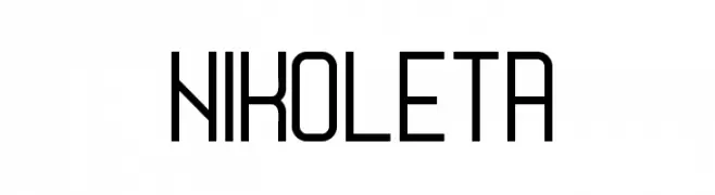
( Boris Garic )
A modern, geometric font with clean lines and uniform stroke width.
 Herunterladen 366 Downloads@WebFont
 -
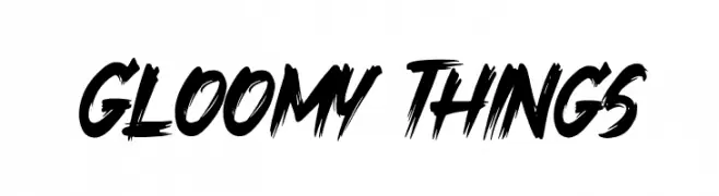
( Fonts by Khurasan - Syaf Rizal - Personal-use only. For commercial use please contact owner. )
A bold, brush-style font with dynamic, edgy strokes.
![Gloomy Things Frei Schriftart Herunterladen]() Herunterladen 366 Downloads@WebFont
Herunterladen 366 Downloads@WebFont -
![Hand of Diesel Frei Schriftart Herunterladen]() Herunterladen 366 Downloads@WebFont
Herunterladen 366 Downloads@WebFont -
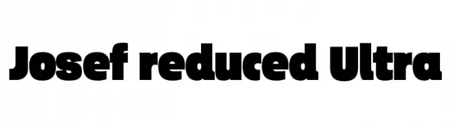
( ingoFonts - Ingo Zimmermann - www.ingofonts.com )
A bold, modern font with thick, uniform strokes and tight spacing.
![Josef reduced Ultra Frei Schriftart Herunterladen]() Herunterladen 366 Downloads@WebFont
Herunterladen 366 Downloads@WebFont -
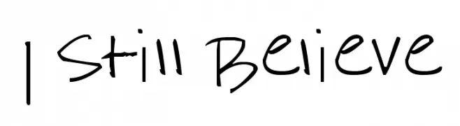
( Fonts by www.fontpanda.com. Personal-use only. For commercial use please contact owner. )
A casual, handwritten font with a playful and informal style.
![I Still Believe Frei Schriftart Herunterladen]() Herunterladen 366 Downloads@WebFont
Herunterladen 366 Downloads@WebFont -
-
( Fonts by datto )
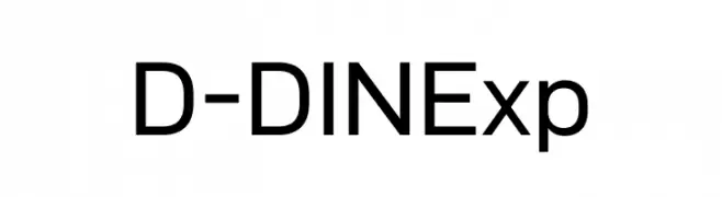
A modern, geometric sans-serif font with uniform stroke widths and clear readability.
![D-DIN Exp Frei Schriftart Herunterladen]() Herunterladen 366 Downloads@WebFont
Herunterladen 366 Downloads@WebFont -
( Fonts by Daniel Zadorozny - www.iconian.com - Free for personal use )
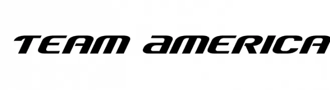
A bold, italicized font with a modern and dynamic style.
![Team America Frei Schriftart Herunterladen]() Herunterladen 366 Downloads@WebFont
Herunterladen 366 Downloads@WebFont -
![Pretty Clever Frei Schriftart Herunterladen]() Herunterladen 366 Downloads@WebFont
Herunterladen 366 Downloads@WebFont -
( Fonts by Vladimir Nikolic )
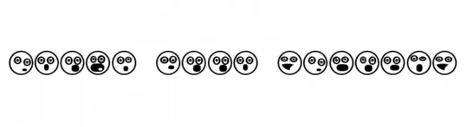
A playful set of emoji-like symbols with bold outlines and expressive faces.
![Emoji Boom Regular Frei Schriftart Herunterladen]() Herunterladen 366 Downloads@WebFont
Herunterladen 366 Downloads@WebFont -
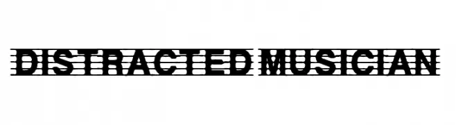
( Fonts by Anke Arnold - www.anke-art.de )
A decorative font with musical staff lines integrated into each character.
![distracted musician Frei Schriftart Herunterladen]() Herunterladen 366 Downloads@WebFont
Herunterladen 366 Downloads@WebFont

Welche Schriften sind gerade am populärsten?
Poppins, Roboto, Montserrat, Open Sans und Lato sind wegen ihrer klaren Formen und breiten Einsetzbarkeit sehr gefragt – von Markenauftritt über Landingpages bis hin zu Postern.
Welche Fonts eignen sich für Logos?
Geometrische Sans‑Serifs (z. B. Poppins, Familien im Gotham‑Stil) sind ein häufiger Griff für sauberes, skalierbares Branding. Für eine persönlichere Note bleiben Scripts und Handschrift‑Stile beliebt. Kombinieren Sie einen prägnanten Headline‑Font mit einer neutralen Brotschrift für Wiedererkennung und Harmonie.
Wie oft wird die Top‑Liste aktualisiert?
Regelmäßig – basierend auf realen Downloads und Interaktionen. Schauen Sie öfter vorbei, um aufstrebende Favoriten früh zu entdecken.
💡 Tipp: Seite bookmarken – Trends wechseln schnell, und heutige Top‑Schriften inspirieren morgen vielleicht das Rebranding.