Willkommen bei den Top‑Schriften – hier treffen Beliebtheit und Qualität aufeinander. Das sind die in diesem Jahr am häufigsten heruntergeladenen und genutzten Fonts. Wenn Sie sichere Optionen für Logo, Web oder Social suchen, starten Sie hier.
Jeder Top‑Font überzeugt durch Balance, Lesbarkeit und Vielseitigkeit. Sie finden moderne Sans‑Serifs, elegante Scripts, Vintage‑Serifs und minimalistische Displays.
-
 Herunterladen 338 Downloads@WebFont
 -
( Fonts by Jacob Fisher - www.pizzadude.dk )
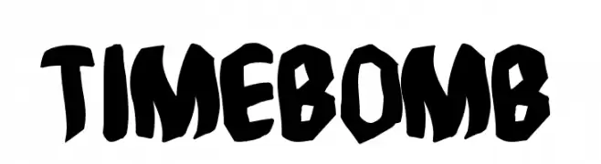
A bold, jagged font with a graffiti-inspired style.
![Timebomb Frei Schriftart Herunterladen]() Herunterladen 338 Downloads@WebFont
Herunterladen 338 Downloads@WebFont -
( Fernando Carvente - serifchocolate.com )
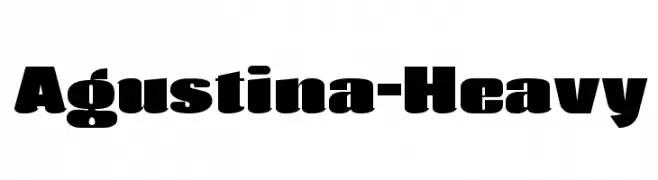
A bold, heavy font with a modern and impactful design.
![Agustina-Heavy Frei Schriftart Herunterladen]() Herunterladen 338 Downloads@WebFont
Herunterladen 338 Downloads@WebFont -
( Fonts by Locomotype )
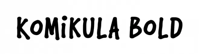
A bold, playful font with a hand-drawn, comic book style.
![Komikula Bold Frei Schriftart Herunterladen]() Herunterladen 338 Downloads@WebFont
Herunterladen 338 Downloads@WebFont -
( Fonts by Monofonts )
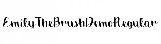
A playful brush script font with dynamic strokes and artistic flair.
![Emily The Brush Demo Regular Frei Schriftart Herunterladen]() Herunterladen 338 Downloads@WebFont
Herunterladen 338 Downloads@WebFont -
-
( Fonts by Dan Steinbok - Out Of Step Font Company - outofstepfontco.com - Personal-use only. For commercial use please contact owner. )
A bold, decorative font with a 3D sketch effect and rugged outlines.
![Backtrack Regular Frei Schriftart Herunterladen]() Herunterladen 338 Downloads@WebFont
Herunterladen 338 Downloads@WebFont -
( Fonts by Daniel Gauthier )
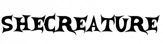
A bold, gothic-style font with sharp, angular edges and a dramatic flair.
![SheCreature Frei Schriftart Herunterladen]() Herunterladen 338 Downloads@WebFont
Herunterladen 338 Downloads@WebFont -
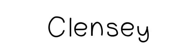
![Clensey Frei Schriftart Herunterladen]() Herunterladen 338 Downloads@WebFont
Herunterladen 338 Downloads@WebFont -
( Fonts by Daniel Zadorozny - www.iconian.com - Free for personal use )
A bold, distressed font with a rugged, grunge-like style and slanted orientation.
![G.I. Incognito Leftalic Frei Schriftart Herunterladen]() Herunterladen 338 Downloads@WebFont
Herunterladen 338 Downloads@WebFont -
![Dots All For Now 3D JL Frei Schriftart Herunterladen]() Herunterladen 338 Downloads@WebFont
Herunterladen 338 Downloads@WebFont


Welche Schriften sind gerade am populärsten?
Poppins, Roboto, Montserrat, Open Sans und Lato sind wegen ihrer klaren Formen und breiten Einsetzbarkeit sehr gefragt – von Markenauftritt über Landingpages bis hin zu Postern.
Welche Fonts eignen sich für Logos?
Geometrische Sans‑Serifs (z. B. Poppins, Familien im Gotham‑Stil) sind ein häufiger Griff für sauberes, skalierbares Branding. Für eine persönlichere Note bleiben Scripts und Handschrift‑Stile beliebt. Kombinieren Sie einen prägnanten Headline‑Font mit einer neutralen Brotschrift für Wiedererkennung und Harmonie.
Wie oft wird die Top‑Liste aktualisiert?
Regelmäßig – basierend auf realen Downloads und Interaktionen. Schauen Sie öfter vorbei, um aufstrebende Favoriten früh zu entdecken.
💡 Tipp: Seite bookmarken – Trends wechseln schnell, und heutige Top‑Schriften inspirieren morgen vielleicht das Rebranding.