Willkommen bei den Top‑Schriften – hier treffen Beliebtheit und Qualität aufeinander. Das sind die in diesem Jahr am häufigsten heruntergeladenen und genutzten Fonts. Wenn Sie sichere Optionen für Logo, Web oder Social suchen, starten Sie hier.
Jeder Top‑Font überzeugt durch Balance, Lesbarkeit und Vielseitigkeit. Sie finden moderne Sans‑Serifs, elegante Scripts, Vintage‑Serifs und minimalistische Displays.
-
( Fonts by www.aenigmafonts.com )
A bold, futuristic font with rounded edges and a modern, playful style.
 Herunterladen 328 Downloads@WebFont
 -
![Table in a Bear Suit Frei Schriftart Herunterladen]() Herunterladen 328 Downloads@WebFont
Herunterladen 328 Downloads@WebFont -
( Zetafonts - www.zetafonts.com )
A sleek, ultra-light, and modern narrow font with clean lines.
![Cocogoose Narrow Trial UltraLight Frei Schriftart Herunterladen]() Herunterladen 328 Downloads@WebFont
Herunterladen 328 Downloads@WebFont -
![Tombstone Regular Frei Schriftart Herunterladen]() Herunterladen 328 Downloads@WebFont
Herunterladen 328 Downloads@WebFont -
![Victor Handwriting Frei Schriftart Herunterladen]() Herunterladen 328 Downloads@WebFont
Herunterladen 328 Downloads@WebFont -
-
( Fonts by Trollax Kinora - Personal-use only. For commercial use please contact owner. )
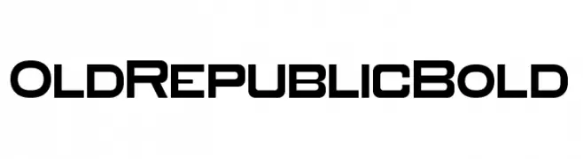
A bold, geometric font with a modern and futuristic style.
![Old Republic Bold Frei Schriftart Herunterladen]() Herunterladen 328 Downloads@WebFont
Herunterladen 328 Downloads@WebFont -
( Fonts by Woodcutter Manero - http://www.woodcutter.es - Personal-use only. For commercial use please contact owner. )
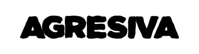
A bold, rounded font with a strong, playful presence.
![Agresiva Frei Schriftart Herunterladen]() Herunterladen 328 Downloads@WebFont
Herunterladen 328 Downloads@WebFont -
( Fonts by Astigmatic One Eye Typographic Institute - Brian J. Bonislawsky - astigmatic.com )
A dramatic, edgy font with sharp, elongated strokes and a cohesive design.
![Skinner AOE Frei Schriftart Herunterladen]() Herunterladen 328 Downloads@WebFont
Herunterladen 328 Downloads@WebFont -
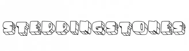
![STEPPINGSTONES Frei Schriftart Herunterladen]() Herunterladen 328 Downloads@WebFont
Herunterladen 328 Downloads@WebFont -
( Fonts by Misti Hammers - mistifonts.com - Personal-use only. For commercial use please contact owner. )
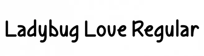
A playful, rounded font with smooth curves and a friendly vibe.
![Ladybug Love Regular Frei Schriftart Herunterladen]() Herunterladen 328 Downloads@WebFont
Herunterladen 328 Downloads@WebFont


Welche Schriften sind gerade am populärsten?
Poppins, Roboto, Montserrat, Open Sans und Lato sind wegen ihrer klaren Formen und breiten Einsetzbarkeit sehr gefragt – von Markenauftritt über Landingpages bis hin zu Postern.
Welche Fonts eignen sich für Logos?
Geometrische Sans‑Serifs (z. B. Poppins, Familien im Gotham‑Stil) sind ein häufiger Griff für sauberes, skalierbares Branding. Für eine persönlichere Note bleiben Scripts und Handschrift‑Stile beliebt. Kombinieren Sie einen prägnanten Headline‑Font mit einer neutralen Brotschrift für Wiedererkennung und Harmonie.
Wie oft wird die Top‑Liste aktualisiert?
Regelmäßig – basierend auf realen Downloads und Interaktionen. Schauen Sie öfter vorbei, um aufstrebende Favoriten früh zu entdecken.
💡 Tipp: Seite bookmarken – Trends wechseln schnell, und heutige Top‑Schriften inspirieren morgen vielleicht das Rebranding.