Willkommen bei den Top‑Schriften – hier treffen Beliebtheit und Qualität aufeinander. Das sind die in diesem Jahr am häufigsten heruntergeladenen und genutzten Fonts. Wenn Sie sichere Optionen für Logo, Web oder Social suchen, starten Sie hier.
Jeder Top‑Font überzeugt durch Balance, Lesbarkeit und Vielseitigkeit. Sie finden moderne Sans‑Serifs, elegante Scripts, Vintage‑Serifs und minimalistische Displays.
-
( Fonts by 7NTypes )
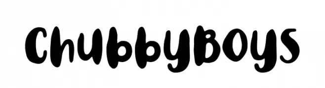
A bold, playful font with thick, rounded strokes and a whimsical style.
 Herunterladen 322 Downloads@WebFont
 -
( Woodcutter - woodcutter Manero - www.woodcutter.es )
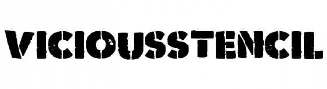
A bold, distressed stencil font with an industrial and gritty aesthetic.
![Vicious Stencil Frei Schriftart Herunterladen]() Herunterladen 322 Downloads@WebFont
Herunterladen 322 Downloads@WebFont -
( Free on condition that you make a donation of 5€ favor of an organization dealing with global warming. http://www.sergiolelli.it )
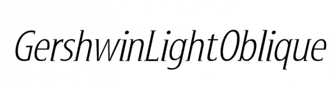
An elegant, light, and slightly oblique font with medium contrast.
![GershwinLightOblique Frei Schriftart Herunterladen]() Herunterladen 322 Downloads@WebFont
Herunterladen 322 Downloads@WebFont -
( Fonts by Nirmana Visual - Sigit Dwipa - Personal-use only. For commercial use please contact owner. )
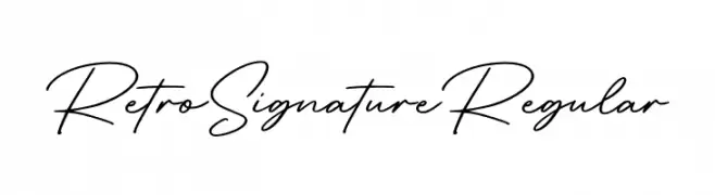
A classic, elegant handwritten font with a vintage signature style.
![RetroSignatureRegular Frei Schriftart Herunterladen]() Herunterladen 322 Downloads@WebFont
Herunterladen 322 Downloads@WebFont -
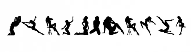
( Fonts by bob istheowl http://luc.devroye.org/bobistheowl.html )
A display font featuring artistic female silhouettes as characters.
![BeautyMarks Frei Schriftart Herunterladen]() Herunterladen 322 Downloads@WebFont
Herunterladen 322 Downloads@WebFont -
-
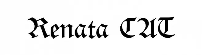
( Fonts by www.peter-wiegel.de. Personal-use only. For commercial use please contact owner. )
A classic blackletter font with ornate, medieval-inspired design.
![Renata CAT Frei Schriftart Herunterladen]() Herunterladen 322 Downloads@WebFont
Herunterladen 322 Downloads@WebFont -
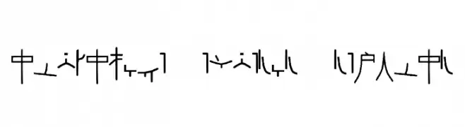
( Fonts by Shelley Evans )
Abstract, geometric font with a coded, ancient script appearance.
![Alphacode Emperor Regular Frei Schriftart Herunterladen]() Herunterladen 322 Downloads@WebFont
Herunterladen 322 Downloads@WebFont -
Schriftart von Qbotype. For commercial use please contact the owner.
( Fonts by www.phuxerdesigns.com.ar - Non-commercial use of any typeface free version, only buying the full version )
A bold, geometric font with a futuristic outline style.
![Bim Frei Schriftart Herunterladen]() Herunterladen 322 Downloads@WebFont
Herunterladen 322 Downloads@WebFont -
( Fonts by Hanna Bie )
Playful, bold, rounded hand-drawn font.
![Monkey Pie Frei Schriftart Herunterladen]() Herunterladen 322 Downloads@WebFont
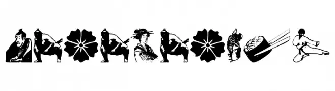
Herunterladen 322 Downloads@WebFont -
![japanapush Frei Schriftart Herunterladen]() Herunterladen 322 Downloads@WebFont
Herunterladen 322 Downloads@WebFont


Welche Schriften sind gerade am populärsten?
Poppins, Roboto, Montserrat, Open Sans und Lato sind wegen ihrer klaren Formen und breiten Einsetzbarkeit sehr gefragt – von Markenauftritt über Landingpages bis hin zu Postern.
Welche Fonts eignen sich für Logos?
Geometrische Sans‑Serifs (z. B. Poppins, Familien im Gotham‑Stil) sind ein häufiger Griff für sauberes, skalierbares Branding. Für eine persönlichere Note bleiben Scripts und Handschrift‑Stile beliebt. Kombinieren Sie einen prägnanten Headline‑Font mit einer neutralen Brotschrift für Wiedererkennung und Harmonie.
Wie oft wird die Top‑Liste aktualisiert?
Regelmäßig – basierend auf realen Downloads und Interaktionen. Schauen Sie öfter vorbei, um aufstrebende Favoriten früh zu entdecken.
💡 Tipp: Seite bookmarken – Trends wechseln schnell, und heutige Top‑Schriften inspirieren morgen vielleicht das Rebranding.